Why Help Content Fails and #contentstrategy
Listen here:
Content strategists ask a lot of questions about content. For help content, the question that should haunt content strategists is why help fails.
Most Help Fails the User
Most users think help content is useless. It's an almost universal perception that help content will be, for the most part, unhelpful. It's a last resort measure, when you can't figure it out from the interface, when no colleagues are standing by to assist, when you've reached a certain level of frustration and have nothing else to try -- only then do you bring yourself to begrudgingly click the help button. Why is it this way? How can we turn help around into a success story?
Content Strategy and Successful Help
Sometimes when I read about content strategy, a lot of the topics discussed seem subordinate to the larger question of why help fails. For example, here are some possible topics for discussions in content strategy:
- Content reuse
- User contributions to the help
- Metadata
- Messaging
- Voice and tone
- Content ownership
- Legal compliance
- Management of the content throughout the content life cycle
- Terms and vocabulary
- Style guides
- Content authoring systems
- Syndication of help content across social media channels
- Content versioning
- Search engine optimization
- Silo-type culture in the organization
While all of these factors contribute to the help experience, none seems to be a fundamental reason why help might fail or succeed.
What the Users Say
This morning I decided to ask a couple of typical computer users (who often complain about help to me) why they think why help often becomes a frustrating experience. I interviewed my dad (visiting in town this week) and my wife. You can listen to their experiences here (it's 5 minutes long):
My father is a 75-year-old retired government worker, literature enthusiast, and Macbook and iPhone 4G user. In his most recent foray into help, he doesn't have trouble getting to the right topic, but when he lands on the topic, the information is gibberish. He says he wants a more standard, predictable help experience across applications.

I also interviewed Shannon, a 33-year-old incredibly sexy mother of four daughters, a popular blogger (on WordPress), a college-educated bookworm who reads more than she breathes, and a person with an extremely short patience and frustration threshold. She explains how she recently spent 2 hours looking at Ikea instructions to put together a desk before concluding that they shipped the wrong parts. Even though the manual was full of pictures (to the exclusion of all text), the instructions failed to provide the information she needed (to confirm or deny the validity of the parts).

Shannon also feels that applications such as iTunes and iPod, which are notorious for their "usability," are in reality perplexing and unusable. She resists the idea that she's "stupid" even when the help information is confusing or poorly worded.
She also complains about how difficult it is to find the right topic, which is why she often doesn't use help. She stresses the need for technical writers to better understand users, especially the terms they use. She thinks she can't find topics in the help because they're named with unfriendly terms (and therefore obscure) rather than simply being absent from the manual.
A Content Strategy Framework
In an STC Summit presentation about Testing Content Strategy: What Works, What Doesn't, Colleen Jones and Kevin O'Connor move toward some of these larger questions that I think we should be asking. As they evaluate content, they ask three questions:
• Can users find and read the content that they need?
• Do they understand it?
• Can they act on it?
Colleen and Kevin's questions are the right focus. In applying this framework to help content, I would keep their first two questions and change the last to "Does help have the right information?"
I should probably interview a handful of other people to arrive at a consensus, and I might eventually do that. But for now, I'm going to generalize the three main reasons why help fails:
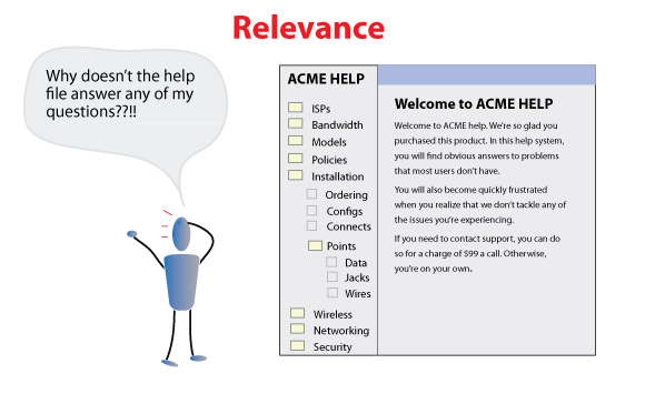
- Help lacks the right information (Relevance)
- The topics are hard to find (Findability)
- The content is hard to understand (Clarity)
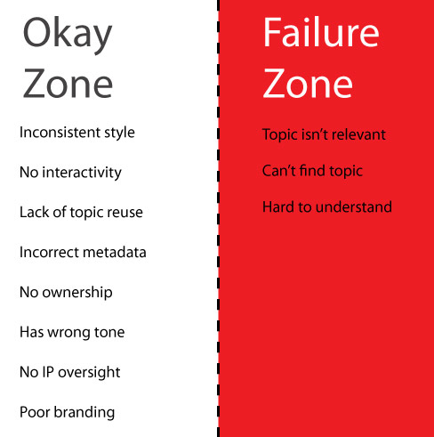
Everything else is a footnote to the experience of help. If a help system lacks relevance, findability, or clarity, it's going to fail for the user. In contrast, if help succeeds in these three areas but falters in some of the other criteria, such as style and tone, it will still be an okay user experience.
Help Lacks the Right Information (Relevance)
The lack of relevant content is, I suspect, the biggest reason help fails. How many times do you dismiss a help file because you know your question won't be answered there? Of you scan through the help but find that your questions aren't in there at all. Either the help is too basic, or it doesn't address your specific scenario. Either way it becomes useless -- even if the content is legally accurate, conforms to a style guide, and is tagged with the right metadata.
Getting relevant content in your help requires you to get into your users' heads, to talk with them and become familiar with the tasks they will perform, the questions they'll ask, the language they speak, and the information they will need as they go about their processes. Figuring out this information is difficult. I'll give you an example.
In my organization, we're releasing a new member directory. The directory is pretty intuitive, which is why I haven't written any help for it. But I need to. I look at the stream of feedback from users and can pick out questions here and there about the directory. The questions aren't simple ones, such as, how do I update my profile? Or how do I upload a photo? The questions are more like, if I'm an out-of-unit leader, why don't I have administrative rights to edit other profiles? Or, I received a blank screen when uploading my photo -- are there some unstated requirements I didn't follow about size, dimension, and format?
Getting relevant help content is the most difficult aspect of writing help. It's nearly impossible to anticipate all the questions users will have, to understand the vocabulary they'll use to describe their tasks, and to grasp the their environment and work processes. You can get this information from users, but most technical writers don't have open access to users. You can't just leave your cube and wander down on another floor to mingle with users. Often you can't even call them. The project manager may feel uneasy about you contacting users, arguing that there should be "one point of contact."
A few years ago, Joe Sokohl gave a presentation at Doc Train West about the Kobayashi Maru principle. It's a Star Trek scenario that requires you to break the rules in order to win the game. That's much the same story technical writers must take: to win the game, you have to break the rule that says "you can't talk to the user." You have to disregard these rules and start communicating with others outside your cube and outside your IT department. It's hard. I don't do it nearly as often as I should. But it doesn't have to be arduous.
For example, as I was perusing user feedback last month, I ran across a user who seemed particularly frustrated, and she fit the exact role I was trying to better understand. Without asking permission from anyone, I emailed the user to ask if I could walk her through answers to some of her questions. In return, I said it would help me understand her perspective so that I could write better help.
She turned out to be a gold mine of information. She had so many questions and issues, it really made me think critically about the application. And it made me realize how woefully inadequate my help content was.
It's impossible to create relevant help content while living in the bubble of your project team. Ask the project manager, the quality assurance tester, or the business analyst all the questions you want. They'll get you 70 percent of the way there, perhaps. But it takes some interacting with users to understand all the information you'll need for successful help.
For more reading on this topic, see
- You learn more from users in 5 minutes than you do from 2 weeks of project meetings
- Two Stories About How to Write Help Content
The Right Topic Is Hard to Find (Findability)
Finding the right topic has been the ongoing focus of my series on Organizing Content. Organizing content is all about arranging and positioning help so that it can be found by the user in the moment he or she needs it. This could mean locating the help in the interface, or search-engine-optimizing it so that it rises to the top of the search results, or organizing it with various navigation facets, such as by most popular topics, latest topics added, format, or role.
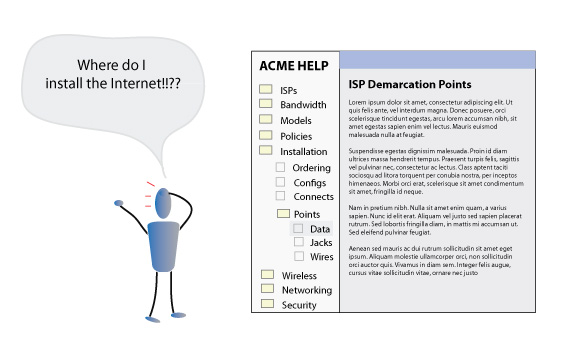
There's a certain paradox about findability that's a little troubling. To make help content relevant, you usually have to add more information, including answers to the questions that users in different roles would ask, the information users in different scenarios would need, and so on. Creating help that is relevant to every user role, scenario, and purpose will bloat your help system with a lot of topics, perhaps twice what you initially anticipated. The more topics you add to the help, the harder it gets to find that content, because it gets buried. As a result, the help content becomes less informative, because users can't find the information they need.
Compare the paradox to this analogy. You buy a pack of baseball cards. The pack of cards has a couple of your favorite players, but many are missing. Still, you can easily locate your favorite player cards and quickly read their stats and other information. One day your uncle gives you his baseball card collection. He has thousands of baseball cards in a box. You combine your small pack of cards to the thousands of other cards in the box. Now you may have all your favorite players in there, but you're not sure because you can't find any of them. Their easy location is scattered among all the other cards. You have more informative content, but you also seem to have less informative content at the same time.
Findability tries to solve this problem by organizing content in a way that makes sense to users. With baseball cards, you might organize them in alphabetical order, by team, by year, or by player positions. Using one of these navigational facets, you could then narrow down your search by the type of card you're looking for and get to it more quickly than shuffling randomly through the pile.
Every help system has some organizing logic, but it's usually just a series of topic-based folders that the technical writer thought made sense. In reality, topics easily overlap. One person's organizing logic differs easily from another person's -- just look how people organize their files on their personal computers. In the end, the topic-based folder method is arbitrary and frustrating, particularly with large help systems.
Let's look at a quick example. Open up Madcap Flare's webhelp and expand the User Interface Elements - How to Use Each One book. When you expand this book, about 200 topics appear within it, in one flat, non-hierarchical list. The list is alphabetized, and it's pretty much comprehensive of everything in Flare. I always look at this folder with a certain bewilderment. Is this the best way to organize help? Rather than trying to guess a logical structure of folders (for example, Using Topic Templates, Formatting Help Topics, Reusing Content, etc.), it's just one big feature list. Despite this lack of structure, Flare's search is surprisingly good.
For more on the topic of findability, see my series on Organizing Content.
The Content Is Hard to Understand (Clarity)
The third question involves an angle I haven't explored much, but it's the heart of what is driving my new series on Visual Imagination. The reader should be able to understand the concept or task you're explaining. This sounds easy, but remember that technical writers tackle complicated concepts and processes. If it were easy, we wouldn't be needed.
Most of the apps I document are kind of kludgy and only half-intuitive. They're patterned after a business process that excludes outsiders by design. They're created by people with a variety of skillsets, and no project ever has an infinite budget to fix mistakes in functionality and design. As a result, explaining how to accomplish a task or concept can require an unexpected degree of dexterity and articulation.
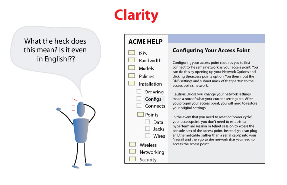
Certainly clear, articulate writing goes a long way toward helping users understand a topic. Adding examples with specific details, screenshots showing confusing areas of the screen, and using terms the user understands all play a part in clarity.
But there's another element too: illustrations. It's one of the most under-emphasized aspects of help that has the potential to convert boring, text-heavy help into engaging content.
Why add illustrations? Put simply, we are visual people. From the time we were children, we've been drawing pictures, seeing the world around us, painting with color, exploring what we see. Most users are visual learners. Pictures clarify and communicate. Shapes and locations and colors all give rise to relationships and patterns and hierarchies that mean something to the user in immediately understandable ways. More than anything else, illustrations can help clarify the big picture concepts that most users struggle to understand.
All too often when we create help topics, we drown them in words. We use the absolute easiest and laziest method to communicate the concepts to the hurried user. While text may be a good option when you have simple information to convey, such as where to turn off hyphenation in Illustrator's text boxes, it fails when you tackle more advanced concepts, such as explaining how Illustrator's Pen tool works. Remember that the software interface is a visual experience. Our tools to explain it should be visual too.
When you have technical concepts to explain, illujobapis_overviewstrating the information in ways users can see and immediately understand, whether through illustrations or through screencasts, will do more for help content than a hundred efforts to address other content strategies.
For example, if you were writing about bandwidth and trying to explain that each additional user strains the total overall download speed, wouldn't an accompanying illustration make that concept much clearer for the user?
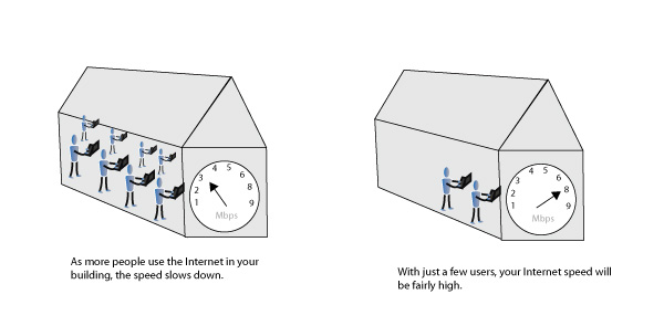
I've been trying to drive home concepts through illustrations in my past few posts. I've found that illustrating an idea also helps me clarify exactly what the concept is. As users see pictures in combination with text, it will reinforce the ideas and engender understanding like nothing else. Essentially you're adding another sense to the interpretation of the information: sight.
For more information, see my visual series on Visual Imagination.
Conclusion
No discipline has ever needed a focus on content as much as technical communication. At least half of the time or more, help fails for the user. When we talk about content strategy, we should consider the core issues that define the help experience for the user: relevance, findability, and clarity. These criteria are what constitute the experience of help.
By the Way, Is This Whole CS Context a Semantic Buzzword?
I've been phrasing this whole discussion in the context of content strategy. But ensuring relevance, findability, and clarity should be the core competency of any technical writer/communicator. In Sarah O'Keefe's recent post on Content strategy for technical communication, the questions she asks about audience, information, deliverables, timeframes, formats, etc., are the same questions that any technical writer worth paying should be asking.
I asked, have we been approaching tech comm unstrategically all these years? She responded,
It's my experience that most people focus on their available/preferred toolset, and then figure out what they can do with those tools to deliver tech comm. I am asking them to take a step back and really think about their requirements instead of limiting themselves to what their favorite content-development software is capable of doing.
If that's what separates a content strategist from a technical communicator -- taking a step back -- then perhaps I have been a content strategist all along without knowing it. Certainly this blog is all about asking the larger questions rather than blindly carrying out orders from a project manager.
Column McAndrew also tackles this same semantic question in his post on DMN Communications, I'm a Content Strategist. Or am I?. He writes,
Call me old fashioned if you will, but what is the difference between a Content Strategist and a Technical Writer? While you are at it, add Information Developer, or one of the many other job titles bandied around, to the list. Aren't they all fundamentally the same? If you changed your job title from a Technical Writer to a Content Strategist, would you operate any differently? If you do, I'd suggest you weren't doing your job correctly in the first place.
I agree with Column. In the past, some people have made a distinction between technical writer and technical communicator to emphasize the larger, more conceptual thinking behind communication. Have we simply moved on to another term with "content strategy"?
I have to admit, I'm mixed. With web development, the term fits. But with help content, it seems redundant. A good technical writer is by default a content strategist.
Most of what I covered in this post -- relevance, findability, and clarity -- are core issues for technical writers. If technical writers don't address these topics, they're not doing their job. If they do address them, does it make them content strategists? If content strategists don't address these issues, but instead focus on other reasons (such as style and review cycles), they're not focusing on the main components that drive and define the user experience, so their role becomes somewhat trivial. In the end, both roles converge on the same issues, so separating the job titles makes little sense to me.
About Tom Johnson

I'm an API technical writer based in the Seattle area. On this blog, I write about topics related to technical writing and communication — such as software documentation, API documentation, AI, information architecture, content strategy, writing processes, plain language, tech comm careers, and more. Check out my API documentation course if you're looking for more info about documenting APIs. Or see my posts on AI and AI course section for more on the latest in AI and tech comm.
If you're a technical writer and want to keep on top of the latest trends in the tech comm, be sure to subscribe to email updates below. You can also learn more about me or contact me. Finally, note that the opinions I express on my blog are my own points of view, not that of my employer.


