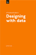
Book Review: A Practical Guide to Designing with Data, by Brian Suda

A Practical Guide to Designing with Data (Five Simple Steps, 2010), by Brian Suda, is a thorough exploration of best practices for graphs and charts. It's somewhat similar to Edward Tufte's Visualizing Information in focus, and both have a shared antipathy toward "chart junk" in the effort to tell the story of data. Suda explains,
The main purpose of this book is to encourage you to visualize and design for data in such a way that it engages the reader and tells a story rather than just being flashy, cluttered and confusing. (viii)
Everything that's flashy, superfluous, and unnecessary is essentially chart junk. Chart junk gets in the way of the purpose in using a chart or graph, which is to tell the story of data. Any time you add visuals that distract from the data, or which don't add to the data, this chart junk just gets in the way.
With this assumption, the graphs and charts Suda focuses on in Designing with Data are minimalistic. He encourages you to avoid bringing in too many dark lines or colors. To de-emphasize certain lines, make them light gray. To highlight an area, add a splash of color -- but only a splash. Suda dislikes the gaudy multi-dimensional, multi-colored charts and graphs that you can too easily produce with PowerPoint, Excel, and other tools. He feels this excess of pixels all too often prevents the reader from understanding the data.
In a culture of visualization and infographics, Suda's book is a wake-up call to graphic minimalism. Suda writes,
A visualization ... seems to contain much more 'chart junk', with many sometimes complex graphs or several layers of charts and graphs. A visualization seems to be the super-set for all sorts of data-driven design. (11)
The focus on minimalism also has echoes in Jean-Luc Duomont's Trees, maps, and theorems, which I reviewed last year.
Given the rising trend of infographics, Suda's book provides an interesting counter. At Podcamp 2011, Tristan Higbee of Blogging Bookshelf said some of his most popular posts are ones with infographics; he now actually has a course on infographics. Higbee notes that people searching for infographics (see Google Trends for the term) has skyrocketed in the past few years. Most notable among the producers of infographics is New York Times. Check out the New York Times' gallery of infographics. Fast Company also has a category dedicated to infographics.
Given this trend toward infographics and visualization, it's easy to get caught up in the graphic design of the information, emphasizing the artistic aspect of the display. Yet Suda says,
To tell the story behind the data, we need to stop grasping for the perfect visualization and instead return to the basic language of charts and graphics. Only then can we begin to uncover the meaning and relationships the data has to offer. (v)
Returning to the basic language of charts and graphs is the core theme of the book. The debate between minimalism (with basic graphs and charts) and decoration (through infographics and other visualizations) is something Suda touches on with more depth outside his book, in a comment on a 10 minute BBC video clip about "making information beautiful."
Two artists have contrasting views. David McCandless wants to bring his graphic design skills to the information landscape to portray information as a kind of art, to evoke more than mere information but also patterns and emotion and attention. Neville Brody says that over-visualization can too easily become pretty "wallpaper" -- something that's pleasing to look at, but which misses the underlying point of the story. The story gets lost in the decoration.
Suda comments:
While I personally find myself agreeing with Neville Brody, I also find myself defending David McCandless. Neville's flippant comment about “It is very pretty, I would like that on my wall”, goes to the heart of the problem with visualizations and infographics, they are decoration more than they are tools to convey data. (The art of making information beautiful)
Although he sides with Brody, he applauds McCandless for pushing the limits and compares him to information pioneers such as Florence Nightengale, whose innovation in displaying information led to the formation of a new type of chart.
Designing with Data provides excellent information if you're designing charts or graphs. If you're looking for a book that explores infographics and visual storytelling, this book isn't it. Yet Suda's book still provides a good reminder to avoid unnecessary elements and decoration that distract from your story. In the last section of the book, Suda notes that he's not opposed to more elaborate visualizations. He just encourages readers to first master the basics and tell the story, and then to experiment with something more artistic or creative after that.
About Tom Johnson

I'm an API technical writer based in the Seattle area. On this blog, I write about topics related to technical writing and communication — such as software documentation, API documentation, AI, information architecture, content strategy, writing processes, plain language, tech comm careers, and more. Check out my API documentation course if you're looking for more info about documenting APIs. Or see my posts on AI and AI course section for more on the latest in AI and tech comm.
If you're a technical writer and want to keep on top of the latest trends in the tech comm, be sure to subscribe to email updates below. You can also learn more about me or contact me. Finally, note that the opinions I express on my blog are my own points of view, not that of my employer.
