This Theme Is Now Responsive
 Previously, I've used WordPress plugins to style this blog's view on mobile devices, but with all the buzz about multi-device display and publishing, I decided to switch themes to a completely responsive theme.
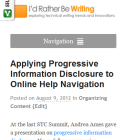
Because I use minimalistic themes, switching from one minimalistic theme to another is almost unnoticeable. But so you can see the difference, resize your browser to a smaller size. As you resize it, you'll see the navigate bar suddenly switch to another style. On your mobile device, the text will still be readable. You can read the content on mobile, tablet, and desktop computers. Even the print looks good (hit Ctrl+P).
I didn't manually style the theme. I'm using Canvas, a theme from Woothemes. Canvas is more like a minimalistic, responsive theme framework than anything else. Hands-down it is the most popular and flexible theme from Woothemes, and with all the responsive styling built-right in, it's a good choice for a blog theme.
Interestingly, the main stylesheet for Canvas defines the mobile display. An additional stylesheet, layout.css, makes adjustments for a desktop display. In other words, the designers prioritized mobile first, rather than adjusting for mobile after designing for a desktop display.
In the layout.css stylesheet, you'll see various media queries. These media queries tell browsers to style the content a certain way for specific device sizes:
@media only screen and (max-width: 1000px)
@media only screen and (max-width: 768px)
@media only screen and (min-width: 768px)
That third media query targets the desktop display, and if you look at the styles, you'll see about 50 styles in that section, compared to only about 5 styles in the previous two sections.
I think responsive themes tend to be more minimalistic to accommodate this flexibility across devices. And when it comes to minimalism, I've always felt that content is much more important than design. I choose my blog themes like I choose my glasses -- I want the nearly frameless glasses that let people focus on my eyes rather than my frames.
I was recently listening to Joe Sokohl's STC Summit presentation, Destroying the Box. He talks about Frank Lloyd Wright's architectural philosophy as an inspiration for UX design. In the presentation, Joe quotes Lau Tzu, who says, "The reality of the building does not consist of the roof and walls, but the space within to be lived." I gravitate toward the same philosophy with blog themes. I want to make it clean and open enough for my content to breathe.
About Tom Johnson

I'm an API technical writer based in the Seattle area. On this blog, I write about topics related to technical writing and communication — such as software documentation, API documentation, AI, information architecture, content strategy, writing processes, plain language, tech comm careers, and more. Check out my API documentation course if you're looking for more info about documenting APIs. Or see my posts on AI and AI course section for more on the latest in AI and tech comm.
If you're a technical writer and want to keep on top of the latest trends in the tech comm, be sure to subscribe to email updates below. You can also learn more about me or contact me. Finally, note that the opinions I express on my blog are my own points of view, not that of my employer.
