Exploring Flare's Mobile Webhelp Format in Depth
I've recently been exploring Madcap Flare's Mobile Webhelp format. Madcap introduced this new format in version 7, so it's not a new feature (Flare is now on version 8). Nevertheless, I haven't used this format much much partly because I haven't had any mobile projects until now, and because mobile documentation is still so young.
A Standalone Help File?
The first question to ask is, should mobile help be packaged in its own file rather than the app? If a user clicks the help file, does the help load in its own frame, taking the user out of the context of the app? This seems to be an important first question to consider.
When you're in a mobile app, it's not always intuitive how to task-switch to another app. If you upload your help to a web server so that it's accessible from a URL, and then you link your app's help button to that URL, when users click the help, they're taken out of the app to a web browser.
If developers are just going to strip your content into their own modules to display inside the app, I'm not sure the mobile webhelp target is worth bothering with.
However, keeping the content in Flare and publishing to the mobile webhelp target has several clear advantages:
- You can more easily single source to a printed PDF.
- You can more easily translate the content (because of the Flare-Lingo combination).
- You can maintain control over the help material.
- You can take advantages of other Flare features, such as dropdown hotspots, cross-references, search, and glossaries.
(One solution in dealing with help loading outside the app is to add a button in the mobile help's header that allows users to toggle back to the app. More on that later.)
Separate Theme or Same Theme for Mobile?
Let's assume we want a mobile display. The next question is, do we want a separate set of theme files for the mobile display, or should the same content just look good on both desktop and mobile browsers using the same theme?
Flare's mobile webhelp feature was developed before responsive design took the main stage. The idea of responsive design is that you have one source but different rules in the stylesheet that alter the display of content for different devices. Just as Flare has styles for a print and online medium in the same stylesheet, media queries allow you to add more styles for devices of different widths and types.
If you can do responsive design well, your content will display nicely on smartphones, tablets, and desktop devices without the need for entirely separate sites and code bases. If you look at this blog on a mobile device, it should look readable, because the stylesheet includes responsive design. But I just have one theme. There isn't a separate theme that loads for mobile devices.
Flare has a separate skin for the mobile display. Having worked on some responsive WordPress themes, I must confess that I see merit to Flare's approach. Here's why: When you try to use the same theme for both mobile and desktop displays, and just adjust the media query styling to accommodate different devices, there are a plethora of details that can go wrong.
Adding a little bit of styling on one element can throw off the display in some mobile devices but others. Adding some styling to accommodate a tablet, for example, may distort the view on a desktop or smartphone device. Fixing the display for a mobile device may throw askew the display on a desktop, and so forth. And the whole theme has to be minimalist to be flexible enough to adapt well on different devices.
The many intricate touchpoints involved in responsive design make it a challenge. Separating out the mobile theme into its own bit of code with its own stylesheet and layout is somewhat of a relief. Undoubtedly, Flare's mobile theme is more basic, simple, and flexible than the HTML5 theme. But it's less of a worry knowing that when I adjust the padding on a dropdown hotspot, for example, it's not going to affect my desktop view styling. So, in a way, customizing the design is simpler with Flare.
Mobile Webhelp Options
Now let's look at the mobile format a little more closely. When I first showed the skin to an Android developer, his first reaction was that it looked very iPhone-like. You can style the skin, but the degree to which you can customize it is limited.
The default menu shows five possible options:
- Table of Contents
- Glossary
- Index
- About
- Search
I'll explore each of these features, starting with the main menu, in detail.
Main Menu. The app always defaults to this main menu. You can drill into the Table of Contents, but the Home button on the toolbar will take you back to the overall menu, not to the Table of Contents menu.
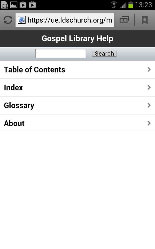
(Note: These screenshots are from a project I was recently documenting. If you want to explore the version I implemented online, you can do so here.)
Because of this default home location, I thought it would be good to use each of these features (Table of Contents, Glossary, Index, About, and Search). If I just had Table of Contents (a single option) it might confuse users as to why I presented them with this extra step and required them to drill down before presenting the actual content.
If you really want your list of topics in the table of contents to show as the default home, here's a workaround for doing it. However, the workaround involves editing the generated output, so this is a somewhat tedious process if you regularly regenerate your output.
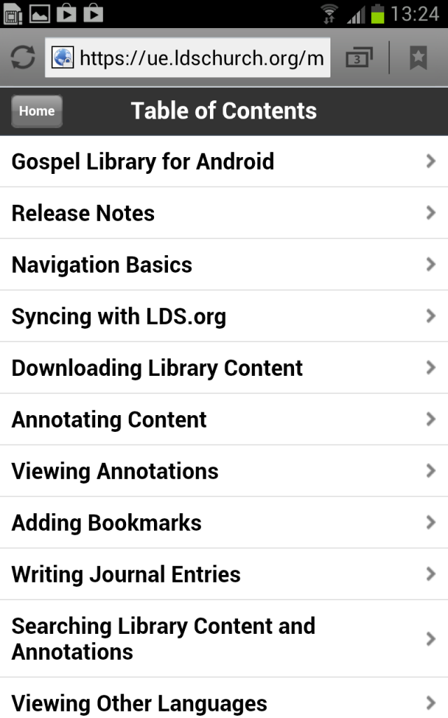
Table of Contents. The way you navigate the table of contents works pretty well, in my opinion. I don't have a whole lot to say here other than that it just works. The topic names are large enough that you can easily tap them on a mobile screen, and you can navigate forwards and backwards intuitively and easily enough.
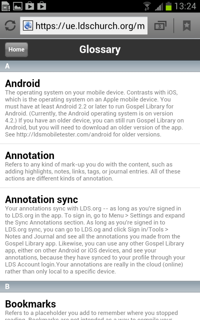
Glossary. The Glossary display also looks great. I like the hierarchical styling between the terms and their definitions. It's easy to navigate and scroll. You can also style the gradient bars that separate the letters through the mobile skin editor.
Unfortunately, as with the glossary in other Flare targets, you can add either a definition or a link, but not both. So often I've wanted to define a term and then point users to more information in the help through a link.
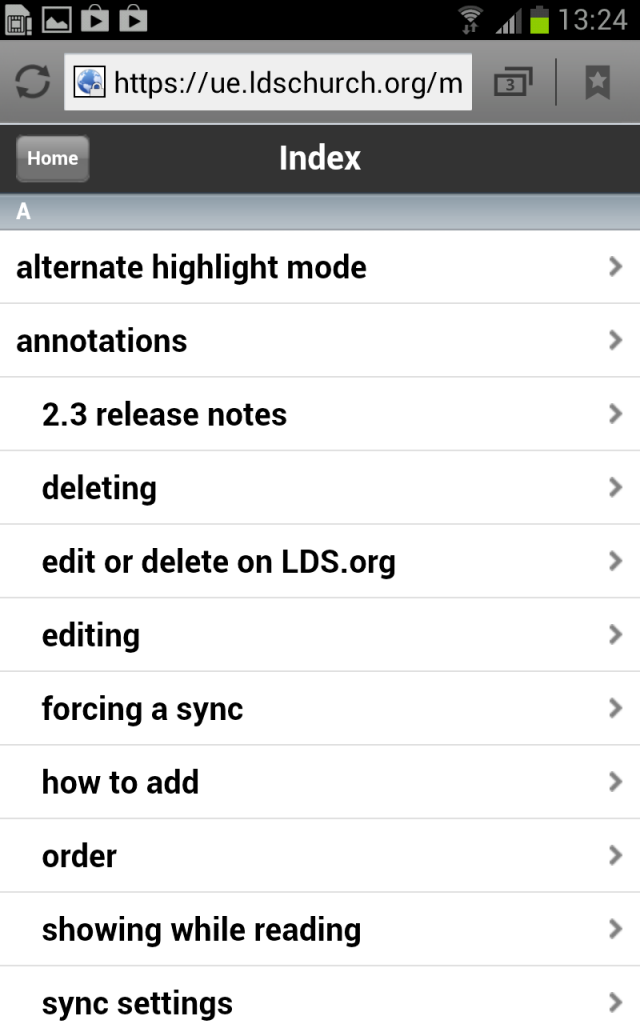
Index. The index looks all right, but there's no hierarchical styling between keyterms and subkeyterms except an indent. Despite my best efforts to style this feature, the styling is coded with embedded style attributes rather than references a stylesheet. As a result, I was unable to change the style of the subkeyterms.
More problematic, when you click an index entry, it goes only to the page (not the topic) where the index entry resides. If you have dropdown hotspots on your page, like I do, the hotspot where the index entry is located doesn't expand to show the location of the index keyword area. This makes the feature somewhat useless because I like to stack a lot of topics in hotspots on a single page rather than breaking them out into their individual pages.
My help is probably too small to make an index worthwhile, but it could be helpful in a larger project.
About. The About page lets you browse to a graphic and include it. You are limited to a graphic only, no text. People searching in the help file usually don't look for an about graphic, though I suppose this might be where you could brand your department's authorship of the help file.
Search. The search works well. I like how it highlights the term you searched for in the search results. There's no way to remove the highlighting on the page, but this is fine by me.

(Although the search doesn't look like an option in the menu, when you're configuring the features in your skin, Search is one of the check boxes, so I listed it here. I'm not sure why anyone would turn off search.)
Drop-Down Hotspots
I've become a serious fan of drop-down hotspots, and if this javascript feature is relevant on any platform, it's especially relevant on a mobile platform. For example, take a look at Wikipedia's mobile display of, say, this page. You can see that each section is collapsed into a dropdown hotspot (this is the mobile view, which you access by adding an "m" after "en" in the URL).
Here's the same styling of hotspots in my sample help file.
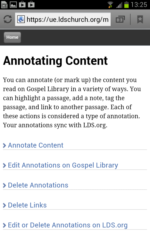
The graphics in the above screenshot are customized. I personally think the default style for the dropdown hotspots in Flare's mobile webhelp aren't very mobile friendly. The graphics are too small to click, and the default styling doesn't have enough white space. You can fix this with a bit of hacking.
Customizing Dropdown Hotspots in Flare
First let's change the buttons. Flare pulls the expand and collapse buttons from this directory: C:Program Files (x86)MadCap SoftwareMadCap Flare V8Flare.appResourcesImagesWebHelp
(Note: Open Windows Explorer and paste in that path. Don't paste it into a web browser.)
You'd think the images would come from the WebhelpMobile directory, but they don't. I assume that's because the developers want to be efficient in not doubling the same resources used by one skin in another.
Tweak the collapse.gif and expand.gif files. I pulled a chevron graphic from the WebhelpMobile directory and rotated it. That WebHelpMobile directory is here: C:Program Files (x86)MadCap SoftwareMadCap Flare V8Flare.appResourcesWebHelpMobileAdvancedSkinsDefaultImages
For the collapsed state, I made the graphic blue to reinforce its clickability.
Now, the chevron graphic rides a little high on the line, so adjust the style a bit by adding this code to your mobile stylesheet:
.MCDropDownHotSpot_
{
padding-top: 0px;
margin-bottom: 30px;
}
And then style the hotspots with some more space and other details:
MadCap|dropDownHotspot
{
cursor: hand;
text-decoration: none;
margin-bottom: 12px;
display: block;
color: #486fae;
font-family: "Lucida Grande";
font-size: 14pt;
border-bottom: solid 1px #d3d3d3;
margin-top: 15px;
padding-top: 15px;
}
Note: You can't just add the expand or collapse images to the MadCap|dropDownHotspot style in the Advanced Editor using the background-image property. That doesn't do anything because these hotspots are driven by javascript.
Customizing Header Background
The Header background is among the easiest elements to style. You can change that default blue gradient to a color that better matches your application. The header is a sliver graphic (tall and thin) that repeats horizontally. You can edit the header style in the mobile skin editor.
If you want to modify the original header graphic, you can find it here: C:Program Files (x86)MadCap SoftwareMadCap Flare V8Flare.appResourcesWebHelpMobileAdvancedSkinsDefaultImages.
Customizing Home button
The default home button graphic comes in several pieces. This allows the button to automatically adjust for a longer name. You can find the home button pieces here: C:Program Files (x86)MadCap SoftwareMadCap Flare V8Flare.appResourcesWebHelpMobileAdvancedSkinsDefaultImages
If you want to change the home button, make a copy of the these default images, and then adjust them in an application such as Photoshop to change their color. Then reinsert them through the skin editor. This allows you to create different looking mobile outputs (for example, one for iPhone and another for Android).
(Rather than make drastic changes to this button, I just desaturated the color in Photoshop.)
You can also change the default images in the Flare source files, but remember that any hacking you do to default images in source files will be lost when you reinstall Flare.
Using Topic Toolbar
In addition to these elements, you can also customize a topic toolbar. As with other targets, you add a Topic Toolbar proxy to your master page, and then configure the topic toolbar in the mobile skin editor.
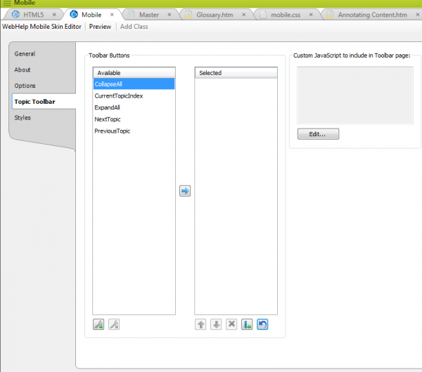
The graphics in the topic toolbar are visually unsatisfying. The Next and Previous buttons are green (contrasting with the default blue gradient header), and the Collapse and Expand buttons are too small to see. (The Show Content Index button applies to a browse sequence only, and probably won't show unless you have a browse sequence enabled.)
Unfortunately, the skin editor doesn't allow you to change the topic toolbar graphics through the skin editor. You would have to actually change the buttons in Flare's source code. However, this turns out to be impossible. All the buttons for this topic toolbar comes from this directory: C:Program Files (x86)MadCap SoftwareMadCap Flare V8Flare.appResourcesWebHelpDefault.flwhtImages
Flare doesn't like it when you modify images in this folder. If you do change an image, even if you keep the same file name, format type, and other details, Flare takes a long time to start up, showing a "Please wait while Windows configures Madcap Flare" message for several minutes before loading. Then when you navigate back to that Default.flwhtImages folder, you'll see that any changes you made are overwritten by the default buttons.
In short, you can't modify these topic toolbar buttons easily. As a result, I don't recommend trying to implement the topic toolbar. (Fortunately, the topic toolbar doesn't seem essential by any means.)
Different Formats for Different Devices?
Flare's mobile webhelp is a one-size fits all solution. If you try to include media queries, Flare strips them out. I hope this restriction will be fixed in their next release. If you want to adjust the display for different mobile devices (for example, a mobile skin for Apple, another for Android), you would need to create a separate stylesheet.
You could do this fairly easily without a ton of extra work. You could create a master mobile stylesheet, and then import that mobile stylesheet into various specialized stylesheets for each mobile device.
For example, call the master mobile stylesheet "mobile.css." Then create a different stylesheet for an iPad, calling that stylesheet "ipad.css." On the ipad.css file, put this at the top:
@import ('mobile.css')
Then add your custom styling below it.
Of course if you do this, your help button needs to be sophisticated enough to serve up help for iPads in contrast to help for other devices. That complexity right there is probably more than you want to deal with.
Conclusion
Overall, I think Flare's mobile webhelp is a good first attempt at a mobile format, but it needs some refinement and potential readjustment. Despite my reservations about the complexity of responsive design, I would like to see the HTML5 help look better on mobile devices by default. (I know the table of contents side pane is going to be tricky.)
Regardless of the shortcomings I pointed out in Flare's Mobile Webhelp format, this format has given me a powerful tool for me to add value to mobile projects. I can better pitch our group's services to mobile teams and show them an output that their app needs. So far it has worked well.
About Tom Johnson

I'm an API technical writer based in the Seattle area. On this blog, I write about topics related to technical writing and communication — such as software documentation, API documentation, AI, information architecture, content strategy, writing processes, plain language, tech comm careers, and more. Check out my API documentation course if you're looking for more info about documenting APIs. Or see my posts on AI and AI course section for more on the latest in AI and tech comm.
If you're a technical writer and want to keep on top of the latest trends in the tech comm, be sure to subscribe to email updates below. You can also learn more about me or contact me. Finally, note that the opinions I express on my blog are my own points of view, not that of my employer.
