
Getting mobile friendly display and responsive design just right, especially with ads
- Mobile friendly displays now a requirement, not an extra
- Challenges with responsive display and ads
- Challenges to ad spots with responsive design
Mobile friendly displays now a requirement, not an extra
It used to be that having a responsive display for your mobile site was a nice-to-have feature. However, now Google will actually penalize you in the search results if your site isn’t mobile friendly. According to TNW News,
This is one of the biggest changes to the Google algorithm in years, so it’s one to take seriously. From yesterday, a site’s “mobile friendliness” will now play a key role in the way it is ranked, and sites that are not mobile optimised will appear lower down on Google’s search pages.
With mobile search growing at 10x the rate of desktop, businesses that don’t have mobile ready site stand to lose up to 1/3rd of their traffic. More than two thirds of Fortune 100 companies are not considered mobile friendly, according to research firm SumAll, so this is set to have a big impact. (See Are you ready for Google’s mobile algorithm change?.)
If you go into Google Webmaster Tools and go to Search Traffic > Mobile Usability, you can see if there are pages that aren’t mobile friendly. You can also test the mobile friendliness here.
I looked in Google Webmaster Tools the other day and found a lot of pages tagged with “Content not sized to viewport.”
It turns out that I forgot to add a max-width: 100% tag in my stylesheet for my images. As a result, they were expanding past the viewport size on mobile.
Here’s the fix:
.col-md-9 img {
    max-width: 100%;
    display: block;
}
This code means that the maximum width of any image should be 100% of the container. So if your container is 480px wide and your image is 800px wide, the maximum width of that image will be 480px and will display well in mobile.
Challenges with responsive display and ads
Although I have a Bootstrap-based theme, which is designed with specific mobile breakpoints and responsive display, I had some challenges with the ads.
As you can see on my site, I put ads into my top banner area and sidebar. What happens when the screen real estate shrinks from desktop to mobile? Try it – shrink your browser size to an iphone. You’ll see that the same ad space changes.
If you shrink your browser, when the viewport size gets to 980px, the top banner ad “moves” to the Latest Posts section. Additionally, the sidebar content “moves” below the posts.
I say “moves” because the element doesn’t actually move — one element gets hidden and another element is suddenly shown. Here’s how I did that. For the top banner, I have the ad inserted in two places in my theme. In the desktop view, the top space has an ID tag called topComic. When the viewport is more than 980px, it is set to display normally. When the viewport is under 980px, it’s set to display none.
There’s another instance of the ad (topBannerImageHomepage) that has the reverse display settings. When the viewport is more than 980px, it’s set to display:none. But when the viewport is less than 980px, it displays block. The same technique is used with the sidebar. Here’s the code:
#sidebarAreaHomePage, #topBannerImageHomepage {
    display: none;
}

@media only screen and (max-width: 980px), only screen and (max-device-width: 980px){
    /* mobile sidebar area, mobile top banner ad area */
    #sidebarAreaHomePage {
        display: block;
    }
    #topBannerImageHomepage {
        display: block;
        margin-top:10px;
    }
    #topBannerImageHomepage img {
        max-width: 80%;
    }
        /* top banner area, normal sidebar area */
    #sidebarArea, .topComic {
        display: none;
    }
}
If you’re new to media queries, you can see them in CSS stylesheets with the @media tag. The parentheses following this tag is the condition. So the above code says when the viewport condition has a maximum width of 980px, then apply these styles.
There are a ton of different devices, so deciding what to change at what width is a bit of a conundrum. However, you can use a site called Protofluid.com to see how your site looks at different viewport sizes. Here’s what my site looks like on an iPhone 5.
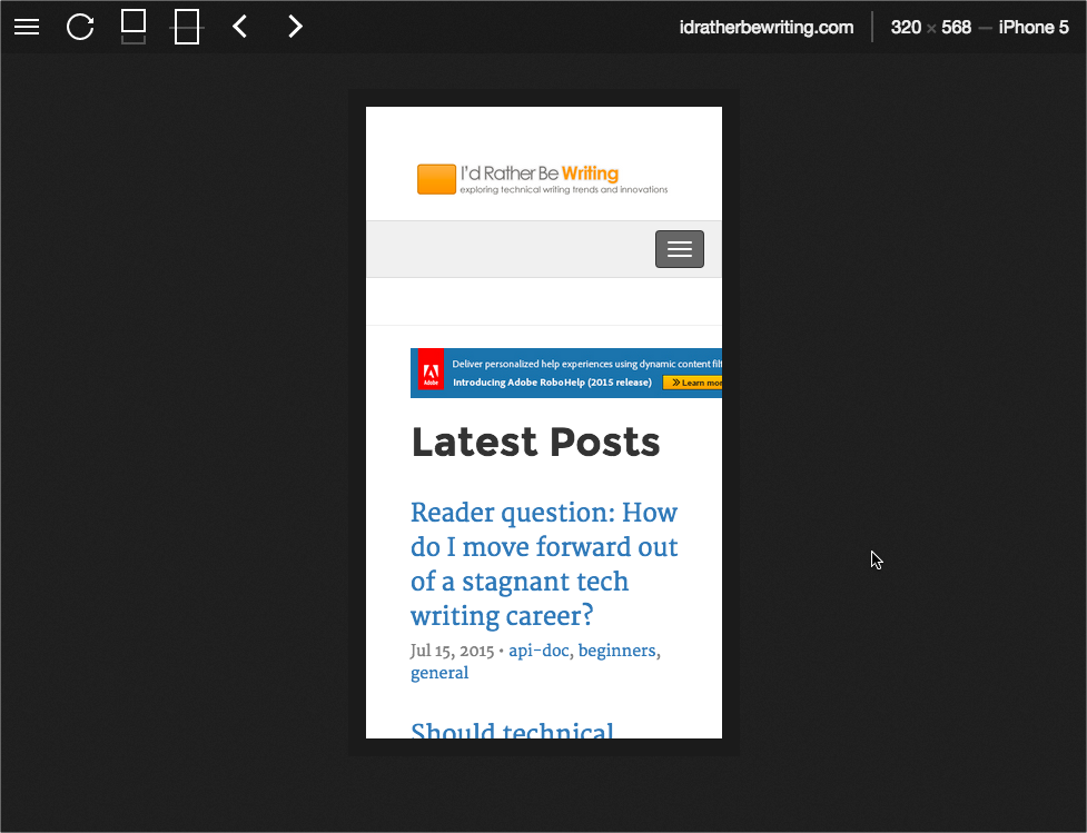
You can see there are some challenges with that top banner. At the desktop display, the width is 480px, but this is too big for the iPhone display. I just set the width to 80% instead, because I wanted the ad smaller in relation to the other elements with the mobile view, not just filling 100% of its container.
Challenges to ad spots with responsive design
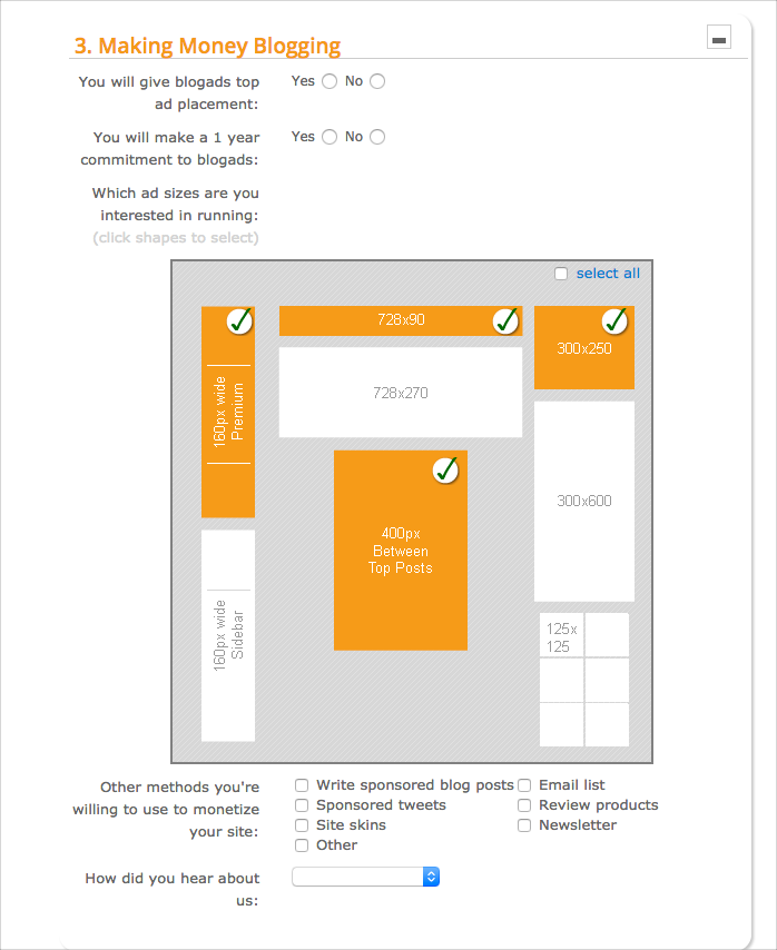
Typically when sites sell ad spaces to advertisers, they promise certain sizes and spaces. For example, with blogads.com, which is an ad network that publishes ads across a variety of sites in its network, the application process requires you to indicate what ad slots you’re selling on your site.
But how do these same spaces change when your site shifts into mobile view? No mobile view has this kind of real estate.
Given that mobile interactions are growing (for example, about 18% of my site’s traffic comes from mobile and tablet devices), figuring out ad spaces can be more challenging. Ad creatives need to be somewhat responsive as well.
I’ve been reading HTML5 Advertising for some tips on handling this issue, but I’m not very far into the book. Basically, I think the solution is to let advertisers know that the ad has different display properties and positions for different devices.
Certainly the mobile space presents a lot of new challenges to sort out.
About Tom Johnson

I'm an API technical writer based in the Seattle area. On this blog, I write about topics related to technical writing and communication — such as software documentation, API documentation, AI, information architecture, content strategy, writing processes, plain language, tech comm careers, and more. Check out my API documentation course if you're looking for more info about documenting APIs. Or see my posts on AI and AI course section for more on the latest in AI and tech comm.
If you're a technical writer and want to keep on top of the latest trends in the tech comm, be sure to subscribe to email updates below. You can also learn more about me or contact me. Finally, note that the opinions I express on my blog are my own points of view, not that of my employer.