
FrameMaker and the mobile web: Evaluating Adobe FrameMaker's responsive HTML5 output
- Responsive HTML5 output
- Google ranks non-responsive sites lower
- How to view the mobile responsiveness of a site
- Documentation websites and mobile-friendly displays
- Conclusion
Responsive HTML5 output
FrameMaker is already well-known as an excellent print publishing tool, but what about its ability to publish web help, especially responsive HTML5 output? (You can actually publish ePub and Kindle with FrameMaker too, but in this post, I want to focus exclusively on responsive output.)
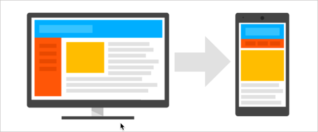
The HTML5 responsive output is a single output that can be easily viewed on any device (mobile, tablet, or desktop). When you view the site, the display adjusts or “responds” to the device’s viewport size and dimensions to provide an appropriately readable view.
In web design, creating a responsive site is one of the most challenging aspects you face. It’s one reason why so many web designers use Bootstrap and its 12-column grid, so that they can get the responsive design right from the start.
When I did WordPress consulting some years ago, I almost always started with themes that already contained responsive styling. Even then, I ran into issues on some devices.
For example, one time I helped implement a WordPress theme called Canvas for the Rockley Group. Even with Canvas being developed by top designers with responsive styling promoted as the main selling point, it fell short. Charles Cooper manually tested it with a box of about 17 different mobile devices and found a number of issues with the responsive display.
In sum, building a responsive site that works well across all browsers, platforms, and devices is hard. It’s not something you want to do from scratch.
Google ranks non-responsive sites lower
Is the mobile responsive view important if your mobile traffic is less than 5%? YES! The mobile view still matters because Google will actually lower your SEO rank for non-friendly mobile displays.
On a Google Webmaster Central Blog post in February 2015, Google stated:
Starting April 21 [2015], we will be expanding our use of mobile-friendliness as a ranking signal. This change will affect mobile searches in all languages worldwide and will have a significant impact in our search results. Consequently, users will find it easier to get relevant, high quality search results that are optimized for their devices. (Finding more mobile-friendly search results)
If your site isn’t mobile friendly, the lower page rank may push your site to the second or third page of results. Given the need to promote help content as an asset (and help establish the value of docs in product discoverability phases) it’s important to have strong SEO.
How to view the mobile responsiveness of a site
One way to evaluate the mobile responsiveness of a site is to use Google’s Mobile-Friendly Test.
I took a sample page from FrameMaker’s responsive HTML5 help and analyzed it with Google’s tool.
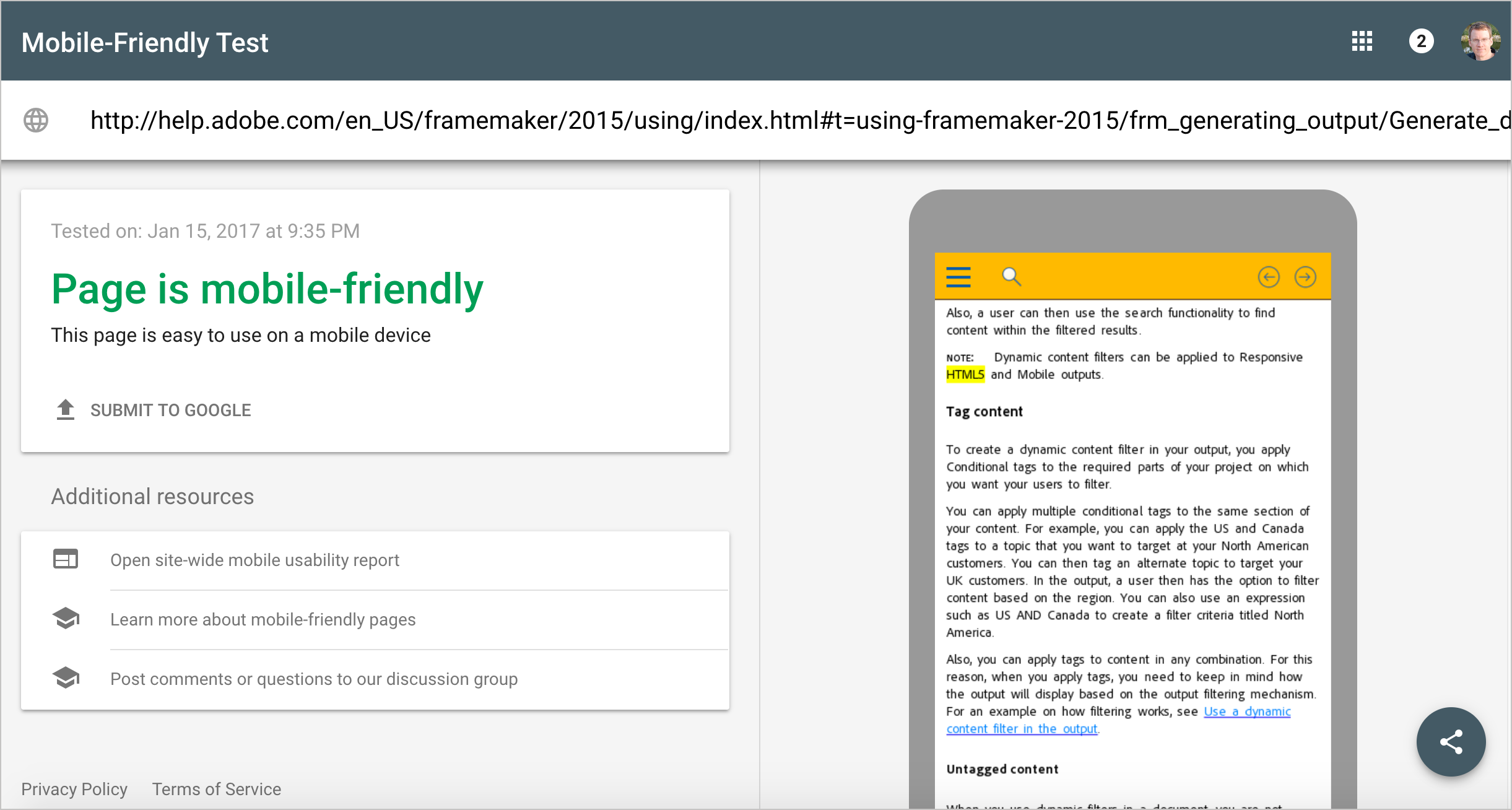
Google’s assessed it as mobile friendly.
You can also manually shrink your browser window smaller to see the mobile responsive view. Or you can use the Developer Tools option in Chrome by going to View > Developer > Developer Tools. Then click the Toggle Device Toolbar button as shown in the following screenshot:
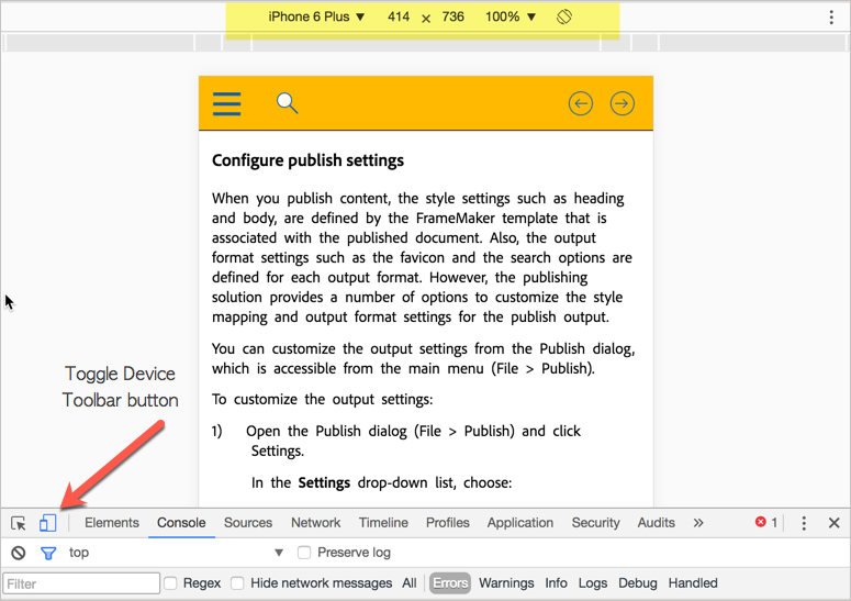
You can choose different device displays from the drop-down menu at the top (highlighted in yellow above).
The device toolbar in Chrome only superficially tests the mobile display. To really test content on mobile, you need to use an actual device. For example, open this page on your mobile phone or tablet, and then click the sample page from FrameMaker.
You can assess the mobile friendliness by looking at any of the following aspects:
- Image sizes and aspect ratios
- Video playback and size
- Text readability
- Horizontal scrolling
- Navigation controls
- Pinch and zoom
- Page loading speed
- Popups or other interstitials
- Redirects and other JavaScript
- Overlapping or hidden elements
All of the above can pose issues. For example, images might extend beyond the viewport’s size, or be oddly stretched. Videos with custom Flash players might not work. Text may be tiny or require horizontal scrolling. The navigation controls might not be easy to select, or other elements might overlap their display. Popups might be impossible to close. Page download time can be too slow, and so on.
Documentation websites and mobile-friendly displays
Without question, the most difficult aspect of documentation websites is what to do with the navigation menu in the mobile view. In Google’s Mobile SEO guide, the authors show how elements may need to shift around in the mobile view:
Typically, websites will move navigation from the side into the main column for mobile displays. While this may work for simple navigation, documentation websites with more robust navigation controls don’t look good with extensive navigation embedded in the main column.
In FrameMaker’s responsive view, the navigation menu elegantly slides in when you tap a button on the top menu. You can choose to show another side menu for glossaries. Additionally, you can also do searches and view search results all within the mobile view.
Adobe has done a superb job with their mobile friendliness, making a complex website simple to use and interact with.
Here are a few screenshots from FrameMaker’s responsive help taken with my iPhone 5:
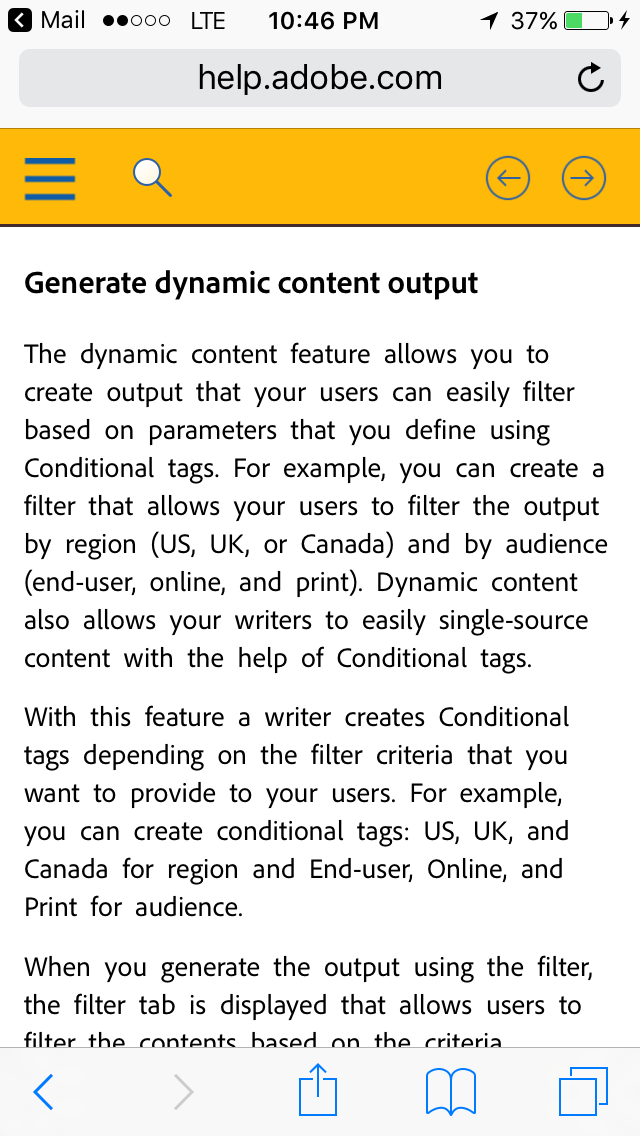
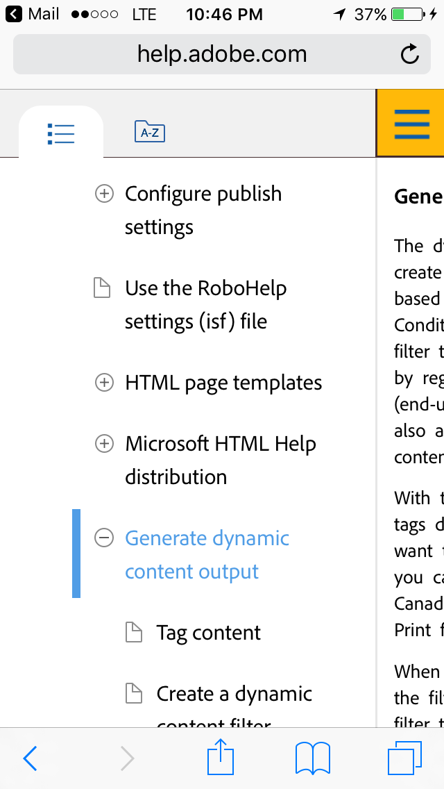
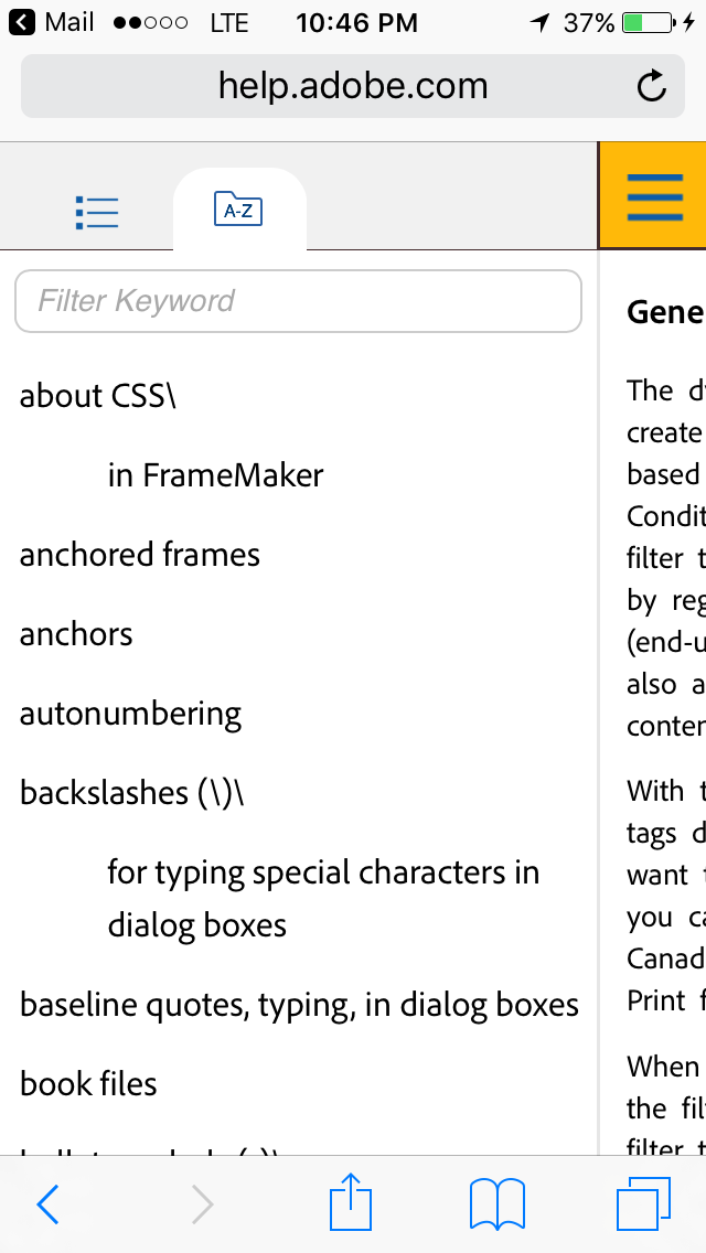
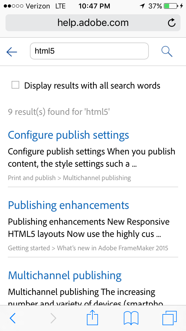
The navigation menu controls are easy to touch. The expand/collapse buttons in the nav menu are large enough for my bulky thumbs but not so big that they take up too much screen real estate (it’s a difficult balance to get right). The way the nav menu slides in and out makes the page content easy to read and navigate.
Conclusion
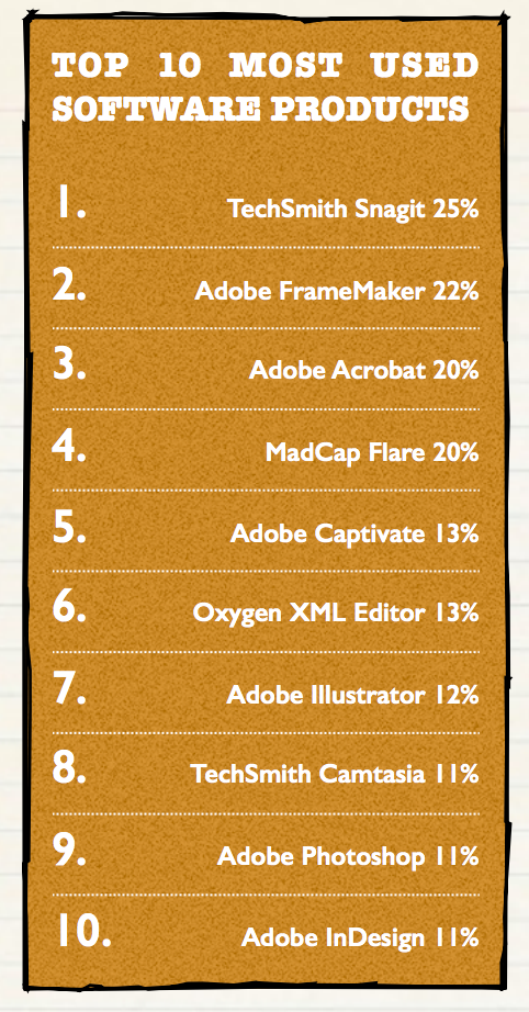
In Scott Abel’s 2016 Technical Communication Benchmarking Survey, which included more than 700 respondents, Scott found that Adobe FrameMaker is used more than any other help authoring tool. (The only tool more used is TechSmith’s Snagit, which is used for graphics, not help authoring.)
Scott writes:
Adobe FrameMaker is in use in 22% of the companies surveyed, making it the second most mentioned tool used by technical communicators in our survey. As far as authoring tools go, FrameMaker is used slightly more often than MadCap Flare (20%) and Oxygen XML Editor (13%).
Similarly, the most recent WritersUA tools survey also showed that Adobe FrameMaker ranked as being more important than other help authoring tools (based on 1 to 5 number ratings from users). Adobe FrameMaker scored 199, higher than any other help authoring tool. (The next highest ranked tool was Flare at 148. OxygenXML scored 66.)
Both of these surveys point to the industry saturation of FrameMaker. A lot of technical writers use it for a reason — it works, not only for print (which is surprisingly still in high demand), but also for publishing responsive HMTL5 output on desktop and mobile.
Although it’s possible to build your own responsive display, few do it, since it involves a heavy understanding of media queries and responsive web design. For the most part, technical writers should focus on content, not tools. The time you spend doing responsive styling can easily exhaust your bandwidth to focus on the help content for your next release.
To learn more about Adobe FrameMaker, you can download a free trial here.
Note: Adobe is one of the sponsors for this site.
About Tom Johnson

I'm an API technical writer based in the Seattle area. On this blog, I write about topics related to technical writing and communication — such as software documentation, API documentation, AI, information architecture, content strategy, writing processes, plain language, tech comm careers, and more. Check out my API documentation course if you're looking for more info about documenting APIs. Or see my posts on AI and AI course section for more on the latest in AI and tech comm.
If you're a technical writer and want to keep on top of the latest trends in the tech comm, be sure to subscribe to email updates below. You can also learn more about me or contact me. Finally, note that the opinions I express on my blog are my own points of view, not that of my employer.