
Tech comm trends: Providing value as a generalist in a sea of specialists (Part V)
- Information usability
- Principle 1: Let users switch between macro and micro views
- Principle 2: Make information discoverable as the user needs it
- Principle 3: Ensure information harmony in the larger landscape
- Principle: Reduce and distill information to its essence
- Your reactions and input?
Information usability
Another gap that opens up in the era of specialization is an opportunity with information usability. Information usability refers to making information simpler and easier to use. It’s just like product usability but focusing on the information instead of UI design.
When engineers and other specialists create documentation, they rarely consider information usability. Mostly, engineers just try to explain the complexity and go no further with their effort to make the information accessible or understandable to users. It’s the same phenomenon as when engineers create interfaces — they just sort of throw it all together. Remember that sample dialog box that was designed by engineers?
Consider the equivalent output in documentation and you get a sense of the lack of information usability.
There’s a common phenomenon you see when specialists start writing. It’s called the “curse of knowledge.” It highlights how people who accrue more knowledge become increasingly inarticulate to convey that knowledge in understandable ways.
For example, my father-in-law is a doctor, and whenever we ask him some health-related questions related to some injury, he almost always refers to different parts of the body with their medical names. When I jammed my finger, he explained about the “proximal interphalangeal joints” or “PIP joints” and such, because that’s the vocabulary in the specialist’s head for articulating problems.
My point is that when specialists try to articulate a concept, they’re trapped by their own specialized knowledge in ways that make it difficult for them to communicate the ideas simply.
As a generalist, you can bring your skills in information usability to the specialist’s knowledge to make the information more accessible and consumable to users. This practice of designing information to make it more accessible, consumable, and useful is really just the practice of simplifying complexity. Here are 7 principles of information usability that we’ll explore here:
- Principle 1: Let users switch between macro and micro views
- Principle 2: Make information discoverable as the user needs it
- Principle 3: Ensure information harmony in the larger landscape
- Principle 4: Reduce and distill vast information down to its essence
- Principle 5: Conform to the patterns and expectations of the genre and schemas
- Principle 6: Reduce the complexity of technical language
- Principle 7: Iterate and increment on content following an agile approach
I dive pretty deep into each of these principles in my series on Simplifying Complexity: Simplifying complexity.
I’ll provide some of the highlights here in a quick way, and you can see if any of the topics interest you to learn more. (In some ways, blog posts and presentations are meant to be like variety appetizers that you sample. You’re not meant to eat the whole meal but to figure out if something appeals to you.)
Principle 1: Let users switch between macro and micro views
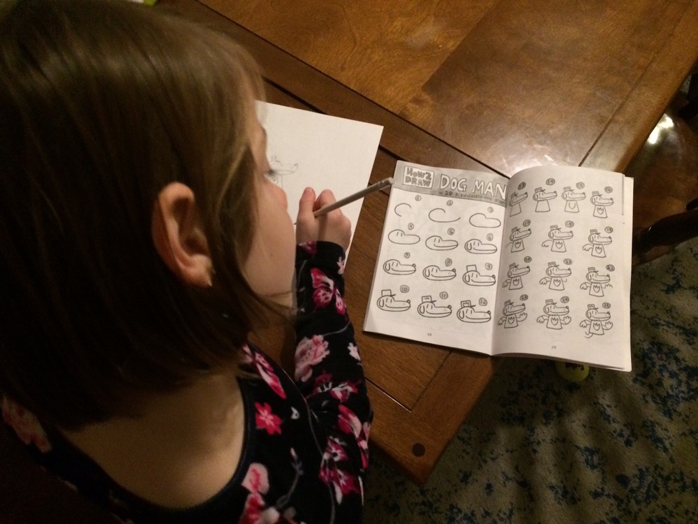
One way that we simplify any complex process is by dividing it up into smaller steps. For example, in drawing books for kids, one way to make it easier to draw is by chunking up the process, like this:
Chunking long, complicated tasks into a series of subtasks is a foundational principle in tech comm. However, when you chunk up a complex process into small steps, it’s easy for users to get lost in the details, especially if the chunked tasks span several topics and pages or more.
To help move the user through each of the steps, it helps to embed a workflow map at the top of these steps. The workflow map helps orient users through a larger process. Here’s an example of a simple process map I used in some of my documentation:

Creating these maps is pretty easy, but it can become more challenging when you have various branching or conditional scenarios. I tend to create different process maps for different aspects of documentation. For example, I might have several process maps within docs rather than one single map.
The absence of maps in documentation constitutes one of the main reasons why people get lost. Imagine going on a hike without a map. Maps are critical for orienting users through complex terrain. Just as maps help us navigate cities and wildernesses, they can also help us navigate information spaces as well. Adding these maps is particularly appropriate for installation or setup tasks, as there’s a clear start to end progression.
To read more, see Principle 1: Let users switch between macro and micro views.
Principle 2: Make information discoverable as the user needs it
While maps work well for linear processes, in complex systems sometimes you can’t lay out a clear path for the user to follow. In fact, one definition of a complex system is that the feedback the user receives at each step of the way influences the next decision they make.
An analogy for complex systems is to think about mathematically describing buoys in water after a boat goes by. The buoy’s up and down movements depend on a continuous feedback loop not only from the wake but from other buoys and their motions.
One scholar, Michael Albers, describes complexity as follows:
Each new piece of data the user uncovers affects the path taken and the eventual outcome. … it does not lend itself to being performed with a defined set of tasks nor can those tasks be performed in a fixed order. (Content and Complexity)
In these systems, presenting the user with a linear map that consists of specific tasks won’t help much. Albers suggests that for these scenarios, the topics in the information system need to dynamically adhere together around the user’s specific needs.
By decoupling the information into separate, semantically identifiable pieces that you can manipulate, Albers says these pieces can be dynamically assembled to address the context the user needs at a particular moment in his or her journey. He uses an analogy of “cintering” (a ceramics process where separate molecules suddenly adhere together) to describe this. Here’s a video on cintering:
In this model, information is perhaps chunked and tagged with the right metadata in order to support different ordering and presentation to the user. Overall, this kind of chunking and metadata allows you to adapt your content to better target it for the right user at the right place, time, format, language, and device.
There are lots of different applications of this idea, but a simple one is to simply support the user’s ability to find information when he or she needs it. Probably the most common method people use to find information when they need it is to google it. Users type a phrase in a box and expect the list of results (aggregated from many different sources) to provide some guidance. This list of search results isn’t too far off from the cintering process that Albers describes — discrete units of information are suddenly presented together in a list.
When specialists write, probably the last concern on their minds is the discoverability of the topic. They aren’t thinking about how to surface this material in the moment the user needs it. By adding the right metadata to the topic and structuring it in ways that supports SEO, you can help support discoverability of the content.
One easy way to encourage discoverability is by adding a two-sentence description of your topic that encapsulates the point of your topic in a quick, easy way. This description should be the starting point for your topic, as these first two sentences factor heavily in SEO. Make sure this short description gets pushed into the meta tags of your page.
The next step would be to research metrics around page visibility. Based on your analysis of analytics, are users finding the page? Why or why not? If not, can you link to the topic from within a context that the user does see (such as user interface page or error message)? Or can you link to the topic from more popular topics? Alternatively, are you even using the right keywords in the topic that users are likewise using? That kind of SEO analysis on the visibility of content is rarely something that specialists consider when creating docs.
I won’t go into depth about my forays into SEO, but I do pay attention to page metrics. In looking at my docs at work, I noticed that about 14% of our doc traffic was focused on specification pages, so I expanded and amplified the specification information on that page to be even more comprehensive and navigable. I also started linking out to other pages from that master specification page. The specification page sort of becomes the landing page and entry point for other docs.
To read more about how to make information discoverable, see Principle 2: Make information discoverable as the user needs it.
Principle 3: Ensure information harmony in the larger landscape
To provide documentation for a complex product, one strategy is to have the specialists contribute the content related to their area of expertise. For example, in one of my projects at work, the audio focus engineer contributes best practices for handling audio within an app, the multimedia team contributes best practices for syncing audio-video streams with playback rates, the voice team handles the voice interactions, the localization team handles the language preferences and string documentation, and so on.
But what happens when you have a multi-authored documentation effort with a lot of contributing experts writing in silos? In my experience, contributing experts tend to have tunnel vision in the documentation. They look — in a myopic way — at their own piece of the information, because that’s the area they understand in depth.
When the engineer contributes a specialized article, does he or she read the other information on the developer portal to understand if the content he or she is contributing harmonizes with other information on the site? Is the contributing specialist aware of what has been written previously on the topic? Suppose the site has thousands of pages of documentation. How does the contributor know what other pages are relevant, and whether the information he or she is contributing contradicts, harmonizes, or integrates well with the other information?
A contributor’s myopia would be acceptable if each of the documentation components functioned independently of each other. For many topics, this is indeed the case. But increasingly, one element interacts with other elements, one system interacts with other systems, and so on. In Overcomplicated: Technology at the Limits of Comprehension, Samuel Arbesman writes:
Specialization is required in order to understand more and more about the intricate systems around us, such as the human body, now divided up among numerous specialties in medicine. But at the same time, the systems we are building—the technologies that run our world—are not only intricate and complicated, but also stitch together field after field. We have systems in the world of finance that require an understanding of physics; there are economists involved in the development of computer systems. The design of driverless cars is a good example, requiring collaboration among those with expertise in software, lasers, automotive engineering, digital mapping, and more.
The nature of the web is trending toward an interconnected web of APIs, where multiple systems interact and influence each other. This is where specialization and interconnected systems create a risk of unpredictability and lack of interoperability.
Before adding new topics to an information landscape, look to see how the new information will fit in with the existing information — across all information forms, from docs to blogs, forums, white papers, and more. More importantly, analyze how this information will interact with other, separate systems.
Synthesizing information to harmonize with the larger information landscape requires wide reading and analysis but is essential for the user experience, since users often bounce from one information source to another as they consume information. Consuming this information can be akin to taking a graduate level course where you have to crunch through large amounts of material and analyze the content. This kind of broad and deep reading across the entire site isn’t something specialists are likely to do, as they are often narrowly focused on their own area of expertise only.

In my projects, when one of the engineering teams wanted to contribute docs that touched on other content, I Cc’d the other teams and asked them to evaluate whether the new information to be integrated harmonized. One engineer raised some issues about it, and noted potential conflicts. I then got the two engineers battling off against each other. Had I just worked with a single team on content, I might have simply published out the new content without realizing that I was contributing towards a contradictory and conflicting information experience for users.
For more information, see Principle 3: Ensure information harmony in the larger landscape.
Principle: Reduce and distill information to its essence
In contrast to integrating information into larger structures, the opposite activity — taking an existing body of information and distilling its essence down into a smaller information unit (whether that smaller unit is a title, overview, heading, topic sentence, or other information) also requires cognitive prowess.
Crystalizing large information into a brief distillation that captures the main point in as little a space as possible can be a difficult skill that rivals a poet’s astuteness with language and articulation. Despite the difficulty with the task, this distillation can go a long way towards simplifying a complex system.

For example, a good structure in a doc page usually provides a title, summary, headings, mini-TOC, and topic sentences that let users take in the information at a glance rather than reading the content line by line. These elements are simple, but they are the bread-and-butter of information usability. Let me just focus on the summary, which I think is the most important.
A couple of years ago, while browsing information on Jakob Nielsen’s site, I became converted to the benefit of summaries in content. Seeing this summary allowed me to quickly process whether the article contained the information I was looking for.

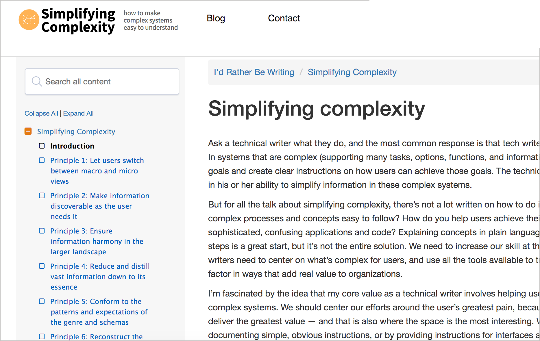
In almost all my blog posts, you see a short summary at the top that usually tries to capture the main point of the article. On my Simplifying Complexity site, I’ve put this information into a “Principle” at the top.
The summary is arguably the most important part of the entire topic because most articles have a high bounce rate and short view time from visitors. A user clicks the title, thinking the content would answer his or her needs, and then quickly jumps to another page after scanning the content. In the digital age, users jump from one document to another looking for the right information. In fact, a Time, Inc study found that
“Consumers in their 20s (‘digital natives’) switch media venues about 27 times per nonworking hour—the equivalent of more than 13 times during a standard half-hour TV show” (“The Evolving Role of the Technical Editor”, STC Intercom, Sep 2012).
In short, the summary provides an efficient way for users to judge whether they’re on the right page.
Interestingly, this summary is one of the hardest elements to write. I’ve been including summaries on my blog posts for a while, and it is extremely difficult to compress meaning into a few sentences that describe the whole in a useful, informative way. The ability to reduce a large amount of information into a few sentences that distill the meaning in a clear way is a skill that few possess. The more topics and ground your content covers, the harder the summary is to write. In fact, if your content doesn’t have a clear focus, it will be nearly impossible to write a summary.
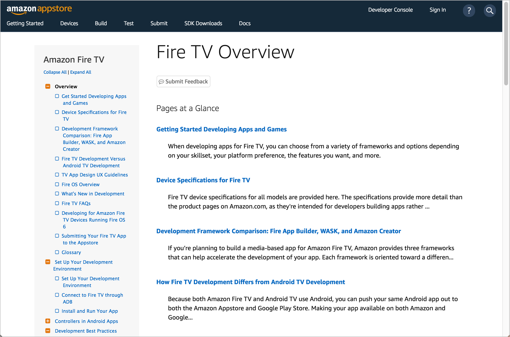
In addition to making information on a single page more usable, the summaries can be pulled out into a “Pages at a Glance” feature that would work as a section overview. For example:
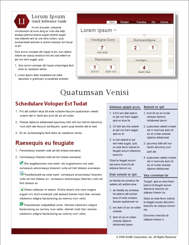
Besides distilling information into summaries, another approach is to distill information into quick reference guides. A quick reference guide provides a 1-2-page guide (in an attractive magazine-style layout) that briefly summarizes the core tasks and features in the system. Here’s an example:
For more information, see Principle 4: Reduce and distill vast information down to its essence.
Your reactions and input?
You can see the responses (so far) here.
About Tom Johnson

I'm an API technical writer based in the Seattle area. On this blog, I write about topics related to technical writing and communication — such as software documentation, API documentation, AI, information architecture, content strategy, writing processes, plain language, tech comm careers, and more. Check out my API documentation course if you're looking for more info about documenting APIs. Or see my posts on AI and AI course section for more on the latest in AI and tech comm.
If you're a technical writer and want to keep on top of the latest trends in the tech comm, be sure to subscribe to email updates below. You can also learn more about me or contact me. Finally, note that the opinions I express on my blog are my own points of view, not that of my employer.