
What makes a good covid sign?
- Amount of information to cover
- Attempts to be nice
- Attempts at humor
- Zero visual design skills
- Blocks of information rather than bulleted lists
- Clarity and directness without enforcement
- Combining familiar iconography with new messaging
- Lumping together groups of people
- Shouting at people
- Confusing messages
- Signs versus UI text
Amount of information to cover
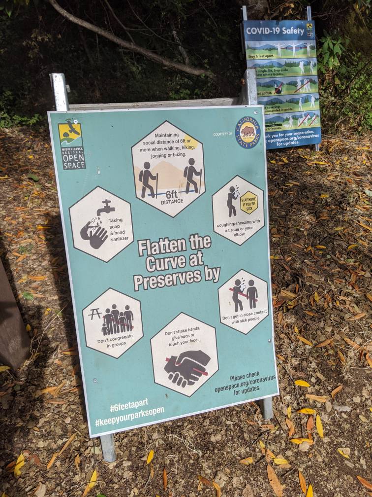
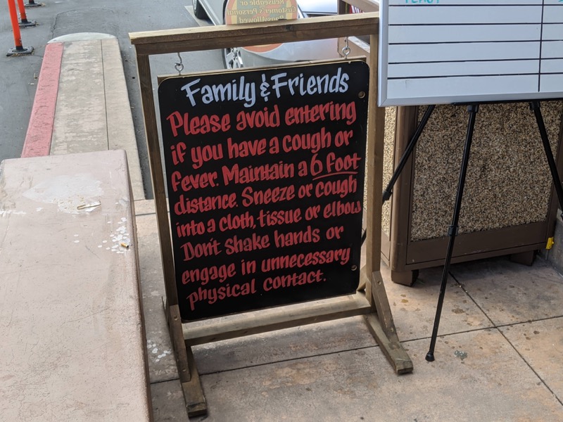
This sign is well-balanced and visually attractive, but there’s too much information to take in at a glance, and as a result I don’t really absorb anything from it. A sign has at most about 5-10 seconds of attention from those passing by. As a result, signs probably should focus on one brief message and limit the amount of text.
Attempts to be nice
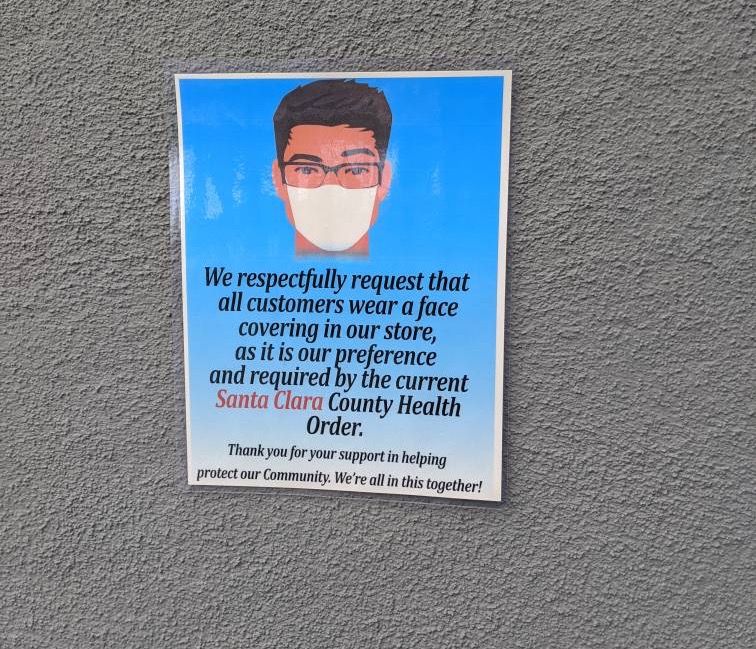
Few attempts try to be so polite as this sign, but it comes across as unnecessarily wordy. A simple “Face mask required for entry” would have sufficed. This sign tries to walk the line between being polite and informing people about a county health mandate. Is it the store’s “preference” to comply with a county health order?
Attempts at humor
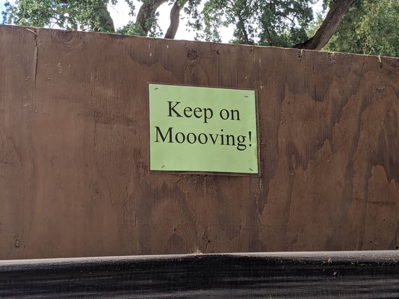
This sign prompts people who would normally pause here to look at cows, sheep, and other animals to keep moving, since congregating in one area leads to crowds. Other signs in this farm area are equally humorous – “Sheep your distance!” and “You goat this!”
Humor works well here, but the signs don’t need to do much work because there is heavy black canvas covering the fences anyway and no animals to see. Most people appreciate good puns, though. I’ve seen subreddit threads go on and on with puns sometimes.
That said, it’s probably tricky to be funny during a time when thousands of people are dying in a pandemic. Humor probably only works in a small number of scenarios, such as with farm signs.
Zero visual design skills
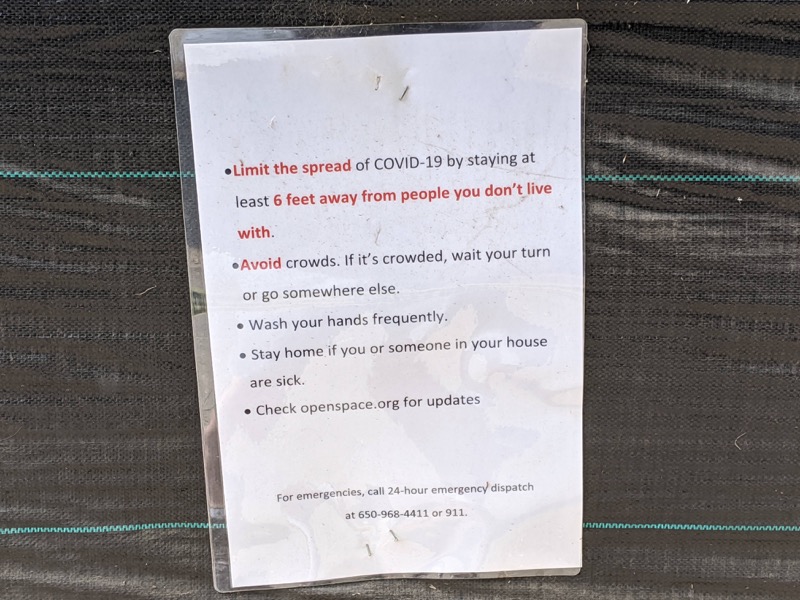
This sign’s creator had zero visual design skills, and as a result the sign has very little visual appeal. Even the lamination and stapling look done in haste.
Sometimes a sign that looks like a “written notice” might attract curiosity, but when viewers realize that it’s the same instruction as elsewhere, they’ll probably pull away.
Also, the instruction to “Wash your hands frequently” doesn’t apply on a trail where there are no places to wash your hands. Instead, this instruction should have been more specific to the area.
Blocks of information rather than bulleted lists
Similar to the previous sign, this sign doesn’t incorporate any visuals except for fancy typography. Clearly someone has skills with chalk. But the long narrative text without any bullet points makes it hard to scan and consume at a glance. This sign appears at the entry of a store, as people are walking in.
Clarity and directness without enforcement
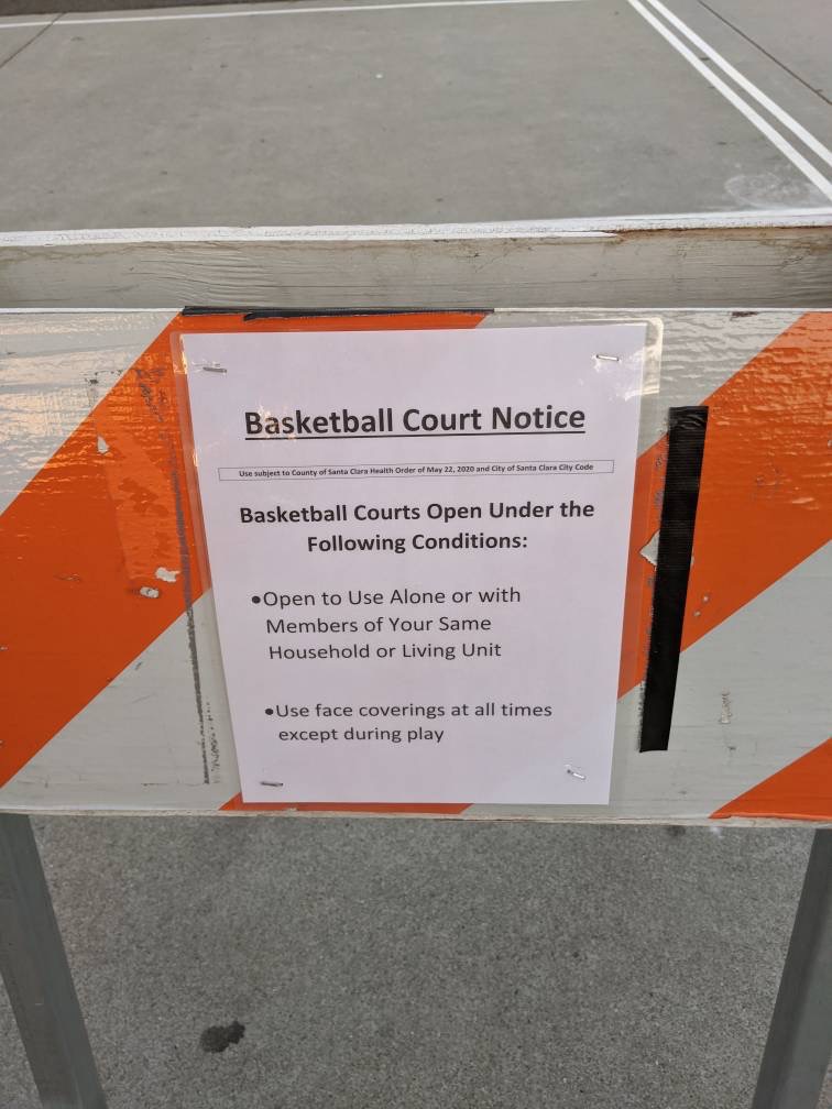
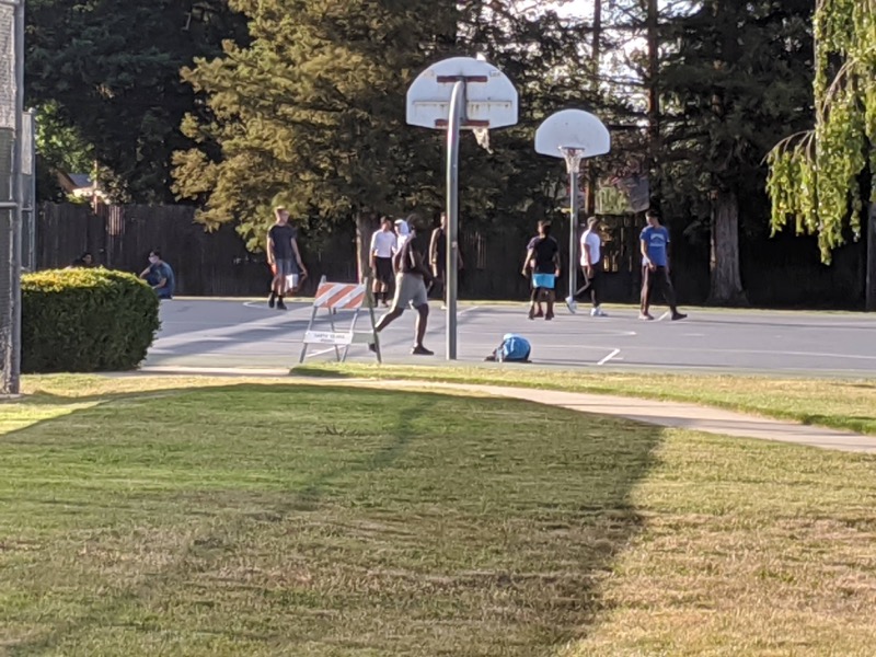
I was excited to see park officials re-install basketball rims at the park, but then disappointed to learn that pickup basketball wouldn’t be allowed except with my own family. This sign is straightforward and clear, for sure. I thought it cast out all room for misinterpretation. However, glancing at court with people playing ball mocked the notice here. People could freely disregard the policy:
This leads to another point. It’s one thing to put up a sign that clearly states an expected behavior but much more effective to change the environment in a way that enforces the behavior. When the park removed the basketball rims, it was effective in deterring play, but also effective in sending many ballers into states of depression.
With the previous sign that said “Keep mooving!”, without the black cloth covering the fences, people would have inevitably stopped and congregated to look at the sheep, goats, cows, etc.
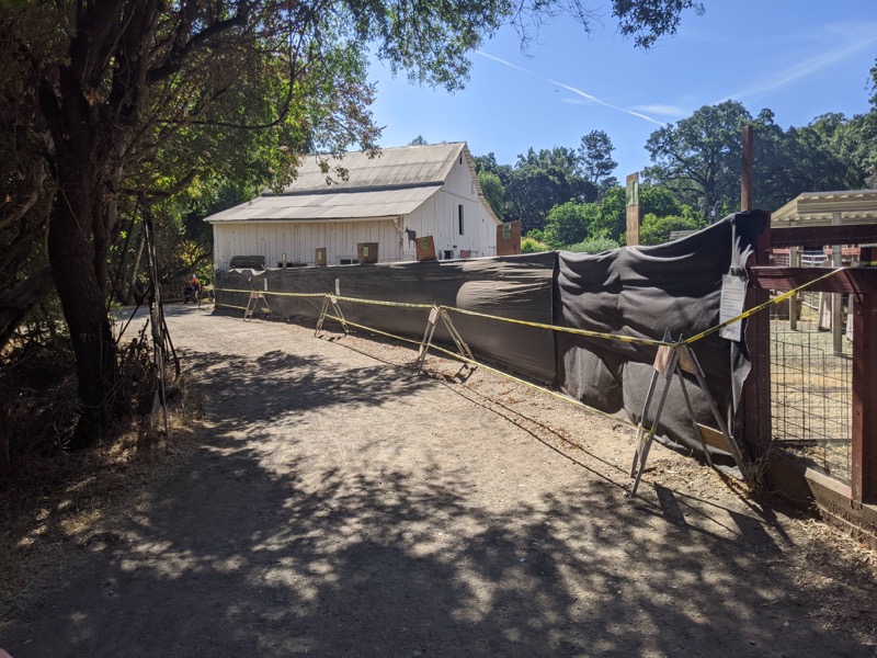
With these coverings, there’s no point in stopping anymore.
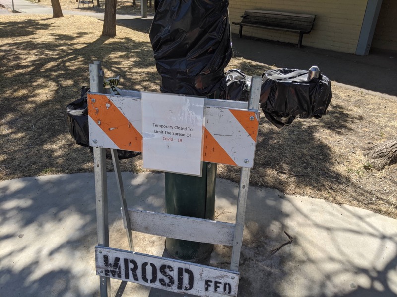
Here’s another example where the sign doesn’t need to do much because the behavior is enforced. Even if you wanted to drink from the fountain, you would not be able to.
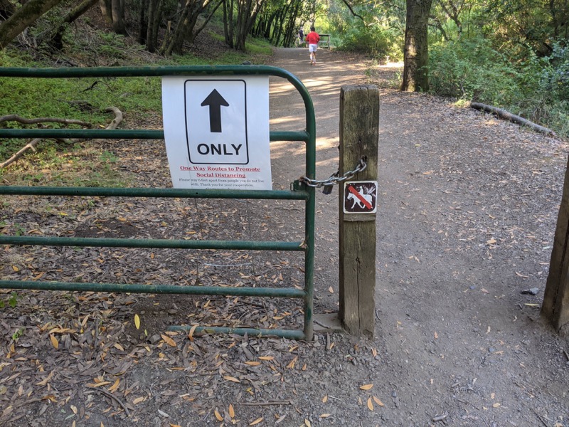
Combining familiar iconography with new messaging
Now let’s look at the approach that I think works best.
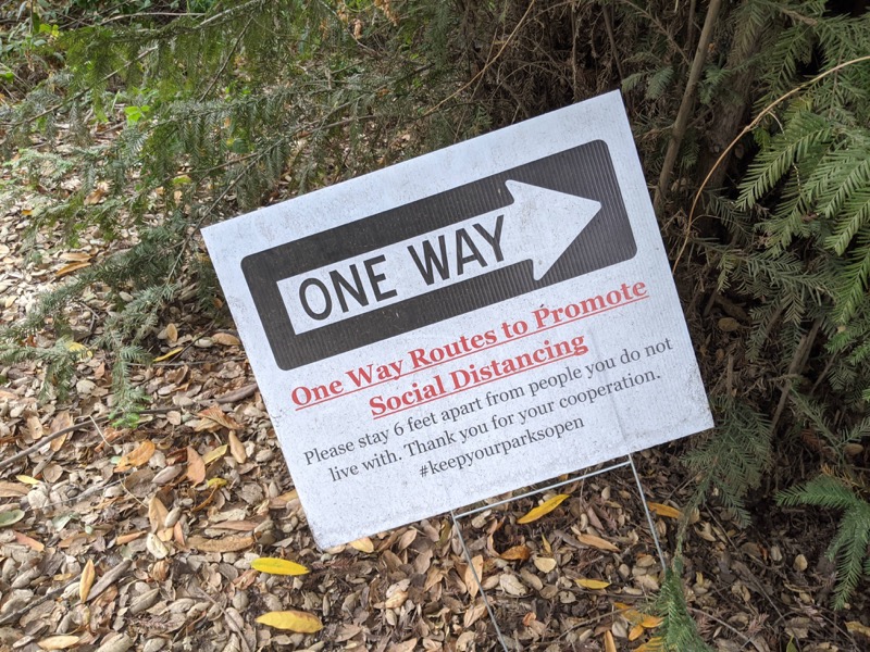
This is my favorite sign because it combines familiar iconography or symbology (“One Way”) with Covid instructions. Rancho San Antonio is a system of urban hiking trails, and someone was genius enough to create one-way flows on these trails to eliminate (or at least reduce) two-way traffic. It works extremely well, and even after Covid I would appreciate the same signs because the trail flow is so much better.
The text cascades from large to small, getting more detailed as you keep reading. If you read the hashtag, #keepyourparksopen, it’s even a subtle attempt to instill fear for non-compliance. If you disregard the sign, the park may close.
Here are a few more examples of signs that combine familiar iconography/symbology with Covid instructions:
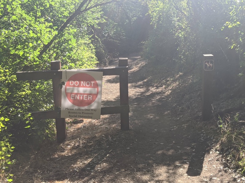
We unconsciously follow this sign because our driving habits have taught us the danger of disobeying Do Not Enter signs.
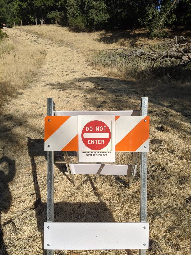
Here’s another Do Not Enter combined with a familiar construction barricade. Using these familiar caution/warning symbols and icons goes a long way toward tapping into our unconscious responses to these signs. Disobeying this sign and walking up this trail would make me feel uncomfortable.
Here’s one more. This just works:
You can get the message here at a quick glance, and the instruction is unmistakable.
Overall, this approach — combining familiar symbology and iconography with Covid instruction — gets my winning vote. In addition to combining familiar signposting with Covid instructions, these signs have good visual balance, the messages are brief and clear, and even though nothing enforces the behavior on the trail, going the wrong way on a one-way trail just feels wrong.
Lumping together groups of people
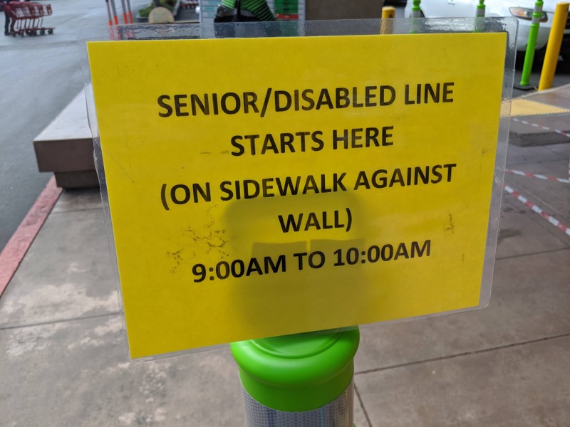
The sign here lacks visual design (except a yellow color), but it commits another error with “SENIOR/DISABLED” people grouped together. I’m sure that when I’m a senior, I will resent being referred to in this way, just as many are frustrated when people group “women and children” together in the same category. Also, “disabled” is a term that can also offend persons with disabilities.
Shouting at people
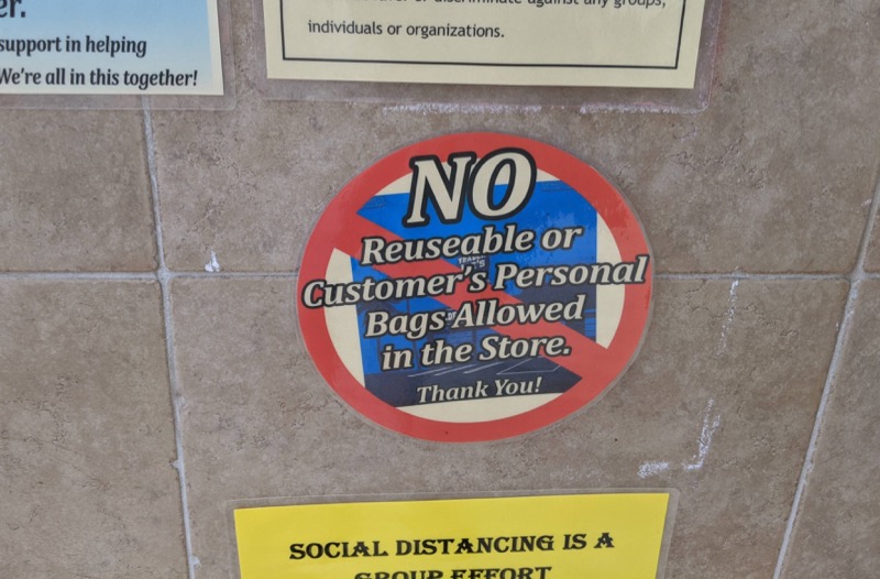
This sign tries to create visual appeal, but the large “NO” font seems to shout at me without sending a clear message. It’s hard to understand at a glance exactly what is prohibited: “reusable or customer’s personal bags.” That’s a mouthful.
The red line slashing across the text taps into common visual imagery about prohibited items, but the text appears superimposed over the red line. It’s also unclear that the blue rectangle in the back is a bag. Finally, the red, white, and blue color scheme makes the sign look patriotic in some way.
I’m not sure how to improve the sign, but it fails for me. Maybe a clever approach with an anthropomorphized bag that says “Leave me at home” or something would have been more engaging.
Confusing messages
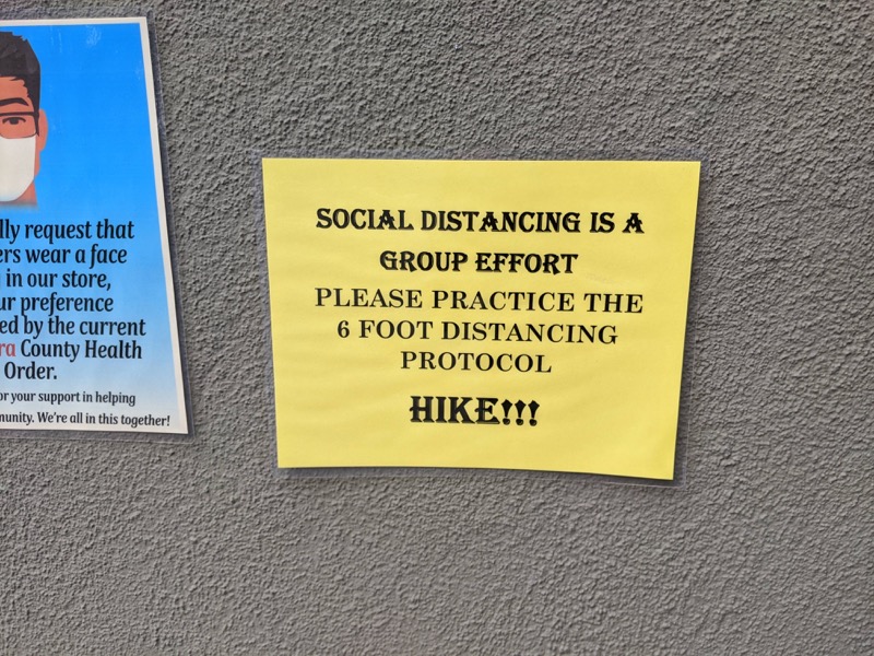
If there’s one rule for a sign, it’s that the text must be clear. I have no idea what “HIKE!!!” means here, yet these signs are read by thousands of people going in and out of Trader Joe’s each day. The sign also tries to be preachy without cause, teaching me that “Social distancing is a group effort.” Am I to process this instruction about social philosophy as I’m walking past the sign? The last word (“HIKE!!!”), not only in bold but followed by three exclamation marks, leaves me confused. That’s the ultimate sin of a sign: confusion. At the very least, a sign should be simple, clear, and direct.
Signs versus UI text
Although I like critiquing Covid signs, I’ve never made one myself, and I don’t make other signs either. However, I am frequently asked to edit micro-copy in user interfaces. Do the same principles apply?
Summarizing from the above, here are a few highlights:
- Avoid too much information
- Don’t try to be polite
- Avoid humor unless it works for the situation
- Strike a balance with visuals
- Make text readable at a glance
- Find a way to enforce the behavior
- Leverage familiar iconography
- Don’t lump groups of people together
- Don’t shout at people
- Avoid confusing messages
Much of this applies to UI text. For example, when we create a tooltip for a confusing section in a UI, we can do the following:
- Keep the tooltip short and focused
- Make the text consumable at a glance
- Avoid trying to be polite or funny
- Avoid shouting at people
- Avoid confusing terms or messaging
- Leverage familiar iconography/symbology that people are accustomed to
As with most writing scenarios, communication in one scenario often has similar principles for communication in other scenarios. If you have favorite Covid signs you want to share, feel free to add links in the comments below.
About Tom Johnson

I'm an API technical writer based in the Seattle area. On this blog, I write about topics related to technical writing and communication — such as software documentation, API documentation, AI, information architecture, content strategy, writing processes, plain language, tech comm careers, and more. Check out my API documentation course if you're looking for more info about documenting APIs. Or see my posts on AI and AI course section for more on the latest in AI and tech comm.
If you're a technical writer and want to keep on top of the latest trends in the tech comm, be sure to subscribe to email updates below. You can also learn more about me or contact me. Finally, note that the opinions I express on my blog are my own points of view, not that of my employer.