
Madcap Flare Review: 45 Things I Love About Flare, 31 Things I Hate About It
 Madcap Flare is one of the most advanced, functionally robust online help tools for technical writers who want to single source their content. When you use Flare to create an actual project (rather than just experimenting with a trial version), you come to know the ins and outs, the major benefits and the quirks, its usability and learning curve, the things you love and the things you hate.
I just finished converting a help file (which I originally created using RoboHelp 7) into Flare, using version Flare 3.01. I also added quite a bit of content and other enhancements to the help. While working with Flare for about a month, I took careful note of all the things I liked and disliked about Flare. This post is a compilation of my notes.
I also rated the importance of each item on a scale of 1 to 5. In my system, 5 is extremely important, and 1 is relatively trivial. I arranged the numbers in general order of importance. Here are my lists.
Love about Flare
1. Clean Word output. When I generate printed documentation, the Word output looks almost perfect, especially the numbering and margins. Although there are still some minor things to edit and check, the Word output is definitely impressive. This is the most important feature for me because I want to single source my content. 5
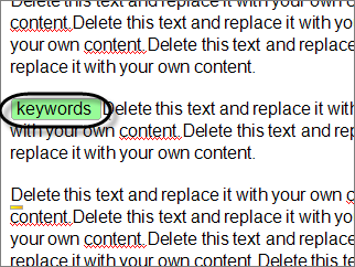
2. Index words embedded mid-topic. I can add index keywords half way through the topic if I want. Embedding index keywords in topics (rather than just within headings) is critical if you have numerous hotspots on a page or have long pages and plan to generate printed output. You'll want your index words to point to the right pages. Indexes are key features in print manuals — and indexes need to be accurate. 5
3. Cross references. The concept and implementation of cross-references (as opposed to just hyperlinks) is a major step forward for single sourcing — at least when printed documentation is one of your outputs. When I generate my Word target, cross references I created in Flare indicate the correct page numbers of the topics they link to. Except for a bug about cross references pointing to bookmarks in drop-down hotspots, the cross reference feature works pretty well. 5
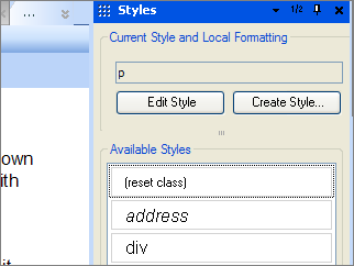
4. Persistently open style pane. When I press F12, Flare's style pane opens and stays open. The styles that appear are related to text I've selected. If I'm in a list, list styles appear. If I've selected a word, character styles appear. If I'm in a paragraph block, paragraph styles appear. And I can quickly select the style I want. 5
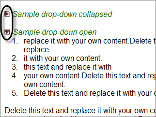
5. Drop-down twisties. The drop-down hotspots have little twisty arrows at the top to indicate their state — collapsed or expanded. When the drop-down text is expanded, the twisty arrow points down. This creates more clarity for the user about the text on the screen. (Note: In the image below, I customized my twisty images.) 5
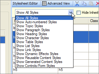
6. Thorough integration of CSS standards. CSS is used to style everything, even the Webhelp skin and printed output. CSS is a standard that isn't a proprietary Flare format language, but rather is knowledge you can apply in many aspects of web design. Except for the special table style editor, standard CSS determines the display for nearly everything in Flare. I love the exposure to CSS. The more masterful I become with CSS, the greater control and style I have over the way my content displays. CSS is a topic that is rich and deep. Mastering this styling language allows you to go beyond Flare and use your knowledge in other applications (for example, WordPress, a blogging platform, uses CSS to style the look and feel of its display). You can also manually insert more advanced CSS styles than what you find in the Flare CSS editor. 5
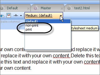
7. Multiple mediums for stylesheets. Each stylesheet can have a print and online medium (and additional mediums too). This allows me to define one style for print output and another style for online output without having to create separate stylesheets. Where styles are the same, I leave the setting as default and it applies the style for both print and online mediums. Very convenient. 5
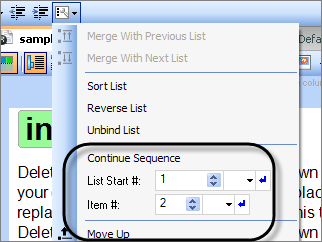
8. Lists functionality. The lists button and functionality simply works, and I don't have to resort to any tricks to continue lists or do anything special to have them start at a certain number. 5
9. Flawless display in both Firefox and Internet Explorer. You don't have to worry about discrepancies for Flare's Webhelp display in Firefox and IE. It looks good in both. The Webhelp frames fully load and lists look similar between the two. 5
10. Mix-and-Match ability with targets, TOCs, and stylesheets. Probably one of Flare's strengths is the ability to have multiple targets (outputs), table of contents, and stylesheets, and to be able to mix and match them for your project needs. 5
11. Open-and-close speed with topics. The tabbed interface with topic editing is nice, and the topics open and close quickly, even when I have 50 tabs already open. There's almost no delay. 5
12. Drop-down text. Drop-down text (hotspots) work flawlessly, without any formatting quirks or hassle. They're easy to apply and remove (“unbind”), and you don't have to deal with copying and pasting text into a pop-up dialog box, hoping the formatting isn't thrown askew. 5
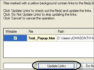
13. Automatic updates of changed file names and locations. When I update a file name or location, Flare updates all references to that file. 5
14. Breadcrumbs. This navigational map for users helps them understand where they are in the help maze. The path for the breadcrumbs is generated from the TOC, rather than the folder structure. You can style the size, color, and path symbols (> or |) of the breadcrumb. 5
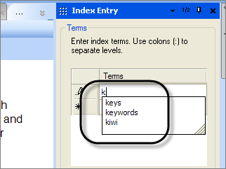
15. Editing index entries. Whoever designed in the indexing interface and functionality deserves a special dinner, because it's about the most usable feature in the entire application. As you type new index keywords, a drop-down list appears showing index words you've already typed (which is helpful for knowing whether the keyword should be a sub-keyword). Additionally, it's easy to see all your index words, and then go directly to them in the topics so you can update them. You can also cut and paste the index keyword chunk wherever you want to move it. 5
16. Interface flexibility. It's easy is to drag and drop and redock the panes. I have two monitors, so I often drag some panes onto the second monitor to make more space. 4
17. Active user forum and knowledge base. Flare has a strong community of enthusiasts who are eager to help out and answer your questions. Sometimes the number of users and their enthusiasm/participation in forums is as important as the tool. For example, WordPress's strength lies in its passionate community of users. 4
18. Printed output intelligence with headings. If I have an H1, H2, and H3 heading in my online help, when I output to Word and use the book as the heading title, Flare automatically shifts the headings down to accommodate the tiered structure, using the book as H1, the topic title as H1 as H2, etc. 4
19. Madcap's company size and focus. The company isn't so big that you can't get your voice heard by someone who matters. The company's entire focus is on technical communicators. You can email Mike or Jennifer directly. 4
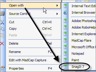
20. Shortcut for editing images. I can open and edit images in SnagIt or Photoshop directly from the Content Explorer pane. When I save my edits, they immediately appear in the image. 4
21. Windows Explorer Integration. I can open any files in Windows Explorer (directly from Flare) to see or add content. Quite amazingly, even edits made in Windows Explorer (for example, renaming an image file) are applied in Flare. The application doesn't freeze up when I make changes in Windows Explorer (however, if you relocate a topic into another folder via Windows Explorer, Flare doesn't auto-update the location). 4
22. Styles for drop-down heads. The drop-down head is the first line of a drop-down hotspot (Flare uses the term drop-down text). You can apply styles to the drop-down heads so that your printed output styles them as headings, if you want. This is key for single sourcing because obviously the drop-down text will be expanded in the print target. 4
23. Accordion stacking and organization of content. The accordion stacking of the panes in the interface works well to show and hide content I need. Additionally, the general organization of topics in the Content Explorer and Project Explorer makes sense to me. 3
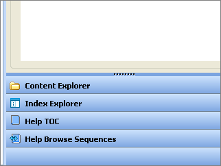
24. Content Explorer filter. The filter drop-down in the Content Explorer allows me to limit my view to only certain types of files. For projects with hundreds of files, this filter is really helpful. 3
25. Flare's online help. Flare's help is comprehensive, context-sensitive, and interactive. I can comment on a topic if I have something to add or say. It seems like the help file was written by people who actually write help. I also like the “What's Next?” topics that often appear at the bottom of a topic. While there are some gaps, particularly in terms of how to style the content, Madcap's help file is overall decent, especially combined with other resources, such as the knowledge base and user forum. 3
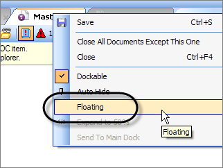
26. Detachable tabs. I can detach and float a tab over to my other monitor, such as the TOC. With the TOC on my other monitor, I can navigate the help either through the Content Explorer or the TOC. I like that I can completely dismantle the interface and reassemble it in the layout I want. 3
27. The robustness of the tool. With all the functionality and customization possibilities, Flare is a tool I won't grow out of. Sure the learning curve may be time-consuming, but with sophisticated features and complex outputs, some study time is expected. 3
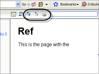
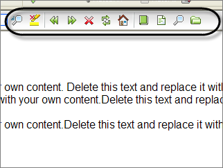
28. Collapse, expand, and print buttons in the Webhelp toolbar. For all those drop-down hotspots in your content, it's nice to collapse or expand them with nifty toolbar buttons. You don't need to code your own special javascript for this built-in functionality. And they added the print button by default, which seems obvious to include but was missing in RoboHelp. 3
29. Intelligent cursor behavior. I have a love/hate relationship with the cursor. I love it when I can use the arrow keys to escape a table or conditional tag or other formatting. Otherwise I generally hate it, but have learned to live with it and recognize its utility at times. 3
30. CSS editor filter. The CSS Styles editor also has a filter, which is essential as well because the number of styles for any given project can be daunting and this filter makes them manageable. 3
31. Smart index keywords based on TOC builds. If the target of your TOC excludes certain topics, no index keywords embedded in those topics appear in the index. 3
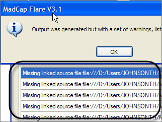
32. Error log when generating output. When I generate an output/target, Madcap let's me know if there are any errors, such as broken links or missing files. It allows me to save the error log as a report I can view later. 3
33. Perceived lack of company bureaucracy. When I offered to advertise Flare on my podcast for a free copy of Flare, I received a license for it within a day or two. I can contact a human quickly, and in fact whenever I sign up for a trial version or a webinar, someone calls me to ask if I have questions. 3
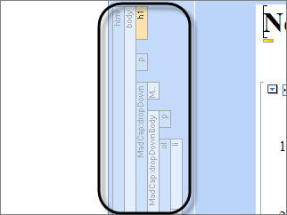
34. The mysterious-looking structure bars. The structure bars on the left of topics do come in handy when you're trying to see what formatting is applied to blocks of text, or when you're trying to manipulate blocks of text. 3
35. Internal text editor. If I don't like the CSS Style Editor, I can edit stylesheets using the built-in text editor. As much as I appreciate the CSS Style Editor interface, sometimes I'd rather edit the styles manually with the text editor. It's nice to have this text-only option rather than opening the file in a backdoor method. 3
36. Absence of erratic spacing in the Webhelp output. I love that my Webhelp output doesn't have random spacing errors (like tabs that snuck invisibly in), such as what I occasionally encounter with RoboHelp. 2
37. Real rather than virtual folders. The folders in the Content Explorer pane are real folders in Windows Explorer. When I package up my help, I don't have any surprises about the locations of the files. 2
38. Conditional tagging functionality. The builds and exclusions are intuitive and easy to apply. Additionally, the structure bars show the tag color as well. 2
39. Mark of the Web. This little feature allows me to generate and view the Webhelp on my computer without that annoying Microsoft Internet Explorer security information bar blocker getting in the way. 1
40. Image resizing. I can change the size of my images by dragging an image edge directly within the content window. 1
41. Table styles. I can create tables with alternating color rows. The only drawback is that the table styles are non-standard CSS format that competes with any table styles in the regular stylesheet. 1
42. Smart printing of online topics. When you print a topic from your Webhelp file, the print medium of the stylesheet is applied. Nice touch. 1
43. Adding Related Topics. The usability of this feature is a complete no-brainer. My only complaint is that you can relate a topic to itself, and instructions for styling the pop-up were missing. 1
44. Full skin previews. While you're customizing your Webhelp skin, you can see previews of entire skin, rather than just a section of the skin. (My only complaint: the Mark of the Web doesn't kick in with this preview, so IE gives you the information blocker bar.) 1
45. Conditional table selections. I can conditionally select table rows or columns and include or exclude them without a gap showing in the output. 1
Hate about Flare
1. Can't create cross references to bookmarks in drop-down heads. Let's say you're using drop-down hotspots to consolidate multiple tasks in a single topic. And you want to refer to those specific drop-down hotspot headings with cross-references in other topics. Online, it may not be an issue because the drop-down hotspots appear neatly grouped (collapsed) together. But in print, they span multiple pages. Well, here's the bug: you can't create a cross-reference to a bookmark when the bookmark is a drop-down hotspot. The result is an avalanche dump of all the drop-down text into your cross reference link. I did devise a workaround that involves combining hyperlinks with cross references and conditional tags. It works well enough, but this bug is still a hassle to what would otherwise be dream functionality. 5
2. Confusing table styles. Flare provides a table editor that allows you to produce advanced styles for your table, such as alternating rows. However, styles for this table are housed in the table stylesheet, whereas your other styles are housed in the regular stylesheet. Sounds simple, right? Wrong. The regular stylesheet also provides table styles, so if you have conflicting table styles between the two stylesheets, display problems occur. Additionally, it's not clear where you're supposed to set styles for the table data, table headers, and table margins. The help file is quiet on the topic, and the user forum experts say to use the regular stylesheet for some table styles, and the table stylesheet for others. Overall, Flare makes it tough to create several classes of tables that are intended for both online and print formats. In the end, I skipped using the table stylesheet and manually edited the regular stylesheet to include the table styles I needed. 5
3. Ambition without completion. I wish Madcap would have focused their development efforts on fixing the bugs, usability issues, and functionality in Flare rather than ambitiously moving ahead to create a handful of new products (especially duplicate products, where other apps already exist). This is the most frustrating feeling — knowing that cross-references don't completely work in version 3.1, and then receiving an email from Madcap announcing a completely new product. To be honest, I wish Madcap would have merged with TechSmith and incorporated SnagIt and Camtasia into Flare. Both companies need each other's products. 5
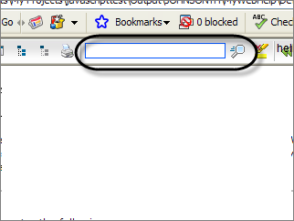
4. The deceptive Quick Search field in Webhelp. The Webhelp toolbar provides a Quick Search field that, at first glance, would appear to search for words in the entire project. When you enter a few searches, I thought it was broken until I realized it was only searching for keywords in the visible topic — which is hardly desirable. I want the project-wide search to be immediate and visible to users, as well as the Table of Contents. 5
5. The learning curve. I was pretty familiar with RoboHelp, and while Flare markets itself as a RoboHelp replacement tool, it took me several weeks to feel comfortable with Flare. I actually like learning new tools, but I was consulting the help file every 10 minutes. I have more than a dozen pages of notes on how to do things in Flare. 5
6. Poor Webhelp toolbar graphics. The buttons on Flare's Webhelp skin are not visually impressive enough to wow customers. They aren't embarrassing either, and they are easy to modify or swap out. Still, I could pay a graphic designer under $1,000 to create an icon set that would be significantly more attractive. 5
7. No labels for Webhelp toolbar buttons. Flare's Webhelp has a plethora of buttons (granted, you can choose the buttons you want to appear on the toolbar). It would be great to add some labels below the buttons. While you can select labels to apply, the default location for the label is directly on top of the button. It's not clear if you're supposed to position the label's location via the stylesheet (if so, what style name?) or if you're not supposed to select both a button and a label. It would be nice if the default label location was at the bottom of the button. (Update: for more info on Flare's toolbar and labels, see this forum thread.) 4
8. Quirks with deleting things. Sometimes if I select and delete things, I get unhandled exceptions and the application crashes. Other when I select and try to delete something, nothing happens — probably because I'm not using the cursor correctly. (Deleting objects using the structure bars is the preferred, more trouble-free way. But structure bars don't appear for character level formatting.) 4
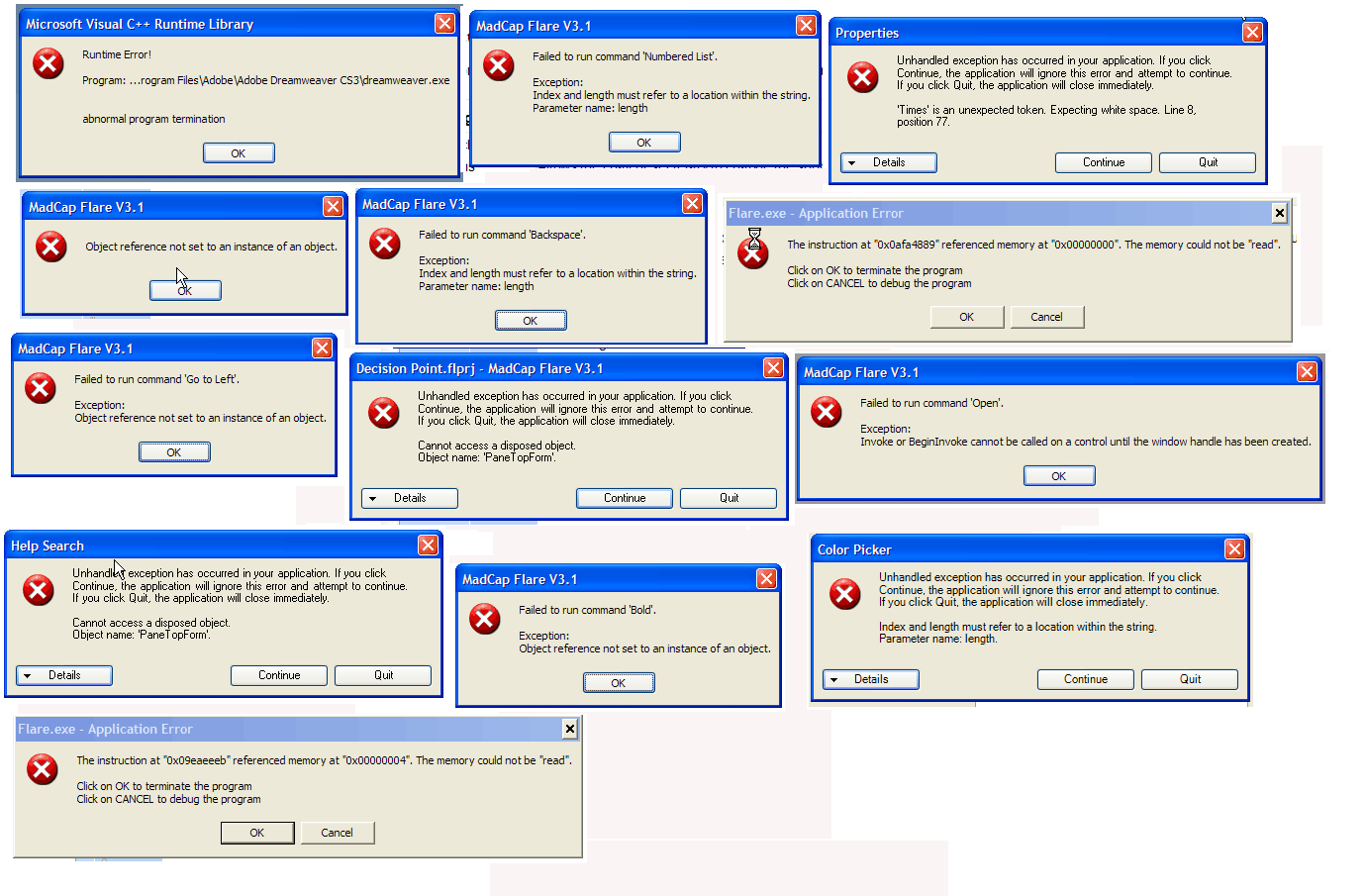
9. Abundance of unfriendly error messages. I'm seeing a lot of error messages, most of which seem written by programmers. For an application that is in version 3, that's too many error messages. A lot of times the error messages appear when I incorrectly select something and try to delete it. Other times I'm sure I'm doing something illegal, just not sure what. I made a collage of the error messages here. (I have to admit that some errors are probably due to improper code from RoboHelp when I imported the RoboHelp project into Flare. But still…) Click the image below to enlarge the thumbnail. 3
10. Lack of integration with Captivate/Camtasia. If I don't want to use Mimic (because I prefer tools like Camtasia or Captivate, which I happen to think are miles ahead of Mimic), there's no direct way to import Flash or non-HTML files into Flare through the interface. You have to open the content folder in Windows Explorer, paste in your html and flash files, and then double-click the topic to initiate an HTML to XML conversion wizard. Then it plays. Shouldn't an import HTML feature been built-directly into the interface? I don't want to be forced into using other Madcap tools. 3
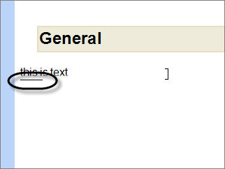
11. The unintuitive, weird cursor. The cursor takes some practice to figure out. You wouldn't expect that such a common feature would be a conundrum. To be honest, sometimes I love the cursor, other times, such as when I'm selecting character-level things, I hate it. (In the image below, I pressed the down arrow to change the cursor state to escape the current paragraph block and format.) 3
12. Lack of pixel size information for images. When you resize an image, you can't see the actual pixel size of the image. It's important to know the image's pixel size if you're exporting the image to a printed target, where margins are important. Why not just resize to a specific dimension prior to inserting into a Flare topic? Because images resized in SnagIt or Photoshop look fuzzy; images resized in Word (in the printed target) look crisp. So as long as you insert images at their full size in Flare and then drag them smaller, they'll look sharp in Word. The problem is, I want my images in Word to be uniformly sized, which is hard to specify when you're just dragging the image smaller using the resizer. (If you use Capture, apparently you won't have this problem.) 3
13. The learning curve. Despite my familiarity with RoboHelp, I felt Flare had quite a learning curve. I'm still learning a lot. Tip: Don't try to learn Flare in a crunch, or you'll set yourself up for high blood pressure. Give yourself several weeks to get comfortable with Flare. People usually wait to convert to Flare until they're forced into it (such as when they realize their RoboHelp's Webhelp doesn't display correctly (by default) in any other browser except Internet Explorer). Then it's crunch time to make your help file look right. Mixing a quick turnaround of deliverables with a significant learning curve will frustrate you. 3
14. Lack of instruction about the MiniTOC. The MiniTOC was a new concept for me, and instructions in the help lacked some critical details about how this feature does and does not work. Basically, the MiniTOC provides a table of contents for topics within your online book. But the topic that the MiniTOC is embedded on can't be listed in that TOC book or else the MiniTOC won't show. You do, however, link the TOC book to the topic with the MiniTOC. (Wasn't that obvious? ) I find the MiniTOC a cool feature, particularly as a placemarker in the breadcrumb trail. It just took a while to figure out. 3
15. Assumptions about my understanding of CSS. I feel like the designer of Flare was a CSS guru who thoroughly understood classes, selectors, attributes and rules of inheritance with CSS. Although I am somewhat familiar with CSS, I'm not a guru by any means, and I would appreciate more instruction and detail about it. I guess there are myriad online tutorials for CSS on the web, but a special section in the help, outlining the most common CSS attributes used in online and printed help files (for example, how to style a note or tip), would be greatly appreciated. 3
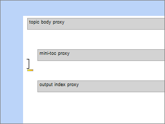
16. Absence of drag-and-drop functionality for proxies. The way Flare works, you have masterpages (templates) that you add proxies (special sections, like bodies and indexes and miniTOCs, as well as page footers and headers) to. The proxies on the masterpage are applied to all your topics (if you select that masterpage for your project). However, getting the proxies and footers/headers correctly positioned and aligned on the masterpage is tricky. For example, to add a footer that has an alternating right and left alignment, with nothing showing on the first page, you add three footers right on top of each other. While you're adding them, you have to know how to manipulate the cursor so that you escape the previous footer, or your next footer will be included in the previous footer, driving you crazy when you try to interpret the output. 3
17. Conditional text seems flaky. The conditional tagging I've applied to text disappears when I apply links to the text. Then when I select my conditionally tagged text to see the tags, at times no check marks appear next to the conditions I selected. (Looks like someone else had this problem too.) 3
18. Can't have the stylesheet simultaneously open in Dreamweaver. If I open the stylesheet in Dreamweaver while I also have Flare open, the stylesheet file begins to show numerous MFCA.tmp files in place of the .css file. Maybe the .tmp files are harmless, but it makes me uncomfortable. Why not use the built-in text editor, you ask? Because Dreamweaver provides great little prompts for CSS attributes. And Flare's built-in text editor lacks word-wrap formatting. 2
19. No public tracking of my bug submissions. Sure this would be a groundbreaking feature for companies, but when I submit a bug to Flare, I want to know what happens to it. Does someone read it? Do they say oh yeah, we're already working on it? Or, sure that's coming in the next release. I'd love to track my bug/enhancement submissions, or to be notified in some way about how it's being handled. 2
20. Confusing stylesheet commands for cross-references. Granted, the cross-reference feature is pretty cool, but figuring out the style commands could be more intuitive. It would be nice to select from a drop-down box in the format column, rather than typing {para} or some other command. {para} generates the first paragraph of any heading or bookmarked text. {page} generates the page number. {paranum} generates the first numbered list of the paragraph. {parakeet} generates a picture of a parakeet. Just kidding. 2
21. Incorrect WYSIWYG display for printed styles. In the WYSIWYG editor, you can choose to see how the topic will look with different stylesheets applied. However, the print medium's display didn't show the correct margins for my tables. 2
22. TOC centering quirk in navigation pane. If you have a long table of contents entry in the Webhelp, selecting that entry centers the TOC entry, making the books on the left hidden. RoboHelp has the same problem. Why don't they make these topic names wrap by default? The workaround is to widen the navigation pane and shorten your topic titles, or to uncheck the Auto-Sync check box. 2
23. MadCap Analyzer is a separate product. MadCap Analyzer would be a beautiful addition to Flare, providing comprehensive reporting and giving you style suggestions that will make your project more efficient. Unfortunately, rather than rolling Analyzer into Flare, it's a separate product you have to buy. 2
24. The CSS Style Editor. While I take my hat off for the attempt at producing such an editor, the actual execution could be more usable. Attributes for styles in the Simple Editor mode appear in a long list of columns, forcing you to scroll right about a foot. When you double-click a style, a dialog box with side tabs appears, but the side tabs don't include all the options from the columns. Additionally, many columns are irrelevant to certain styles, and it's somewhat of a guessing game as to which attributes correspond to which styles. The Advanced Editor provides more comprehensive display, but why have the dual modes? 2
25. The term “proxy.” Proxy is not a common term. In Flare, proxy is used to identify sections of a template that you apply to your content. The word kind of fits, but not really. Maybe some more brainstorming could have eliminated my shoulder-shrug when I saw this term. 1
26. Ability to cripple your project. If you do a find-and-replace for a code tag across your entire project, and you replace the wrong tag, you could cripple your entire project. XML is strict in that errors with tags make the topic completely unshowable. (You can still edit the text in the built-in text editor and tediously fix the tags.) 1
27. Selecting one topic at a time in the Content Explorer. The Content Explorer, where all your topics and images are stored, only allows you to select one object at time (within Flare's interface). If you're trying to drag an item from the bottom of the pane into a folder that's at the top of the pane, and that top folder isn't visible, you can't do it. The pane doesn't automatically scroll up with your mouse. To move multiple objects simultaneously, you have to open the content within Windows Explorer. 1
28. Lack of keyboard controls. Two keyboard controls I frequently use are absent in Flare: the Ctrl+Backspace to delete a word, and the Shift+Return for a soft return. [Update: I'm not sure why I thought Shift+Enter doesn't work -- it does.] 1
29. No quick code view tab. I love flipping back and forth between a design and code view. Many editors offer this, but Flare makes it harder to see an editable code view. You have to right-click the topic and select View in Text Editor. The text doesn't wrap, so you have to use your scroll bar to move right. The designers may have purposely made it difficult to edit the XML code (for fear that users would corrupt their own help files), but to be honest, the XML looks almost identical to HTML except for the declarations at the top. Would a code view tab have been that harmful? 1
30. Silent failures for printed targets. If you have an error in a topic (an error which you can't see), sometimes a topic won't generate in the printed target. One of my topics was quietly missing from the printed target. I checked the code in the topic and saw some tags that looked odd. When I created a new topic and removed the tags, it generated correctly. I just assumed all the topics appeared in the printed output. (To be fair, the corrupt code may have resulted from the RoboHelp import of the topic.) 1
31. Too many search results from the help file. I enjoy the thoroughness of the help, but the number of search results is perplexing. It seems like there are 300 results for every search. I guess 300 is better than none, and of course I can narrow the search string. 1
Conclusion
Despite all these problems, I still really like Flare, and would definitely recommend this tool as the leading online help tool on the market today. In comparing it with RoboHelp, Flare wins hands-down for functional superiority. However, you should know what you're getting into.
I'm also hoping that by publishing this list and exposing some of the problems with Flare, Madcap developers will turn their attention to fixing them. Or perhaps expert Flare users will explain tricks around the problems, or help me see where I am wrong. I went to all this trouble because I like the tool and want to see it improve.
Overall, Flare scored 152 love points and 86 hate points. This means I love about twice as many features as I hate, which is always promising when selecting a help authoring tool.
About Tom Johnson

I'm an API technical writer based in the Seattle area. On this blog, I write about topics related to technical writing and communication — such as software documentation, API documentation, AI, information architecture, content strategy, writing processes, plain language, tech comm careers, and more. Check out my API documentation course if you're looking for more info about documenting APIs. Or see my posts on AI and AI course section for more on the latest in AI and tech comm.
If you're a technical writer and want to keep on top of the latest trends in the tech comm, be sure to subscribe to email updates below. You can also learn more about me or contact me. Finally, note that the opinions I express on my blog are my own points of view, not that of my employer.