Seeing Before Reading: Messages Encoded in the Design of Information [Visual Imagination #2]
I stumbled across an essay called The Rhetoric of Text Design in Technical Communication, by Charles Kostelnick, a professor at Iowa State University, that discusses the meaning encoded in the visual arrangement of information. Kostelnick writes,
We see documents before we read them: this initial encouter evokes an aesthetic response but one with immediate practical consequences. Since seeing precedes reading, the reader's first glance influences the information processing that follows. The balanced arrangement of visual elements on the page, the contrast among these elements, the efficient use of space—together these create a unified visual display that predisposes the reader to respond favorably (or unfavorably) to the information in the document. (200)
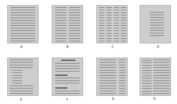
Here's an example showing a variety of document designs:

What messages do you immediately infer about the design of the information based solely on the structures above? Kostelnick explains that the design functions as "macro-punctuation." Just as punctuation clarifies meaning within sentences, the way we arrange and style information visually also provides "visual cues—e.g., division, coordination, subordinations—that enhance the reader's ability to process information in the text" (190).
From the design of the information, you can make inferences about relationships, parallelism, equality, emphasis, repetition, patterns, and coherence within the information. These inferences prompt readers to understand some aspect of the information before they even read it.
In the graphic above, A has an equality about the information, as does B, C, and D. But with documents G and H, the smaller columns perhaps contain subordinate information, such as notes about the main information.
Beyond hierarchy that establishes relationships, divisions also send messages to the reader. Looking at F, you can guess that the unique sections will contain different but related ideas, whereas the documents without divisions will contain a more unified theme.
Document E has a list of items. You would expect that the list of items supports an idea in the preceding paragraph, that the list items be parallel concepts or examples following from the preceding block.
D provides more white space than C. The design suggests a stronger focus on the information, that we read every word, whereas C invites us to skim and scan, much like reading a newspaper.
Overall, the design of information provides cues about the meaning of the information. These cues, like punctuation, are often unconsciously interpreted by readers, but they do significantly influence the message.
About Tom Johnson

I'm an API technical writer based in the Seattle area. On this blog, I write about topics related to technical writing and communication — such as software documentation, API documentation, AI, information architecture, content strategy, writing processes, plain language, tech comm careers, and more. Check out my API documentation course if you're looking for more info about documenting APIs. Or see my posts on AI and AI course section for more on the latest in AI and tech comm.
If you're a technical writer and want to keep on top of the latest trends in the tech comm, be sure to subscribe to email updates below. You can also learn more about me or contact me. Finally, note that the opinions I express on my blog are my own points of view, not that of my employer.
