Minimalistic Callouts Heighten Visual Appeal
Lately I've been working on quick reference guides that contain a lot of callouts around screenshots. (By callouts, I mean explanatory text that points to some part of the image.) In trying to come up with the right design for callouts, I surveyed how other authors approached callouts. Below is a sampling of about 14 different approaches to callouts, with my analysis below each example.
Some Examples of Callouts
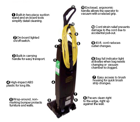
The author avoids bubbles around the callouts and keeps the text minimalistic. Each callout has a bold title followed by regular text. Callout lines end with a filled circle rather than an arrow. This works well. I'm not sure why the author stacked all the callouts on one side of the image, except perhaps to save space.
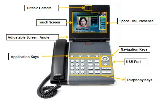
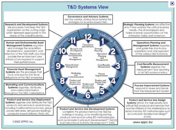
The inclusion of callout bubbles around the text makes the graphic look too busy. The callout bubble format takes the visual emphasis off the device and places it onto the callouts themselves. Callouts should be more in the visual background, not the foreground. The writer also uses triangles formed from the callouts themselves to function as arrows. This increases the amount of visual attention placed on the callout format. With so many callouts, the callout bubble format looks clunky and cluttered.
Again, boxes around the callouts draw too much visual attention to the callouts themselves. This visual attention competes with the image. The lines of the callout boxes combine with the yellow connecting lines to create a sense of busyness and clutter.
Besides the obviously wrong choice of a pink font, which blends too easily in with the pink color of the house and hurts the eyes, the text is fairly minimalistic. The author here avoids arrows on callout lines as well to reduce the visual energy. The author also uses the space around the graphic rather than stacking all callouts on top of each other on one side. This works, but the loud pink font still calls too much attention to the text. A softer, quieter black font would have done a better job at minimizing the massive amount of text around this graphic. The soft gray color of the callout lines is a good choice. If the author had used pink callout lines in addition to pink text, it would have been a nightmare.
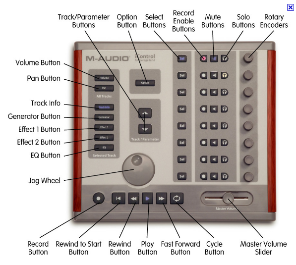
Callouts are short names only here. Given the abundance of callouts, the author wisely chose a minimalistic style for the callouts, with simple callout lines that avoid even circles or arrows. The problem with this graphic is that we have no descriptions of any components, so names such as "Rotary Encoder buttons" are meaningless. The author needs to take a less comprehensive approach to describing the image. Or else the author needs to provide a reference to more information in some of the callouts.
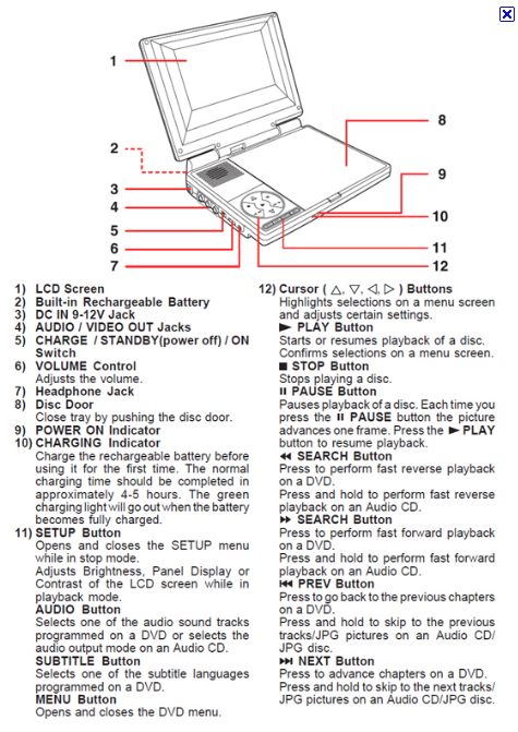
The author's use of referential numbers will be useful for translation of this content. Geoff Hart makes this point in Integrating Text with Graphics in Procedures (Dec 2010 Intercom), but also notes that the text loses much of its power by separating itself from the visual element it describes. Geoff writes:
The primary disadvantage is that this approach separates the symbol (the number beside part of the image) from its meaning.... That increases the cognitive difficulty of using the graphic because readers must lead the task at hand (examining the graphic) to perform a secondary task (finding a number in the key to read its explanation), then must return to the image so they can ponder the relevance of that explanation.
Geoff says that as long as you don't have to keep moving back and forth between the graphic and the explanation, this format can work all right. In these cases, the graphic would serve a referential purpose, where you need only one or two pieces of information.
Clearly at some point you enter a state in which a graphic has too much text. The author should reduce the number of callouts as well as drop the borders around the callouts, which only increase their size and visual attention.
The callout lines here are right angles, similar to what you might draw in Visio, with no rounded corners or arrows. While these square connectors may reduce the visual energy by giving the reader symmetry, the lines are a little hard to follow. This convention more closely aligns network diagrams and an older graphics style. The author could probably round the corners to modernize the look, or use straight lines with a soft color that doesn't draw too much attention when crossing the image.
With this graphic, the reader has to make the connection between the numbers and the callout. No callout lines connect the two at all, which increases the cognitive load to interpret the graphic. The double instances of the numbers amplifies the perceived amount of notes and callouts on this relatively simple graphic.
Notice how these big blue callout formats amplify the presence of the text. The arrowheads make the callout lines look less elegant. The various slants of the callouts produce more visual busyness and gives the graphic an amateur look.
The author uses yellow callout lines with black callout text. This contrast is an interesting choice. Would gray not have worked here? Against a white backdrop, the yellow lines fade out and are hard to see, so there's a visual strain in trying to connect the callouts to the areas they point to.
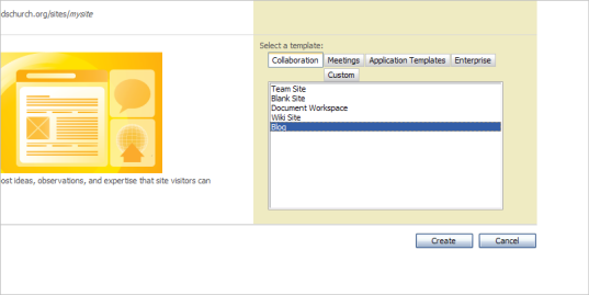
The callouts here are minimalistic and professional looking. Notice how the reduction in callout formatting increases the professionalism and clarity? The author also chooses a soft gray rather than a hard black for each callout line and end point -- this helps reduce the focus on the callouts and places more visual attention on the image. The callout supports the image rather than dominating the image.
This minimalistic approach echoes a point Alan Porter makes in the last STC Intercom. Porter quotes one of Edward Tufte's definitions of graphic excellence:
Graphical excellence is that which gives the viewer the greatest number of ideas in the shortest time with the least ink in the smallest space. (The Global Language: Using symbols and icons when Delivering Technical Content, Dec 2010 Intercom.)
In other words, Tufte calls for a minimalism with graphics -- express the idea in the fewest strokes, with the least ink. Leave out the noise. Jean Luc Doumont recommends the same graphic minimalism in his book Trees, maps, and theorems. In “Achieving simplicity and harmony” (p.75), Jean Luc argues that with formatting, writers should use “a healthy dose of self-restraint” instead of indulging in the many layout possibilities that desktop publishing software offers.
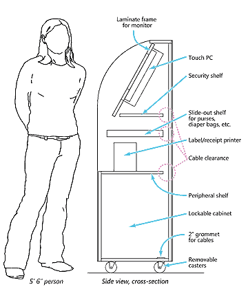
Here the author uses rounded callout lines rather than the square connectors. The rounded/bent nature of the arrows produces more of a sense of motion. Notice how the "Cable clearance" callout has a different callout style -- pinkish dotted lines, rather than blue? Presumably this is because the callout lines intersect other callout lines, and the author wants to avoid this collision, which produces visual cacophony. However, the different color of the callout lines here suggests that the "Cable clearance" callout is in a different category or class than the other callout lines. There's a semantic problem with changing callout line formats.
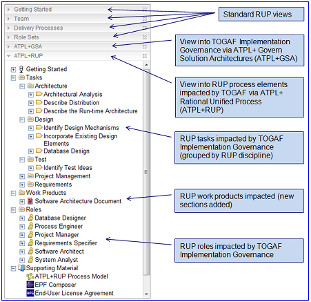
This is my favorite callout example. Despite the abundance of callout text, the text doesn't dominate the rather small image. The callout headings are minimal and in a narrow font to reduce visual space. The callout lines -- light black -- are as minimal as they can be, and lack even a dot or arrow at the end.
Although graphics programs offer a lot of opportunities with callout design, many times the design only detracts from the intent of the callouts. Don Moyer explains that the focus on design can sometimes backfire:
sometimes so much effort goes into aesthetics, special effects, fancy shadows, glowing objects, and 3D wizardry that the scope and structure of the story is neglected. (The Trouble with Visual Explanations: A Quick Look at Common Problems, Dec 2010 Intercom)
In other words, the "professional" execution of graphics can sometimes overshadow or even divert attention from the image's central meaning. This last example reinforces the strength of minimalism when it comes to callouts. Le
Conclusions
Callouts should not distract the focus away from the image but should supplement the image. To keep the callouts in the visual background, make the callouts as minimal as possible, avoiding callout bubbles, box formatting, or background shading. These design-heavy types of callout formats work if you're trying to "call out" attention to the presence of the callout text, or if you have just one or two callouts. But when you have an abundance of callout text on a graphic, as we often do in technical illustrations, shouting attention to each callout foregrounds the callouts at the expense of the graphic and leads to a clutterered, busy, amateur look. Each callout screams, "Look at me!," and when you have 6 to 8 callouts on a single image, the effect is too much noise.
When it comes to callout lines, avoid arrows at the end or any other graphics that draw too much attention to the line. Especially if the lines will be slanted in various directions, keep the width narrow to avoid drawing too much attention to conflicting slants (which produce negative visual energy). Choose a soft color, such as light black or gray, to reduce attention on the lines. Keeping with the minimalistic technique, maintain an adequate padding of white space between each callout.
About Tom Johnson

I'm an API technical writer based in the Seattle area. On this blog, I write about topics related to technical writing and communication — such as software documentation, API documentation, AI, information architecture, content strategy, writing processes, plain language, tech comm careers, and more. Check out my API documentation course if you're looking for more info about documenting APIs. Or see my posts on AI and AI course section for more on the latest in AI and tech comm.
If you're a technical writer and want to keep on top of the latest trends in the tech comm, be sure to subscribe to email updates below. You can also learn more about me or contact me. Finally, note that the opinions I express on my blog are my own points of view, not that of my employer.


