
Single Sourcing Screen Captures to Print, Online, and Mobile Using Flare and Capture
The other week my colleague asked me to write down a few notes about how I handle images with Flare. I realized there's a lot to know about images, especially when trying to single source them both to print and online outputs. In this post, I'll jot down a few of the more tricky points when it comes to single sourcing images.
Dimensions
Before taking a screenshot, the first question to ask is what dimensions to use. You want to figure out the right dimensions from the start so that your screenshots don't have different zooms and magnification levels, different widths and so forth. You want to avoid the hodgepodge variety of sizes and shapes that end up looking amateur. Decide on your height and width early so that all screenshots look similar.
The height and width of your screenshots depends on the layout of your deliverables. For print, if you're using a single column that's say, about 4 inches wide, then you want your screenshots to fit comfortably within that width. Screenshots in a printed guide can still be readable when small, whereas online images that are compressed to small sizes may become unreadable. In both mediums, you want the screenshots to be crisp and clear.
As a general principle, err on the side of being too large. Take your screenshots at your 800px wide by 450px tall or so, and in your stylesheet, apply a max-width property for the online images. Flare will pick up on that max-width property and resize the images accordingly, so you won't end up with huge image files. And in print, your large images will scale down in a crisp way. I need to explain more, obviously, but that's my general approach.
Thumbnails
You're probably thinking, 800px wide seems really big. That's okay. In addition to using max-width styles to reduce the image sizes, Flare allows you to display the screenshots as thumbnails, conserving space so you don't exhaust all your screen real estate. I've started including thumbnails in my help. Here's a quick example.
When you click the thumbnail, it expands to a much larger size. I like the thumbnail model and think it's a good practice for online help. It allows you to increase the number of visuals in your help material without overwhelming users who are simply scanning for text.
As thumbnails, the screenshots can be wider than usual because they expand in their own space rather than following the column width of your text instructions. The 800px wide screenshot looks fine when it's expanded and the background dimmed.
DPI
When you consider image dimensions for print, you have to factor in the dots per inch setting, or DPI.
To get clear images in print, you need to use a higher DPI (dots per inch) for your images. Ideally, you want to use a DPI of 200 or higher (but usually not more than 300, since most printers can't print this level of detail anyway). You also want to use a lossless format, such as TIF.
Note that if you take a screen capture (maybe 800px wide) from on a computer screen, and then increase the DPI to 200 or 300, the image shrinks to about two thirds the size or more when you output to print.
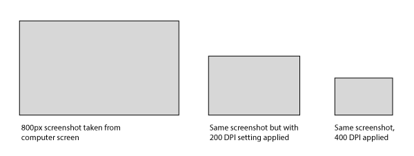
Why does this happen? Your screen's resolution can display only a certain number of pixels per inch (PPI), which are converted to dots per inch (DPI) for print format. To achieve 200 DPI, the image has to pack many more dots into a smaller space. Because there aren't that many dots available (graphics programs don't just create new dots), the only way to get a density of 200 DPI is by decreasing the image's dimensions.
Unless you want small screenshots in print, you have to increase the initial size of your screen captures to something like 800px wide or larger. Then apply a DPI setting (such as 200) that reduces the image's size to the dimensions needed for your print output. This result is about a 500px image. If your print layout is narrower, increase the DPI until the image fits nicely into the layout. Conversely, if the print images look too small, lower your DPI setting a bit, backing it down to 150 DPI or so.
Using Capture with Flare for print and online images works well, since Capture allows you to specify a unique DPI and image format (such as TIF) for the print format, while having other settings for your online images. In Capture, you can set up a profile that has all of these settings. With each new screen capture, you simply apply the Capture profile to it.
You can always change the profile settings in Capture later and reapply it to your image. For example, if you decide to switch your print layout to dual columns, and now you need your print images to be much smaller, you can update the Capture profile with a higher DPI and reapply the profile to your existing images.
Mobile
I've talked about setting dimensions for online and print images, but what about with mobile? If you've ever taken a screenshot of your iPhone and sent it to your PC and then viewed it on your monitor, you'll notice that the screenshot is much larger than the actual screen. Here's a screenshot from my iPhone 4 of one of Scott Nesbitt's posts:

This is a screenshot taken with an iPhone 4, not an iPad. Why is the screen capture so big? Your iPhone's screen has a higher PPI (pixels per inch) display than your monitor. The iPhone 4 has about a 336 PPI display. When you capture the screen on your iPhone, there are a lot more pixels in the image. If your monitor only has about a 98 PPI display, then what does your computer do with all the pixels? It's can't delete them. The image has to expand to a larger size, because the monitor can only display about 98 pixels per inch.
What does this mean for screen captures on retina display devices like iPhones and iPads? It means that a large image rescaled in the browser will display more crisply and clearly on a mobile device than on a regular desktop monitor. For example, you could have an image that's 1,000px in width, with media query settings to set its maximum display to be 400px wide. The image will look much more crisp than if you had simply resized the image to 400px in a graphics editor beforehand.
To do this, in my mobile output, I add a media query style such as the following:
@media (max-width: 480px)  {
img {max-width:100%;}
}
@media (min-width: 481px)  {
img {max-width:300px;}
}
The image's full size may be 800px or 1,000px, but the browser will only display the image at the maximum width of its container when the image is viewed on a mobile device whose display is 480px or smaller. The image will look crisp this way.
(Note that currently Flare strips out media queries when you generate a mobile target, so you'll have to add the media queries to the generated stylesheet post-process. Madcap says their next version will fix this issue.)
For more information on images in mobile display, see these three posts:
- Retina Display and Screen Capture Sizes in Online Help
- Exploring Flare's Mobile Webhelp Format in Depth
- 10 Realizations While Writing Documentation for a Mobile App
Captions
Now that I've talked a bit about screen dimensions, what about captions — the explanatory text that appears below the screenshot? Should you include captions? Yes and no.
For online formats, you don't necessarily need captions, especially if you're using thumbnails. You'll notice that Flare's help doesn't use captions. That's because when you shrink a thumbnail to 48px, there's no room for a caption any longer than a few words. Plus, when you expand the thumbnail, the caption disappears into the dimmed background anyway.
If you use thumbnails, you'll need to add any caption information as a callout in the screenshot. (Callouts are text displayed on the image itself, whereas captions appear as text underneath the image.) Adding callouts is a good idea anyway, since connecting text with visuals increases user comprehension.
If you do plan to use callouts with Flare, you'll definitely want to use Capture, since it's a vector-based graphics program and allows you to easily change callouts as needed. Stored in vector formats, the callouts will also be easier to translate.
However, single sourcing callouts between print and online formats can be tricky — you have to consider the readability of your callouts for both outputs. If your callouts in an 800px image have a 12px font size, those callouts will be reduced when you render the image to print (as I explained in the DPI section). The result is that your callouts become about 7px in size — way too small to read.
To counter the problem of miniature callouts in print, you have to use a font large enough in the callouts so that the 200DPI setting doesn't shrink your font size into oblivion. But you don't want the callouts to look so big for your online output that your readers wonder if they're getting the large-print-blind version. I've found that 14pt or 16pt font works all right. It's not too big in online outputs, nor too small with print outputs.
Dealing with Page Breaks in Print
Although captions are optional with online formats, captions are important to include in printed outputs. When you generate your help target to PDF, you may find that page breaks get in the way of a seamless looking output. For example, a page may stop short on step 2 and not pick up until the next page because the image is so large it doesn't fit on the existing page.
Here's an example. What happens after step 2? Is the procedure over?

The reader may be a little confused after step 2 due to the gap. However, with the figure reference (Figure 11) pointing to an image, it's clear that there's an image that comes next.
Because of the confusion that page breaks cause, it's a good idea to always include figure references in your print output. However, you don't want the figure references to appear online (especially if you're using thumbnail images for your online help), so apply conditional styling to hide both the figure reference and caption in the online output.
Translating Screenshots
If you're translating your content, using screenshots may be a huge headache. Madcap Capture stores any callouts in an XML format that you can easily send off to your translation group, but translating a callout doesn't do much good if the screenshot itself is still in English.
To fully translate a screenshot, you need to capture the screen in another language. If you're translating your content into 10 languages, each screenshot becomes 10 times the trouble, if not more because you have to figure out how to set up any dummy data displayed in the screenshot into those additional languages.
I know this sounds English-centric, but one practical strategy might be to gracefully exclude screenshots for non-English languages. Or maybe pick another one or two languages and exclude screenshots from the other languages. If your instructions are understandable without the screenshot, then applying conditional tags to the screenshots would allow you to exclude them in the translation.
If you know that you're not going to translate your screenshots, this affects how you refer to the screenshot in your help instructions. You can't include sentences such as, "As shown in the following screenshot, you must keep in mind X, Y, and Z." Instead, you would write something like, "You must keep in mind X, Y, and Z. (See Figure 1.)" Then apply conditional styling to "(See Figure 1.)" so that it gets excluded from the translated output.
Conclusion
There's really a lot to say about screenshots. I feel like I could write five more posts on this topic, but I've already gone on too long. I'm curious to hear whether my approach to screenshots aligns with yours. How can I improve my image single-sourcing process?
About Tom Johnson

I'm an API technical writer based in the Seattle area. On this blog, I write about topics related to technical writing and communication — such as software documentation, API documentation, AI, information architecture, content strategy, writing processes, plain language, tech comm careers, and more. Check out my API documentation course if you're looking for more info about documenting APIs. Or see my posts on AI and AI course section for more on the latest in AI and tech comm.
If you're a technical writer and want to keep on top of the latest trends in the tech comm, be sure to subscribe to email updates below. You can also learn more about me or contact me. Finally, note that the opinions I express on my blog are my own points of view, not that of my employer.