

Collapsible header sections -- more problematic than helpful
I'm a flip-flopper when it comes to collapsible sections. Sometimes I think they're great, and other times I think they're problematic.
A while ago I converted nearly all of my help's subheadings into collapsible sections. I trend toward longer help pages, and the collapsible heading sections seemed like a natural way to provide a kind of clickable TOC. Readers could see up-front all the sections on the page and go directly to the section they needed. No need to scroll and scroll. Collapsible sections, it seemed, provided a way to reduce long pages into a more usable form.
And so I went about collapsing my heading sections. That's when I started noticing how problematic collapsible sections get.
Problem #1: Pages get too long
If you can collapse your heading sections, your pages can get really long because you can just keep adding more and more sections without feeling like the page is too massive.
This may seem cool at first, since it means you can reduce the overall number of pages in your help material considerably. You can potentially reduce the unique page count to a third of the normal size, without forcing readers to look at infinitely scrollable pages.
However, long pages are often harder to manage. There comes a point when there's simply too much information on one page. The human mind does a better job processing information when the information is divided into smaller chunks (to an extent -- the chunks can't be too small or you lose context).
For me, a good page size is anywhere between about 500 and 1,500 words or so. But when you start hitting the 2,000 + word count range, it doesn't seem to work as a regular web page.
If you make your pages shorter, the need for collapsing sections decreases. Some topics may be only 300 to 600 words long. For those pages, do you still collapse the section headings? It looks silly if you do, and inconsistent if you don't.
This pretty much sums up the problem. Shorter pages don't need collapsible sections. The majority of tech writers create help in short topics rather than long topics (often because they're single sourcing), so that's why you rarely see collapsible sections used in help material -- short pages just don't need them.
Problem #2: Where to start collapsing
Another problem with collapsible headings is figuring out where to start collapsing them. If you have an introductory paragraph on your page, following by maybe 5 or 6 subheadings, most likely you'd just start collapsing each subheading.
But if that introductory paragraph is rather short, maybe 1-2 sentences, the page looks mostly blank. You have all of this empty space due to the collapsed headings.
This is not to say that another style technique that uses collapsible sections couldn't be successful. Check out this help page from Google called Using Keyword Planner to get keyword ideas and traffic estimates. Here the author decided to collapse only tasks.
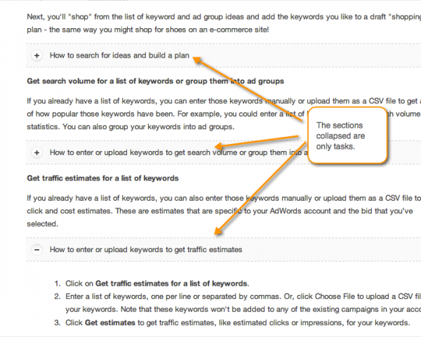
The collapsed sections don't leave the page looking empty. In fact, they do a pretty good job at reducing the page size in a reader-friendly way.
But I wonder how this strategy works across an entire help site. Are all lists collapsed, or just some lists on pages that seem long? What if the page consists primarily of task steps and not concepts?If the collapsing is done in a mostly arbitrary way, isn't that inconsistency going to create confusion for readers, who will wonder why some sections are collapsed while others aren't?
Problem #3: Loss of immediate scannability
As a reader, I like to generally scan a page without having to manually click buttons to reveal the text. Although it can be nice to pick and choose what parts of the page I want to see, more often than not, I don't want to be burdened by opening up every single section I want to see. When you collapse heading sections, you force readers to do a lot more work just to read the page.
For example, here's the welcome page for Flare's help. Lots of sections are collapsed.
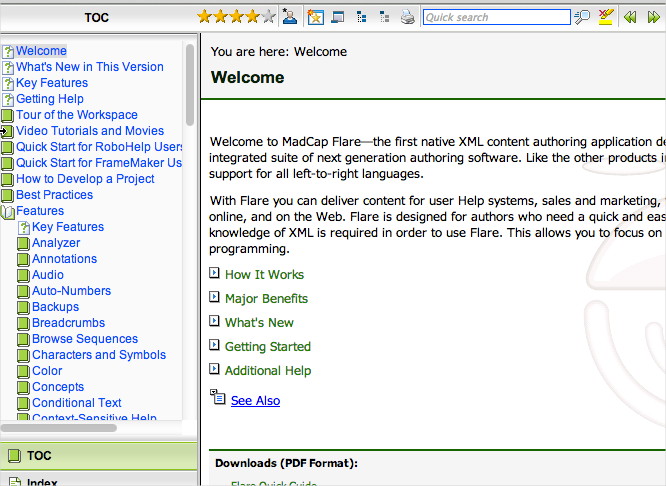
This might be a good thing, since you can go directly to the section you want. But it also means you have to click the page repeatedly just to see what each section contains.
Collapsing sections like this requires the subheadings to be more precise and clear. The subheadings need to do a stellar job at telling me exactly what's in the section. That way I won't have to guess with each click, wondering what information it contains.
I have to confess that when my collapsed subheadings are stacked like this, they're a lot less clear. At least when subheadings aren't collapsed, they also serve as a welcome break and pause for the reader, regardless of what the words actually say.
Problem #4: Linking
Linking may seem like a problem only inherent in the collapsible technique I was using, but since our help is on Drupal, we implemented the Collapse Text module. You can roll your own expand/collapse code, like I did here at Sample Expand and Collapse Code with Twisting Buttons, but using the existing module was simply easier (at first).
It turns out that for each section you want to collapse, you have to format it like this:
<br />
[collapsed title="This is the collapsed title"]</p>
<p>Here's the content that gets collapsed....</p>
<p>[/collapse]<br />
Now, what happens when you want to link to this section? Can you add an ID value to the link? No, the module chokes on it. You have to add an empty style tag with an ID inside the collapsed section.
<br />
[collapsed title="Rules for custom attributes"]<br />
<a id="rules-attributes"></a><br />
The section opens automatically when the user goes to this spot, but since the ID is below the actual title, the title is slightly out of sight in the browser window.
The only workaround is to use a special class that offsets the position, like this:
<br />
a.anchor {<br />
        position: relative;<br />
        top: -30px;<br />
    }<br />
When a user clicks a link with this class, the user's position gets offset 30 pixels at the top. To use this class in the context of the module, your links end up looking like this:
<br />
[collapsed title="Rules for custom attributes"]<br />
<a class="anchor" id="rules-attributes"></a><br />
It's just kind of crappy kluge-like code. Most likely another write would come along, assume a wysiwyg editor inserted this jargon, and delete it.
While I mentioned wysiwyg, if you flip into your wysiwyg view, all of these heading titles are hard to find, because the wysiwyg editor only recognizes the heading tags (such as h2).
I haven't even mentioned the blow to SEO that happens when you strip out your h2 tags and replace them with bracketed material. The brackets are actually shortcodes that get converted to HTML when you view the page in the browser. So the final code looks like this:
<br />
<fieldset class="collapse-text-fieldset collapsible collapsed form-wrapper"> <legend><span class="fieldset-legend">Sample Collapsed section</span> </legend><div class="fieldset-wrapper"> <div class="collapse-text-text"><br />
Try styling that. You'll be hitting Inspect Element for quite a while just trying to figure out what controls what.
To be fair, the module author probably didn't intend to use this technique with headings, but that's how I was using it. I only note all this to show that what seems fairly simple gets much more complicated as you work out the details.
In retrospect, if implementing collapsible sections, use the jQuery technique I referenced earlier and apply it to an existing style. Then you can turn the collapsed sections on or off almost instantly.
Problem #5: Searches
A final problem is with search results. If a user searches for a keyword contained in the collapsed sections, the sections don't expand to show the reader where the keyword is. The reader would need to expand each section on the page to figure out where the keyword is on the page.
This becomes rather tedious for the reader, so you might think oh, let's just put an Expand All button and Collapse All button on the page. This functionality isn't included in the Drupal module by default, so again, you have to either roll your own (discarding the module), or expand the module's functionality.
Then, assuming you get the thing working, you have to decide whether you'll include the Expand / Collapse buttons on every page by default or only on select pages. You'll no doubt want it on select pages, because you certainly don't want Expand / Collapse buttons on pages where there aren't any collapsed sections.
To add the buttons selectively on the page, you'll need to define a style element and add some jQuery to trigger a script when the element is clicked. This means more scripts and more styles, adding to your loading page's loading time. Not a huge deal here, but it's more hassle. (I actually have no idea how to automatically expand a specific collapsed section that contains a keyword on a search results page.)
Is all of this extra programming worth it? I don't think so.
A better solution
Although I've pointed out a lot of the problems with collapsible sections (both technical problems and with usability), collapsible sections could come in handy in places. I do like how Google has used collapsible sections to shrink various lists on the page. But ultimately I decided that a table of contents feature on the top (automated based on h2 tags) is a better solution.
With the table of contents method, the page is long but the reader can easily jump to the right section. This model offers both scannability and selectability. You can see a demo page here on a test Drupal site I'm playing with (leveraging the TOC Filter module). Readers are already familiar with this model because it's the same model Wikipedia uses.
About Tom Johnson

I'm an API technical writer based in the Seattle area. On this blog, I write about topics related to technical writing and communication — such as software documentation, API documentation, AI, information architecture, content strategy, writing processes, plain language, tech comm careers, and more. Check out my API documentation course if you're looking for more info about documenting APIs. Or see my posts on AI and AI course section for more on the latest in AI and tech comm.
If you're a technical writer and want to keep on top of the latest trends in the tech comm, be sure to subscribe to email updates below. You can also learn more about me or contact me. Finally, note that the opinions I express on my blog are my own points of view, not that of my employer.