Version 5.0 of my Documentation Theme for Jekyll now available
- Where to download the theme
- Unique sidebars with different products in the same output
- Advantages of multiple sidebars in the same site
- Challenges with multi-product sites
- Theme needs
Where to download the theme
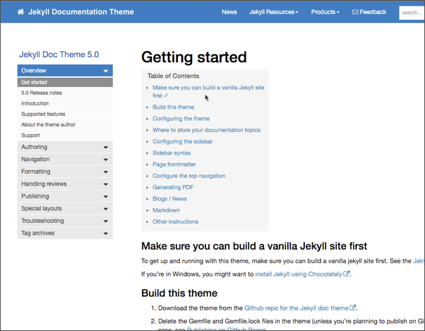
You can download the Documentation Theme for Jekyll and find instructions for using it here.

Unique sidebars with different products in the same output
In this latest version, I’m trying to avoid the tech authoring model where you generate a separate output for every audience, product, version, or other variant in your docs. Most help authoring tools apply conditional filtering but do so by pushing out separate, self-contained sites. You end up with dozens of different, unique websites, each intended for a specific user. This is the default model for single sourcing, it seems.
Problems with this model include the following:
- No ability to feasibly review all the outputs, either for authors or SMEs. There’s a greater chance that an output will contain an error that you never see because you’re likely not reviewing 20 different sites, and neither are the engineers.
- Complete breakdown with web searches from Google. If you have 20 different sites for different product variants (versions, audiences, configurations, etc.) a search from Google will invariably land on the “wrong” site. You’ll have to figure out how to guide the user to the right one.
- Maintenance nightmare. The more you push out separate sites, the more file directories you have to manage until it gets ridiculous. If you push out new sites with each version, this quickly grows into so many file directories, and managing them all, including moving the files, becomes a nightmare. (20 sites for each version x 10 versions = 200 sites.)
Version 5.0 of my doc theme allows you to associate a unique sidebar for each product. For example, let’s say you have 7 products all on the same site (a single website). With each page, you can specify a particular sidebar in the frontmatter.
To see it in action, go to the theme. In the top navigation menu, select from among three different products in the Products menu. Note how the sidebars change.
Advantages of multiple sidebars in the same site
This multiple sidebars model provides a number of advantages:
- Reduced number of levels for users to expand in the TOC. Without unique sidebars, you would likely need to have one massive sidebar showing all products. This model would push each topic down a level, forcing users to expand and collapse more sidebar sections to get what they need.
- Increased relevancy of each sidebar link. The entire sidebar can reflect all the content the user cares about. There’s no need to force a lot of irrelevant links or sections in the sidebar simply because there’s no other navigation component.
- Ability to separate out the content without pushing each product into a self-contained sites or directories. When you have all your content in one site, you can spend more time caring for that site’s details and providing more sophisticated styles, controls, and other interactive components in that site.
By combining all products in the same site, you allow more cross-over and upsell from one product to another. This model works especially well when users might implement more than one of your company’s products, or when part of documentation from one product applies to another.
Challenges with multi-product sites
The multi-product site does pose some challenges:
- Search results can be a mixed jumble that frustrate users. There’s a high chance that your content turns into doc soup. These types of sites would definitely benefit from faceted filtering or other ways to separate out products through search filters.
- Page titles will likely need to reflect the product. You can’t just use “Getting started” or “Configuring preferences” for each of your products. You’ll likely need to write something like “Getting started (ACME)” and “Configuring preferences (ACME).”
Theme needs
Note that I haven’t integrated a more robust search with this theme. At some point, I would need to integrate with something like Algolia or Swiftype to provide a more powerful search feature. To get facets, I’d probably need to integrate something from Apache Solr. In that sense, the theme is somewhat limited. But there’s a chance that you could leverage engineering resources to build out this functionality. Tech writers tend to focus mostly on content, which is what this theme allows you to do.
If you’d like to try out the Jekyll theme, I’d be interested to hear your feedback. If you’re new to Jekyll (no matter your platform), I’m especially interested to hear if you can get Jekyll up and running with my installation instructions (Mac or Windows).
About Tom Johnson

I'm an API technical writer based in the Seattle area. On this blog, I write about topics related to technical writing and communication — such as software documentation, API documentation, AI, information architecture, content strategy, writing processes, plain language, tech comm careers, and more. Check out my API documentation course if you're looking for more info about documenting APIs. Or see my posts on AI and AI course section for more on the latest in AI and tech comm.
If you're a technical writer and want to keep on top of the latest trends in the tech comm, be sure to subscribe to email updates below. You can also learn more about me or contact me. Finally, note that the opinions I express on my blog are my own points of view, not that of my employer.

