Separating Basic from Advanced Topics: How Twitter Organizes Their Help [Organizing Content #18]
When you click Twitter's help link, the help content is divided into three categories:
- Twitter Basics
- Something's Not Working
- Report a Violation
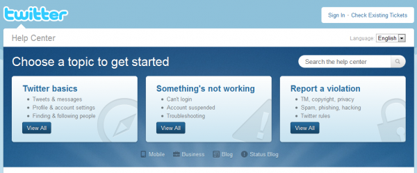
This division suggests a mental pattern about how people use help. You have the newbie group. These people are new to Twitter and need a grounding in the basics, such as what an @ reply is versus a dm. The content in this section, Twitter Basics, is simple and avoids focusing on the pain points; instead it focuses on the fundamentals.
The Something's Not Working section lists specific problems users have encountered. The topics in this section are more of a random list of issues users have probably logged as support tickets.
The third column, Report a Violation, also has a surprising number of advanced topics. It's more than simple violation reporting. More than 50 different topics are listed on that page.
Evaluating the Organization
Twitter's model for organizing help content seems reasonable. But it fails to consider a point Kathy Sierra made several years ago in her post, The best user manuals EVER. She says that if you have a note or tip or FAQ about a specific topic, that content should be grouped in with other content on the same topic. Kathy expresses this point well through a couple of diagrams:
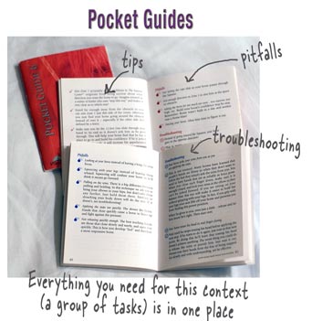
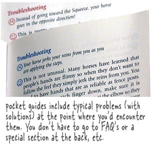
Twitter's help doesn't follow this principle. Basic topics are in the Basic section -- for example, How to Change Your Profile Picture or Information is in the Basic section. But a similar topic, I Can't Update the Profile Information for My Verified Account, appears in the Something's Not Working section. Should these topics be grouped together in one place? In other words, should basic and advanced information for the same topic be in one place?
Centralizing or Separating?
One advantage to centralizing topic content in one place, as Sierra recommends, is the search engine optimization that results. If a page has more keywords, it will rank higher in the results. A user searching for information might have better luck finding the page if the page is more keyword rich.
On the other hand, shorter topics usually have more pointed topic titles that rank higher in search results because the keywords are found in the title rather than the content body.
Overwhelming or Disappointing
Another consideration in centralizing or separating out content is whether you would rather overwhelm new users or disappoint advanced users. If you group all content together in one place, you may end up overwhelming the new user. What would normally be a simple task, such as Signing In, can have a dozen sections associated with it, if signing in happens to have a lot of troubleshooting notes and other tips, quirks, or issues. This abundance of topics can overwhelm new users and make them feel that the application is more complicated than it really is. This is one argument for separating out basic from advanced content.
However, separating out the complexity from the help will most likely disappoint advanced users who will now have a harder time finding the answers they need in the help. When an advanced user looks for help about signing in, they'll be scattered in their search because the information about signing in isn't in one place. The organization in the Advanced section could parallel the same organization in the Basic section, but then the advanced user would be left to guess whether the topic was basic or advanced.
From Neatness to Chaos
When you peruse the Something's Not Working or Report a Violation sections in Twitter, you'll see that they tend to lose their tight organization and look like a jumble of questions and problems, as shown in the image below.
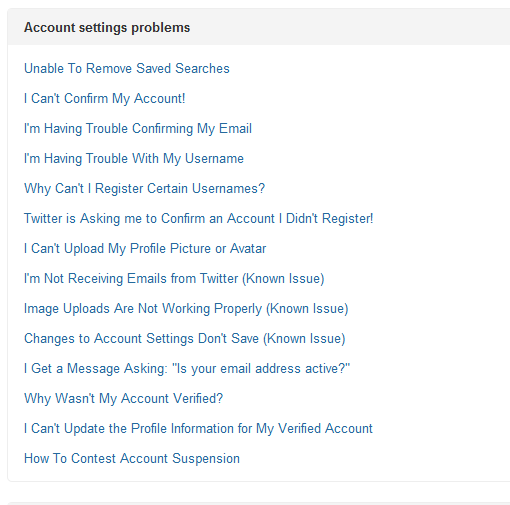
Advanced topics tend to look this way -- a loosely organized list of randomly worded topics. In contrast, the topics for the basic section are tightly organized with parallel verbs.
It seems that you can't have both. Either you have advanced topics mixed with basic topics and end up with a semi-chaotic looking organization. Or you separate the two and maintain clarity in the help but introduce more problems with findability.
One Way to Resolve the Separation
One way to resolve this grouping basic and advanced information is to provide a list of advanced/troubleshooting topics as links in the sidebar next to the basic topics. For example, in the following topic, How To Change Your Profile Picture or Information, you could list the advanced/troubleshooting topics in the sidebar as Related Links.
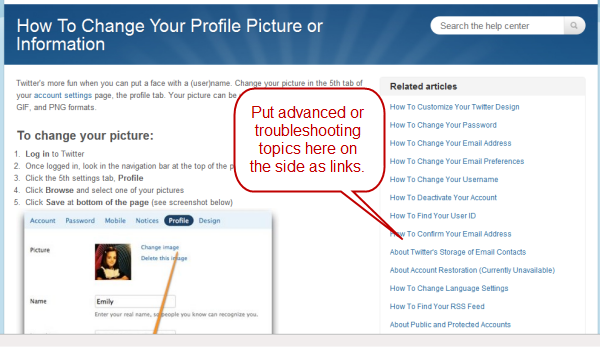
Twitter already does this to some extent, but the Related Articles mostly pull from the Basic section.
Conclusion
Overall, determining how to organize basic information along with advanced information poses one of the main challenges with content organization. Online platforms allow more possibilities for grouping similar content together without overwhelming the user, since you can rely on links to go directly to the content. Printed content would probably resort to cross references from one section to another. But regardless of the medium, there is no clear approach for integrating basic and advanced content.
About Tom Johnson

I'm an API technical writer based in the Seattle area. On this blog, I write about topics related to technical writing and communication — such as software documentation, API documentation, AI, information architecture, content strategy, writing processes, plain language, tech comm careers, and more. Check out my API documentation course if you're looking for more info about documenting APIs. Or see my posts on AI and AI course section for more on the latest in AI and tech comm.
If you're a technical writer and want to keep on top of the latest trends in the tech comm, be sure to subscribe to email updates below. You can also learn more about me or contact me. Finally, note that the opinions I express on my blog are my own points of view, not that of my employer.

