The Interface Is Text [Organizing Content #23]
In my last post, The Technical Writer as an Outsider, I argued that being an outsider to a project gives you a valuable perspective about the gaps, problems, inconsistencies, and other issues in an interface, so you can do a better job documenting it for other outsiders.
After writing the post, I tried to embrace the outsider mindset and hunker down at my desk to go about my work. Working under this metaphor, I realized that I was no longer moving toward a solution, but merely providing documentation to address something others had already created. I felt a sense of emptiness and lack of purpose.
One of my colleagues, Derek, shared with me a new metaphor he recently adopted to describe technical writing. He had a bitter experience on his first project in our organization when one of the project managers told him the tech writer's role is to document "what is, not to suggest what should be." Now Derek has come to think about technical writing as a kind of janitorial job. He said,
At the end of the day, we're really janitors. I know it may sound derogatory and even offensive, but our job is to clean up other people's messes. Project managers don't want to see us, they don't want to interact with us. They just want us to arrive after the work is done; they want us to come in and do our jobs quietly, cleaning up the spills, vacuuming the crumbs, taking out the trash -- all without complaint or objection.
Such a mindset is not only uninspiring, any writer with a keen eye for language and a good analytical mind will be unfulfilled in such a role, and Derek knows it. Playing the janitor, acting as an outsider, or as Gryponmountain puts it, playing the monk in LadyHawke whose job it is to describe the broken stairs and other areas of decay and hazard in an old decrepit cathedral, will lead the once-aspiring technical writer to burn out and seek another career. At our core is the drive to create, not to clean up.
But there's another dimension to this problem, and it's a more important one. Putting aside all resentment about playing a janitorial role, language experts should play a more active role in shaping the interface because the interface is text. As such, writers do a disservice to project teams if they don't play a role to help clarify and sharpen the interface language.
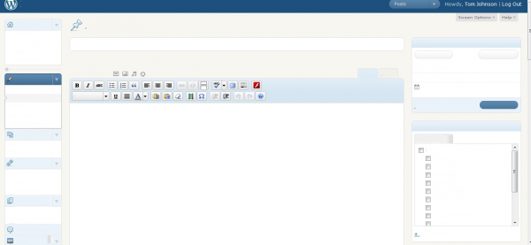
Of course the interface also has a good bit of graphics and design, but largely what users interact with is text. This assertion is most striking when you actually remove the text from the interface you're using. For example, here's the text removed from the WordPress interface.

Go ahead and create a new post, timestamping it to be published next Monday, add a category and change the author. What, you can't do that? You could probably still format the content with the rich text editor's buttons, but what kind of content are you creating -- a page, a post, or something else? And what is that pushpin at the top doing?
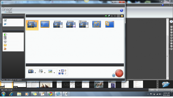
Here's the text removed from the Snagit interface.

Go ahead and create a menu delay capture, add a border around it, and set the default file type to be PNG and stored in the D:// drive. Again, it's difficult to do this without text, and only possible if you already know the application.
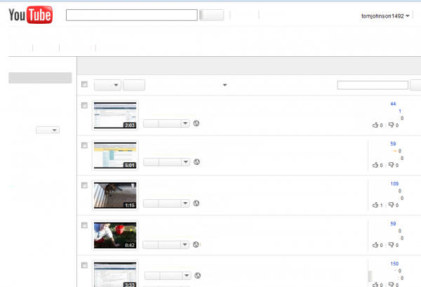
Here's the text removed from the Youtube admin interface.

Upload a new video and tag it with your website title, and then select to play it in HD with captions. Again, it's impossible to do much of anything in the design itself, as simple as the interfaces are in each of these examples. The user needs to the text to navigate and understand the interface.
What Kind of Writing Is Interface Text?
Writers are often skilled in all types of language forms, from short poems to letters to essays to how-to text. But the text on an interface is a different kind of text. If you isolate the text from the design elements, you lose a lot of the meaning, similar to what happens when you remove the text from the design.
The design adds meaning to the words. When designers choose a typeface for the text, it adds meaning. The hierarchy, the position on the page, the background color, the bold or italic formatting, the relationships and proximity to other elements, the length of text, the text's placement in the user's line of vision, the accompaniment of icons -- all of these design elements give context to the text, so that you're no longer just playing with words and deciding on the right word. You're trying to find the right word in the right context.
The Challenges of Word Choice
Designers attempt to add meaning through design elements, but the greatest challenge designers and project managers face in interface text is probably word choice. How many times have you seen a word used in an interface you're documenting that just doesn't seem to fit? Users need to reconcile a banking statement. Committee members can submit a linked item. Building schedulers can allocate resources. To stop spam you activate Akismet. Bloggers can burn a feed. Analysts can drill down into the data. Content managers can configure the slug for each URL. When you upload an image, the message you see says Crunching. In every instance, the word choice is probably wrong. It doesn't communicate plain understanding to the user.
In addition to the wrong word, other times the problem is inconsistency. When you finish making edits, you Save / Submit Changes / Commit. If you don't want to save your changes, you can Cancel / Discard / Go Back. To set up a recurring series in a calendar, you can choose to set up a repeating event, and later you can edit the recurring event.
Finding the right word for the context is a skill. It often involves discovering the language of your users -- through interviews, observations, or other feedback -- rather than sitting in a project meeting and reasoning it out.
In an upcoming post I'll dive into more principles for interface text. But my overall point here is that the interface consists mainly of text, and because of this, writers (language experts) need to help shape and craft this interface language.
You can't influence the interface text if you're brought on to the project team one month before it's released. By that time, quality assurance engineers are already running their regression testing and preparing to hand it off to infrastructure for release. Developers have already used the same terms on multiple screens, dialog boxes, error messages, database tables, and throughout the application code. Unless there's a major problem with the words, no one will be inclined to change them. The project manager sees no pressing need to make language changes so late in the game, because everything seems to be working just fine prior to release. No customers have complained yet, so it's easiest to leave it alone.
Some Research Supporting Early Involvement of Writers
If you want to insert yourself early on the design process, the first step is to believe that you belong there. You are a word expert. The interface is full of words. In Text Treatment and User Interface, Tobias Komischke notes,
Before graphic user interfaces, text was the primary means of both input and output defining human-computer interactions. Even today, much of the information user interfaces present is textual. Therefore, we should notunderestimate how the right text treatment can measurably improve user productivity and increase user satisfaction.
In other words, when interaction designers present their prototypes for the new application interface, they're not just presenting a design. They're working with words and designing text with meaning in everything from buttons, labels, page titles, error messages, dialog boxes, tabs, drop-down boxes, notes, and other interface text. Writers should be present during the design meetings. We understand the nuances of language more than any other project team member.
In Art and the Zen of Web Sites, Tony Karp says,
In a successful advertisement it's the graphics that grab you, but it's the text that does the selling.
While designers would disagree that graphics only catch your attention, certainly almost no one can get by without text. The user interface becomes incomprehensible. But you can still often get by even if you strip out the stylesheet and images.
Apple, the king of intuitive interface design, stresses the importance of clear, consistent text and recommends including a writer in the development process. The Apple Human Interface Guidelines state:
Although Mac OS X uses graphics as a primary means of user-computer interaction, text is prevalent throughout the interface for such things as button names, pop-up menu labels, dialog messages, and onscreen help. Using text consistently and clearly is a critical component of interface design.
Your product development team should include a skilled writer who is responsible for reviewing all user-visible onscreen text as well the instructional documentation. The writer should refer to the Apple Publications Style Guide for guidance on Apple-specific terminology.
Is text a "critical component of interface design"? Of course. Take the text away and the user can do nothing. Involving the writer early to get the text right can make a huge impact on usability.
The Microsoft Developer library also encourages involving the writer early on in the design process. In an entry on User Interface Text, the Microsoft authors say:
Software developers often think of text as relegated to product documentation and technical support. "First we'll write the code, and then we'll hire someone to help us explain what we have developed." Yet in reality, important text is written earlier in the process, as the UI is conceived and coded. This text is, after all, seen more frequently and by more people than perhaps any other type of technical writing.
Comprehensible text is crucial to effective UI. Professional writers and editors should work with software developers on UI text as an integral part of the design process. Have them work on text early because text problems often reveal design problems. If your team has trouble explaining a design, quite often it is the design, not the explanation, that needs improving.
I find it reassuring that the two biggest companies in software, Apple and Microsoft, both recommend involving the writer early in the development process to shape the language of the user interface.
Regardless of what companies and style guides recommend, writers will need to prove their worth to earn a seat at the table. As such, writers will need to be familiar with best practices for including text in the interface. In my next post, I will explore best practices for adding interface text.
About Tom Johnson

I'm an API technical writer based in the Seattle area. On this blog, I write about topics related to technical writing and communication — such as software documentation, API documentation, AI, information architecture, content strategy, writing processes, plain language, tech comm careers, and more. Check out my API documentation course if you're looking for more info about documenting APIs. Or see my posts on AI and AI course section for more on the latest in AI and tech comm.
If you're a technical writer and want to keep on top of the latest trends in the tech comm, be sure to subscribe to email updates below. You can also learn more about me or contact me. Finally, note that the opinions I express on my blog are my own points of view, not that of my employer.

