10 Ways to Bomb Your Presentation
 Conference season is approaching and presenters are busy preparing their notes and PowerPoint slides. Now is the perfect time to review some good ways to bomb a presentation (especially since I did a great job bombing a presentation I gave today).
1. Prepare your presentation without any awareness of your audience.
About the worst thing you can do is grossly misunderstand your audience. Assume they're familiar with an application they aren't, or that they're interested in learning about X when it's really Y they want to know about.
Make other assumptions about their technical level and familiarity with the tools and technologies you're talking about. Make any of these assumptions incorrectly and your entire presentation could be off target, causing you to hopelessly shift mid-course and completely ditch your presentation in an impromptu redirect that makes you look unprepared.
2. Create a really long PowerPoint with lots of text in a small font.
Listen to the audience's response when Chris Anderson, Wired magazine's editor in chief, apologizes for not preparing a PowerPoint.
(Okay, I turned up the applause volume a little.)
Anyone who has attended a bad PowerPoint presentation feels dread every time another presenter starts adjusting a projector. As much as I'd like to entirely dismiss PowerPoints, most presenters, including myself, feel we need some kind of visual aid.
Guy Kawasaki, a well-known entrepreneur, has a simple 10/20/30 rule for PowerPoint. Guy explains the 10/20/30 rule as follows:
It's quite simple: a PowerPoint presentation should have ten slides, last no more than twenty minutes, and contain no font smaller than thirty points...Ten is the optimal number of slides in a PowerPoint presentation because a normal human being cannot comprehend more than ten concepts in a meeting... If you must use more than ten slides to explain your business, you probably don't have a business.....
You should give your ten slides in twenty minutes.... In a perfect world, you give your pitch in twenty minutes, and you have forty minutes left for discussion....
... Force yourself to use no font smaller than thirty points. I guarantee it will make your presentations better because it requires you to find the most salient points and to know how to explain them well.. "The 10/20/30 Rule of PowerPoint"
In other words, go with 10 slides, 20 minutes, and text no smaller than 30 point font, and you'll probably avoid making most common errors with presentations. Of course this assumes you're prepared to talk about the content you're presenting on.
Garr Reynolds, author of the PresentationZen blog, suggests making the slides mostly visual to avoid the problem of too-much text.
The slides used in my presentations are usually a mix of full-screen, high-quality photos, some charts/graphs, and slides with single words, short phrases, or short quotations. The idea of using very, very large type on screen is a good one. And though I think photos and graphics can be most effective, when we do use text on a slide, we would be well advised to keep it large and concise. ("Takahashi Method" uses king-sized text as a visual)
I found Garr's PresentationZen.com to be a goldmine of perfect information, so I quoted extensively from it in this post.
3. Attempt to configure the projector 2 minutes before the presentation starts.
Right when you need to be taking deep breaths, smiling, and greeting your audience, instead someone arrives with the projector and expects you to hook it up with perfect resolution and display on an odd-sized screen. Almost invariably, you have to fiddle with your laptop's resolution, focus the projector, adjust the projector's stands. This is assuming that the projector even displays your laptop's screen at all. What was that toggle key again???
If any technical glitch occurs, it puts you in stress mode, which will make you stiff when you actually start your presentation. Instead, arrive 30 min. early just to set up the projector display. Become familiar ahead of time how to adjust your resolution, configure presentation display modes, and toggle the function key that makes your screen display on the projector. Also make sure the projector isn't some old clunker that flickers or is extremely small and displays slanted. If that's the case, prepare handouts.
4. Read your slides to your audience, especially with your back slightly turned.
When you prepare slides with a lot of text, you'll have a natural tendency to read the slides. And to read the slides, you have to half-way turn your back to the audience. Guy points out that when you begin reading your slides, the audience starts reading them too, but because people can read faster than they can read out loud, the audience moves ahead of you. "The result is that you and the audience are out of synch," he says.
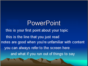
You can avoid this problem by sticking to large font. This .ppt shows 30 point font, in case you're wondering how big that is. I think 30 is even too small. There's nothing I hate more than trying to speak to people who are not looking at me but instead trying to read something behind me.
Garr says that you should be familiar with the B key while giving PowerPoints. Pressing B is a toggle that displays a blank screen instead of the presentation, allowing you to focus the audience's attention back on you.
5. Rely on a high-speed Internet connection to move through a key software demonstration.
Have you ever heard someone tell you, oh yeah, you'll have wireless Internet. So you bank on that, dedicating about 20 minutes to a live software demo. But when you start trying to click through the app to show the features, the pages load like you're on prehistoric dial-up, moving 1 KB per second. Pages take so long to load they actually time out and show errors. While you wait for pages to load, you make caustic remarks about how slow things are moving, and how it's "usually not like this."
"So then you click here" .... ..... ... .. ..... ..... .......... .................. ......"and this screen finally appears" ...... ..... ... "then click this button" .... ........ .......... ... . ... "is the connection usually this slow here?"
Instead, show screenshots of key features, and explain conceptually how they work.
6. Cover, in detail, the plots of Moby Dick, War and Peace, and Les Miserables in less than an hour.
Don't you hate it when the presenter has crammed so much information into the presentation that there's no possible way he or she can get through it all without talking like an auctioneer and avoiding any kind of questions or discussion because "we've got a lot to get through." No we don't. You brought it upon yourself to try to cover Moby Dick, War and Peace, and Les Miserables when you only had time for One Fish, Two Fish, Red Fish, Blue Fish.
Garr gives sage wisdom here:
The problem with many presentations is that people simply try to say too much in a short amount of time. Most people struggle with practicing restraint in the preparation stage—including myself—and have a hard time making the tough choices about inclusion and exclusion before the presentation. Often no time is given to the idea of exclusion nd paring down. As a result, audiences all too often get more than they want, need, or can comprehend. ("Deep or Wide: You Decide")
7. Postpone audience questions so you can finish getting through the presentation.
"If you have any questions, I'd like you to save them until the end," the presenter says, but then he or she has so much material that the end never quite comes. When it does, the presenter has allowed 3 minutes to answer questions. But your question was relevant about 30 minutes ago on slide 9. This only frustrates the audience and antagonizes them towards you.
8. Manually drive your laptop's stick wheel mouse.
Now let's be real and recognize that the table your laptop is on is about 3 feet off the ground, so you have to hunch over to use the mouse, and stand right near the projector. You can't move around because you've got to stay by your laptop to click through the slides.
Why chain yourself up like that? Instead, try buying one of those wireless mouse clickers that gives you freedom of mobility during a presentation. Without one of these gadgets, you end up tethered to your laptop.
9. Think about what you'd really rather be doing.
Garr's most important piece of advice is to be passionate about your topic. I agree. Passion, enthusiasm, excitement -- these can all make up for otherwise poor preparation. It's so rare that I see someone genuinely excited about something. Enthusiasm is inspiring. Garr writes,
If I had only one tip to give, it would be to be passionate about your topic and let that enthusiasm come out. Yes, you need great content. Yes, you need professional, well designed visuals. But it is all for naught if you do not have a deep, heartfelt belief in your topic. The biggest item that separates mediocre presenters from world class ones is the ability to connect with an audience in an honest and exciting way. Don't hold back. Be confident. And let your passion for your topic come out for all to see. ("Top 10 Delivery Tips")
10. Distance yourself from the content.
Finally, while all of the above tips are worthwhile, if you have some good stories to tell, your audience will love you. I majored in English because I realized one day I like narratives. Stories have power. They form myths that shape our beliefs. Surely you have some kind of stories that stem from experience surrounding the topic you're presenting on. Otherwise how did you get to be an expert on it?
Don't distance yourself from this personal content by excluding your stories from the presentation. This is what moves the audience more than anything else.
Garr explains,
Good presentations include stories. The best presenters illustrate their points with the use of stories, most often personal ones. The easiest way to explain complicated ideas is through examples or by sharing a story that underscores the point. Stories are easy to remember for your audience. If you want your audience to remember your content, then find a way to make it relevant and memorable to them. You should try to come up with good, short, interesting stories or examples to support your major points. ("Organization and Preparation Tips")
Conclusion
Please, please, please, if you are presenting at any conferences I'm attending this year (Doc Train West and STC Summit), don't bomb your presentation. And if I start bombing mine, raise your hand and let me know.
About Tom Johnson

I'm an API technical writer based in the Seattle area. On this blog, I write about topics related to technical writing and communication — such as software documentation, API documentation, AI, information architecture, content strategy, writing processes, plain language, tech comm careers, and more. Check out my API documentation course if you're looking for more info about documenting APIs. Or see my posts on AI and AI course section for more on the latest in AI and tech comm.
If you're a technical writer and want to keep on top of the latest trends in the tech comm, be sure to subscribe to email updates below. You can also learn more about me or contact me. Finally, note that the opinions I express on my blog are my own points of view, not that of my employer.

