Lessons Learned with Quick Reference Guides: Timing and Truth
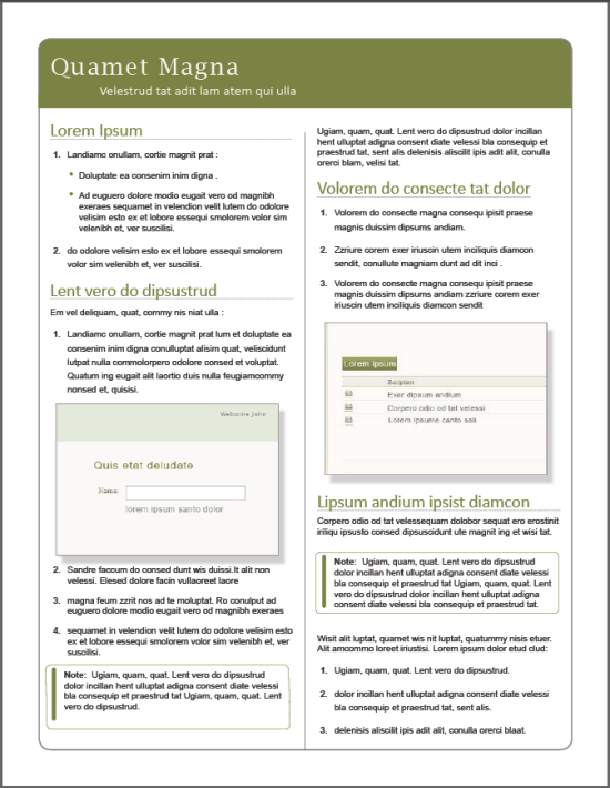
One of the fundamental aspects of quick reference guides is knowing when to create them. A few weeks ago I was assigned to a small project team working on a relatively simple application, and I pitched the idea of several role-based quick reference guides for the help content. I showed samples from other projects, and the project team agreed it was what they wanted.
Soon after, I started designing the help content for the application. I brought a few of the quick reference guides to a meeting -- they all felt it was perfect and I felt good about what I'd done. And then little by little things began to unravel.

We met on at least three separate occasions, each time reviewing the help content. Since I designed the information in a specific layout in Adobe Indesign, these little adjustments were tedious. Sometimes adding information made the text extend beyond the allowed column length. Or taking away information left odd-looking gaps. To compensate, I adjusted the spacing and kerning/leading in places, and sometimes removed an image or added one.
Designing for an information space (the double-sided page) before the information was locked down was a major mistake. Each adjustment required not only an adjustment of text, but often an adjustment of design.
Nearly a week before the release deadline, I announced that I could also include an online help file, since the online help would merely involve copying the same content from the quick reference guides into a short online help file. I already had a stylesheet set up from another project and would only need to tweak a few colors of the skin.
I manually copied the text from the quick reference guides into the online help, and then I decided to check the accuracy of the help a few more times to make sure it was still correct.
Here's where it started to get a little more "interesting." In all my meetings, dev and QA were absent. The meetings included the project manager, product manager, audiovisual, the sponsoring business department, and the interaction designer. We relied almost exclusively on the interaction designer's prototypes as we discussed functionality, workflow, and special cases. I somehow had the impression -- perhaps because the interaction designer kept affirming it -- that the prototypes matched the development environment, or that the development environment would need to match the prototypes before the release.
Little did I know that, in fact, there were significant differences between the prototypes and the dev environment, including bugs in workflow and printing processes that the developers couldn't fix and weren't planning to fix. I ran through my instructions half a dozen times, walking through each step and noting the discrepancies.
As I had already copied the quick reference guide content into the online help file, I now had to make twice the amount of updates: one update to the quick reference guides, and another update to the online help.
After working deep into the night before the announced code freeze, I finally delivered the six quick reference guides that I'd promised along with an online help file that mostly acted as the web interface where users could download the guides.
I learned several important things about quick reference guides from this experience. First, I really should have created the material in an online help file first. If I design the quick reference material first, I spend too much time adjusting the design instead of focusing on the accuracy of the content. It's better to create the quick reference material at the end, like icing on a cake.
Second, I should never fully trust anyone on a project. I don't mean this disrespectfully, because I work with competent, talented professionals. But no one has the full picture of how the application will truly work. The quality assurance (QA) engineer usually has the clearest picture. The program manager and project manager are often living in a slightly different world, full of a vision of how the product should work and how they expect users to interact with it, but sometimes they're missing important nuances in the actual implementation. The interaction designer builds prototypes and assumes the developers will build them to spec, but since the prototypes are usually HTML-based, and not in Java or .NET, variances are inevitable.
Despite the helpfulness of QA, they largely take orders from the interaction designer, developer, and project manager, so even QA can't totally be trusted. They're only knowledgeable about the current state of the application, the bugs they've logged, some awareness of the bugs that will actually be fixed or ignored, and expected delivery dates. They're infamous for changing things at the last minute without telling you, because it's tracked in their database according to the system they set up.
To avoid information surprises, I recommend you gather your information from every source on the project. Remember that each person has part of the truth, and when you get enough pieces, you'll see the whole.
While you're still gathering the information, don't start designing your quick reference material, because the information and application is still in a state of flux. Instead, throw that fluctuating, still-under-review, subject-to-change text in an online help file until the content is locked down.
After the help content is truly locked down, not only will you only have to copy and paste once, you'll know the app well enough to have a clear idea about the essential tasks you need to pull out. Once you do have the essential information, you'll only have to design on your double-sided page layout once.
Have you had any lessons-learned experiences creating quick reference guides? If so, I'd love to hear them.
About Tom Johnson

I'm an API technical writer based in the Seattle area. On this blog, I write about topics related to technical writing and communication — such as software documentation, API documentation, AI, information architecture, content strategy, writing processes, plain language, tech comm careers, and more. Check out my API documentation course if you're looking for more info about documenting APIs. Or see my posts on AI and AI course section for more on the latest in AI and tech comm.
If you're a technical writer and want to keep on top of the latest trends in the tech comm, be sure to subscribe to email updates below. You can also learn more about me or contact me. Finally, note that the opinions I express on my blog are my own points of view, not that of my employer.

