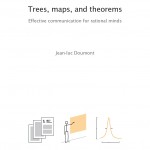
Page Layout and Design Tips from Jean-luc Doumont's Trees, maps, and theorems

I'm currently reading Trees, maps, and theorems: Effective communication for rational minds, a new book by Jean-luc Doumont. The reason I wanted to read the book is for Jean-luc's expertise in visual design and page layout, because I thought it could help me design better quick reference guides. Although very little of the book deals with design and is more geared toward engineers (the "rational minds"), he does address page layout and intuitive design in a couple of sections. Here are a few passages of advice:
- "Leave more distance between unrelated items than between related ones." For example, headings should be close to the text they belong to, rather than equidistant between the last section and the new section. (This principle is termed proximity in Robin William's Non-Designers Design book.)
- "Be visually consistent: format identical items identically, similar items similarly, different items differently." This helps the reader understand and predict the relationships between the various information units at a glance.
- "To indicate hierarchy, display more prominently those items that rank higher or that are more important." Again, in other circles, this would be the principle of contrast.
- "Make sure that each page guides the readers visually along a useful reading sequence or, alternatively, that it gives a clear picture of possible entry points." This principle is especially important. A document without a clear focal point for readers can lead to a confusing design, such that you look at it and you're not sure where to begin because you're eye is drawn everywhere and nowhere (p.73).
Jean-luc's book has a unique page layout itself. The format is large-print (hence the excessive cost of the book, $99). Each section is usually contained in one bifold spread (by that I mean across two full pages). But you read each spread from right to left. Two columns are on each page. The right column on the right page contains a general explanation of a principle. The left column on the right page contains a minimal graphic. The right column on the left page contains more practical application of the information. And the left column on the left page contains Q&A about the topic. Here are a few sample pages. It's a weird structure, I have to say. There isn't much flow from page to page, and I'm not used to reading from right to left. Still, it is consistent.
In "Achieving simplicity and harmony" (p.75), Jean Luc argues that with formatting, writers should use "a healthy dose of self-restraint" instead of indulging in the many layout possibilities that desktop publishing software offers. He recommends black for type color and white space as a principle means of adding contrast. "To make a piece of text stand out," he says, "just set it apart: increase its distance from other items, thus surrounding it with space."
Jean-luc also recommends using a single type-face with a couple of type sizes rather than multiple type faces: "Select faces within one family, as these were designed to work well together" (p.74). And he encourages left alignment of the text, with other objects below it aligned along the same left edge. You should only make the decision to justify the text if you prefer a more formal look and if the text blocks "align nicely with the other items on the page" (p.74).
Here I have to pause and make a small comment about a strange, almost OCD quality of the book. Every paragraph of Jean-luc's book not only has justified text, but the last line of each paragraph ends perfectly justified as well, so that each paragraph is an exact rectangle, but there isn't much extra spacing between the words at all. At times the content seems to have been written to fill a perfect block form. He doesn't address this preference of his, but I remember some discussion about it at a presentation he gave at the STC Summit a few years ago.
As for color, he recommends minimalism as well: "Unless you master color design, use few colors, perhaps just one (besides black) in a few tints. Design the page in black and white first, then apply color in touches wherever it adds value" (p. 72). His book's design illustrates this principle. Drop caps are orange, graphics are grey with a tint of orange, the sidebar is shaded gray, and everything else is regular black, with ample space in the margins.
Finally, he recommends avoiding underlining, bold formatting (within paragraphs), uppercase, and unusual fonts. Overall, Jean Luc is a design minimalist, preferring few colors and fonts and a consistent, simple page design.
As for the question of whether to design the layout before or after writing your content, Jean-luc says, "Logically, a text must have been drafted before it can be formatted, so drafting appears before formatting …. Still, the format might pre-exist or be designed before the text is drafted. Layout constraints, as on the length of texts, should be identified early, so the texts can be optimized accordingly" (p.72). In other words, you write before you apply format and design. However, it's a good idea to know the constraints of your design before you start writing.
That's about the extent of the discussion on document design. (He does have a lot to say about the structure and organization of content, such as putting your conclusions first and providing a table of contents, but that wasn't my primary interest.) Overall, Jean-luc feels that advanced page layout, with multiple colors and font faces and a complex structure, more often than not comes across as amateur and conveys "visual cacophony" rather than an appealing layout. He prefers to minimize the "signal to noise ratio" by adding as little ink to the page as possible to thereby increase the focus on the content.
In buying the book, I failed to realize that I don't fit the category of "rational minds." The book should really be titled something like "Structure, diagrams, and reports: writing principles for engineering and science students." The trees, maps, and theorems part is merely a cute way of saying this, or referring to hierarchy, table of contents, and conclusions. Most of the advice in the book addresses the situation of the engineer, who must write reports, give presentations, include charts and graphics, and create other engineering documents. It is not for people creating help materials, although there is occasional overlap.
Some sections are particularly geared towards engineers. Talking about charts, Jean-luc says "a slope (a ratio of two variations) is more accurate viewed as a direct linear representation of the first derivative" (p.129). Derivatives? Reminds me of calculus classes I took years ago.
Talking about the idea number for lists, he writes, "Four is a square (22): it is a combination of two binary options. Four is therefore a useful number of answers for rating scales (++/+/-/--), as it embodies a cascade of two binary choices: first, is it rather positive or negative; next, is it a little or a lot" (p.21). Huh? Are we talking about bulleted and numbered lists or quantum mechanics?
Given the engineering audience, one can't hope for too much style and flair in the prose, but it reads like a college textbook, outlining basic principles in a flat way. It is too focused on "clarity, accuracy, correctness, etc." (p.79) to make for a fun or engaging read. The start and stop motion of each bifold spread may make it accessible at any entry point, but it also gives you no lure to move from one section to another.
However, if you happen to be teaching a class on writing for engineers and scientists, this book might be just what you need.
About Tom Johnson

I'm an API technical writer based in the Seattle area. On this blog, I write about topics related to technical writing and communication — such as software documentation, API documentation, AI, information architecture, content strategy, writing processes, plain language, tech comm careers, and more. Check out my API documentation course if you're looking for more info about documenting APIs. Or see my posts on AI and AI course section for more on the latest in AI and tech comm.
If you're a technical writer and want to keep on top of the latest trends in the tech comm, be sure to subscribe to email updates below. You can also learn more about me or contact me. Finally, note that the opinions I express on my blog are my own points of view, not that of my employer.

