Less Text, Please: Contemporary Reading Behaviors and Short Formats
Yesterday I had a meeting with some managers about a series of quick reference guides that I had been preparing. If you remember, much of my callout post referred to a strategy about callout design. It was the same project. (The team actually went with bubble callouts rather than my minimalist callouts, but that's another story.)
During the meeting, as the team looked at the callouts on the quick reference guides, they felt there was too much text. Reduce the text, increase the font, they said.
Reduce the text? Make it even shorter? The content was already a two-page quick reference guide. Were we now to make it a postcard?
I get this feedback a lot. Hand any help material to a non-writer in a meeting, and the request I routinely hear is to make it shorter. Too much text. People aren't going to read this, they say, as if they were expecting to take in the entire content with a five-second glance.
My experiences lead me to wonder about the possible transformation of reading experiences, and if reading is still the same in our online age. When you add in the immediacy of online content, hyperlinks, mobile formats, RSS feeds, and endless information, do people still read in the same way? And if people read differently today than they did 50 years ago, how do we change our help deliverables to fit contemporary reading patterns?
Attention Spans
Probably the most radical argument about shifted reading behaviors comes from Nicholas Carr, who asserts that Google has rewired his brain, reduced his attention span, and given him more superficial reading habits, including some fidgeting. In short, Carr thinks that Internet content has made him “stupid.” In an article in The Atlantic, Carr explains,
Over the past few years I've had an uncomfortable sense that someone, or something, has been tinkering with my brain, remapping the neural circuitry, reprogramming the memory. My mind isn't going—so far as I can tell—but it's changing. I'm not thinking the way I used to think. I can feel it most strongly when I'm reading. Immersing myself in a book or a lengthy article used to be easy. My mind would get caught up in the narrative or the turns of the argument, and I'd spend hours strolling through long stretches of prose. That's rarely the case anymore. Now my concentration often starts to drift after two or three pages. I get fidgety, lose the thread, and begin looking for something else to do. I feel as if I'm always dragging my wayward brain back to the text. The deep reading that used to come naturally has become a struggle. (Is Google Making Us Stupid?)
In other words, rather than sitting down with a book and immersing himself in it, drowning out the world around him as he drinks in page after page, he now gets restless after a few pages. His attention span compels him to turn somewhere else, to read from a different author or source. His reading experience is much more cursory and shallow, thanks to the Internet.
Steven Johnson also argues a similar point in the Wall Street Journal. He has the epiphany while sitting alone in a restaurant in Texas. He argues that the deep, immersive reading experience evaporates with the ability to immediately view or download any content, almost anywhere. Johnson writes,
Because [print books] have been largely walled off from the world of hypertext, print books have remained a kind of game preserve for the endangered species of linear, deep-focus reading. Online, you can click happily from blog post to email thread to online New Yorker article -- sampling, commenting and forwarding as you go. But when you sit down with an old-fashioned book in your hand, the medium works naturally against such distractions; it compels you to follow the thread, to stay engaged with a single narrative or argument. (How the e-Book Will Change the Way We Read and Write.)
In other words, the shift from print books to online content, in which every page is linked to another page, in a giant web of connected content, has given readers a lack of patience. They can't remain on one narrative thread for long periods of time. They instead jump around. They sample and move on, they glance and click. No one sits down to eat a long literary dinner any more.
Hyperlinks
One main enabler of the short, cursory attention span is the hyperlink. At the last STC Summit, Ginny Redish and Kathyrn Summers noted how the hyperlink becomes an obstacle for low-literacy users, causing them to click links randomly and lose their train of thought. Each hyperlink presents a forking path for the reader, presenting the reader with the decision to click elsewhere. If a reader is slightly bored, the temptation to move on to greener web pastures is often too much, regardless of the literacy level.
Smart Phones
Smart phones also contribute to the shift in reading behaviors. The smaller display and screen real estate on a smart phone, as well as the smaller font of the text, strain reading. But the portability of the smart phone compensates for the strain in an overpowering way, so that the reverse is also true: people read more, at least according to Peter Collingridge, a publisher of Enhanced Editions software for the iPhone.
Collingridge says that “People aren't reading less on mobile devices, they're reading more.” This is because “occasional reading suddenly became so much easier: on the bus, waiting for the tube, opening an app that remembers the exact place you left it for a quick literary fix becomes second nature very quickly.”
Collingridge finds that to deal with his insomnia, he'll read his “iPhone in bed at all hours, without the need for a light” (Reading Wolf Hall on the iPhone).
Collinridge specializes in digital editions for e-books, so perhaps readers are able to enter the deep-focused reading state that Johnson describes, even on mobile. However, on my smart phone, a Palm Pre, I tend to only read RSS feeds. I can move through dozens of feed items relatively quickly, choosing to save good reads through my Read It Later app, which saves posts to Instapaper.
Reading an article longer than 3,000 words gets tiring, and I quickly feel like I'm making my way through Moby Dick. It's a bit harder to jump and skim on the mobile device, because I can only see a two-inch span of the article. Still, I may read more content because I can curl up in my favorite position on the couch or bed and read from a device in my hand. I may lie there reading for an hour or more, but moving from feed to feed, from site to site, often in the dark.
This behavior no doubt turns habitual. Soon my reading pattern is to jump and click, moving from site to site, regardless of whether I'm at a desktop, a laptop, or holding a book or magazine. The smart phone inculcates a new reading pattern in me that favors short text.
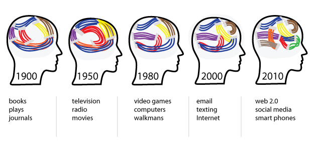
As the following image shows, the shift in media from books to television, and then to video games, Internet, social media, and smart phones, has slowly rewired our brains. We have shorter attention spans. We prefer short texts.

Given this rewiring, perhaps we technical writers should start producing help materials optimized for this type of brain? I'll come back to this idea in a minute. First, a few more arguments about how reading is transformed.
The Blog
In contrast to book authors, the army of daily bloggers cranks out a million short posts a day. One rarely finds a 5,000 word essay to slog through on a blog. And if you do find one, given the average literary skill online, it might not be worth reading carefully. In fact, most blog posts are re-spun cliches or ideas that we've already read or already understand, so skimming this content only makes sense.
Regardless of the content quality, if blogs are the new format for online content, and most are short articles (under 2,000 words), doesn't this new standard for brevity reduce the reader's ability to endure long, book-length texts? The more you read blog posts, the more you expect content to be short. We're surrounded by a culture of content in which short formats are the norm.
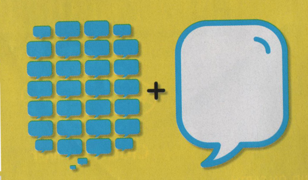
Even critics who defend the intellectual depth of these short formats still acknowledge their brevity. Clive Thompson in Wired says, "The torrent of short-form thinking is actually a catalyst for more long-form meditation" ("The Short and the Long of It," January 2011). His assertion is brilliantly illustrated through this simple concept diagram.

Whether all of these short-form texts aggregate into long-form trends and deeper, more extensive analysis overall is beside my point. I cite Clive here as yet another critic who acknowledges the shift in formats from "long, well-thought-out arguments" to "text messages, tweets, and status updates." These short formats may be micro-components of a collectively intelligent macro discussion. But the mere fact that discussions take place in short formats rather than long ones reinforces the trend I'm highlighting: short texts surround us as the norm.
Tags and Categories
In addition to favoring short forms of content, blogs are also structured with tags and category links, which invite readers to explore content thematically rather than as a whole. Interested in the topic of web design? Click this web design category link and peruse the available articles. Or click the usability tag and see even more specific selections on the topic. Thematic reading often spans numerous articles rather than pointing readers to a single lengthy work. You end up reading an online bibliography or collection rather than a single book.
At my work, we just released a notebook tool that allows users to highlight passages and bookmark articles as they read site content. They can add the content to a folder and tag it. The result is a chopped up bag of short content that provides a litany of quotations, highlights, and article titles on a topic. All short and concise. A reader can move through dozens of sources, sampling each article in very little time. Eventually you'll be able to share your collections with other readers, so readers will no longer be turning to lengthy primary source material for learning. Instead, they'll move through a smattering of individual paragraphs from dozens of sources, all compiled together in a list showing 10 items per page.
So Much Content
Never mind the type or format of content, another cause behind the changed reading behavior is the abundance of content. With a thousand new posts in Google Reader all the time, access to every online newspaper in the world, new podcasts to listen to, email to check, updates to Twitter and Facebook arriving every three minutes in little corners of the screen -- it's no wonder people have short attention spans. There's simply no way to get through the sea of information navigating a sailboat. You need a speedboat to manage the choppy waters, with a strategy to skip and skim as fast as possible.
Lament
Despite the abundance of short text, I still lament the trend. The less I write, the happier my project teams are. If I could deliver everything in a handful of haikus, I would be the most popular writer in town.
Text in this long guide
Reduced to a few callouts
Users jump with joy
The shorter documentation is, the more likely people will read it. But at some point, brevity doesn't translate into simplicity. It translates into obscurity. Knowing the exact point that happens – when text I've shortened lacks clarity and only becomes confusing – isn't always apparent. It depends on the context the reader brings.
The same people who clipped back my copious callouts into a few marketing bubbles would have also pruned this post from 2,000 words to 200. Would that make the text more valuable? Just as there's a balance between simplicity and obscurity, there's a balance between length and learning. More people might read a short text, but a longer text yields more learning. Is there no pleasure in learning anymore?
At any rate, as technical writers, the era of brevity invites us to emphasize short forms of instruction. As such, I present to you, patient reader, a list of the top 10 short text deliverables, optimized for the online reader:
- Quick reference guides
- Screencasts (1-2 minute)
- Visual callout guides
- Role-based guides
- Interactive rollover screen tutorials
- Instructive blog articles
- Online quick reference sites (example)
- Laminated job aids
- Cafeteria table tents
- Standalone diagrams and illustrations
These formats may not be ideal in all situations, but the trend is clear: shorter guides, more visuals, and less text, please.
About Tom Johnson

I'm an API technical writer based in the Seattle area. On this blog, I write about topics related to technical writing and communication — such as software documentation, API documentation, AI, information architecture, content strategy, writing processes, plain language, tech comm careers, and more. Check out my API documentation course if you're looking for more info about documenting APIs. Or see my posts on AI and AI course section for more on the latest in AI and tech comm.
If you're a technical writer and want to keep on top of the latest trends in the tech comm, be sure to subscribe to email updates below. You can also learn more about me or contact me. Finally, note that the opinions I express on my blog are my own points of view, not that of my employer.

