Does Translation Mean You Should Omit Illustrations?
One can hardly dismiss the power of visuals. One of the oldest truisms in communication is that a picture is worth a 1,000 words. Instead of lengthy text, we praise infographics, diagrams, workflows, and other visual illustrations that communicate ideas. (See this collection of New York Times infographics.)
In Visual Language: Global Communication for the 21st Century, Robert Horn's main premise is that the combination of text with visuals creates a powerful form of communication.
The other day a colleague, a graphic designer, told me she doesn't read text on web pages; she moves right to the visual, she said -- proudly.
In short, large blocks of text suck. Visuals rock. (See Nation Shudders At Large Block of Text.)
The Problem
Despite this triumph of visual communication, when it comes to technical documents that need translation, visual communication is problematic. If you're translating the document into 10 languages, every screenshot you use requires translation as well. One screenshot becomes ten. Ten screenshots become 100. One hundred screenshots become 1,000.
And not only do the screenshots need translation, you need access to other operating systems, you need the ability to maneuver around in other languages to produce the scenarios to get the screenshots, and so on. For example, try reproducing an error message screenshot in 10 languages.
Let's say you forego screenshots and instead stick with illustrations only. Although it's possible to communicate basic ideas through wordless shapes, you may end up with the equivalent of Pictionary scribbles. Conversely, if you remove illustrations and other visuals, you end up with a text-heavy encyclopedia.
As such, it seems that technical communicators have the following options:
- Pursue a costly route of image-based text, which may result in attractive but expensive and time-consuming documents.
- Strip out all images and deliver text-heavy documents, which users may despise.
- Deliver documents with mysterious and perplexing wordless shape diagrams.
An Alternative
Let's explore an alternative to this conundrum. If you've ever assembled something from Ikea, no doubt you've marvelled at the wordless instructions that move you from step to step. There are no multi-lingual instruction manuals with Ikea products -- just one global picture booklet.
Holly Harkness explains that the model works "because Ikea builds simplicity into their products from the get-go" (The wordless manual). In other words, wordless manuals work because the products are so easy to assemble, they don't require words.
Recently while assembling an Ikea bookshelf, my wife struggled to understand this particular Ikea picture:

She kept calling headquarters when she should have called the local store, apparently. Upon returning the bookshelf with its defective parts to the local store, the sales clerk asked why she didn't call the store first. My wife had called -- but to headquarters, not the local store.
I doubt the wordless picture model that Ikea adopts could work for all forms of documentation, especially software documentation. But certainly Ikea shows us that it's possible to use wordless visuals to communicate an idea.
(By the way, you can browse Ikea's manuals online here.)
Ikea's Secret?
One hunch I have about Ikea's visual technique is that they use a lot of small pictures in sequence, rather than several large diagrams (see this example).
In the Ikea model, you see about 20 smaller pictures to follow, rather than one or two large diagram-like pictures. Why? Without words, you're forced to simplify the process you're representing. The way you simplify an image is by breaking it into smaller images.
Perhaps the way to incorporate illustrations in documents that require translation is to chunk up the illustrations into simpler images that almost anyone can follow. You may end up with more images, but as a whole the images in sequence can help tell the same story that the single image would tell. (Note: I'm referring to illustrations, not screenshots.)
The Principle of Small Multiples
My hunch about why Ikea's technique works ties in with a principle I read about in Edward Tufte's Envisioning Information (a classic to have on any coffee table). Tufte says one principle of visual information is to show a series of small multiples:
Small multiples, whether tabular or pictorial, move to the heart of visual reasoning--to see, distinguish, choose (even among children's shirts). Their multiplied smallness enforces local comparisons within our eyespan, relying on an active eye to select and make contrasts rather than on bygone memories of images scattered over pages and pages (p.33).
In other words, small multiples force you to compare between the images. In that comparison, you can derive some meaning. The differences tell a story.
To illustrate, Tufte includes the following image, called Color Coordination, which has been redrawn in Tufte's book from Yumi Takahashi and Ilkuyo Shibukawa.

My Own Examples
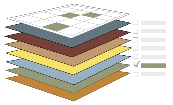
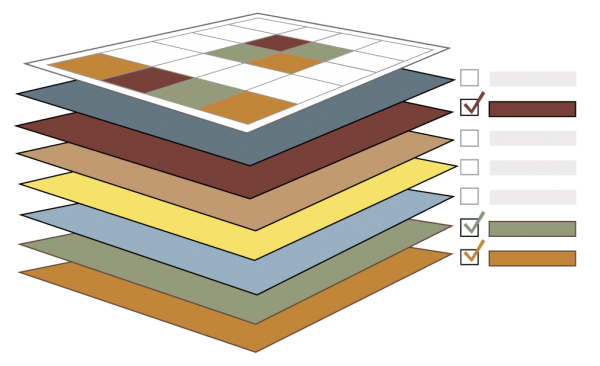
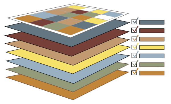
In my own documentation, I've started to move to wordless pictures in sequence as well. Without understanding the context at all, what do you make of the following images? What story are they trying to tell?
By breaking up a single image, which might have been adorned with various callouts and labels, into a sequence of simple images, with slight variety between the images to tell the story, I hopefully communicate an idea without words. This image can be used in documentation in any language, without requiring translation.
Additionally, below each image I could use captions to elaborate on the meaning of the illustration. In the case above, my images are showing the idea of a layered calendar, similar to Google's calendar. You have multiple calendars available, and you can turn the calendars on or off to determine what events show on the main calendar view.
Unless I included a lot of labels and callouts, this image wouldn't work as a single image. But by breaking it into a series of images -- small multiples -- the meaning is clear, even without words.
About Tom Johnson

I'm an API technical writer based in the Seattle area. On this blog, I write about topics related to technical writing and communication — such as software documentation, API documentation, AI, information architecture, content strategy, writing processes, plain language, tech comm careers, and more. Check out my API documentation course if you're looking for more info about documenting APIs. Or see my posts on AI and AI course section for more on the latest in AI and tech comm.
If you're a technical writer and want to keep on top of the latest trends in the tech comm, be sure to subscribe to email updates below. You can also learn more about me or contact me. Finally, note that the opinions I express on my blog are my own points of view, not that of my employer.


