Applying Progressive Information Disclosure to Online Help Navigation
At the last STC Summit, Andrea Ames gave a presentation on progressive information disclosure. If you follow progressive information disclosure, you avoid giving the reader all the information up front. Instead, you present a little bit of information to the reader and then let reader choose to view more if he or she wants.
A classic example is on-screen help text that presents a brief sentence followed by a "Read more" link, which takes the reader to a more detailed explanation on another page.
Many websites follow progressive information disclosure techniques with their navigation. On the top menu of a website, you see a dozen or so main buttons. When you select a topic, the landing page for that topic presents you with many more specific options. Some people differentiate these two types of navigation menus as "main navigation" and "local navigation."
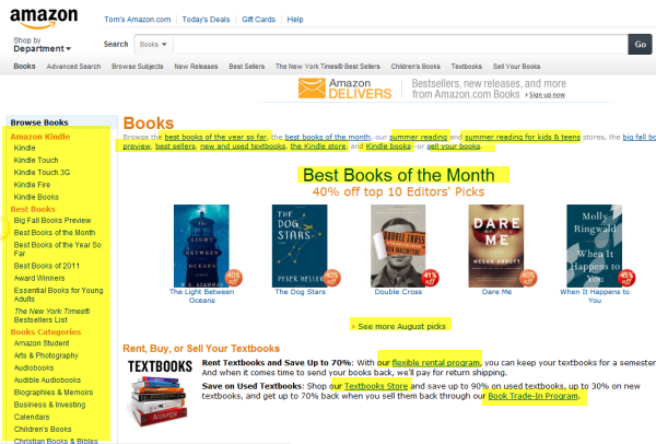
For example, go to Amazon.com. Browse the main topics in the left sidebar. Click Books, and then from the flyout menu, choose Books again.
After selecting Books, you arrive at a landing page that has a lot more granular options relating to books. You can click Best Books of 2011, Summer Reading, Summer Reading for Kids & Teens, Best Books of the Month, Kindle Books, Textbook Store, twenty or more book categories, and many more options (which I've highlighted in the image below)
If Amazon were to present the reader with all of these options up front, on the home page, it would overwhelm the reader. And yet, this is exactly what help authoring tools set you up to do.
Aggressive Information Expansion
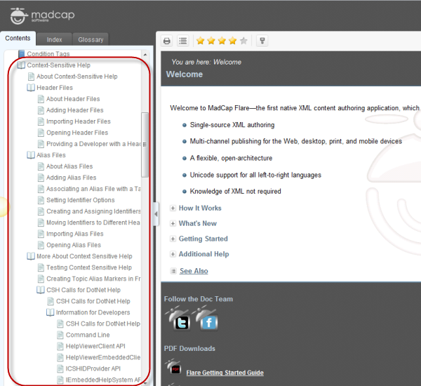
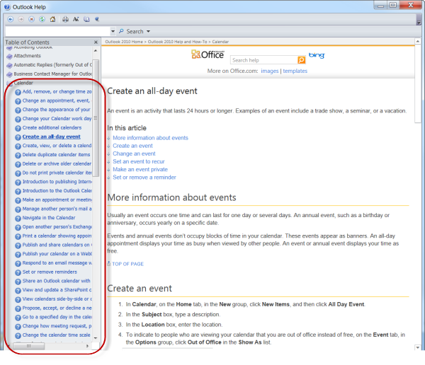
The classic webhelp file presents a table of contents on the left. You expand a book and find additional topics and sub-books inside. You expand the sub-books to view the topics inside of them. Hopefully there aren't sub-sub-sub-books, but sometimes there are.
For fun, open up all the books in an online help file and look over the topics. Rather than following a progressive information disclosure model, webhelp systems follow an aggressive information expansion model.
Here's an example from Flare's help:
And from Microsoft:
(By the way, I am by no means criticizing the help content. Both Microsoft and Madcap have excellent help content. I'm only pointing out that typical webhelp files do not embrace progressive information disclosure in their table of contents (TOC). Instead, we load up our TOCs with all the information we can possibly fit in there, assuming the user will browse for the topic he or she wants among hundreds of options.)
My brother-in-law job-shadowed me the other day at work, and as I opened up all the topics in one of my help files, he said his eyes just glazed over all that information. He said in seeing all those topics, his first reaction was to close that help file and look at it some other time [meaning never].
Presumably, one advantage to presenting the reader with so many options is that the user can quickly navigate to the right topic without wading through page reload after reload, moving to one topic after another to see if the content has answers the user is looking for. Traditional websites don't offer this navigation speed.
But most users get intimidated by a massive table of contents. It makes a help system appear much more complicated than it really is. The intimidation factor alone is enough to consider another approach.
Applying Progressive Information Disclosure to Help
The neat thing about progressive information disclosure is that it tricks readers into browsing and reading more information than they initially set out to consume.
My wife uses progressive information disclosure on our kids all the time. For chores, she asks them to unload 20 items from the dishwasher. Just 20, she will say. So the kids begin to unload 20 items, and before you know it, the kids have unloaded much more than that.
Sometimes it's better if people don't know everything they're getting into.
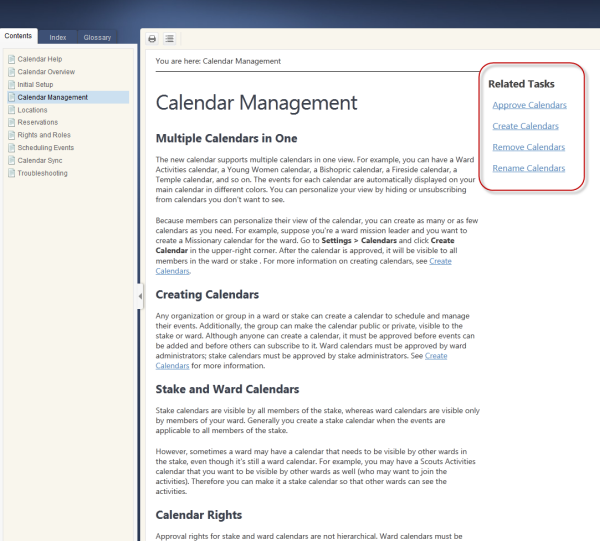
The other day, I tried setting up my help according to a progressive information disclosure model in Flare. I narrowed down the topics to about 10 topics in the TOC (left sidebar). When you click a topic, you see a sidebar on the right that lists tasks related to that topic.
The right sidebar shows information from a relationship table. You only see those topics after selecting a topic from the table of contents on the left.
Unfortunately, this model cuts against the way Flare was designed. Each time I compile the help, I see warnings for topics that aren't listed in the table of contents but are nonetheless linked in the help. It's as if Flare wants me to list everything in the table of contents.
As I fiddled around with this approach, I decided to bag it. My brother-in-law pointed out how the links look similar to ads in gmail. The eye barely notices them. And navigating them felt odd, because with relationship tables, the page you're viewing isn't listed in the table, so the nav options kept changing with each click.
Hotspots
Another technique might be to include more topics as drop-down hotspots on the page itself, taking advantage of jQuery effects to show and hide content.
For example, you could begin the topic with a two paragraph conceptual explanation, followed by a "Read more" link that would expand to show more detail if the reader desired to read it. Below the conceptual intro to the topic, you could have various tasks collapsed in drop-down hotspots.
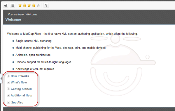
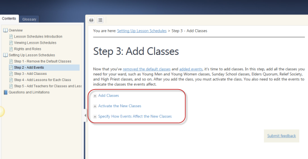
Flare help uses this technique a lot:
And I've also used it in my help:
My brother-in-law preferred this method because it gives readers options to see more if desired. And it doesn't overwhelm the reader with too many topics in the table of contents.
Keeping Information Together
Embedding drop-down hotspots on a page may work better than splitting out the topics as separate entries in the TOC because it keeps the information together. In Designing Web Navigation, James Kalbach says,
Content might not have the same impact or meaning when it's broken up into multiple smaller pages. ... Keeping things together creates a natural relationship between pieces of information. (p.114)
Keeping similar information together helps prevent information fragmentation. Information fragmentation is precisely what happens when you separate information into a million topics in the TOC.
When you over-fragment your help information, the user may land on the page from a search and never realize that the tasks related to a concept are on separate topics from the concept itself, or that the concept lives somewhere other than the tasks, or that one task similar to another task is to be found on another topic.
One of my colleague's pet peeves is to see a help topic that says she can do something but no details on how to do it. The task for the concept lives somewhere else.
Keeping similar information together as a coherent unit helps users navigate to the right place. And hiding that information in hotspots follows progressive information disclosure, since it lets users choose whether they want to read that information or not.
About Tom Johnson

I'm an API technical writer based in the Seattle area. On this blog, I write about topics related to technical writing and communication — such as software documentation, API documentation, AI, information architecture, content strategy, writing processes, plain language, tech comm careers, and more. Check out my API documentation course if you're looking for more info about documenting APIs. Or see my posts on AI and AI course section for more on the latest in AI and tech comm.
If you're a technical writer and want to keep on top of the latest trends in the tech comm, be sure to subscribe to email updates below. You can also learn more about me or contact me. Finally, note that the opinions I express on my blog are my own points of view, not that of my employer.
