
How to get crisp text callouts like in Apple's new Touch bar documentation -- and why you might not want to with translation projects
Checking out the Touch Bar documentation
You can check out the Touch Bar documentation here: Meet the Touch Bar and Touch ID. In particular, take a look at the first graphic (the keyboard with callouts). In the browser, this image is about 400px. However, if you right-click and open the image in a new tab, you see that the full size is much larger, about 1600px.
Why the difference? When you start with a large image and constrain its size down in the browser (by adding a max-width attribute to the image tag), the resolution looks a lot more crisp on a high retina display than a regular display. That’s because the high retina display allows you to pack more pixels per inch.
You won’t really see the difference on a regular monitor, but for fun, I embedded two graphics for comparison below. The first is the graphic at 400px width, while the second is 1600px wide.
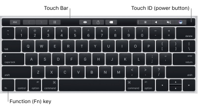
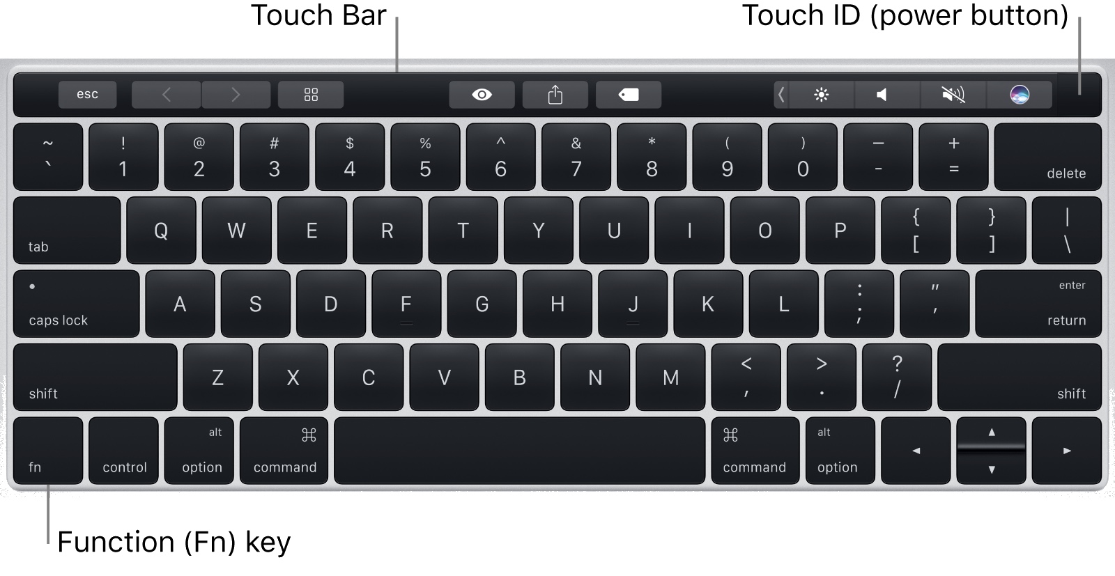
On a regularly 72 DPI monitor, you won’t see much difference between the two. But if you view the same images on a high retina display, which packs in a lot more pixels per inch, the text looks a lot sharper in the second image (with the 1600px original size).
(I also explored this topic in Retina Display and Screen Capture Sizes in Online Help.)
If you aren’t sure how many pixels per inch your monitor has, look at dpilove. My Macbook Pro has 227 pixels per inch, but my Dell monitors have only 166 pixels per inch.
(At my work, I have two flat panel Dell monitors connected to my Macbook Pro laptop. I wish I had a Thunderbolt or 5k monitor instead of the two Dells, but one can’t have everything …)
When I take screenshots, it’s best to take them from the high retina display using Snagit, because Snagit gives me the option to save my screenshot using the pixels captured from the high retina monitor.
(This is one argument for using a high retina display when writing documentation.)
Vector graphics
To take clarity one step further, you could use vector diagrams instead of rasters (for your images with text callouts). Vectors use mathematical algorithms instead of pixels, so the display resizes to fill the width of its container, keeping the sharp, clear edges for your text.
For example, I used vectors in the text callouts for the documentation that I created here. If you right click an image (with text callouts) and open it in another tab, such as this svg image, and then resize your browser window, you can see how the SVG graphic dynamically resizes to fill the space of the container while also maintaining absolute crispness with the text. (Note that the screenshot itself isn’t a vector – just the text callouts.)
With vector graphics, make sure the graphics display properly across browsers. Beyond checking Chrome, Firefox, Safari, Edge, IE 11, and your mobile or tablet devices at hand, you can also use services like Browserstack.com to increase your tests. I recommend this style hack for targeting older IE browsers, which are problematic with vectors.
Although my tests with Browserstack did reveal some gaps in browser support, I’m not too worried. If developers are still using IE 8, they’re not my target audience anyway.
Translation and text callouts
If you’re translating your content, you might not want to use text callouts in your diagrams. With translation, it’s a best practice to put numbers or letters in the callouts and elaborate below the image with a legend. Here are several examples:
- http://psgips.blog24.fc2.com/blog-entry-068.html
- http://news.mynavi.jp/articles/2014/02/10/tiwtter_howto/
- http://www.alchemyschool.com/alch/blog/1080-1080.html
This is probably the best one:

I tried to find some Apple documentation in Japanese to see if they also translated the text callouts or if they used the legend approach. Although I couldn’t find the Touch Bar docs, I did find this pdf, which suggests that they do translate the text callouts.

Without question, putting text near the object it describes increases the immediate readability. However, there’s also a downside to putting text in callouts – you have a limited amount of space. You can’t expand with any more details other than a 1-2 word description. (Apple’s text callout style uses a smaller font than their body font. This smaller size may be to accommodate more text in the allowed space.)
Still, the limited space available in text callouts makes them less readable. You end up giving items just a name rather than providing both a name and some explanatory detail.
Additionally, because the text callouts usually stick out on the left or right, you have to shrink your image size smaller to fit it into the allowed space (or you extend your callouts vertically as with the Apple example). If you have more than 5 or 6 text callouts, you have to get creative in drawing lines to the various regions. (With number or letter references, you also have draw lines to regions, but you aren’t as constrained by the limited space.)
Bright accent colors such as red, orange, or magenta are often used for the callout liness – these colors usually stand out against the main background of a user interface. Apple’s choice of gray for callout lines makes the lines a bit quieter, but this color will become problematic when the UI consists of gray tones. Lines that cut across the image often need a white stroke to stay visible.
When it comes time to translate the image, if the text is stored in the image file itself, you’ll have to either extract the text into a standalone file or send the image file to the translator with some kind of denotation about which callout will refer to which translated name.
Additionally, when you get the file back, you’ll have to re-align all of the text because no doubt the translated text will require adjustments with alignment and spacing. Overall, putting text in callouts greatly increases the difficulty of translation.
For all of these reasons, it’s just best to use the legend approach with callouts when you’re translating your content.
About Tom Johnson

I'm an API technical writer based in the Seattle area. On this blog, I write about topics related to technical writing and communication — such as software documentation, API documentation, AI, information architecture, content strategy, writing processes, plain language, tech comm careers, and more. Check out my API documentation course if you're looking for more info about documenting APIs. Or see my posts on AI and AI course section for more on the latest in AI and tech comm.
If you're a technical writer and want to keep on top of the latest trends in the tech comm, be sure to subscribe to email updates below. You can also learn more about me or contact me. Finally, note that the opinions I express on my blog are my own points of view, not that of my employer.