Leaning Towards Longer Topics and Shorter TOCs
Everyone knows it's a good practice to chunk your help material into discrete topics, but how granular should you chunk it?
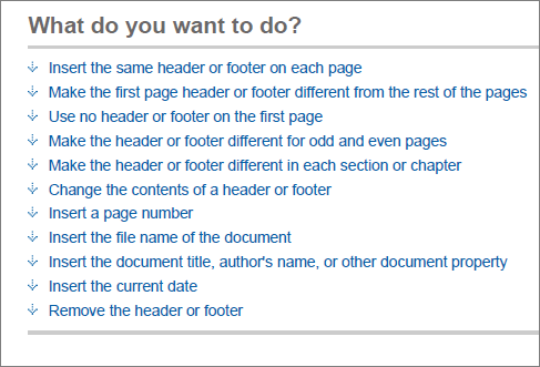
Take a look at this Microsoft Word 2007 help topic on inserting headers and footers.
Although inserting headers and footers is the main task, the topic really has 11 related tasks:
- Insert the same header or footer on each page
- Make the first page header or footer different from the rest of the pages
- Use no header or footer on the first page
- Make the header or footer different for odd and even pages
- Make the header or footer different in each section or chapter
- Change the contents of a header or footer
- Insert a page number
- Insert the file name of the document
- Insert the document title, author's name, or other document property
- Insert the current date
- Remove the header or footer
The author could have created 11 separate topics. Do you agree with Microsoft's decision to group all of these subtasks into the same topic? Or would you rather explore each subtask as a separate topic in a table of contents?
Although the practice of single sourcing encourages chunking of tasks, if you won't be reusing the subtasks or related tasks independently, there's little reason to separate them out into discrete topics. Forcing all of these subtasks into separate topics would severely bloat the table of contents (TOC), rendering it not only less usable, but also more intimidating. Your application's apparent complexity would magnify.
Separating each subtask into its own topic often forces users to click in a non-linear pattern from topic to topic as they search for the right task. This nonlinear clicking can give users a headache. It's part of the reason why reading online is more strenuous than reading a book. Books provide more of a hierarchical layout and logical progression of ideas. In contrast, the web is a scattered maize.
Consolidating subtasks into one topic also improves the user's ability to find topics. With fewer topics in the TOC, the user can actually browse the TOC and find the right topic. But even if the user reverts to keyword searches, the longer topics will have greater keyword density and more likely rise to the top in search results.
I sent a question across Twitter the other day asking whether anyone had done research into this issue, and Brenda Huettner pointed me to a Web Usability Guidelines reference book. Chapter 8 echoes Brenda's response that "it depends." The authors say that older people are slower at scrolling, but comprehension may be better because the user remains on the same page. Here's an excerpt:
Guideline: Use longer, scrolling pages when users are reading for comprehension.
Comments: Make the trade-off between paging and scrolling by taking into consideration that retrieving new linked pages introduces a delay that can interrupt users' thought processes. Scrolling allows readers to advance in the text without losing the context of the message as may occur when they are required to follow links.
However, with pages that have fast loading times, there is no reliable difference between scrolling and paging when people are reading for comprehension. For example, one study showed that paging participants construct better mental representations of the text as a whole, and are better at remembering the main ideas and later locating relevant information on a page. In one study, paging was preferred by inexperienced users.
Sources: Byrne, et al., 1999; Campbell and Maglio, 1999; Piolat, Roussey and Thunin, 1998; Schwarz, Beldie and Pastoor, 1983; Spool, et al., 1997; Spyridakis, 2000.
In other words, each time a page loads, you interrupt the user's thought process. By remaining on the same page, the user can better grasp the concept as a whole.
Thanks for the resource, Brenda! In the studies, the content consisted of web pages rather than help material. Some of the examples for scrolling depict long, sophisticated pages -- quite a bit more hairy than the Word example above. Still, I agree with the general findings and think they apply to help authoring.
My colleague Ben Minson, however, raises an important objection to long topics. He says,
In reality, people don't want long topics. They want to think that procedures are short and simple. Long topics intimidate people and make them reluctant to consult the documentation in the future. ("Long Topics: A Help Author's Crime Against Humanity")
I agree that no one wants to be confronted with a massive topic when all they need is information to complete simple task. However, adding a quick topic menu at the top, similar to the following image, seems to solve that problem, doesn't it? The user can jump immediately to the relevant topic, rather than meticulously scrolling down and checking each heading.
Overall, in my experience, it's easy for a help's TOC to grow successively larger as you think of more and more scenarios, possible tasks, and concepts to explain. But if you reach the end of the project and see that your initial 50 topics have grown to 250, I think something's wrong. Most applications aren't that complicated. When users expand the TOC and find a seemingly infinite number of topics, it's the equivalent of the disheartening "thud" from a long printed manual.
About Tom Johnson

I'm an API technical writer based in the Seattle area. On this blog, I write about topics related to technical writing and communication — such as software documentation, API documentation, AI, information architecture, content strategy, writing processes, plain language, tech comm careers, and more. Check out my API documentation course if you're looking for more info about documenting APIs. Or see my posts on AI and AI course section for more on the latest in AI and tech comm.
If you're a technical writer and want to keep on top of the latest trends in the tech comm, be sure to subscribe to email updates below. You can also learn more about me or contact me. Finally, note that the opinions I express on my blog are my own points of view, not that of my employer.


