Arguments for and Against Tripane Help
My colleague Ben Minson wrote a post about why tripane help is a relic of the book-paradigm documentation age, and how it can limit us from taking advantage of other web technologies. See Why I Don't Like Tri-pane Help.
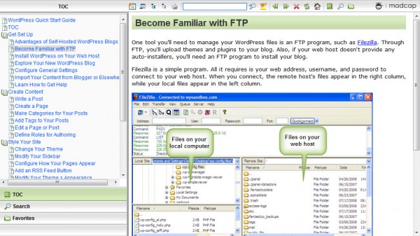
As a quick definition, tripane help is the standard webhelp HTML output that has several frames -- the table of contents pane on the left, the main topic area in the middle, and a pane across the top. For example, here's a sample tripane help I created a couple of years ago for WordPress:

I agree with Ben's arguments that discourage tripane help, and yesterday I even wrote somewhat of draft rant titled "Rest in Peace, Tripane Help." But as it was still in draft mode, I mulled it over. I also listened to a Scriptorium webinar on DITA Best Practices by Tony Self, which helped me see another side of the argument. In this post, I want to present a more balanced argument for and against tripane help.
Cons of Tripane Help
Let's start with the cons of tripane help.
Hard to modify. Have you ever tried to modify the look, feel, or functionality of tripane help? It's usually a complicated undergrowth of impenetrable frames and custom code. Hacking RoboHelp's webhelp, for example, requires you to dive into arcane tips and tricks from sites such as Rick Stone's RoboWizard, which still looks, with its outer space background, like websites did back in 1995. Rick's site itself is an example of tripane help.
Flare gives you finite control over the style of each element, but not over the larger structural elements. What if I don't want frames? What if I want the main search engine on the home page? What if I want the sidebar on the right, with drop-down submenus that slide out? Why can't I just code it with a separate CSS file from scratch like a regular website, choosing what I float, choosing the behavior of my navigation buttons, etc?
Overall, tripane help is hard to modify because of the extensive frameset and proprietary code.
Looks outdated. Although you can tweak its styles here and there, you can't make tripane help look like a regular website. It just doesn't fit in with anything on the web that you find post-2005.
The more we move into the future of the web, the greater the divide grows between tech comm and interaction design. That divide worries me. When people see a tripane help site open up, it immediately signals a sense of outdatedness.
Lacks web functionality. It's not just about the limitations of tripane help's look and feel, though. It's also about web functionality: RSS feeds, comments, embedded videos, lightboxes, jQuery effects, real-time editing, browser-based authoring, built-in metrics, category links, tags and tag clouds, most popular articles, faceted browsing, instant search, search engine optimization, threaded conversations, and so on. You don't get hardly any of this with tripane help. Ouch.
By confining our HTML deliverable to the rigid tripane help, we become distanced from the forward movement of the web. We become publishers of HTML content but without any of the slick knowledge of web design or interaction design.
Keeps you in book paradigm mode. As Ben points out, we also get stuck in a book paradigm mode, where the only idea we can come up with for organizing our help content is a bunch of topic folders. Ben points out:
One of the limitations of a TOC is that you can display only topic titles. If you set up pathway pages like Redish describes, you can give the reader more guidance. A risk you take with TOCs is that as the user doesn't find what he wants, he expands more and more books or folders, and he ends up with an overwhelming list of topics. Instead of holding his hand and leading him along, you've paralyzed and frustrated him.
In my experience, help authoring tools don't lend themselves to dynamic Web outputs that allow you set up this kind of guided experience. You could do it, but it's not supported well out of the box.
Limits your technical creativity. When we get comfortable with a tool that allows us to publish tripane help, we get locked into whatever built-in features and capabilities the help authoring tool allows. Sometimes we can hack in tweaks and other modifications, but it's usually not worth the hassle. What happens when we want to try leveraging some of the more web-like features to improve our help, such as faceted browsing or instant search? Because we have confined our technical prowess to a specific tool, we're not equipped to be more creative and innovative with new approaches to help. We become dependent on tool vendors for innovation.
Pros of Tripane Help
Now for the pros of tripane help.

Allows you to focus on content. In the Tony Self DITA webinar, Self stresses that the paradigm of DITA authoring is to separate content from format and design.
In the DITA model, an author creates a standalone topic that is independent of any particular book or format. This standalone topic can be pushed out into any deliverable or any table of contents and stand on its own. Because of this, the DITA writer doesn't worry about styles or design. The DITA writer can focus on the content, because after all, this is what ultimately matters.
Tripane help allows you to avoid worrying about format and design. You don't have to consider the details of the CSS and the look and feel of the content in the web output. Someone has already taken care of that. The design has already been created, and you can redirect this effort that you would normally spend on design and apply it to your actual help content (perhaps creating illustrations and other content diagrams, if you still have an itch to design something).
Most users don't complain about the design of help anyway. They complain about the poor content, right? So doesn't it make sense to focus on content rather than design?
Allows variety of classification schemes. At first, it seems that you can only create a topic-based hierarchy for your table of contents (TOC) in a tripane help. The tripane help seems to force you into a book paradigm. But this is only convention. You could abandon the traditional TOC approach and instead organize the content by audience, by timeline, by most popular support requests, or some other scheme.
A lot of tools that produce tripane help have tagging, relationship tables, and other techniques for applying non-traditional organizations. In fact, these tools may even make it easier to manipulate the content in alternative ways.
With the robust TOC that tripane help offers, you could build these alternative entry points directly into the TOC, giving users several different ways to navigate the content -- by task, by role, by workflow, by popularity, by department, by feature release dates, and so on. Tripane help gives you an easy way to do this, rather than relying on a web team or a JavaScript/interactive designer to help you code these features.
Provides content re-use, localization, single sourcing. Although these benefits aren't specific to tripane help, using a tool that auto-compiles to a tripane help output usually gives you additional advantages with content re-use, localization, and single sourcing. You can conditionalize content for various role-based, versioned, or beginner/advanced types of guides. You can package all your files up and send them off for translation, and then reimport them. You can single source your content into print and online and mobile deliverables.
Sure, a web 2.0 site looks cooler, but is it worth the sacrifice of content re-use, localization, and single sourcing, which may be much more important for technical documentation needs? All of these additional benefits are usually available if you stick with tripane help instead of abandoning it for a web-based content management system.
Conclusion
One of the potential fixes for the tripane help eyesore, without losing the benefits, is to have the help authoring tool output its content into div tags that you can use to structure and style as you wish. If you can escape the traditional tripane look and generate a more attractive website, you can move towards the best of both worlds.
Unfortunately, tripane help has helped contribute to a growing divide between interaction designers and technical writers. So even if you could structure your output with div tags, most technical writers lack these web design skills. They've been limping along with the tripane output for so long that even basic HTML is often an unexplored territory.
Additionally, most technical writers aren't familiar with any other information architecture techniques outside of basic topic-based hierarchies, so they may not feel a need to innovate with alternative organization patterns.
About Tom Johnson

I'm an API technical writer based in the Seattle area. On this blog, I write about topics related to technical writing and communication — such as software documentation, API documentation, AI, information architecture, content strategy, writing processes, plain language, tech comm careers, and more. Check out my API documentation course if you're looking for more info about documenting APIs. Or see my posts on AI and AI course section for more on the latest in AI and tech comm.
If you're a technical writer and want to keep on top of the latest trends in the tech comm, be sure to subscribe to email updates below. You can also learn more about me or contact me. Finally, note that the opinions I express on my blog are my own points of view, not that of my employer.


