Using Treejack as a Method for Evaluating Your Help's Navigation
Recently, at my request, one of my user research colleagues did some usability testing on a webhelp file. He did what's called a “treejack,” which is a method that asks users to identify the place in a navigation system they would go to find a topic.
For example, if you were trying to figure out how to schedule a projector on a calendar (to use a scenario from my treejack), where would think you would find it in the navigation tree? The user then navigates a series of labels to drill down into what he or she feels would be the location.
The method is called a "treejack" because Treejack is the name of the online tool from Optimal Workshop. (I'm sure there's a more general term for the activity.)
While you could do this same usability test using a series of document folders (nested inside each other), the treejack shows you the unsuccessful paths that participants follow. What I've learned is that users have a lot of success when the labels are clear, but when you have vague navigation labels, such as "Managing Calendars," where a lot of different tasks and topics could be grouped, success rates decline. Words that have subtle distinctions in meaning, such as scheduling versus reserving, also mislead users.
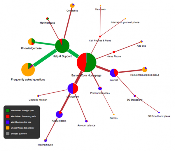
Here's what a sample treejack output looks like. This is a graph from the Optimal Sort site:

As I looked down the treejack paths to see where users clicked, I could see the logic that would lead a user to think the topic would be organized in that folder. For example, in my treejack, setting up and migrating calendars could have been grouped under Getting Started (it wasn't), just as “turning off the old calendar,” a somewhat random miscellaneous topic, could have been grouped under FAQs (it wasn't).
The problem with organizing help is that words have so many nuances and subtleties, they can be used in a lot of different ways. There are shades of meaning, words that accommodate multiple definitions. Using general terms such as "managing," "viewing," or “working with…” leads to a variety of topics that the folders could contain. Only when words have unmistakably singular meanings do users navigate to the right topic in the navigation tree almost every time.
Naming Conventions for Concepts and Topics
Another challenge users faced is how to distinguish between concepts and topics. In navigating the webhelp tree, it wasn't clear to users if a topic was conceptual or task-based. In my content model, I start the first topic of each help folder with a conceptual topic, phrased as a gerund (“Managing the calendar”). I include the bulk of that folder's conceptual information on that folder's conceptual topic, and then let all sub-topics in that folder be tasks. I do this because I found that separating each concept out into its own help topic bloats the help and makes it seem unnecessarily complex.
For tasks, I use the imperative form (“Create a calendar,” “Approve a calendar”). I do this partly because I've found that the imperative form is much more search friendly. When searching for words, most users type active keywords that express what they want to do – for example, “create a new calendar.” Users rarely type “creating a new calendar” if they're looking for information on how to create a calendar. However, the help engine in many webhelp files (such as Author-it) doesn't interpret “create” and “creating” as the same form of the word. Only words that have matching stems (“edit” and “editing”) are treated as the same keyword.
Regardless, this distinction between gerunds for concepts and imperatives for tasks wasn't clear to users. I could preface concept topics with “About,” perhaps. But as the landing page for the webhelp folder, my page usually matches the folder name. So unless I want “About” included in every help book title, I tend to omit it.
I'm curious to know if others have adopted a standard convention for distinguishing between task and concept topics. If so, I would be interested to hear what it is.
As always, the usability study opened up my eyes to a lot of the difficulties inherent in organizing help. There's a reason why users often can't find what they're looking for, and it's not just a matter of organization. It's due to the slippery nature of language. Perhaps I need to think about ways to make language more exact, to shy away from words with vague meaning. I also need to provide more abundant cross-references in various topics to redirect users toward the "right" path.
About Tom Johnson

I'm an API technical writer based in the Seattle area. On this blog, I write about topics related to technical writing and communication — such as software documentation, API documentation, AI, information architecture, content strategy, writing processes, plain language, tech comm careers, and more. Check out my API documentation course if you're looking for more info about documenting APIs. Or see my posts on AI and AI course section for more on the latest in AI and tech comm.
If you're a technical writer and want to keep on top of the latest trends in the tech comm, be sure to subscribe to email updates below. You can also learn more about me or contact me. Finally, note that the opinions I express on my blog are my own points of view, not that of my employer.

