Using the Proximity Principle to Design Online Help Navigation
One of my favorite books on design is Robin Williams' The Non-Designers Design Book. The book provides advice on graphic design more than anything else, but at least one principle applies to information design as well: Proximity. The Proximity principle says you should group similar content together.
Items relating to each other should be grouped close together. When several items are in close proximity to each other, they become one visual unit rather than several separate units. This helps organize information, reduces clutter, and gives the reader a clear structure. (p.13)
In designing a business card, for example, you should probably put your address information in the same place. It would look odd to put your street on the left, your state on the right, and your zip code at the top. We expect to see like content appear in approximately the same location.
In designing information, we follow the same principle, right? We group our help topics into similar books so the reader can find the information. Some topics may share properties with other groups, somewhat like the platypus shares properties with mammals, birds, and reptile classes. But by and large we can roughly organize content into similar groups.
The problem is that even if topics are grouped in the same book in a table of contents (TOC), users don't often navigate using the TOC. They navigate through keyword searches, cross-reference links, and context-sensitive links from within an application. Navigating outside the TOC, the content no longer appears grouped together, as it was initially designed.
When you break content up into multiple topics, you lose some of the proximity that good information design would exemplify. At the worst, users may perceive the help topics to be fragmented, isolated from each other, and scattered about.
Rather than grouping content in books in the TOC, we could also group topics another way: on the same page. Instead of using the TOC as the main method of navigation, we could use the TOC to list a series of concepts, and then group all the subtopics related to each concept on that concept's homepage. This way, the user always sees similar content together, in one place, regardless of how the user navigated to the content.
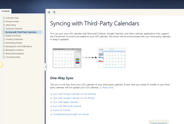
I recently overhauled the help for one of my products with this approach. You can see it here: https://ue.ldschurch.org/ldsapphelp/calendar.

I wanted to avoid the typical multi-level, intimidating TOC approach with help systems. (For reasons why, see my post Applying Progressive Information Disclosure to Online Help Navigation.) Instead, each entry in the TOC is more like an article, with many topic sections.
To avoid a really long page, I collapsed most of the information in hotspots and togglers on the page. The user can expand the sections he or she wants to read more about.
This approach to organizing help makes the content a lot cleaner. Readers aren't overwhelmed from the start. Instead, readers navigate to a page and pick and choose the information they want to see. Readers don't need to expand book and sub-book and sub-sub-sub book as they glance through dozens of topics, which begin to fill and expand the left side of their screen like an expanding hurricane.
Instead, the content pulls the reader in because it looks so simple, so light. You can actually browse the TOC without a sense of shock.
I also wanted to focus on concepts rather than individual tasks. So each topic begins with a concept. I collapsed that concept after a few paragraphs so the reader could see the tasks below it. To collapse the concept, in Flare I inserted what's called a toggler.
The way a toggler works, it expands a section that you identify. I manually added a div class with a special name around the section I wanted to expand, and then I selected that div class in the toggler. This way I could get the "Read More" text to expand various blocks of text.
One thing I haven't done here is create the tasks as snippets. Right now if I wanted to reuse the content from a topic, I would have to reuse the entire topic, including all the tasks. With snippets, each of the components could be reusable as an independent element.
I'm not opposed to including books in the TOC when there's enough content to justify it. (In fact, there's a bug in Flare that occurs when you don't have any books in the TOC -- the highlighting doesn't stick when you select the TOC text rather than the icon.) But this help system is small -- only 66 pages when printed, because it's a small web application. I could easily scale this model, adding more and more content in the TOC as needed (for a bigger, more complex system).
Overall, I hope this approach won't feel so overwhelming to readers. I don't think readers want to be presented with all the sub-options that will appear to them down the line before they even click one link. Instead, with this model, they choose a topic they're interested in, and then they're presented with additional information once they go to that page. This is how navigation on the web usually works, so why not follow a similar pattern with help content?
The collapsable sections provide a more modern way to segment and browse information. I wouldn't list more than about seven or eight tasks per page before I break up those tasks on to different pages -- the same guidelines one might follow if breaking up the content into separate topics in a TOC book. The difference with this approach is that by putting the information on the same page, the content lives together. The topics aren't potentially fragmented as they are when they are merely grouped into the same book in a TOC.
This method of organization also solves the problem of connecting topics with tasks. In the DITA model, a lengthy concept usually stands separate from a task. If these two topics are separated in the TOC, the user may land on the concept and need the task, or the user may land on the task and need the concept. You could add cross references to connect the two, but then your help consists of a lot of cross references. Each task would potentially lead with a reference back to the main concept for more information. With DITA, cross references might be added in a relationship table at the end of a topic, so the references can be even more subtle.
The method I'm experimenting with -- grouping similar content on the same page in different collapsible sections -- doesn't require me to refer to the concept or to the task using cross references. The user who is confused about "syncing," for example, can read the concept, expanding the "Read More" link to view the concept in full detail.
The user who already knows what syncing means and just needs instructions to sync to an iPhone can go immediately to the task. The reader doesn't have to navigate from one topic to another, expanding book after another book in a table of contents, or looking for a relevant link in a relationship table, or clicking a "See Also" link and scanning for relevant topics.
By grouping similar information together, the reader can quickly and easily find and navigate content. The basic principle, proximity, is at work here. What do you think?
About Tom Johnson

I'm an API technical writer based in the Seattle area. On this blog, I write about topics related to technical writing and communication — such as software documentation, API documentation, AI, information architecture, content strategy, writing processes, plain language, tech comm careers, and more. Check out my API documentation course if you're looking for more info about documenting APIs. Or see my posts on AI and AI course section for more on the latest in AI and tech comm.
If you're a technical writer and want to keep on top of the latest trends in the tech comm, be sure to subscribe to email updates below. You can also learn more about me or contact me. Finally, note that the opinions I express on my blog are my own points of view, not that of my employer.

