10 Realizations While Writing Documentation for a Mobile App
For the past couple of weeks, I've been working on documentation for a mobile app. This is the first time I've documented a mobile app, so it's no surprise that I realized a few new things.
1. It's hard for users to switch between help and the app.
My preference in publishing help material is to give developers a URL that points to a server where I can FTP my help files at will. This lets me retain control of my help material without being locked into application release windows.
On a computer, it's easy to switch tabs between the help and a browser-based application. If your monitor is large, you can put the windows side by side, or drag the extra window onto a second monitor. Or you can even just press Alt+Tab to quickly switch back and forth between windows.
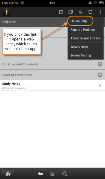
Unfortunately, switching between windows is more difficult on a mobile device. My Kindle Fire is terrible at switching between apps. Basically, you can't. So if you're in the app and you click online help, it takes you out of the app to your web browser (which is another app). You then have no easy way of getting back to the app. The back button takes you to your previous web page, not the previous app.
iOS has better app switching functionality, and the later Android devices do as well. But apparently not the Kindle Fire. Even on devices that have app switching, it's not always intuitive how to switch between apps.
Probably the only elegant way to deliver a help file is to let developers make it part of the app. However, I dislike relinquishing control like this. I know that once the help is hard-coded into the app, it will be difficult for me to update. I'll probably pursue a more integrated route anyway.
2. Taking screenshots on the Kindle requires 20 min. of setup.
You'd think the developers would have made it simpler, but to take screenshots on a Kindle Fire, you have to hook up a USB cord to your device and run through a complicated setup process involving two SDKs, editing of hard-to-find files on your PC, and a few other steps. See this post for details. (It's much easier to take screenshots on an iOS device.)
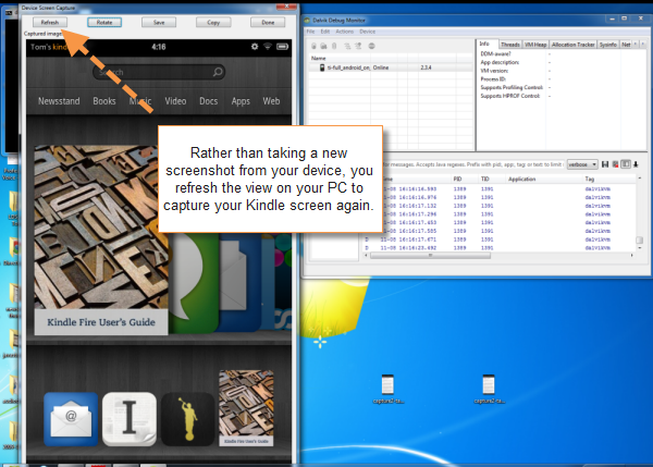
However, once you set up this process for taking screenshots, it's quite neat. Basically this SDK has a refresh button to show your latest mobile view on your desktop. Here's what it looks like.
3. Screenshots from tablets and mobile are large, which is good.
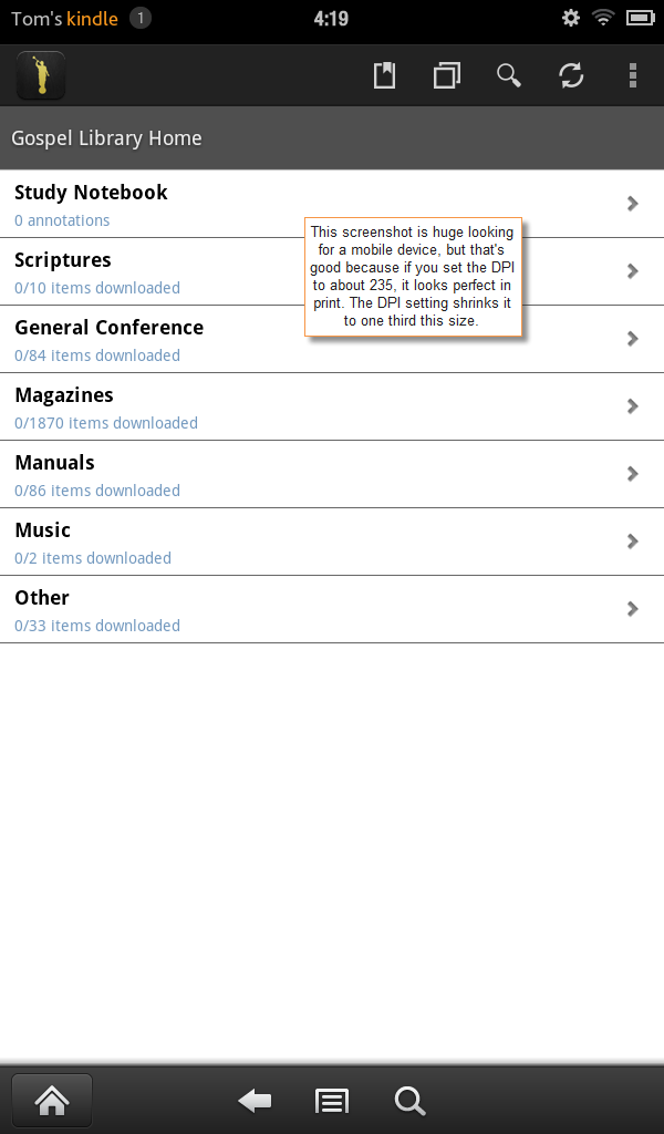
The screenshots on the Kindle Fire seem rather large. When you take a screenshot on a Kindle Fire, the dimensions are 600px by 1024px. If you take a screenshot on a Samsung mobile device, they're 480px by 800px. Both screenshots would be too large if inserted directly in your documentation.
(Why am I using a Kindle Fire? Because it's my only Android device. My smartphone is iOS.)
Here's the default size of a tablet screenshot:
Here's a screenshot from an Android Samsung smartphone. It's also big.
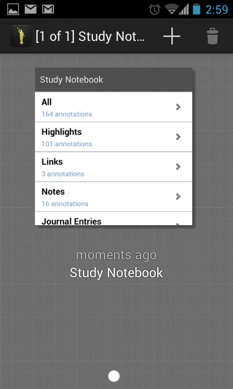
Regardless of these screen capture sizes, if you set the DPI for the print image to about 235, it shrinks the images down to just the right size, keeping it crisp and clear. For example, print out a few pages from my how-to guide and you'll see that you can read the 6px font on the screens with incredible clarity. The images actually look much more proportional to a smartphone, which is fine.
I love using Madcap Capture with Flare, because I can save the images in TIF format, set the DPI to 235, which is appropriate for the printed guide, and yet when I generate a mobile webhelp, Flare will convert the images to PNG and resize them to the max-width dimensions I set in the stylesheet for non-print formats. It works extremely well. More on screenshots in the next section.
4. You have to make image styling responsive on tablet and mobile devices.
I wanted my screenshots to look well when viewed on both tablet and mobile devices. Initially I set a max-width = 100% property in my stylesheet for devices smaller than 400px in width. This looked pretty good on the smartphone, because the viewing frame is so small. Having these screenshots expand to 100% of their frame worked out well (especially for iOS devices with high retina displays).
Not so for the tablet, which has more viewing space. For the tablet view, I didn't want the images to be any wider than 400px. Here comes responsive styling (or CSS media queries) to the rescue. I added the following media queries to my stylesheet:
@media (max-width: 480px)  {
img {
    max-width:100%;
    }
}

@media (min-width: 481px)  {
img {
    max-width:300px;
    }
}
This means that for devices up to a maximum of 480px wide, set all images to fill 100% of the viewing frame. (I decided on 480px based on this Media query values chart.)
However, for devices that are 481px and larger, I don't want that screenshot to display at 100%, because it would fill the tablet frame. I'd rather have them show at about 300px -- a bit larger than the mobile display, but not the full tablet width.
Although I set the media queries in my stylesheet in Flare, there's some kind of bug in the mobile webhelp target that strips them out. (It strips them out in the regular webhelp target too unless you remove the lowercase file names and rename illegal characters to underscores check boxes in the target.)
I was a bit surprised to learn that this wasn't a known bug, so perhaps other people aren't using responsive styling in their Flare projects? I'm not sure, but hopefully this will be fixed in an upcoming release. For now, I just insert the responsive queries into my stylesheet after generating the target. It works fine to manually insert them but is undeniably tedious.
5. EPUB and MOBI formats don't look the same.
I was pretty excited to create a PDF, mobile webhelp, and regular webhelp, but why stop there? I also wanted to create EPUB and MOBI formats. So I created a new EPUB target and published to it with Flare. After a bit of styling, it looked pretty good. But the Kindle doesn't use EPUB; it uses MOBI.
When I converted from EPUB to MOBI using a tool like Calibre, each first line was indented, and some lists also had strange indentations.
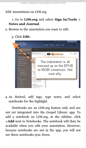
I'm not entirely sure how to fix it, so I need to wrestle with it some more. I realized that I know little about styling output for eReader formats. Even so, for tablets, using an eReader format seems like a necessary target to build.
One problem with eReader formats is dealing with screenshots. If the screenshot doesn't fit on the page well, it can create awkward formatting gaps with a lot of puzzling page breaks. I'm not entirely sure how to solve that.
6. Basic mobile navigation isn't obvious.
Right now our familiarity with smartphones is about a decade behind our familiarity with PCs. About 20 years ago, when personal computers were new, we had to provide more explicit documentation about very basic procedures. For example, I remember detailing each step needed in printing a document, including adjusting printing properties, clicking the Print button in the Print dialog box, etc. I usually exclude that now and just write "Press Ctrl+P to print."
Now many previously unfamiliar but now common computer procedures are intuitive, so you can gloss over them in your instructions -- but it's not the case with smartphones and tablets. With smartphones and tablets, you have advanced gestures, different looking menus, new methods of navigation, double-swipes, long-presses, different rotations, and even tilt-scrolling.
Many of these actions are unfamiliar to people, such as how to lock the orientation on a phone, how to switch between applications, how to side load, how to change the brightness, whether you can pinch to resize, and so on. I think we're in a stage where we can be explicit about basic means of navigation on a mobile device. I have a whole help topic on navigating in the app. Whereas this sort of topic seems outdated on a desktop application, I find it pretty essential for the mobile world.
7. The PDF needs to be in dual columns.
I already have a PDF output configured as one of my standard Flare targets. I thought I could simply use this same PDF target without adjustment. However, since my screenshots are in portrait mode (taller than they are wide), it looks ridiculous to print the guide using a single column (like I do with desktop application help).
I changed my page layout to two columns and restricted the width of my screenshots to 300px. It looks decent this way and is readable.
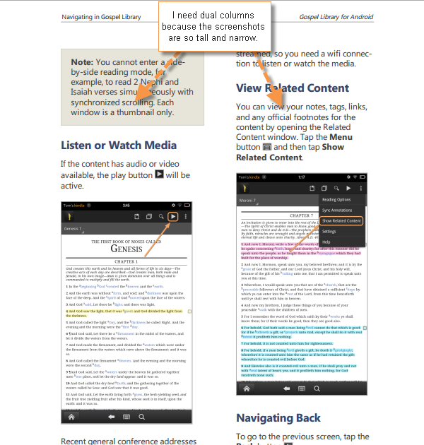
With narrow columns, though, a few things are problematic: long URLs don't work, and neither do occasional screenshots that are landscape orientations of non-mobile browsers. Since the app I'm documenting integrates with an online browser-based app, I found it hard to include screenshots of the online browser-based app because the larger screenshot would break the column width. I ended up leaving the desktop screenshots cropped; I also minimized the number of these desktop screenshots.
8. Recording mobile screencasts will require some extra hardware.
I'm planning to do a few screencasts. Do I have a plan for recording an Android device? Uhm, no, not yet. Even if I had a way to record the screen (some apps claim to do it), I would need to record the finger taps and swipes as well. Motorola's Xoom has a mode that turns on some touch-tracking features, but it would still require some advanced methods to record it.
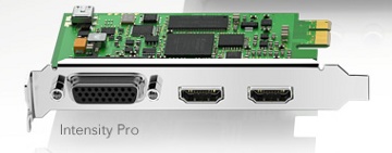
One hardware device I can add, called an HDMI recorder, will intercept the video and display it onto another computer. This method looks promising, but I've been told the video quality is a little fuzzy.
I could also set up a little camera and, with good lighting, take a video of my hand interacting with the device. But editing this seems like a pain (because I'd need to use HD video editing software rather than an application such as Camtasia), and I'm not a hand model. I don't have studio lighting either.
9. There's a lot to say about a little app.
I think many mobile teams think their apps are so intuitive, no instructions are needed. Yet in documenting this one app, I'm finding that there's a ton of information that most people don't know, or at least which I didn't know. People will be surprised to see a 45 page guide for a mobile app, but there's really that much instruction.
While users can hack and stumble their way through the app, they probably only use a small fraction of the features — the features they are comfortable with and understand.
Why might there be 45 pages of instruction? Because mobile and desktop applications now integrate. This integration creates some complexity with the interactions. For example, this mobile app I documented integrates with an online application but not 100%. Some of the terminology is different, and the sync between the two isn't always automatic.
The app becomes a lot more complex when you consider the companion web sites or tools that complement the app. Do you document the mobile app alone, and the desktop app alone? No, that doesn't make sense if users are constantly switching between the two. I wanted to address both applications where relevant to user tasks.
10. Mobile is where the party's at.
A few months ago, the money from one of my projects was swept away and redirected toward mobile. I've since learned that mobile is where the party's at, so to speak. At least in my organization, mobile seems better funded than other projects, there's more excitement around it, and it's sexier. So if you're looking for a place to direct your efforts, going in the mobile direction might be rather fruitful.
I hope that my documentation for this mobile app becomes the first of many. If so, you'll probably see a few more posts from me about creating mobile documentation.
By the way, my mobile documentation is a work in progress, but you can see it by going to https://ue.ldschurch.org/mobile/gla in your browser. This will load the mobile webhelp, which is meant to be viewed on a mobile device rather than your laptop/desktop Internet browser.
To print out the PDF, go to https://ue.ldschurch.org/mobile/gla/printedguides/glahowtoguide.pdf. I welcome feedback and criticism on how to improve this mobile documentation, so if you have ideas, let me hear them.
About Tom Johnson

I'm an API technical writer based in the Seattle area. On this blog, I write about topics related to technical writing and communication — such as software documentation, API documentation, AI, information architecture, content strategy, writing processes, plain language, tech comm careers, and more. Check out my API documentation course if you're looking for more info about documenting APIs. Or see my posts on AI and AI course section for more on the latest in AI and tech comm.
If you're a technical writer and want to keep on top of the latest trends in the tech comm, be sure to subscribe to email updates below. You can also learn more about me or contact me. Finally, note that the opinions I express on my blog are my own points of view, not that of my employer.


