How to design documentation for non-linear reading behavior
This is the third post in my series about user-centered documentation.
First observations about non-sequential reading
In the late 1980s, John Carroll observed non-sequential reading behavior with how people consumed documentation in his seminal book, The Nurnberg Funnel.
This non-sequential reading behavior contrasted with some approaches involving more sequential learning instruction at the time. This observation led Carroll to rethink how to design documentation.
Strategies for non-sequential reading
Carroll's strategy was to divide information into small chunks that can be read in any order. His strategy for the user can be best summarized by his statement:
You can just read the sections about the tasks you want to do.
This non-sequential pattern is really one of the foundations of structured authoring leading up to structured authoring. DITA is a prime example of small chunks of information that can be organized and consumed in myriad ways.
Problems arising chunking
Two problems arise from chunking for non-linear reading:
1. Lack of distinction between chunks and display. The first problem with chunking arises when there isn't a clear distinction between the building block chunks and the presentation.
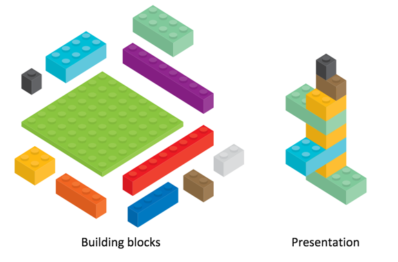
If you chunk information too small, it becomes dependent on a lot of other chunks around it to make sense.
The TOC usually supplies the context for the chunks, but then the user has to rely heavily on navigating the TOC in order to make sense of the content. With this model, the user ends up playing pinball in a fragmented information experience.
2. Auto-bursting from print books. The second problem arises when people auto-burst information from print to online formats.
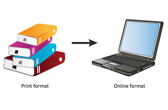
When you arbitrarily decide to split information at each heading 2 level into a new online topic, you end up stripping content from its needed context. The topics no longer make sense as standalone information and require a lot of outside reading to make sense of them.
As a result, information gets fragmented and unusable.
Frankenbook results
Mark Baker calls these autobursted print books "frankenbooks". Mark writes:
A Frankenbook is organized neither for linear reading, nor for random access. No matter where you land in it, you are in the middle of a maze with buttons to move up, down, or sideways, but no means of finding the end of any thread of narrative, great or small. Every page is page 297 and none of them answer your question.
For an example of a frankenbook, he says to see some of IBM's documentation sets.
Every Page Is Page One as the answer
Mark Baker's Every Page Is Page One is a reaction against these fragmented information documentation products.
Mark advocates that topics should be self-contained so that a user can start any where (any topic functioning as page one) and the content should still make sense. In this case, Mark is promoting Carroll's original minimalism design, which was to account for non-linear reading.
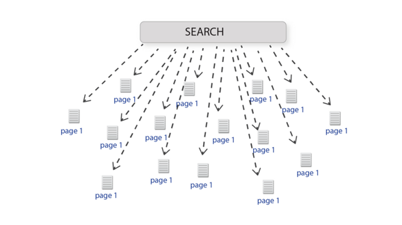
Defining standalone topics
Exactly how you define "standalone" or "self-contained" is a definition that's hard to pin down. Mark notes that every piece of information tends to fit into some larger context.
For example, in a bike manual, you can't understand a section about brake pads without understanding a bit about brakes, and brakes might necessitate information about wheels, and wheels might necessitate information about the spokes, and so on.
Mark isn't advocating that you put the entire book into one topic, creating a single-page doc style of content. He is in favor of chunking information and keeping things at the same level. But rather than depending on the TOC to do the work of providing necessary context, you put that context directly into the topic so the reader can orient him or herself appropriately.
You also make sure that topics are self-contained enough to allow the reader to accomplish his or her goal, which is usually not to understand how an entire car works, but how to perhaps check whether brake pads are good, or understand how to change a brake pad.
Example of a self-contained topic
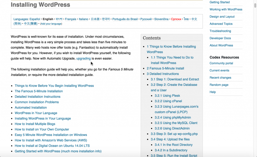
Mark says wikis usually lend themselves to self-contained topics. Here's an example from the WordPress Codex:
The task is to install WordPress, but the procedures vary based on your environment, platform, server, host, and other details. Rather than chunking this information into separate pages, the WordPress Codex authors decided to consolidate it into one massive page.
Example of context
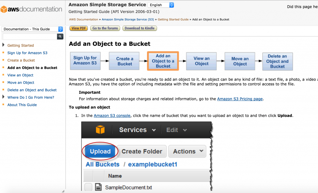
Chunking into small information units is fine provided that you can provide users with the necessary context. Here's an example from Amazon Web Service documentation about S3 buckets.
Here the author has split up a process involving six tasks into individual topics. The topics are connected through an workflow map at the top.
If you land on a page in the middle of this process, it's easy to orient yourself within the overall process. The workflow map's context also allows the author to chunk the information, keeping it relatively simple and manageable on each page.
Applying the principle of context
I liked the workflow map from AWS so much that I implemented a similar technique with a three-step process into my own documentation projects:

After creating several simple images, I mapped the boxes to relative links using this image map generator. You could also incorporate links into an SVG image.
Providing context after a topic
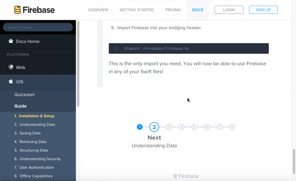
In addition to providing context before, you can also provide context after a topic. In Firebase's Getting Started documentation, there's a nine-step process that guides users through a product setup.
The writer chunks up the material to minimize the content on each page but provides the necessary context to move the user to the next step.
Adding a "What's next?" topic below other topics can also help guide users to the next logical step in a larger workflow context.
Characteristics of Every Page Is Page One Topics
Mark outlines about 7 characteristics of Every Page Is Page One topics:
- Self-contained
- Specific and limited purpose
- Conform to type
- Establish context
- Assume the reader is qualified
- Stay on one level
- Link richly
I think establishing context is one of the best ways to help account for non-linear reading patterns. I'll visit the "Link richly" strategy a bit later in this series.
Testing your content
As a test, to see if your content supports non-linear reading patterns, open it up to five random places and ask yourself, If I were a reader, would I have enough context and information to orient myself if starting at this point?
About Tom Johnson

I'm an API technical writer based in the Seattle area. On this blog, I write about topics related to technical writing and communication — such as software documentation, API documentation, AI, information architecture, content strategy, writing processes, plain language, tech comm careers, and more. Check out my API documentation course if you're looking for more info about documenting APIs. Or see my posts on AI and AI course section for more on the latest in AI and tech comm.
If you're a technical writer and want to keep on top of the latest trends in the tech comm, be sure to subscribe to email updates below. You can also learn more about me or contact me. Finally, note that the opinions I express on my blog are my own points of view, not that of my employer.
