Sadik-Khan's Streetfight: Handbook for an Urban Revolution, plus a visual account of Seattle's downtown biking and pedestrian infrastructure
As she changed the status quo of driving, she ran across fierce opposition and criticism, especially from those who feared the changes would hurt their business or worsen traffic congestion. However, despite the opposition, she made more improvements to biking infrastructure, pedestrian plazas, street design, etc. during these 6 years in NYC than other cities, even Copenhagen, accomplished in much longer time spans. The book is highly readable and includes many photos and street design diagrams to illustrate concepts.
Street design principles
One of Sadik-Khan’s strategies is to focus on street design. She argues that the streets are already wide enough to accommodate more types of traffic, such as pedestrian, bicyclist, and dedicated bus lane traffic. We just need to adjust the street design a bit. The following are a few street design principles Sadik-Khan focuses on:
- Reduce the number of lanes. Narrowing streets from three lanes to two might slow traffic but not in a noticeable way. In fact, narrowing streets prompts drivers to drive more cautiously, reducing the number of accidents and thereby keeping a steady flow of traffic. Speed reductions can also be offset by better intersection light timing.
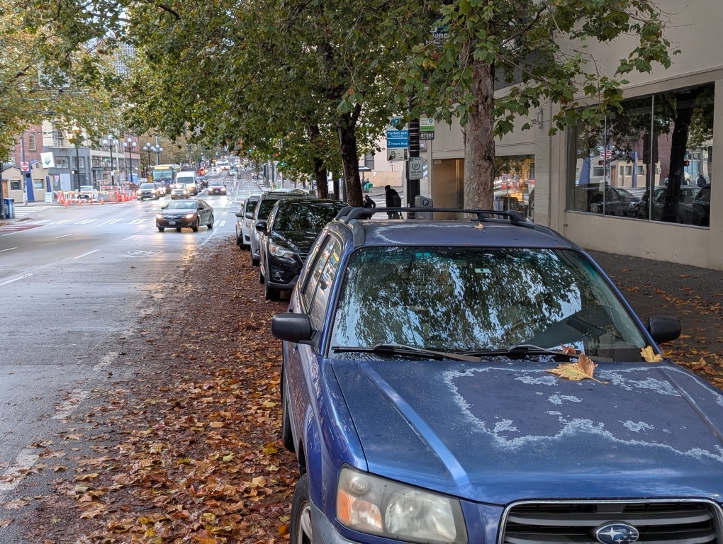
- Add protected bike lanes through floating parking spaces. Instead of having cars park next to the sidewalk, a lane of floating parked cars (floating out into the lane) can act as a barrier between the bike lane and cars.
- Shorten the crossing distance. Shorten crossing distances at intersections through curb extensions and floating islands. The shorter the distance pedestrians need to walk, the fewer accidents.
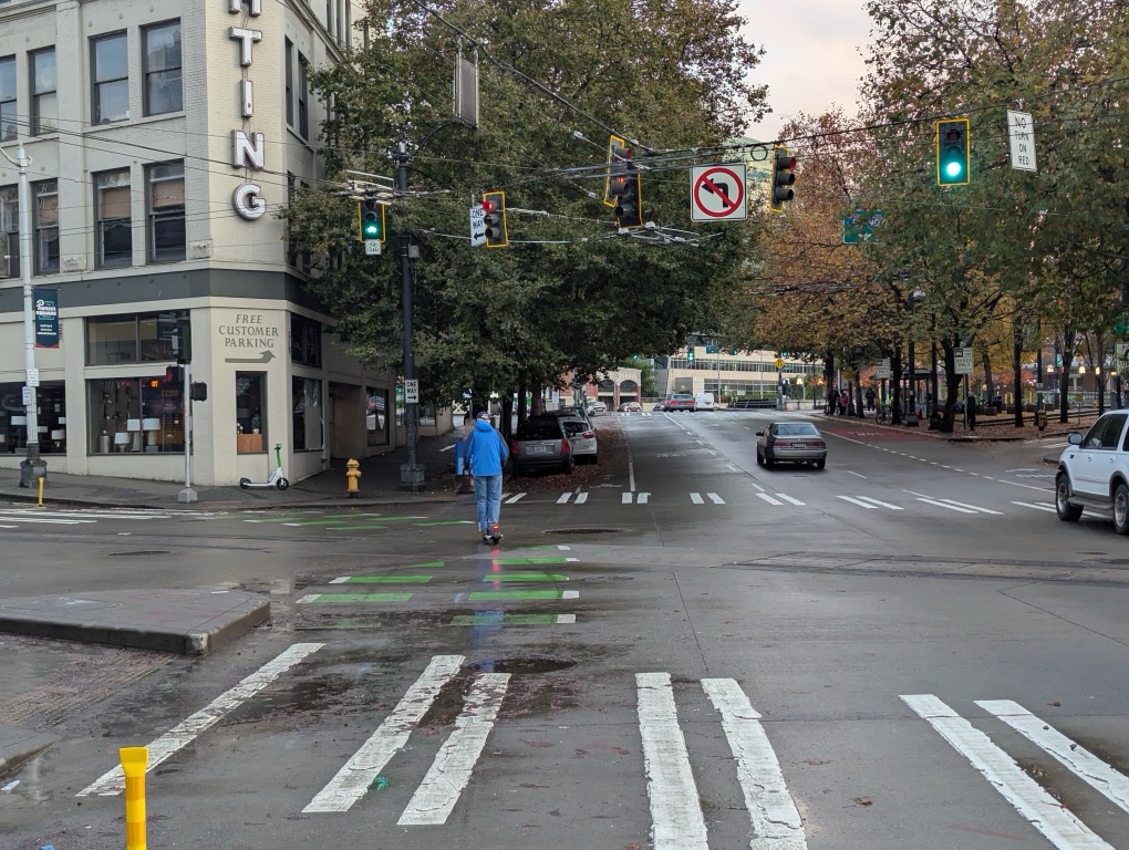
- Use paint to add visual cues. Painting bike lanes green signals the space’s usage to drivers. Use other paint generously to indicate crosswalks, paths, intersections, and more.
- Pay attention to desire lines. If people take shortcuts, formalize those shortcuts into crosswalks or walkways. This prevents people from jaywalking across busy roads to save time instead of following a more distant path.
- Convert poorly used dead spaces near intersections into pedestrian plazas. For the many oddly shaped triangles and other dead spaces, instead of devoting them to a few random parking spaces here and there, convert them into pedestrian areas.
Examples of pedestrian and bicycle infrastructure in Seattle
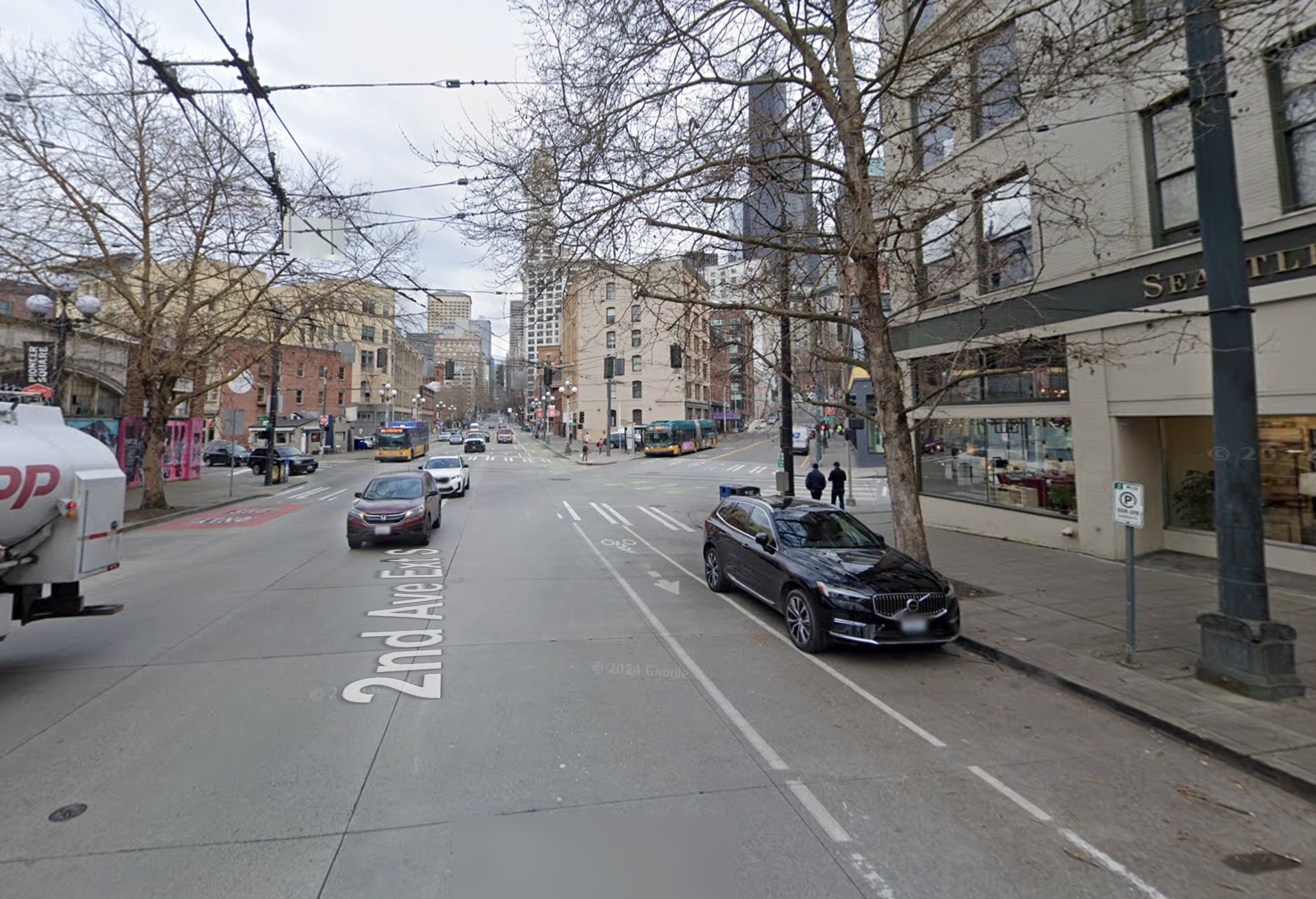
I bike through Seattle multiple times a week (commuting to work). As I decided to follow the downtown city route from King Street Station along 2nd Avenue, I started noticing street design in a way I hadn’t before. Here are a few examples of street design illustrating many of Sadik-Khan’s principles in Seattle.
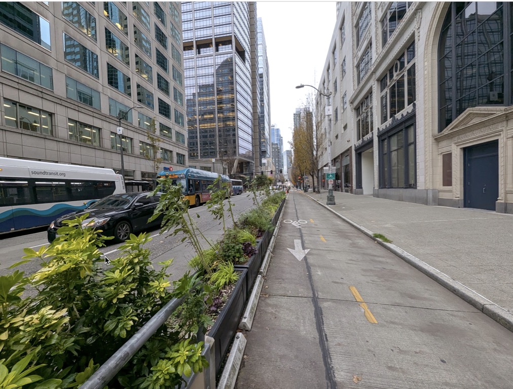
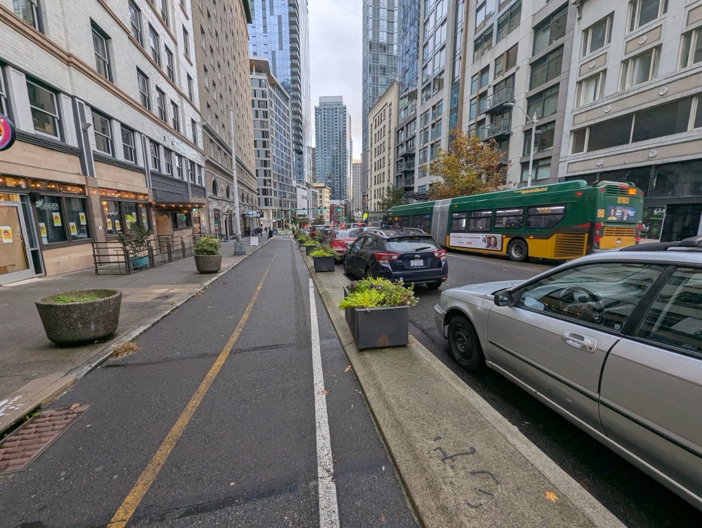
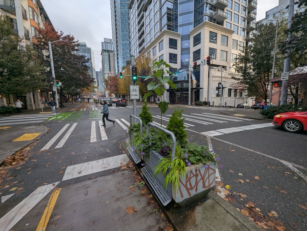
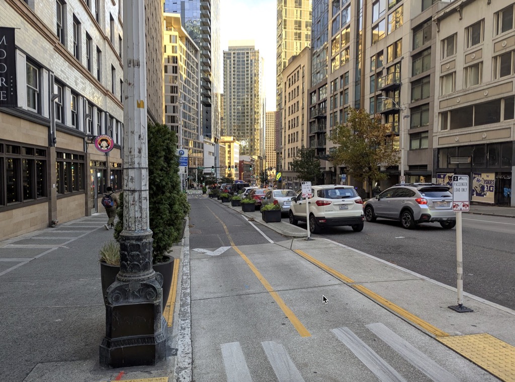
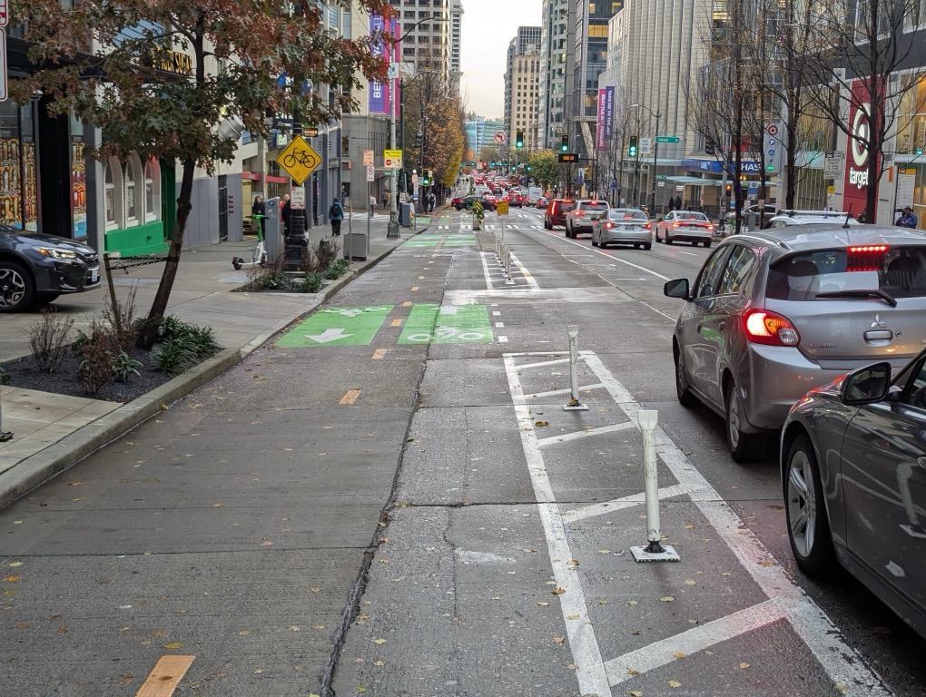
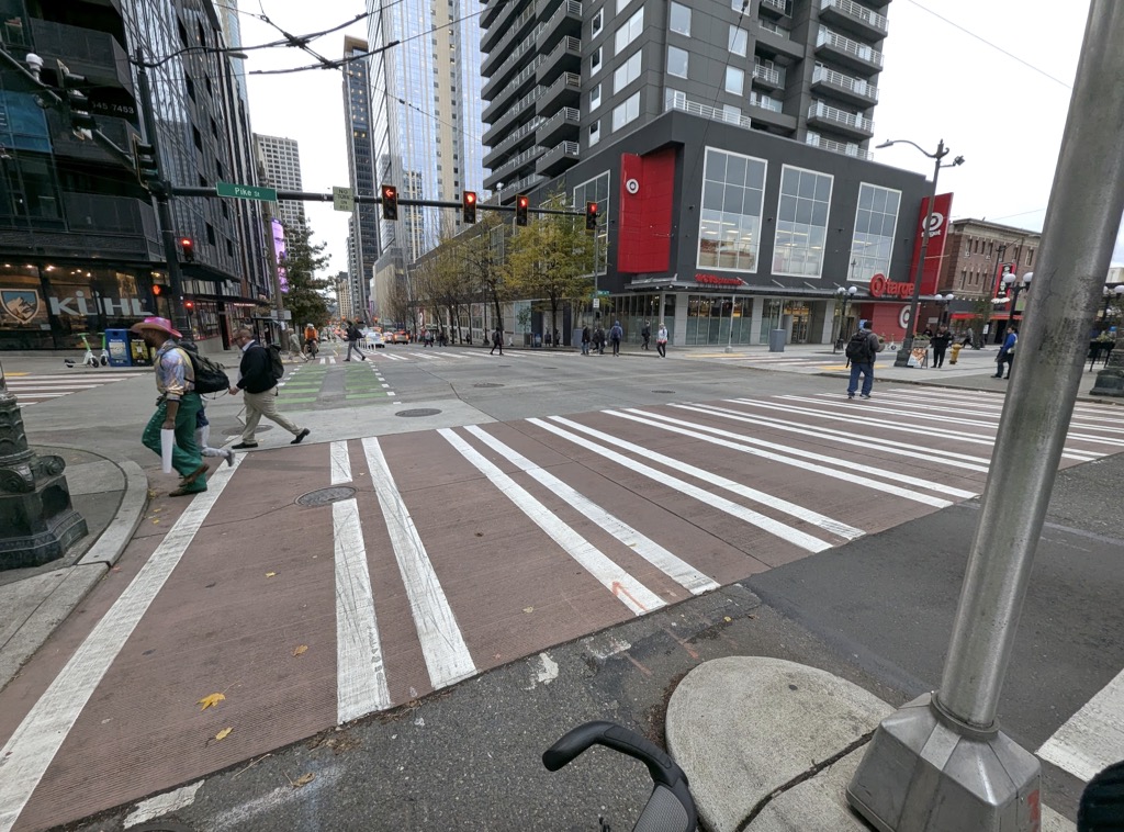
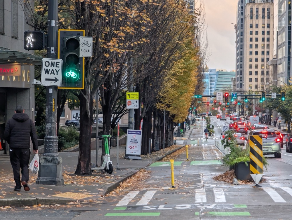

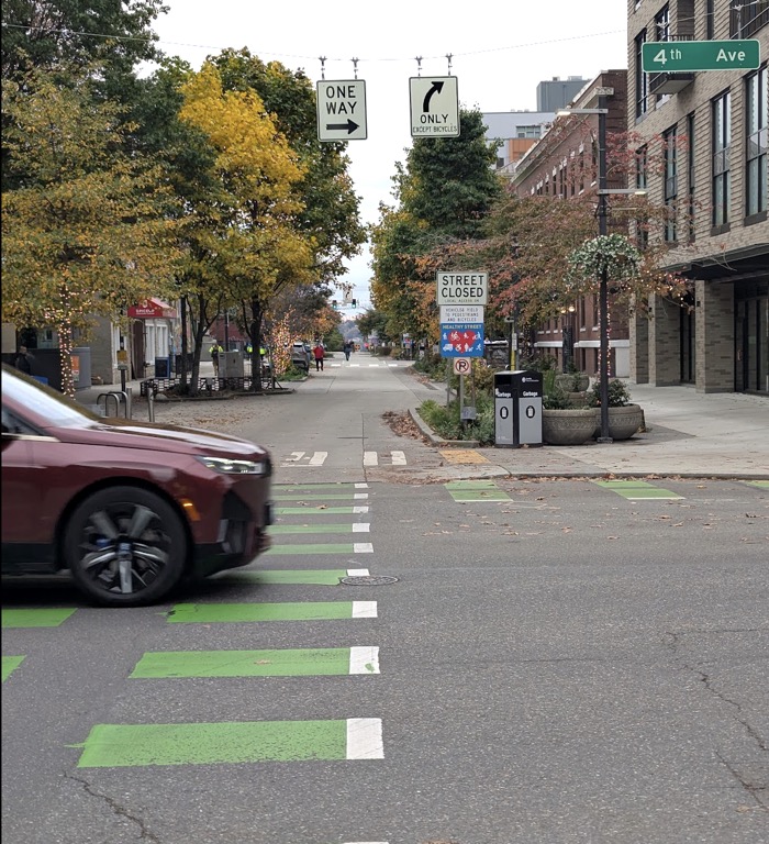
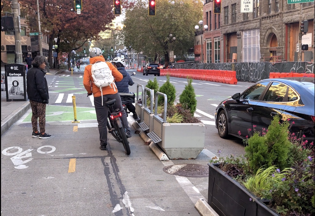
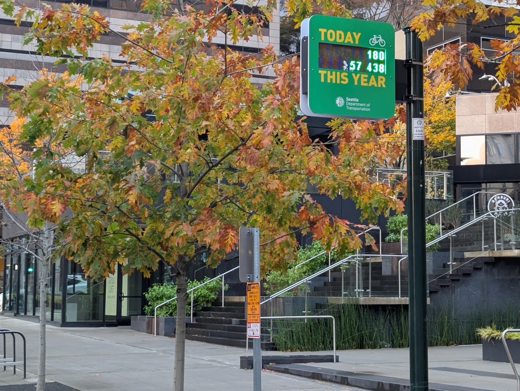
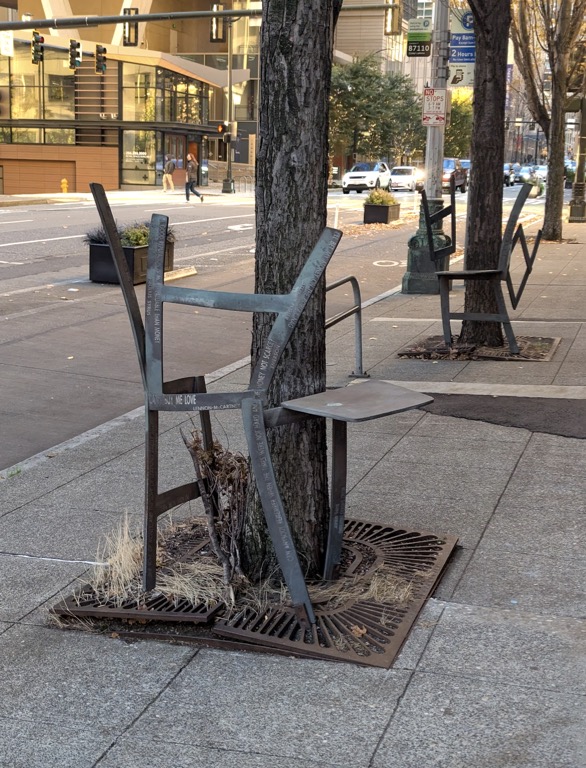
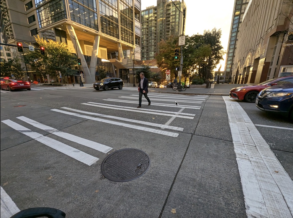
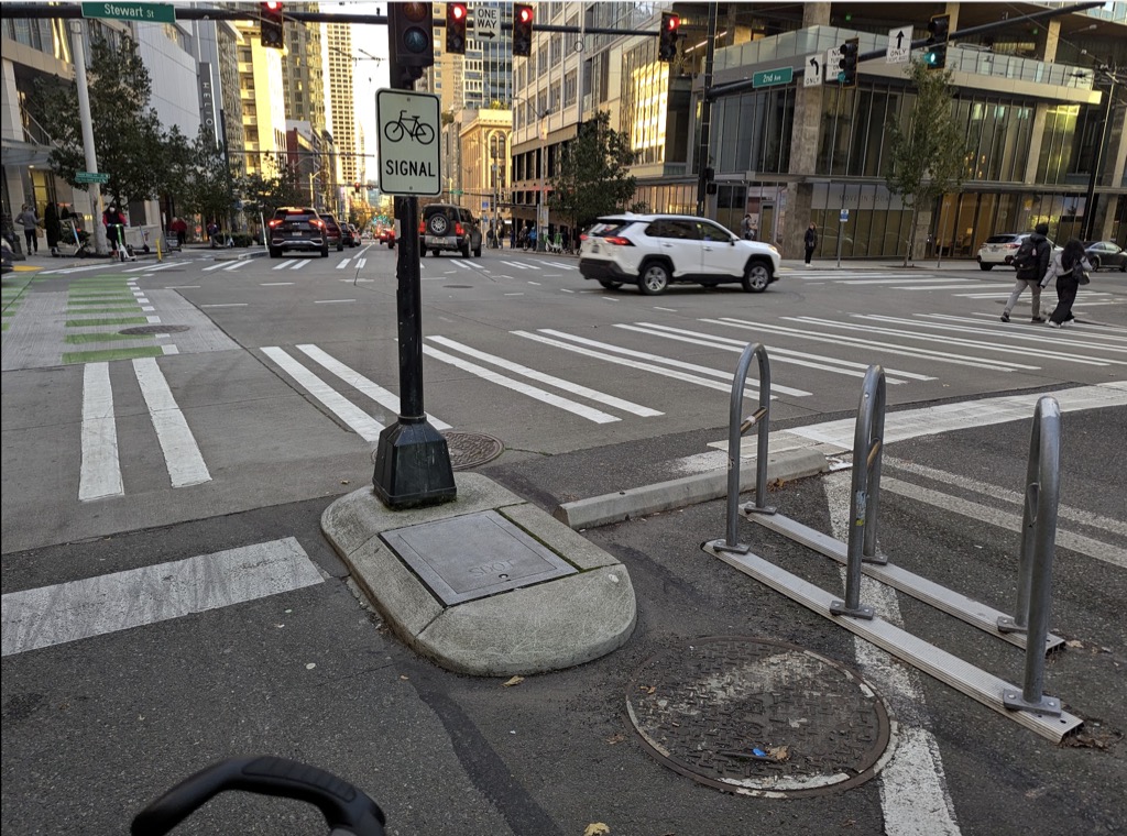
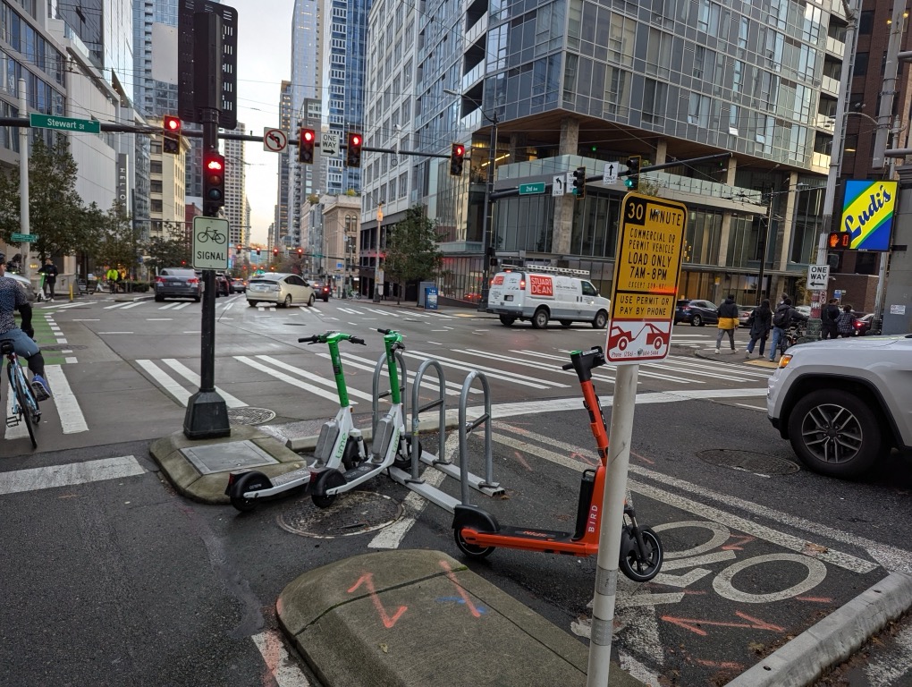
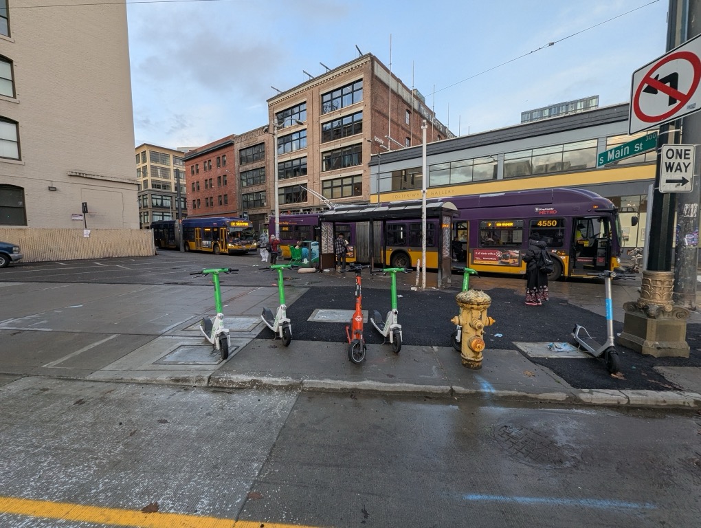
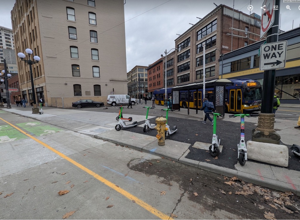
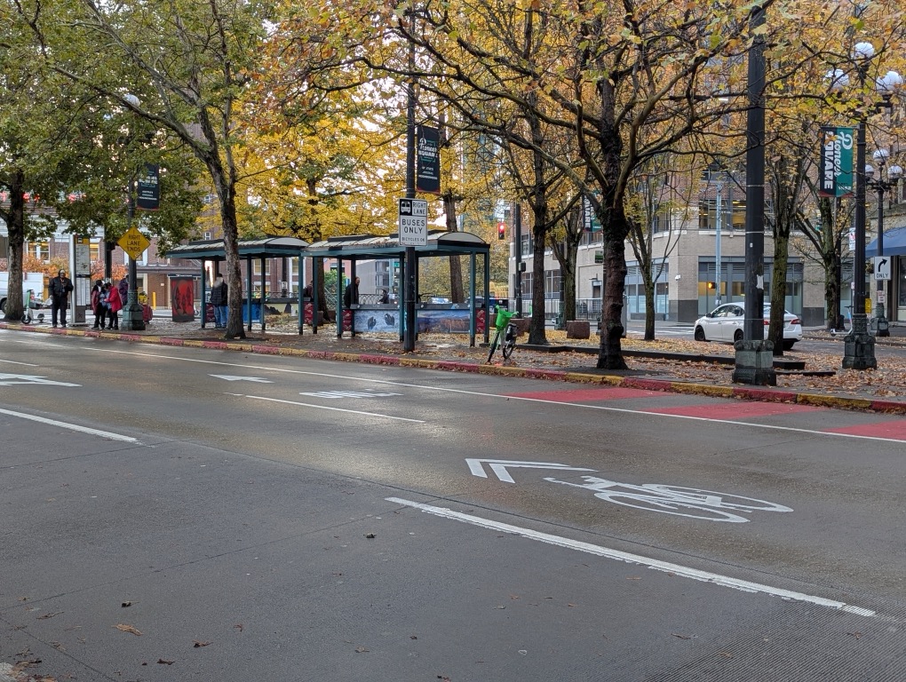
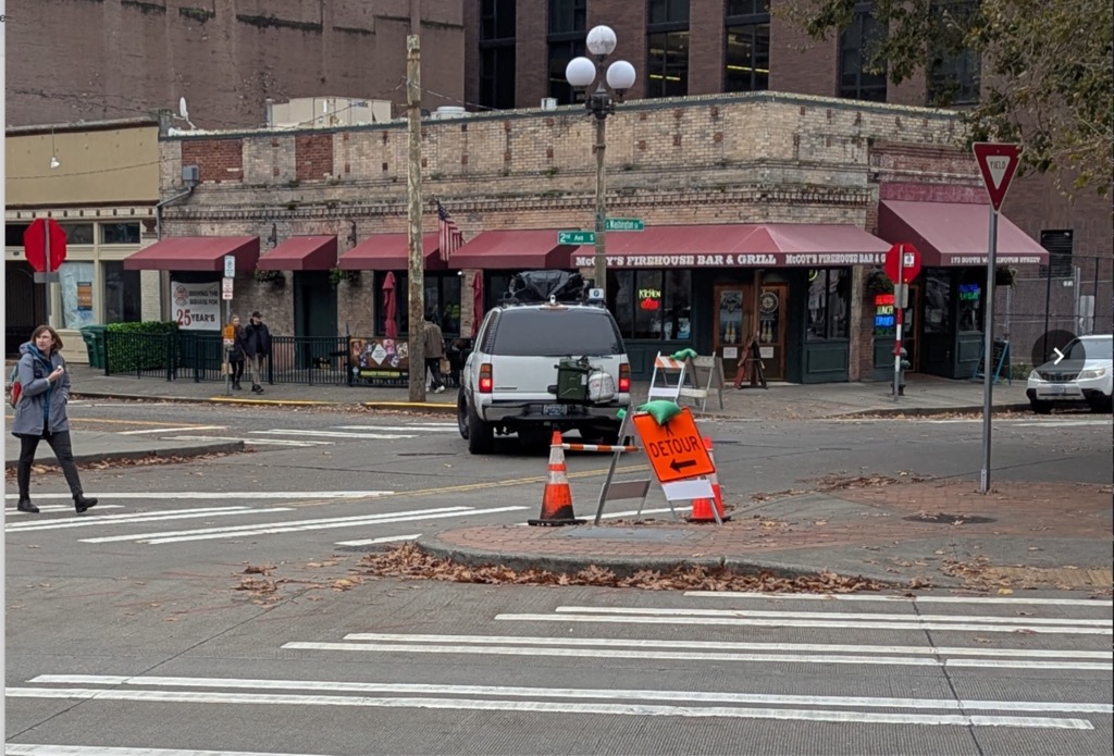
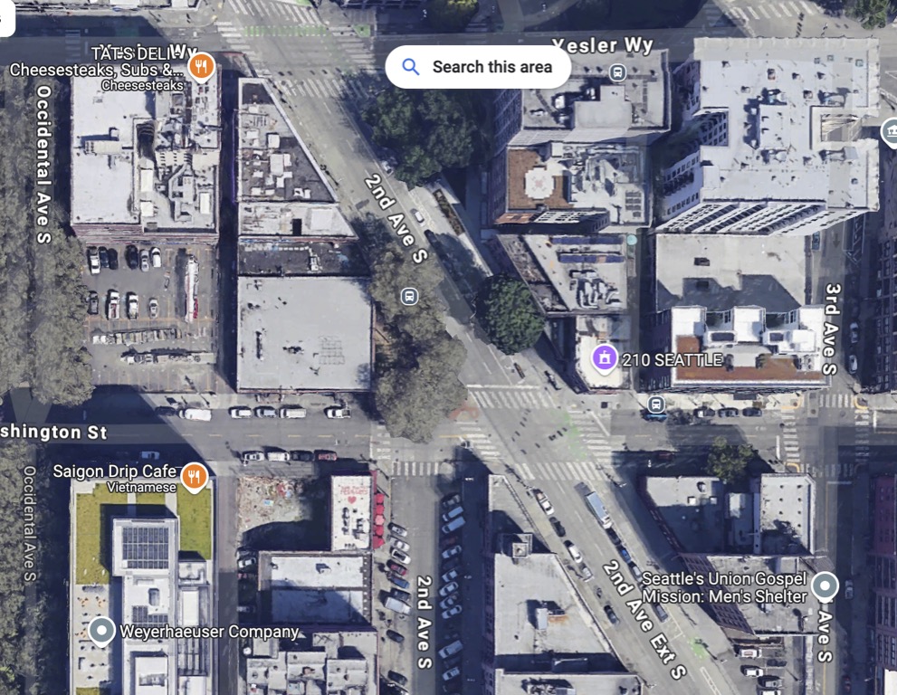
Although most of the downtown biking infrastructure is pretty good, there’s one segment, specifically from King Street Station along 2nd Avenue outside of Seattle Lighting, where there protected bike lane pattern was abandoned.
Strategies
Sadik-Khan also explains various strategies she implemented to help drive this change:
- Low cost, temporary installations first, then permanent later. The temporary installations can prove an idea, such as how increased pedestrian traffic might change an area. Additionally, the temporary installations/changes can help bring about improvements faster than devoting millions of dollars toward a complete street overhaul that might not even be proven out. Temporary installations allow iterative development and help generate community support, as they allow people to realize that changing the status quo can be beneficial.
- Use data to support the changes. This is especially important when critics claim that the changes slow traffic or hurt their business. Data can help garner public support and fuel momentum for more permanent changes.
- Avoid overestimating the extent of support of a few loud critics. Those who opposed the changes had loud voices and seemed like they had more support than they actually did. Surveys showed that the community majority often supported the changes. Some blogs, especially in support of the transportation changes, can exert outsized influence to increase support and counter the vocal critics.
- Import and export ideas. Import ideas from cities around the world where transportation changes are working, from Amsterdam and Copenhagen to Brazil and more. Additionally, you can export your successful ideas to other cities. Given that changes often work across cultural and country borders, we should look for successful models and borrow from them.
- Maps support discovery of new places. Maps can help unlock new areas of the city, inviting people to explore new places off their beaten path. Place frequent maps on sidewalks, and orient the maps based on the direction people are facing.
- Bus rapid transit, congestion pricing, and bike share. Provide dedicated lanes for buses, including curb extensions at the bus stops. Congestion pricing and bike shares might be somewhat dated, since congestion pricing was never successfully implemented and the bike share was replaced by randomly parked ebikes and e-scooters.
- Increased foot traffic supports business growth. Those areas where parking spaces were removed in favor of pedestrian plazas often led to economic growth for the businesses. People on foot and bikes might spend less money but tend to shop more frequently, spending more over time. Many business owners overestimate the amount of business from people in cars.
Overall, Sadik-Khan’s tenure demonstrates how much a transportation champion can accomplish in a short time when armed with vision and courage to challenge the status quo. Many of her changes endured beyond her administration, making Streetfight: Handbook for an Urban Revolution not just an inspiring read, but a blueprint for transforming any city’s infrastructure.
I highly recommend Sadik-Khan’s book, Streetfight: Handbook for an Urban Revolution. This is an inspiring, optimistic record of one of the most transformative periods in New York City’s history.
About Tom Johnson

I'm an API technical writer based in the Seattle area. On this blog, I write about topics related to technical writing and communication — such as software documentation, API documentation, AI, information architecture, content strategy, writing processes, plain language, tech comm careers, and more. Check out my API documentation course if you're looking for more info about documenting APIs. Or see my posts on AI and AI course section for more on the latest in AI and tech comm.
If you're a technical writer and want to keep on top of the latest trends in the tech comm, be sure to subscribe to email updates below. You can also learn more about me or contact me. Finally, note that the opinions I express on my blog are my own points of view, not that of my employer.
