Quick Reference Guides: The Poetry of Technical Writing
 How many times have you written a 75+ page guide and heard the customer say, This is great, but can you give us a condensed version?
After the third or fourth time I'd heard this, I decided to actually try it. I wasn't sure exactly how to lay it out, so I spent a couple of days flipping through magazines — especially WIRED — looking for attractive layouts to copy.
I also needed a better tool than Word, and managed to acquire a copy of Adobe InDesign. After a few days of prototyping and writing, I finished my first one-page quick reference guide.
At the next project meeting, I brought color copies of this one-page version of instructions. The response was overwhelming. You'd think I was handing out free candy. Everyone wanted one.
They immediately started looking it over. In contrast to the pained expressions I'd seen after handing people long manuals, their faces showed incalculable glee. At that point, I knew the quick reference guide was a must-have deliverable for every one of my projects.
The names can vary — "Cheat Sheet," "Getting Started," "Fast Track," "Job Aid" — but the concept is the same. Condense the most important information into one double-sided page. By "condense" I don't mean shrink the font to 6 pt., decrease the leading, and eliminate all white space. With the quick reference guide, you take something that's robust and complex, and distill it down to its essence, but distill it in a way that brings perfect clarity to users. Quick reference guides are like the poetry of technical writing.
Part of the appeal of quick reference guides is the close way they model software learning. Almost invariably, when people need to learn an application, they follow this same pattern:
- They sometimes read a little bit about the product (maybe 2-3 minutes).
- They open the product and see if it's intuitive to figure out without the manual.
- When they get stuck, they turn to the help for information about a specific task.
The quick reference guide serves the user's needs in step 1. Arguably, many people don't even complete step 1, and just dive straight into the application. Still, having a one-page guide to quickly refer to while stumbling around the user interface for the first time can be helpful.
Other than brevity, how then are quick reference guides like poems? It's more than just being concise. With poetry, the poet attempts to evoke a mood or paint a moment, and in that brief moment, capture the entire essence of something. Here's an example of one of my favorite poems, "Lying in a Hammock at William Duffy's Farm in Pine Island, Minnesota," by James Wright.
Over my head, I see the bronze butterfly
Asleep on the black trunk,
Blowing like a leaf in green shadow.
Down the ravine behind the empty house,
The cowbells follow one another
Into the distances of the afternoon.
To my right,
In a field of sunlight between two pines,
The droppings of last year's horses
Blaze up into golden stones.
I lean back, as the evening darkens and comes on.
A chicken hawk floats over, looking for home.
I have wasted my life.
In 13 lines, the poet has captured the entire essence of a lazy summer. The last line in particular, "I have wasted my life," contains levels of depth.
Writing a quick reference guide is much the same effort. It's not that you merely cut words to give a shorter manual, but that you try to compress the manual and express in its five-word equivalent.
I'll grant that the task is probably impossible for technical material. Still, the attempt is there. The philosophy remains the same. Teach us how to use this manual in 5 minutes rather than 5 hours. It's a philosophy of simplification and linguistic efficiency.
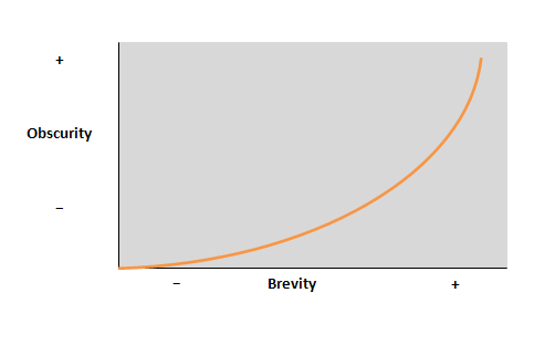
Many people think that the relationship between brevity and obscurity trends in the following direction.

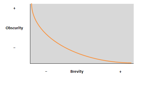
In other words, as your writing becomes more brief, the level of obscurity increases. Actually, a good quick reference guide that does the job in a minimalistic way can have the opposite trend: becoming less obscure as the brevity increases.
This is because, simply put, no one reads the big manual. If you force the reader to wade through hours of preliminary text — a table of contents, table of figures, preliminary legal jargon, explanations of icons and style notations, introductory pages, lists of file menus, tab menus, icon meanings, and so on, before even getting to an actual task — the reader's patience times out long before the manual ever teaches them something. I remember one time I was reading an AuthorIt manual. I'd reached page 87 and still didn't see a single how-to task.
You don't want to focus on too much in a quick reference guide. Remember, the poet focuses on a telling moment, and doesn't narrate the whole of history. Likewise, the scope of a quick reference guide focuses on core tasks — tasks that are representative of the application as a whole.
Also, don't be deceived by the brevity and scope of the quick reference guide. In wrangling with layout, scope, and concision, you might spend several days writing just one page. But when you're done you can practically hang it on your cube wall.
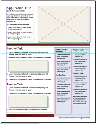
A good layout tool is handy when creating quick reference guides. Adobe InDesign is a powerful tool, but you could probably make do with any program you're familiar with. Here's a sample quick reference guide template (an Indesign .indd file) that I sometimes start with, and then modify to best fit the help content.
If you have any sample quick reference guide layouts that you like, I'd love to hear about them.
Update: For more information on quick reference guides, see my list of other posts and templates on quick reference guides here.
About Tom Johnson

I'm an API technical writer based in the Seattle area. On this blog, I write about topics related to technical writing and communication — such as software documentation, API documentation, AI, information architecture, content strategy, writing processes, plain language, tech comm careers, and more. Check out my API documentation course if you're looking for more info about documenting APIs. Or see my posts on AI and AI course section for more on the latest in AI and tech comm.
If you're a technical writer and want to keep on top of the latest trends in the tech comm, be sure to subscribe to email updates below. You can also learn more about me or contact me. Finally, note that the opinions I express on my blog are my own points of view, not that of my employer.


