Starting Points with Quick Reference Guides: Gathering Before Designing
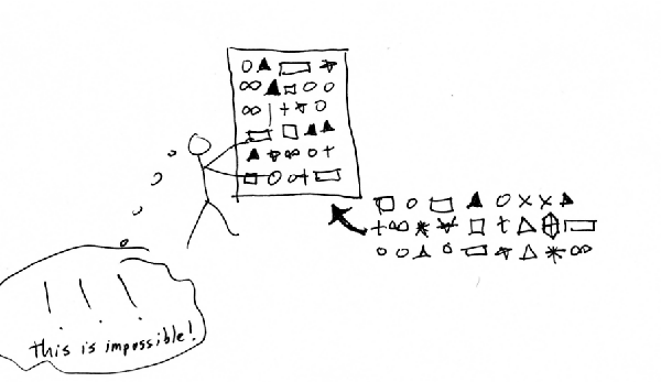
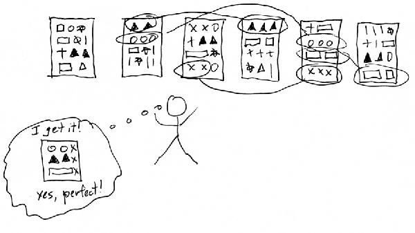
In The Back of the Napkin, Dan Roam explains that drawing pictures can help you solve problems. He says the first rule is to "collect everything possible up front" (p.58). After collecting all your information, you then "lay it all out where you can look at it" (p. 61). By laying out all the information, you can grasp the whole of it, make connections between various parts, see the important sections, and recognize patterns.
These two rules define the starting points when creating quick reference guides. Neglect them and you run into trouble.
For example, on a recent project, I sized up the application and decided the help content would be minimal. I could fit it all on a few one-page quick reference guides spread across several roles. I didn't even need an online help, I decided, but would author directly in my quick reference guide layouts.
I opened Adobe InDesign, created a new document, and started writing the content directly in it. It began well enough, but little by little, the application started to reveal its complexity. Edge cases, special workflows, notes and other important information began to accumulate. I manipulated the text frames and column layouts to fit the information. Needing more space, I adjusted the line spacing, the font size. Then I removed a screenshot, and another. I increased the length of the columns, and so on, trying to make it fit on one page. After some deliberation, I decided to cut entire sections that weren't actually necessary. So I then added a screenshot back in.
The information continued to fluctuate. After some time, having modified the design several times to accommodate the content, I realized my error: I was starting at the end rather than the beginning. I needed to see all the information at a glance before designing the quick reference guide. Without a complete picture of the documentation, I couldn't see which tasks were essential, what to include and exclude in the guide, or how it should be arranged. It became an exercise in frustration.

Returning to Roam's point: First gather all the information. Second, lay it out on the table to see. Roam actually calls this second principle the Garage-Sale principle, because once you lay out all the information in front of you, you can then begin to see it with more clarity. You can note patterns and spot duplicate and overlapping content. You can start organizing it, throwing away extraneous information, noting gaps, and so on.

The next time I needed to make a quick reference guide, I didn't even start to think about the design. Instead, I followed Roam's advice. I opened up a help authoring tool and wrote out the procedures in full, without considering limitations of space or design.
After collecting the information, I reviewed it with a subject matter expert to make sure the information was accurate. She noted some steps that were wrong, information that was missing, and brought up some key issues users would face. I made the revisions to my help content.
I then asked a colleague if I could watch her follow my instructions. I scheduled an hour of her time and then just observed her casually as she tried to perform the instructions. It blew my mind that she could not complete even the first step. From the start, the plugin she needed to download ended up breaking the application she needed to test. When we tried the web interface workaround, she noted serious usability issues with a few fields and a bug with the lookup selector. I made notes about what I needed to fix in my documentation and made the adjustments.
After I felt I had a fairly complete and accurate body of documentation, I arranged the files in an online table of contents. Because it was relatively short (eight pages), I also printed the pages out and physically laid them side-by-side on my desk. Looking at all the information, I realized two procedures overlapped each other. They seemed too redundant to be separate, so I combined them into one task with a note. I also realized another process needed separating out, so I created a new task for it.
Had I been working with this information in little text frames in Adobe InDesign, adjusting and modifying the sentences each time to accommodate new or fluctuating information within the confines of a tight design, it would have driven me crazy. It would have taken a lot of time, hours spent worrying more about how the content affected the design rather than the content itself.
About Tom Johnson

I'm an API technical writer based in the Seattle area. On this blog, I write about topics related to technical writing and communication — such as software documentation, API documentation, AI, information architecture, content strategy, writing processes, plain language, tech comm careers, and more. Check out my API documentation course if you're looking for more info about documenting APIs. Or see my posts on AI and AI course section for more on the latest in AI and tech comm.
If you're a technical writer and want to keep on top of the latest trends in the tech comm, be sure to subscribe to email updates below. You can also learn more about me or contact me. Finally, note that the opinions I express on my blog are my own points of view, not that of my employer.

