Being unreadable (Sins of blogging)
The fourth sin in my ongoing Seven Deadly Sins of Blogging series (being fake, irrelevant, boring, unreadable, irresponsible, unfindable, and inattentive) is being unreadable. Readability is probably the easiest sin to correct, especially if you're familiar with your stylesheet.
Reading Instincts
A while ago I moved The Content Wrangler to WordPress and used a Massive News theme as a starting point. I liked the way the Massive News theme looked, but something kept bugging me about it. The text seemed tiny, and the layout was busy. But Scott didn't complain about this, so I ignored it.
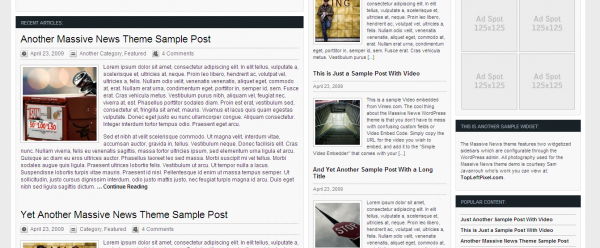
A couple of weeks after the launch, I found myself constantly pressing Ctrl++ to increase the font size so that I could read the posts. Increasing the font size reminded me of another site I read regularly: Lorelle.WordPress.com. Lorelle's font and leading (space between lines) always struck me as large and spacious, but very readable. I could lean back and comfortably read the content.
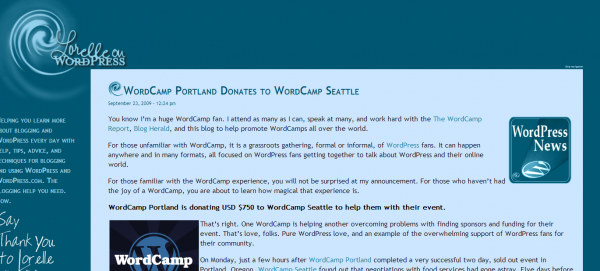
I finally asked Scott if he wanted me to increase the font size a bit and change the layout from three columns to two. He said yes. I also increased the leading and narrowed the main column width.
Now when I visit Scott's site, my eyes focus on the text in the main column, and I can read it without strain.
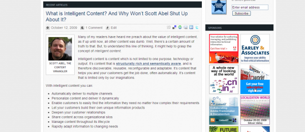
In this post, I focus on the following ten elements for making your blog more readable: font size, line height, line length, typeface, background, subheadings, paragraphs, white space, graphics, and invisibility.
Font Size
Smashing Magazine's study on typography recommends using "a range between 12 and 14 pixels" size for body copy. Jakob Nielsen recommends using at least 10 point, with 12 point for senior citizens. Johno on ILoveTypography.com says,
Don't set body text below 10 or 12px and, if possible, make it bigger. Remember, what's legible on your 65 inch High Definition Plasma monitor, might not be so on a 15 inch MacBook. If in doubt, make it bigger. The body text on ILT is set at 16px.
Here's a screenshot of the 16px font on I Love Typography:
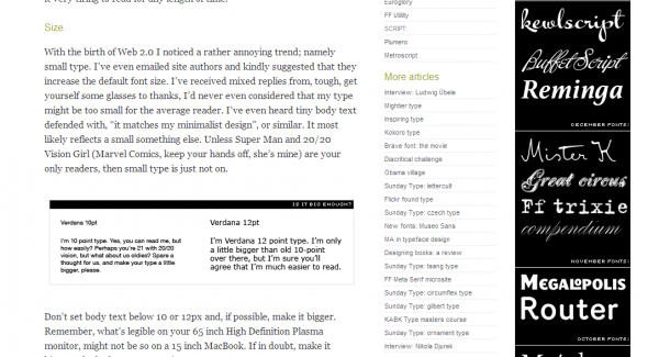
(The smaller text in the graphic is added deliberately to show how difficult it can be to read smaller text.)
How big your font looks depends somewhat on the typeface, but you get the picture: make your font largish. If you look at sites like Techcrunch or Copyblogger, the font size is readable at a distance. You don't have to squint or strain.
Although I don't plan to address headlines much, Smashing Magazine recommends "a range between 18 and 29 pixels" for your headlines.
To modify your font, look for the font-size property in your stylesheet.
Line Height
Line height, or the distance between lines, also affects readability. Smashing Magazine recommends something rather formulaic: "Line height (in pixels) ÷ body copy font size (in pixels) = 1.48." You may have to do a little algebra to figure this out, but if your font size is 13px, your line height should be about 19 pixels in order to equal 1.48.
Mark Boulton adds more reasoning to line height:
A simple rule is your leading should be wider than your word spacing. This is because when the balance is correct, your eye will move along the line instead of down the lines.
When you see a site that has line height (leading) narrower than the word spacing, it does disrupt your visual flow across the page. To change your line height, look for the line-height property in your stylesheet.
Line Length
Line length refers to the column width of your paragraphs. Mark Boulton says that "a general good rule of thumb is 2–3 alphabets in length, or 52–78 characters (including spaces). " Smashing Magazine also notes that classic studies in typography recommend a width between 55 and 75 characters.
This makes sense for readability, because newspapers have narrow columns. Narrow columns make it easier to read (for a good example, check out the Washington Post). However, despite the ideal of 55 to 75 characters in length, Smashing Magazine found that popular sites have an average width of about 89 characters. This is due, I believe, to the need to fit a 600 pixel wide image or HD video into a post.
To adjust your line length, look at the div tag that starts your main content column. Usually there's a width property for this div tag. Just decrease it appropriately.
Typeface
The Smashing Magazine study found the most common typefaces for body copy on popular sites to be "Arial (28%), Verdana (20%) and Lucida Grande (10%)." About 60 percent of the popular sites they analyzed use sans-serif for the body copy. For sites using serif fonts, Georgia is the most common.
It's common to use a contrasting font for headers, with Georgia and Arial being the most common. Basically, a good typeface doesn't draw attention to itself. Stick with the norms.
Background
Smashing Magazine says that invariably, all websites they studied had light backgrounds. You may run across a dark website with white font, and in some cases the combination may be readable. But mostly, popular sites have light backgrounds. Johno on I Love Typography.com adds:
Personally I dislike reading long stretches of reversed out text (i.e. light text on a dark background); how often do we see books set like this? It may well be appropriate for shorter stretches of text on-screen, but I find it very tiring to read for any length of time.
If you do have contrasting colors, Johno recommends grayscaling the colors to see if it is still readable. Also note that sites with dark backgrounds are typically seen as entertainment sites, so unless you want that connotation, stick with light background. With a light background, people reading your site at work won't be embarrassed.
Subheadings
Subheadings refresh the reader's eye, allowing readers to quickly skim and see what your post contains. Here's a good example of subheadings from CopyBlogger:
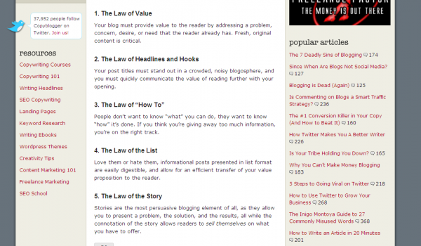
CopyBlogger Sonia Simone explains,
Blog and newsletter readers want meaty content, something that's worth the time they take to read it.
But piling a mountain of words in front of readers doesn't work too well. A page of solid black text looks like, well, work.
So in front of your 20-foot tall stack of words, you put a series of steps. You break your content into manageable pieces, separated by mini headlines or subheads. Each subhead is a step up the staircase.
Each time your reader comes to another subhead, she thinks, "Well, I'll just read to that next little headline there." Then she reads another section, and another.
Subheads break your copy into little potato-chip tasty bites. And we all know how hard it is to stop at just one potato chip.
In other words, subheadings help you get around a problem with blogs: readers want substantial content but dislike reading large stretches of text. The subheading breaks up the text and allows the reader to move step by step through your content. Subheadings also facilitate skimming. Where possible, add a subheading every several paragraphs. It goes without saying that you should keep your subheadings parallel. I also recommend making your subheadings a different color for contrast.
Paragraphs
Have you ever landed on a web page that looks like the writer's Enter key was broken? Long chunks of text without paragraph breaks are extremely unreadable. If you're accustomed to academic styles, you may have been taught that a good size paragraph covers 2/3 of the page. This is what a literature professor once explained to me, because he wanted to see me "develop my points."
However, online reading experiences tire people out much more quickly than print. Content isn't double-spaced as it is in academic essays. Newspapers often break paragraphs every couple of sentences just to make it easier to read. In the Sonia Simone blockquote above, you can see how generous she is with new paragraphs.
White Space
Apple has increased the appeal of simplicity in design. Simplicity often involves removing rather than adding. When you simplify or declutter a blog, you often increase the amount of white space. One site that shows good use of white space is Z-oc.com.
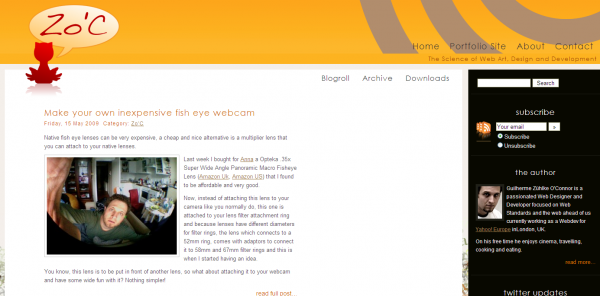
White space has an interesting paradox: The absence of graphics and text plays a significant role in increasing comprehension of the content. The absence of content is what draws the eye towards content. The negative blank space (which possesses nothing) creates a sense of sophistication and elegance. The sense of simplicity and absence of graphics and text is what contributes toward a richer, deeper and more complex artistic expression.
Donald Peterson explains,
In western culture we associate uncluttered spaces with good taste, refinement and affluence. It is also more restful to the eye to read or view items that have a generous amount of white space surrounding them. That is why museums always use broad white walls as a backdrop for paintings on display.
On the Web, white space is essential when the viewer is required to read large amounts of content. Generous margins and clear simple layouts make it easier for the eye to work. Cluttered layouts tire the eye quickly and hinder clarity. Also, just as in advertising, uncluttered layouts convey a sense of good taste and refinement.
You can increase white space in a variety of ways -- increasing the padding in your columns and around images, decluttering your banner area, increasing the leading and font size, increasing the space between the body and sidebar, increasing margins between paragraphs, and adding space in other places.
Graphics
One of the common documentation formats I create is the quick reference guide. Quick reference guides provide one or two page instructions in a brief, concise format. I often look through magazines to get ideas for layouts. After creating quick reference guides for several years, I've concluded that adding a strong graphic to the quick reference guide significantly increased the appeal of the guide. However creative I could be with text layout, it is the image, especially a diagram, that makes the quick reference guide attractive.
In web design, images also play a key role in increasing appeal. An image can break up what might otherwise be a long essay. Images provide concrete examples to communicate what you're saying. Images provide balance and eye candy to give variety to the reader's eye. For example, I've tried to add images to this rather lengthy post, both to break up the text and provide examples.
Invisibility
My final point about readability is to keep your design invisible. You want the reader to focus on the content, not the design around the content. Guilherme Zühlke O'Connor explains,
While the purpose of art is to draw the attention to itself, to make the viewer forget the world for a while and concentrate on it, the purpose of design is just to sit there, without being noticed, while the viewer pays attention to something else.
Design is a support area, the designer's job is to leverage someone else's message and not to draw attention to his own work. Design is an area for team players, for group work. And design must take the user into account.
Good design doesn't jump out at you. It makes the content jump out at you. You find yourself disregarding the design instead of focusing on it.
Conclusion
Although there are other ways to increase your blog's readability, these are the most important elements to consider:
- font size
- line height
- line length
- typeface
- background
- subheadings
- paragraphs
- white space
- graphics
- invisibility
About Tom Johnson

I'm an API technical writer based in the Seattle area. On this blog, I write about topics related to technical writing and communication — such as software documentation, API documentation, AI, information architecture, content strategy, writing processes, plain language, tech comm careers, and more. Check out my API documentation course if you're looking for more info about documenting APIs. Or see my posts on AI and AI course section for more on the latest in AI and tech comm.
If you're a technical writer and want to keep on top of the latest trends in the tech comm, be sure to subscribe to email updates below. You can also learn more about me or contact me. Finally, note that the opinions I express on my blog are my own points of view, not that of my employer.
