The Importance of Chunking for Sorting
If you want to be able to sort information by various classification schemes, such as by most popular, or by role, or by problem, your content has to be chunked in a granular enough way to facilitate the various means of sorting.
Consider a work that is one large book, with no chunks at all. In that case, it would be impossible to sort anything, because you have just one object. With one object, the only pattern you can configure is itself. But if you have a handful of objects, you can arrange those objects into as many patterns as you want.
To use an analogy, let's say you have a pile of rocks. If you have 1,000 small rocks, the potential number of patterns you can configure with the rocks is infinitely greater than the patterns you can configure with just a few rocks.
I noticed this in a recent trip to Arches in Moab. While walking along trails, we saw a lot of rock piles called cairns that act as guide points. The cairns can be stacked and arranged in myraid ways, because they consist of little rocks:

But the big rocks are much more pattern-limited. They mostly just sit there, alone:

Thus if your goal is to enable a variety of patterns or classification schemes, so your users can choose from myriad classifications, according to their individual needs, you must chunk your content in a granular enough way to facilitate the classifications.
Granular chunking poses some difficulties for help content, because if you chunk things too small, the help system becomes arduous to navigate. If each page contains just one topic, you end up with so many pages, navigating the pages will give users a headache.
To avoid this, on my calendar help wiki, the Viewing Calendars page has the following topics on the same page:
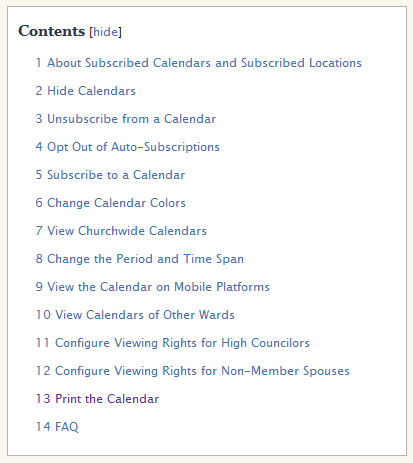
Now, suppose I want to manipulate this content on a more granular level. Suppose the "View Calendars of Other Wards" topic is a popular topic; the "FAQ" issues would be appropriate in a problems-based classification. The "About Subscribed Calendars and Subscribed Locations" belongs to a conceptual table of contents. The "View Churchwide Calendars" belongs to a "Coming Features" type of organization, and so on.
In short, let's say I want to add metadata to each of these sub-topics so that they can be sorted, rearranged, recompiled, or otherwise organized in different classification schemes. If they are compiled in one giant topic, they can't be manipulated at all except on a more macro-level. This is why chunking is such a fundamental principle to technical writing, because without small chunks of content, you don't have many options for manipulating it.
Whether you use a wiki or not, deciding how granular to chunk your content is a challenge. For example, on Microsoft Word's Help, this is the topic for Changing or Setting Page Margins.
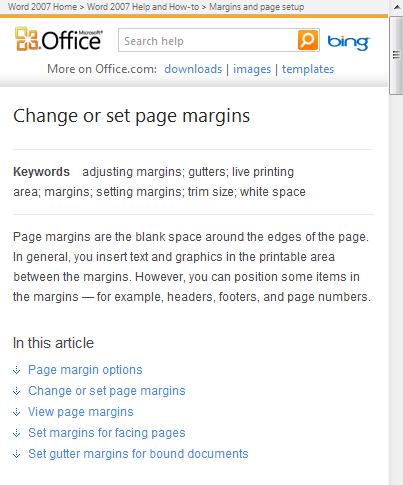
By combining these five topics into one topic, it becomes more difficult to manipulate the individual sub-topics as their own topics. The metadata you add to this topic must account for all the sub-topics within this topic.
Now consider the opposite strategy. Let's make each subtopic its own topic. You can see the effects of this approach in the following Office help search:
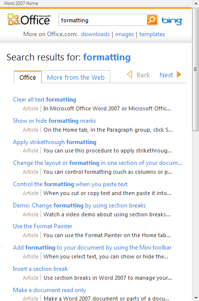
Here the topics on formatting are all chunked into their own topics, so you end up with Clear all text formatting, Show or hide formatting marks, Apply strikethrough formatting, and so on. When a user clicks on a topic, the topic is short, such as the following:

This short topic either answers the user's question or it doesn't. There's not much room for error, since no similar topics are grouped together. If it's not the right topic, the user must return to the list of results and click another, and another, and another until he or she locate the right topic.
In contrast, if you combine a larger number of topics together on the same page, you give more context to the user. He or she can read conceptual introductions followed by a handful of sub-topics that all deal with the general topic. The user can easily scan down the subheadings to find the right sort of task for this topic. But it's harder to manipulate each individual sub-topic separate from the larger topic. And your metadata can't describe each of the individual sub-topics but must cover the larger topic generally.
Chunks that Consist of Chunks
I've been contrasting big chunks versus little chunks without acknowledging that big chunks can consist of combinations of little chunks. So in each of the examples above, the topics can exist separately but be grouped together into the larger topics that you see.
With Mediawiki, this method of reuse is called transclusion. Last week, convinced that I needed to chunk each topic more, I separated all the topics that you see in that first calendar screenshot onto their own individual pages. I then "transcluded" these chunks to form a longer page.
Currently, from the user's point of view, it looks exactly the same. But really, I can now arrange and manipulate these chunks however I want because I can apply unique metadata to each one of the topics.
However, this poses a new problem: searches will find the individual chunks and the larger pages that combine these chunks, which means content will be in multiple places rather than one place.
The Collage and the Painting
Don Day's post on The Collage and the Painting describes how search becomes problematic with little chunks. Day is writing in the context of DITA, but the challenge of working with small chunks is the same. Day writes,
A common talking point about DITA is how the topic-referencing architecture makes it easy to reuse topics in new maps of information. By extension, searching on a facet of interest should bring up a collection of topics that you can read as a focused subset of a larger whole. Print it as a PDF, or output it in eBook format, and you've got some good reading for the commute or for the weekend. But how practical is this vision?
The flaw in the theory comes from loss of context when you pull a set of topics by query. Imagine doing a web search on a subject of interest and then printing the whole list of hits, as is, into a single PDF for later reading. Obviously you will have the problem of duplicated content, possibly some older and less reliable content, a good deal of discussion by people who are not experts on the subject, organizing the hits in a reasonable manner (by timeline, by author, in a hierarchy) and so forth. Metadata might help in preserving bits of a former organization or rationale, but the new use might be totally different from how any of that content was originated. Bringing order out of disarray is the whole drive behind the growing trend of Content Curation.

In other words, if you pull together all topics that have specific metadata, such as all topics related to scheduling events, you may get an unordered collage of topics. The order of the topics may not reflect any kind of sequenced or arranged reading. The list of topics no longer forms a larger, well-written chapter that contextualizes each topic, but rather may seem like little scattered objects here and there.
The effect might be compared to taking an entire book and ripping out all the pages and throwing them on the ground, mixing them up, and then reading the randomly arranged orders. That reading experience is dizzying and un-fun.
In sum, when you run searches on all the topics together that have similar metadata, you end up with assortments of small chunks that lack the continuity and context of a larger chapter or book. This simply seems to be the tradeoff of chunking your content. Your search results become more like a collage, but you have more flexibility in how you arrange your topics.
About Tom Johnson

I'm an API technical writer based in the Seattle area. On this blog, I write about topics related to technical writing and communication — such as software documentation, API documentation, AI, information architecture, content strategy, writing processes, plain language, tech comm careers, and more. Check out my API documentation course if you're looking for more info about documenting APIs. Or see my posts on AI and AI course section for more on the latest in AI and tech comm.
If you're a technical writer and want to keep on top of the latest trends in the tech comm, be sure to subscribe to email updates below. You can also learn more about me or contact me. Finally, note that the opinions I express on my blog are my own points of view, not that of my employer.
