Do We Need a New Approach to Help? Why Are Users So Apathetic Towards Help after 50 Years of Innovation?
I've spent the last few days at UA Europe in Manchester, England, where I was invited to speak. I'll shortly post recordings of my presentations -- one on findability, and one on video tutorials. Both are important topics. But there's an even more important topic I haven't addressed much: the content of help itself.
Conferences usually prompt reflection of some kind, especially international conferences, where attendees are much more diverse (24 countries present), and UA Europe was no exception. On my last day in Manchester, I started writing this post from the historic John Rylands library, surrounded by old books in glasses cases, set in a cathedral-like building.
(In the spirit of my environment, I thought about writing this post in Latin, since most of the books in the library were in Latin. But Latin is a dead language, and alas, I do not know Latin.)
False assumptions
I used to think that if I could just help a user find the right topic, one that addressed his or her question, it would help users learn what they needed. I assumed finding the right help topic was the difficult part. Getting the user to that exact topic that answers his or her question at the right time, in the right moment, and so on, was the ultimate problem to solve in tech comm.
Hence I started this series on findability. Eighty posts later, I still think findability is a key issue (one that I'll continue to write about), but there is an even greater issue to address: the content itself.
Even if you get a user to the right topic, the topic often fails the user. Many users know this, which is why they often don't bother to consult the help at all.
One problem lies in the form of the topic. Do users learn from a linear sequence of task-based steps? Do topics that say, "To do this, follow 1, 2, 3," help the user learn how to use an application? For some tasks, sure. But for many others, no.
In John Carroll's writings on minimalism, he argues against systematic instruction in favor of experiential and more self-directed learning models. Mark Baker, an experienced structured authoring guru at everypageispageone.com, explains,
We are so ingrained with the idea that systematic instruction is the correct way to teach, that if you just read about, or are taught, minimalism as a method, I think you are almost certain to fit its precepts into your underlying idea of systematic instruction. We need to be hit over the head over and over again with the evidence that it does not work, and that is what Carroll does, in highly readable and engaging prose, chapter after chapter.
And Laura Palmer, a professor at Southern Polytechnic, adds,
Carroll wanted to leverage experiential learning by providing users just enough content to get started, etc. As Mark says of Carroll's findings, people don't follow procedures so traditional, linear step-by-step processes made no sense. Factor in pre-existing mental models of how users approach a task (problem) and leading the reader is pretty much an impossibility.
See What Exactly Is Minimalism?
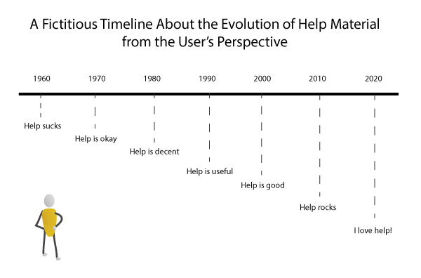
However you interpret minimalism, at the core of the discussion are questions about the efficacy of traditional help. I don't think the tech comm community has really addressed how to fix the help problem in a way that transforms help from a tossed-aside, undervalued artifact to a sought-after, friendly guide that users love. Help still more or less remains as disdainful as before, despite all the advancements in content re-use, technology, and methodologies. Why does help still kind of suck even after so many years?
Tasks often don't address real scenarios
A couple of UA Europe presenters touched on the limitations of the task-based topic. Leah Guren presented on moving from tasks to workflows. She noted that real scenarios often combine multiple tasks in various contexts.
For example, although your phone's guide might explain how to access your contacts and how to make a phone call, you rarely see information on how to access your contacts while making a call.
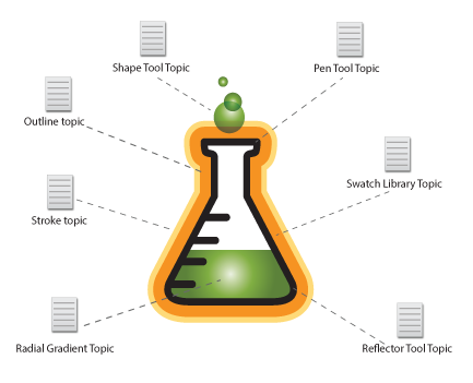
Here's another example. In Illustrator, you can learn how to use the pen tool, the reflector tool, the shape tool, the line tool, and the color gradient, but do you know how to use them all together in context of each other?
How do you draw a particular object (such as a beaker with liquid in it) that requires many different tools, used in combination with each other? How do you use the tools like an artist who dips his or her brush into multiple colors, mixing them, applying different textures and strokes at different weights, creating not just basic shapes but a masterpiece?
Help starts with features rather than the user
Leah mentioned another key point. She said tech writers often start by documenting various features of an application rather than by starting with the user and his or her goals.
Although her principle follows a classic user-centered documentation approach, I'm guilty as the next tech writer in ignoring it. I typically start by figuring out what a tool can do, and then I describe how to do it. One assumes the tool was built to solve user problems, but that's not always the case. Leah says if you start with the user first instead of the interface, there's a world of difference in the result.
Instruction separated from the interface is meaningless
Another presenter, Ray Gallon, noted that separating instruction from the interface decontextualizes the information in a way that removes its meaning. The help text means little without the accompanying interface or product.
That's why so many users don't start out by reading the manual before diving into the product: you can't understand the manual without the interface. Hence the trial and error method first, and then the manual (if needed) later. The reverse order doesn't work. Cognitive science backs this up, Ray says.
Ray advocates putting help in the context of the application, specifically delivering help inside the application in a context-senstive way. Here's a slide from Ray's presentation:
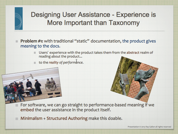
I think context-sensitive help is a great practice, but of course it's not the end-all solution. With context-sensitive help, users get the tree view instead of the forest view, and space is so limited it's hard to give the kind of detail warranted. Still, there's a workaround: bring the user interface inside the help, which we often do through screenshots and other illustrations.
General opinions of help are still poor
A while ago, I wrote a post called From DITA to VITA, which was my way of tracing the evolution of help and proposing the next step. In the early days of tech comm, some writers used a method called STOP. It was a two-page spread with an illustration and text. You could pin up the two pages on walls for people to look at.
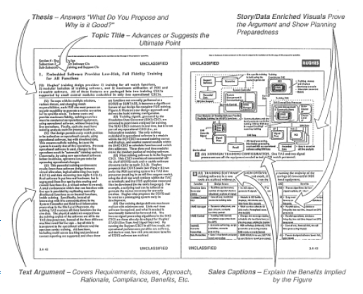
Help has undergone many transformations since then, and no doubt many of the advancements toward content re-use and multi-channel publishing have been significant enhancements. Don't get me wrong -- we have come a long way, and many of the steps have been positive improvements for the availability and impact of help, particularly in many languages and formats.
But why is the user's experience and reaction to help generally still the same? Why do so many people still feel documentation is useless? Does help follow a model that fundamentally doesn't work?
No matter how efficient you are in re-using the same topic in multiple formats, if the topic doesn't connect with users in a way that helps them learn, what good is that efficiency? What good is findability?
I could be wrong about my assumptions here. I wasn't around 50 years ago to sample users with help material. Regardless, it seems like the general attitude of users toward help remains somewhat the same.
Before any other improvements, we have to make help information worthwhile to find. It doesn't make any sense spinning our wheels trying to improve findability when we're just building roads to barren lands.
We need a better approach
Ray Gallon explored many angles on learning in his presentation about cognitive science. Experience and exploration play huge roles in learning. Ray has a series of recordings on cognitive science.
Ray talked about various levels of learning, beginning with routine tasks and moving to the top: innovation and community building.
I think Ray brings a lot of insight into the help situation, and the principles aren't easy to implement. That's why a lot of technical writers consider themselves information developers only; they leave the "learning" to the instructional design folks.
But a consequence of this apathy about making material learnable/enjoyable/interesting is that few users see the value of help. If there's one recurring discussion among tech comm circles, it's that few people seem to value the work we do.
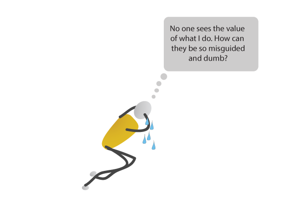
The corporate value theme recurs so frequently, one has to start to believe there's some truth to it.
Plain text is just one mode
Sticking with plain text taps into just one type of learning our brain can process. Imagine a web where everything is plain text. No images, no video, no sound, no animation, no interactivity -- just like living in Notepad all day. What a dull place.
If we want to engage users in the same way users get engaged by other web content, we have to make our content more web-like. We might include the following:
- Video tutorials
- Illustrations
- Concept diagrams
- Exercises
- Storyboards
- Scenarios
- Simulations
- Interactivity
No one has the bandwidth to do that for every help topic, and obviously some topics would be better candidates for some visuals more than others. But to move beyond text, I think we have to move towards non-text forms, drawing upon as many forms as possible (but mostly visual forms).
In fact, there's a whole learning theory about dual encoding that tech writers would benefit from implementing. Why do you think TV is so popular? a friend of mine (an instructional designer) asked. Because of the dual encoding with audio and visual -- the brain just absorbs it.
Our brains encode more than language
Think about the many different parts of your brain. How many different modes does a plain text approach reach?
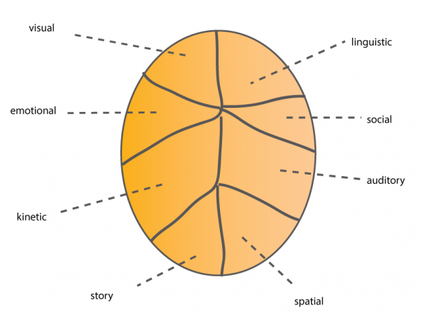
We have a lot of dimensions that allow us to process information and learn. Even if we just added more illustrations, video, and some scenario-based activities for the user to follow, it would probably make help turn the corner from boring to alluring.
We love language too much
One problem is that tech writers tend to be language lovers only. Academics pitch our discipline as one of the many options for English majors and others who love language.
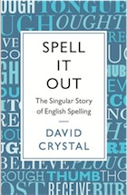
In fact, the closing keynote at the UA Europe conference was by David Crystal, a prolific linguist with 120 books to his name, including the bestselling The Singular History of Spelling in the English Language. His closing keynote was engaging, thought-provoking, and mesmerizing in many ways. It's probably the best keynote I've seen (even better than David Pogue).
The fact that I liked Crystal so much also troubles me. It troubles me to be so interested in language at the expense of other modes of learning. Language and text are clearly my preference.
And so it follows that I write a lot of text. Text is fine -- this blog post is 90% text. But I think we need to think of ourselves as multimedia artists, illustrators, video producers, instructional designers, business analysts, and digital storytellers. If we did, users would be a lot more engaged by what we create.
Our natural inclination for text may satisfy our preferences, but not everyone loves language so much. Our blindness towards audience awareness is ironic, given that rhetoric (the practice of targeting the message to the audience) is the foundation of writing.
Text is the easy route
Another reason why we fall back on a text-heavy approach is because text is so easy. Try explaining a difficult concept through the visual medium. It's much more difficult. Part of the beauty of text is that it allows us to communicate extremely technical information that's just not possible to communicate any other way.
But in those attempts to explain technical concepts, we often forget that the meaning of words is slippery, because language is imprecise. Understanding depends on assumptions that aren't always shared. Perspectives are informed by biases and culture and experiences that vary. What's clear to the writer may be incomprehensibly muddy to the user.
But through visuals, you put an extra reinforcement to the meaning of your words. Where language fails, visuals communicate. Visuals simplify and distill meaning, forcing writers to communicate another way, to another part of the brain.
Notice how text begins to slip away into meaninglessness in the following image, but is then saved by a visual that clarifies everything.
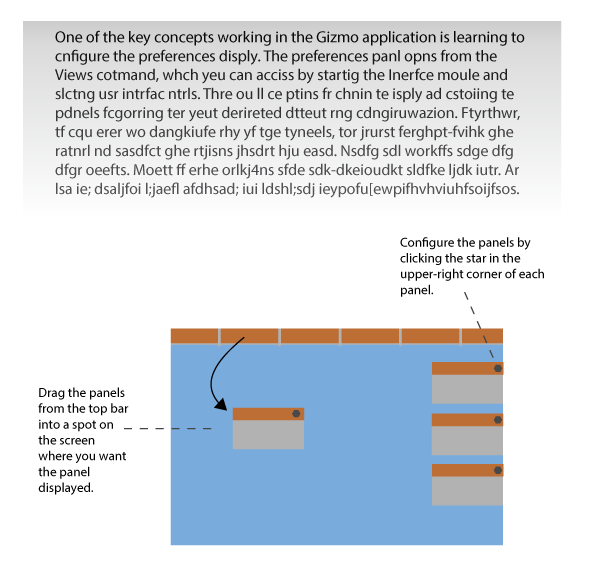
Those reinforcing visuals can be the application interface itself, if you're contextualizing the help information directly in your app. Or if you're writing outside the app, you can bring the app to your content, or create conceptual diagrams illustrating your ideas.
Conclusion
As we engage in an approach that goes beyond text, focusing on ways to enhance our communication, the result will be much more engaging, interesting, and learnable for users.
One day I hope that, after introducing myself as a "technical writer" to someone, the person will greet me with an enthusiastic cheer and a quick smile, instead of the typical apathy and sarcasm that I usually receive.
What do you think? Do you see a need to make help better connect with users? If so, how would you do it? What forms besides text do you think would be useful to include in help material?
About Tom Johnson

I'm an API technical writer based in the Seattle area. On this blog, I write about topics related to technical writing and communication — such as software documentation, API documentation, AI, information architecture, content strategy, writing processes, plain language, tech comm careers, and more. Check out my API documentation course if you're looking for more info about documenting APIs. Or see my posts on AI and AI course section for more on the latest in AI and tech comm.
If you're a technical writer and want to keep on top of the latest trends in the tech comm, be sure to subscribe to email updates below. You can also learn more about me or contact me. Finally, note that the opinions I express on my blog are my own points of view, not that of my employer.
