From DITA to VITA: Tracing Origins and Projecting the Future
With my recent reflections on long versus short text, a comment by Michael O'neil made me wonder whether the “reading to do” mode equated with DITA's task type, and whether the “reading to learn” mode equated to DITA's concept type.
In researching this, I stumbled across a goldmine of an article on the History of DITA. The article (mostly by Bob Doyle) traces the evolution of structured authoring from its earliest attempts in the 1960s through the present day. The history seems to encapsulate all the major innovations of technical communication, culminating in the formulation of DITA.
According to this history, DITA can be traced from the following previous approaches and philosophies: Quick Reader Comprehension (QRC), Sequential Thematic Organization of Publications (STOP), Information Mapping, Minimalism, SGML, Docbook, and other innovations.
Tracing this evolution is fascinating. I've tried to read through some of the sources mentioned inasmuch as I could find them online. I'll try to retell the history with my own commentary along the way. At the end, I'll explain my own method for help authoring.
Quick Reader Comprehension (1961)
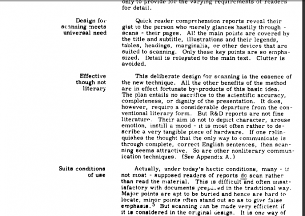
Around 1961, T.J. Matthews, an editor/publisher at the West Coast Navy Laboratory, developed a Quick Reader Comprehension method (QRC) for reports to increase reader comprehension while also making authoring more efficient. To increase the comprehension, he invented a format in which he labeled each section with the main idea on the left, while writing the details are on the right, as shown in the image below.
Matthews explains the philosophy behind this format:
The recipients of an R&D report often differ widely in their subject matter knowledge, use for the material, time for study, and desire for study. They do, however, all have one thing in common. They all need to grasp the main points of the presentation (3-4). … the headings and marginalia that the scanner sees do serve as signposts that direct him to complete text descriptions. This provides a sort of random access effect. The report holder has an intelligent basis for deciding whether to study or skip any part of the material. (Quick Reader Comprehension, p.5)
In other words, the marginalia serve the more advanced user who only wants to quickly scan the material. The novice user who needs more detail can easily dive into more depth by reading the text on the right. Matthews' technique tries to solve the problem of delivering the right amount of information to the audience given the variety of user needs and backgrounds.
Matthews also places a heavy emphasis on illustrations. Illustrations can serve the same purpose as the marginalia, allowing the reader to quickly scan through the document, reading the illustration captions and looking at the visualization of the information to grasp the whole of it. This is actually how most people read National Geographic magazine.
Matthews argues that “literary” (or text-heavy) approaches to technical writing often result from students graduating from English departments, where there is a constant focus on texts rather than graphic design. Matthews' monograph itself is illustrated with graphs and other visuals to depict his ideas. He notes that students who want to enter technical writing need a solid background in graphic design, because “Art and science are not two things; they are two sides of the same thing” (Thomas Huxley in Quick Reader Comprehension, p.12).
To decrease the authoring time, Matthews creates a modular authoring process in which each section is a standalone topic that can be prepared and finished independently. This allows the authors to work on any part of the document at one time rather than proceeding sequentially through the material. Matthews explains:
“…each section or subsection is confined to discussion of a single topic. There is no cross-referencing. This permits the sectional topics to be prepared at any appropriate time and in no particular order. They are done piecemeal. This approach has several advantages over more usual methods. First, outlining is greatly simplified and relegated to one of the last, rather than one of the first tasks in reporting. Second, if the units are prepared during the course of the technical work, then large blocks of material are ready for use as soon as the problem has been completed. It is only necessary to arrange these blocks in logical sequence and write transitional sentences or paragraphs. Third, the reader benefits because the author is obliged to stick solidly to one subject at a time.” (Quick Reader Comprehension, p.6)
In other words, Matthews is moving toward a modular writing process in which you have a series of independent, self-contained modules rather than one long text. This speeds up authoring time and also increases reader comprehension because each section will have a stronger focus. This facilitates the reader who skips certain sections of a document and reads only specific areas.
STOP Storyboarding (1965)
The next major development comes from a publications department at Hughes-Fullerton Aircrafts. Walter Starkley explains that “the notion was to construct the proposal entirely of two-page modules, with text and any associated visual facing each other” (STOP, p.42). In other words, Starkley's STOP method is probably the first quick reference guide.
The following image shows the STOP format.
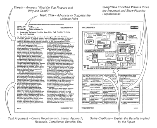
Starkley says some writers objected, noting that some topics called for more elaboration beyond two pages, and other topics don't have visual potential for the required graphic. To address this, Starkley says research shows most writers switch topics after about 500 words anyway (the length of text allowed on one STOP page). For the graphic, they allowed the graphic to visually depict the argument or ideas instead of showing some object.
Because you had to write for a specific structure, the STOP method is one of the first instances of structured writing. The content could not be longer than two pages. The left facing page had to contain explanatory text, while the right facing page always showed a graphic. This consistent structure no doubt led to a predictable pattern for readers to follow.
The writers pinned these guides up on the wall for readers to look at. Because each two page module was self contained, "the reader [was] confronted with a self-contained and easily assimilated theme wherever he may open the document” (STOP, p.47). Again, this self-containment of topics is another instance of modular writing.
Notice the STOP method's emphasis on illustrations combined with text. This emphasis on illustrations will be mostly forgotten by the time DITA develops.
Information Mapping
Robert Horn builds on some of the previous concepts of labeling and modular writing, but he also introduces something new: information types. Horn identifies seven major information types:
Blocks in the domain of relatively stable subject matter can be sorted into seven basic classifications, which we call ‘information types.' The seven information types are:
- Procedure
- Process
- Concept
- Structure
- Classification
- Principle
- Fact
Horn then analyzes the optimal structures for each information type and develops an approach for each type. Horn also introduces the idea of “information blocks,” which are similar to paragraphs but more tightly focused on a single idea, and usually about 7 sentences (no more than 9, to fit with Miller's Law of 7 plus or minus 2). These information blocks chunk the information into reusable components for “precision modularity.”
The following is an example of a document structured with Information Mapping.
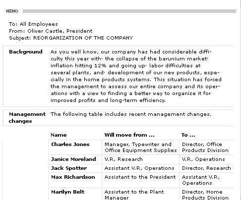
Information Mapping is still a practiced method for authoring, and there's even an Information Mapping conference in Texas this week. However, reading about Information Mapping is somewhat difficult because Horn has trademarked the technique and restricted access to the material. However, you can see a before-and-after demo here.
Minimalism
The next major development is a concept called minimalism, introduced by John Carroll in his book The Nurnberg Funnell. The basic ideas is that learning takes place through action and exploration, not through reading manuals. The more information you can remove from a manual, the quicker you can get users into the application, exploring and learning for themselves.
Carroll has four main principles in his minimalism approach:
- Choose an action-oriented approach.
- Anchor the tool in the task domain.
- Support error recognition and recovery.
- Support reading to do, study and locate.
(See Application of Theory: Minimalism and User Centered Design, by Mary Lou Mazzara.)
In other words, minimalism isn't just about reducing word count because people are busy and don't like to read. Minimalism is grounded in learning theory: users learn by doing, not by reading. Get the user acting in the application. Focus your topics on real tasks the user wants to do. When the user makes errors in the application, provide ways to guide and correct the user.
It seems at this point that graphics and illustrations are no longer emphasized, because the application itself is the visual illustration.
In Managing Your Documentation Projects, JoAnn Hackos relates a story that illustrates how too much information can "get in the way of learning":
In one case study, a publications group decided as part of a paper reduction goal to reduce the size of their hardware installation manuals from over 100 pages of text and illustrations to approximately 20 pages. They eliminated redundancy and cut unnecessary information in the process, but they never consulted the users. All the decisions to eliminate information and redesign the installation books were made by the technical writers and the developers.
The users, 98 percent of whom were trained company techniques, were asked to review the content of the new, shorter manuals for accuracy. They carefully corrected errors in the existing text. Finally, they inquired why anyone in their group needed 20 pages of text to install the hardware. Once they were asked, the technicians explained that all they needed was a picture of the board to verify that they had the right piece of hardware. (103-104).
In other words, by becoming familiar with user's needs, we can often reduce the information in our manuals significantly, not just from 100 pages to 20, but down to 1 or 2 pages.
DITA
In the interest of time, I'll skip past SGML, Docbook and go right to the more well-known cousin/successor: DITA, or Darwin Information Typing Architecture. DITA builds on some of the developments of these previous structured authoring approaches. For example, DITA emphasizes modularity of topics, with the idea that each topic is a discrete, self-contained unit that the user can read without requiring a larger context.
DITA also identifies structures for different types of information, but rather than identifying seven types, it simplifies it to three: concept, task, and reference. Each topic can be one of these three information types. The topics are then assembled through maps that can contain any number of topics.
DITA is also heavily minimalistic. The task types, for example, require a structure that limits content to just one short paragraph after the title, and also eliminates stem sentences that introduce the procedure sequences. So far, not much new.
Where DITA is different is in the emphasis on content re-use and the separation of content from format. Why the emphasis on content re-use? In DITA 101, Ann Rockley explains:
One of the largest impacts of technology on information development is the addition of so many new formats for delivering information. No one just delivers a user guide (book) any more. There is an increasing need for information to be delivered in multiple formats. (DITA 101, 114)
In other words, content re-use is important today because we have more deliverables to produce. This is particularly true due to the Internet, which introduce a need for web help, and with mobile devices, which require a mobile format.
Another strength of DITA is that its structure enforces consistency, so for every task type, readers will become accustomed to the same format. This structure is enforced through the XML architecture of DITA, which requires certain tags in certain orders. More consistency leads to greater usability in the document.
Most importantly, DITA allows you to re-use or single source topics into different deliverables. For example, you can create a guide focused on a specific role, or for a specific scenario; you can compile a lengthy guide or a short guide. Because you can select and compile topics at will, you can create a variety of deliverables that better address a specific user level, context, and need. Ann Rockley notes that this selection allows you to get the right information to the right user at the right time (DITA 101).
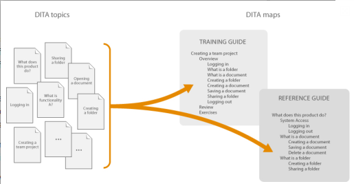
(Image from Reuse strategies and the mechanisms that support them, ditaxml.org)
Because content is separate from format, DITA requires a rendering component to transform the XML (your tagged content) into an output. This is part of the beauty of XML -- you don't hard-bake the format into the content. You can apply a completely different style to the content without actually changing the content. However, customizing the stylesheets requires XSLT programming knowledge, so this also potentially a drawback of DITA.
Beyond DITA
DITA is an impressive format, so one might ask, what could possibly come next? Is DITA the most cutting edge approach to documentation, the culmination of years of refinement and adjustment?
Noticeably absent in DITA's functionality is a collaborative, wiki-like component for working with non-writers, such as stakeholders, project leads, and end-users. However, Don Day, chair of the OASIS DITA Technical Committee, is working on a project that will combine DITA with wiki-like functionality so that DITA can be used as a collaborative tool for a wider audience.
Other developers are working on exporting DITA to a wiki format, and then back again (round-tripping). Lombardi software has developed a method for the export of DITA to Confluence wiki. This looks promising if you use Confluence.
Only Half the Problem
I like the idea of DITA. It should be the back-end technology behind nearly every documentation tool. It clearly has the potential to make authoring processes more efficient. However, DITA only solves half of the problem. Remember back in 1961 when T.J. Matthews tried to solve the problems he was facing with his QRC method? Matthews starts his essay by complaining how the scientist today entering the space era "faces insuperable problems in attempting to keep himself informed on what he needs to know."
He then asserts:
The Quick Reader Comprehension (QRC) method of R&D reporting promises to make both writing and reading more productive. It is potentially capable of saving at least half the manhours that scientists and engineers spend in manuscript preparation, and of increasing greatly the amount of information that can be obtained in a given amount of reading time. (Quick Reader Comprehension, p.3)
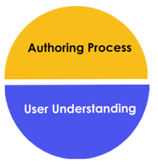
Matthews' attempt is not just to create a more efficient authoring process, but to improve the users' learning, their rate of information absorption and comprehension. DITA just provides more of the same content in different combinations -- topics in long guides, short guides, role-based guides, scenario-based guides, online help, mobile help, and other forms. The ability to pull together topics in the selections you want is critical and a huge step forward, but remember it's still the same topic content. And of course that's the idea of DITA -- same content, but wrapped in different packaging.
However, as a total help solution, we have to keep in mind the other half of the problem: helping the user understand the massive amount of information we're giving them. DITA should be a component within a larger learning strategy, not the solution for learning. Users who look at DITA as the magic button for perfect user assistance are missing a key point. DITA does not significantly enhance learning in itself -- it's just an authoring efficiency.
Multimodal Learning
The innovation in technical communication today needs to focus more on innovation in learning techniques, not just efficiencies in authoring. As we know, users interact with help material in a variety of contexts. Sometimes they read to learn, other times they read to do. Some users are novices who can barely double-click a mouse; others can understand the code running behind the application. Some users are voracious scanners who turn page after page looking for information; others are visual learners who need to see in order to understand. Others need someone to explain tasks to them in person; others prefer interface tips and notes and they explore on their own.
No help material will provide a one-size fits all solution. Rather than simply regenerating the same topics in different outputs, what users need for learning is a multimodal help experience. Just as conferences that offer nothing but lecture after lecture bore their attendees, help material must also provide content in different modes. Not just help in different formats, but different modes entirely. These different modes will not only suit different users but will also reinforce learning with different senses.
The four categories of multimodal learning that help content might address are as follows:
Video (screencasts).Probably the single greatest tool for learning a software application is to see how to do it. Our minds are visually mapped. When we watch how something is done, we understand. No amount of descriptive text and screenshots can really communicate all the a user takes in by watching a two minute video. Lynda.com, a video tutorial site for hundreds of software products, is the probably most popular example of technical communication on the web.
Illustrations (quick reference guides). A user looks at an overview of the system to gather a holistic idea of how it works. A two-page quick reference guide (QRG) with an illustration fills this need. You can't just extract this content from a topic in your online help, because the content is integrated into the illustration, which may only be a screenshot with callouts on it, but ideally it's more conceptual. In my experience, the content has to be revised for the illustration. To make an analogy, a quick reference guide is to a reference manual as a poem is to a novel. It's not just the same content -- it's compressed, it's an overview. It captures the whole in a visual way rather than explaining the parts.
Text (wiki or online help). The user who wants to read the details, or who needs a quick answer to a "how-do-I" question, can consult the written material to find the answer. A wiki is often the best solution here in collaborative environments, because it takes advantage of collective intelligence. But an online repository of any help content also works as long as it's searchable. DITA can provide a good format for this content.
Action (practice and exercises). As John Carroll rightly pointed out in minimalism, you only truly learn something when you act, when you do. Users need practice problems and exercises and if possible, a test system, where they can experiment and explore the ideas and techniques they are learning about. These invitations to act can be added as "suggested homework" at the end of videos or put into a training workbook.
There are other modes for learning, of course. For example, teaching. When you teach a subject, you learn it better than anyone else. But how do you incorporate this learning mode except in a classroom setting? Perhaps if your online help is a wiki, you can give every user his or her own space where he or she can make notes on key tasks. Or encourage forum participation to teach others. But since there isn't a practical application, I omitted it from my big four above.
The acronym for these four main modes of learning is VITA. In Latin, this means life, which is appropriate for the balance of the approach.
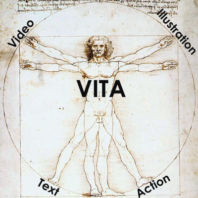
These four modes aren't just the same content pushed out into other formats. They are modes of learning. Some might criticize my approach to say that it falls under training or instructional design more than technical communication, but these lines have always been blurry. Our purpose as technical communicators is not merely to communicate information, but to help users understand the information and to become power users of the application or system we're educating them about.
DITA could be used in this multimodal learning solution. DITA might be a wonderful tool for pushing topics out as screencast scripts and training material, but in my experience, the same topic doesn't work without significant alteration. Single sourcing breaks down when you switch modes in drastic ways -- going from text to illustration, or from written to spoken communication.
For me, it's less important to try re-using content as it is to create content in new modes. And that's the key deception of DITA. DITA would have you believe that you can single source your way into every possible deliverable. In reality, you're just making potatoes in a few different ways (scalloped, mashed, boiled). You're still giving the user potatoes. VITA is a multimodal approach, giving the user a full array of nutrition options, so to speak. It educates and informs by touching almost every sensory input.
About Tom Johnson

I'm an API technical writer based in the Seattle area. On this blog, I write about topics related to technical writing and communication — such as software documentation, API documentation, AI, information architecture, content strategy, writing processes, plain language, tech comm careers, and more. Check out my API documentation course if you're looking for more info about documenting APIs. Or see my posts on AI and AI course section for more on the latest in AI and tech comm.
If you're a technical writer and want to keep on top of the latest trends in the tech comm, be sure to subscribe to email updates below. You can also learn more about me or contact me. Finally, note that the opinions I express on my blog are my own points of view, not that of my employer.
