Second-Level Faceted Navigation [Organizing Content 8]
In my previous post, I introduced faceted classification and faceted navigation as alternative methods for organizing help content. In contrast to topic-based hierarchies, faceted navigation provides multiple paths into the same content. These multiple paths increase the likelihood that users find the right content.
Peter Morville and Jeffery Callendar, two information architects, call faceted navigation "arguably the most significant search innovation of the past decade." Because of its importance in content findability, one aspect I want to now explore further is a second-level faceted browsing system.
Second-level facets help increase the "scent of information," as information designers call it. Like animals sensing the signs of their prey, users stalking content feel motivated to keep looking if they see signs that they're "getting warmer," as Jakob Nielsen puts it. Second-tier facets provide signs that the user is getting closer to making a kill.
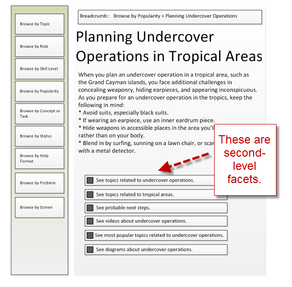
In the following diagram, the user has landed on a topic. The user may have searched for "going on undercover operation" to find the topic. Or the user may have browsed to this topic through one of the first-level facets on the left.
It's not quite the right topic, but the result tells the user he or she is on the right track, since it does address undercover operations. Now the user can refine the selection by choosing one of the second-level facets below the topic.

Here second-level facets can be powerful. In the above example, I chose to include the following:
- See topics related to undercover operations
- See topics related to tropical areas.
- See probable next steps.
- See videos about undercover operations.
- See most popular topics related to undercover operations.
- See diagrams about undercover operations.
I could add more facets as appropriate. For example, since the topic addresses weaponry, I could add "See topics relating to weaponry," and so on. Cross-references within the topics also provide second-level navigation. Using one of these second-level facets, the user can refine his or her search for the right information.
For more examples of faceted browsing, see cokeonshelf's Flickr photostream.
How You Create Second-Level Facets
The technical steps for creating second-level facets depend on the help authoring tool you're using. In Flare, you can add a concept to topics (similar to how you can add tags or categories to posts in WordPress). Once you have added concepts to your topics, you can then insert a concept help control in a topic.
In the help control's settings, you can choose to show all topics tagged with the same concept. You can also add a style class for the link so that it doesn't simply say "See also," but rather has more customized text. Essentially you can tag your topics and then show a list of those tagged topics wherever you want them to appear.
Note: I recommend customizing the "See also" text with more specifics. I once conducted some usability testing with an intern. As the intern scanned the help for information, I asked him why he didn't click the "See also" links at the bottom of the topics. He replied that he has never found that kind of link helpful, so he assumed it would be likewise useless in my help file. If you change the names of these links to something unique to the topic the link appears on, you can decrease the likelihood that the user will dismiss the link out of poor previous experiences.
How Many Second-Level Facets?
How many second-level facets should you provide: You can provide as many custom groupings of help topics as you think may be useful. But keep in mind the tradeoffs of complexity with usability. Mike Padilla notes that as you add more power and control in the faceted filters, you end up with a more confusing navigation. Choosing multiple filters to string together complex AND/OR statements may tax the user too much. If the user doesn't choose the right options in the right combinations, he or she may not get any results at all.
Remember that Facets Aren't Just Topics
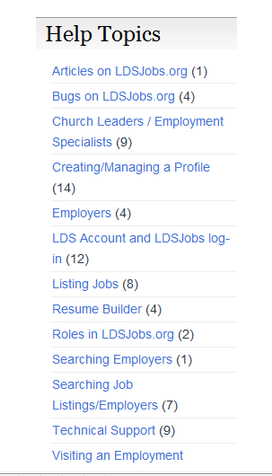
Today I stumbled across a help site that uses categories to organize the help content. It's a simple little help file that seems to start out well, but ultimately feels flat because it doesn't provide a starting point for new users, nor does it provide a second-level of navigation. It ends up presenting a topic-based navigation without any hierarchy.

The help system is based on WordPress, which provides a lot of navigational tools, but beyond the first facet of navigation, there are no more facets. The topics are simply labeled with a category and arranged in alphabetical order. When you click a category, the help topics for that category appear in reverse chronological order. That's it.
How could the user improve the findability in this help system? How could a system of second-level facets increase the scent of information?
First, the navigation could provide a starting point for new users. Listing topics in alphabetical order is almost the worst arrangement you can choose. Why not create a new category called "Just the Basics," intended for beginners? Then add only those topics that newbies would need to read -- and add them in sequential rather than ordering by date or alphabet.
How about adding a "Most Popular" category so that users can discover answers to common questions? The help author could also group by role, area, as well as by help format.
To be even more useful, if I choose "Creating/Managing a Profile," wouldn't it be nice to show a list of more specific tags in the sidebar as I drill into that category?
Tags could include more specific topics, as well as other terms such as photos, social media sites, address, email address, etc, to describe the content. I could then narrow the information more to find exactly what I'm looking for. In this model, categories would then be the first-level facet, while tags would be the second-level facet.
The Universal Need to Narrow
Part of the appeal of faceted search is that it "addresses the universal need to narrow," according to Morville and Callender. This is why it's important not to just leave facets at the first level, but to provide navigational points at the second level as well.
Different tools (for example, Flare versus WordPress) require you to implement the facets a bit differently, but the overall idea is the same: as the user drills into the content, you provide a more narrow set of filters to allow the user to refine the information.
About Tom Johnson

I'm an API technical writer based in the Seattle area. On this blog, I write about topics related to technical writing and communication — such as software documentation, API documentation, AI, information architecture, content strategy, writing processes, plain language, tech comm careers, and more. Check out my API documentation course if you're looking for more info about documenting APIs. Or see my posts on AI and AI course section for more on the latest in AI and tech comm.
If you're a technical writer and want to keep on top of the latest trends in the tech comm, be sure to subscribe to email updates below. You can also learn more about me or contact me. Finally, note that the opinions I express on my blog are my own points of view, not that of my employer.

