Podcast -- Visual Composing: Document Design for Print and Digital Media, with Jo Mackiewicz
Listen here:

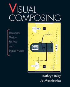
Recently Jo Mackiewicz (Auburn University) and Kathryn Riley (Illinois Institute of Technology) published Visual Composing: Document Design for Print and Digital Media with Pearson. This book covers the visual side of document design, including all the design decisions from the font you use to the colors you choose to the tables, column widths, images types, and more. I interviewed Jo for a podcast about the book. In the podcast, we cover the following:
- Typography, including serif and san-serif fonts
- Font sizes, and recommendations for older users
- Characters per line -- 35, 55, 75, or 95 characters long
- Color -- complementary colors, Itten's wheel, the psychology of color
- Headings and subheadings
- Background colors, negative and positive polarity
- Contrast in document design
- Dual-coding theory, and when aural and verbal conflict but not visual and verbal
- Reasons for gaps in graphic document design among technical writers
- File types for images
- Alignment -- full justification versus ragged right
- Symmetry and professional versus playful tone
Resources
- Visual Composing on Amazon /on Pearson.
- Jo Mackawicz's website.
About Tom Johnson

I'm an API technical writer based in the Seattle area. On this blog, I write about topics related to technical writing and communication — such as software documentation, API documentation, AI, information architecture, content strategy, writing processes, plain language, tech comm careers, and more. Check out my API documentation course if you're looking for more info about documenting APIs. Or see my posts on AI and AI course section for more on the latest in AI and tech comm.
If you're a technical writer and want to keep on top of the latest trends in the tech comm, be sure to subscribe to email updates below. You can also learn more about me or contact me. Finally, note that the opinions I express on my blog are my own points of view, not that of my employer.


