

Coding the sidebar navigation element for documentation websites
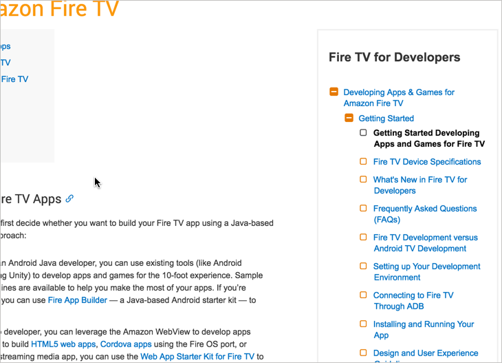
I mentioned in a previous post about tools that I was swimming in Jekyll code for the past few days. I finally finished the sidebar menu I was working on. If you look at this documentation page, there’s now a three-level expandable/collapsible menu on the right.
Let me tell you a little about that sidebar …
First, the default platform is a third-party web-based CMS (called Hippo, which almost no one has ever heard of or used, but it’s based on Java). Theoretically, we could have modified the Hippo theme to integrate a more granular sidebar into its main navigation, and if so, we surely would have added it on the left. However, for a variety of reasons, mainly because Hippo is most likely an interim solution that we’ll replace, and because the platform’s code largely remains a black box, I decided just to hack in the sidebar I needed for now.
This sidebar is generated through Liquid and Jekyll. A YAML file in a Jekyll project stores the data, and the theme iterates through the YAML data and pushes the data items into HTML formatting.
The expand/collapse and accordion features are provided through an open source jQuery component called Navgoco. The accordion feature of the sidebar keeps the list of items manageable. Without the accordion effect, you can expand the folders and get buried in the options very quickly.
The icons are rendered through Font Awesome, which is a cloud-based vector font library. Because they’re vectors, you can adjust the size of the icons through CSS and they remain crisp.
The sidebar is rendered from my Jekyll project into its own HTML file and then included on the page through a jQuery script called inc. (Most Jekyll projects would push a copy of the sidebar into each page, but I deviated from that model here because I’m pushing the output onto another platform.)
Some other scripts, adapted from some tutorials from CSS Tricks, handle the menu highlighting. When the page URL matches the URL in one of the list items, an open class gets added to the sidebar list item. Another jQuery script gets any items with an open class and also adds an open class to the item’s parents. The navgoco sidebar then expands sections with the open class.
This sidebar solution is a hack, made twice as cumbersome because the code is integrated onto another platform that was never intended to include such code. But it seems to work.
Originally I was trying to imitate the AWS docs sidebar, which you can see in this sample EC2 doc set. However, there are a few design differences. With the AWS sidebar, clicking the folder titles both displays an overview topic and expands items below it. With my sidebar, however, clicking the folder titles merely expands items below it. I like it that way. All too often, when folder titles link to topics, the topics are general and don’t say much, like this one.
Another design difference is that the AWS sidebar is fixed in place as you scroll down the page. This is how my Jekyll sidebar ideally should be. However, when you put the sidebar on the right and its height exceeds the page’s height, fixing it in place would result in two scrollbars side by side, which can be confusing to users and reflects poor design. (I once created a site that had 3 scrollbars on the right, and a UX designer almost had a heart attack.) By the way, this is solid argument for keeping the navigation on the left. With a right-based nav, you can’t fix a sidebar in place as you scroll and avoid dual sidebars.
For now, the sidebar is what it is. In the future, I plan to incorporate some of the techniques I used here to improve the sidebar in my Jekyll documentation theme. With the Jekyll documentation theme, the sidebar currently has styling that really only looks good with one level, not three. When you want to have three levels, you need more of the +/- button style similar to what I’ve been showing here.
To take a step back a bit, what started me down this path to improve the documentation sidebar was a fork someone made of my documentation theme that was used as a basis for the Loopback.io documentation site. Check out Loopback.io. It’s really an impressive doc site, entirely coded with Jekyll.
Without a doubt, Loopback.io doc site contains a lot of content. It’s the kind of documentation that, if printed, would probably fill 500+ pages. Additionally, the site accommodates translations for about 5 different languages (or plans to).
The Loopback UX person who improved the code in the sidebar is a total genius with Liquid. The sidebar code provides a more concise design with expandable/collapsible sections, and the site’s display seems to handle as many levels as you can feed it.
The designer used parameters with includes, and then iterated through the parameters passed to the include. This isn’t even documented coherently in the Jekyll documentation, but this person seems to be a pro at Liquid. (You can read an explanation about how to partly do this in Sverrir Sigmundarson’s post, Passing post variables to includes in Jekyll.)
By the way, although my Jekyll doc theme has been on Github for more than a year, this is the first time someone has forked it in a way that takes the theme up a few levels.
Initially I tried to roll back in some of the improvements from the Loopback fork, and while I spent a few hours stripping down the Loopback site and isolating the sidebar code and figuring out how it was put together, in the end I ran into some issues that I couldn’t easily solve (items seemed to slide in from the left instead of dropping straight down), so I just decided to make my modification another way.
Another detail I deliberated about was whether the doc site should have multiple sidebars or a single sidebar. With a site like Loopback’s documentation, they have a need for multiple sidebars – a sidebar that corresponds to different versions of the documentation, different languages, and so on. All the code exists in the same Jekyll project and repository. When I created the existing version of Jekyll documentation theme (version 6.0), I promoted and heralded the idea of having multiple sidebars per project – you just select the sidebar that you want to associate with a page.
However, setting up this kind of swappable sidebar is a little confusing. And ultimately, I’m not sure that it’s such a great idea (at least with documentation projects) to have a mega-site that includes everything. For some projects, sure. In fact, this blog has multiple sidebars, or rather different conditional logic to show different options in the same sidebar.
But I’ve come around on my thinking with multiple sidebars. If you allocate only one sidebar per documentation project, it allows different writers to work more autonomously on projects. There isn’t a compelling need to collaborate extensively in git (potentially running into merge conflicts from overlapping edits by different writers). Why not just separate out documentation into different repos and projects? And if your sidebar can expand/collapse to three levels, that gives you a lot more space to arrange your content, so you don’t need more than one sidebar.
In the end, simplicity is more important in trying to scale the Jekyll platform adoption, so I’m willing to cut away some of the more complex features. Our goal is to make the Jekyll theme simple enough for other groups outside our tech comm team to use it.
However, splitting up content into different repos/projects does create some difficulties. For example:
- How do you link from a topic in one doc set to a topic in another doc set?
- When you have an update to your theme, how do you push out those updates to each individual project?
There are solutions to both of these challenges, but again, they complicate the authoring process somewhat. To solve links across projects, you can create a repo for shared content that each project can pull in. (This post is already getting long, so I’ll spare you the details here for another time.)
For the theme updates, the gem-based themes address this challenge, but it assumes your theme is on Rubygems, which is problematic if your theme is not open-source (such as a corporate theme). You can create your own Rubygems-like server, but it would take a while and require quite a bit of know-how.
Overall, when you look at a documentation site, take a look at the sidebar. It’s usually a complex undertaking.
About Tom Johnson

I'm an API technical writer based in the Seattle area. On this blog, I write about topics related to technical writing and communication — such as software documentation, API documentation, AI, information architecture, content strategy, writing processes, plain language, tech comm careers, and more. Check out my API documentation course if you're looking for more info about documenting APIs. Or see my posts on AI and AI course section for more on the latest in AI and tech comm.
If you're a technical writer and want to keep on top of the latest trends in the tech comm, be sure to subscribe to email updates below. You can also learn more about me or contact me. Finally, note that the opinions I express on my blog are my own points of view, not that of my employer.