
Pages at a glance -- the importance of the first two sentences of any topic
- Implementing “Pages at a glance” in Jekyll
- The importance of the page summary
- Enforcing best practices with structure
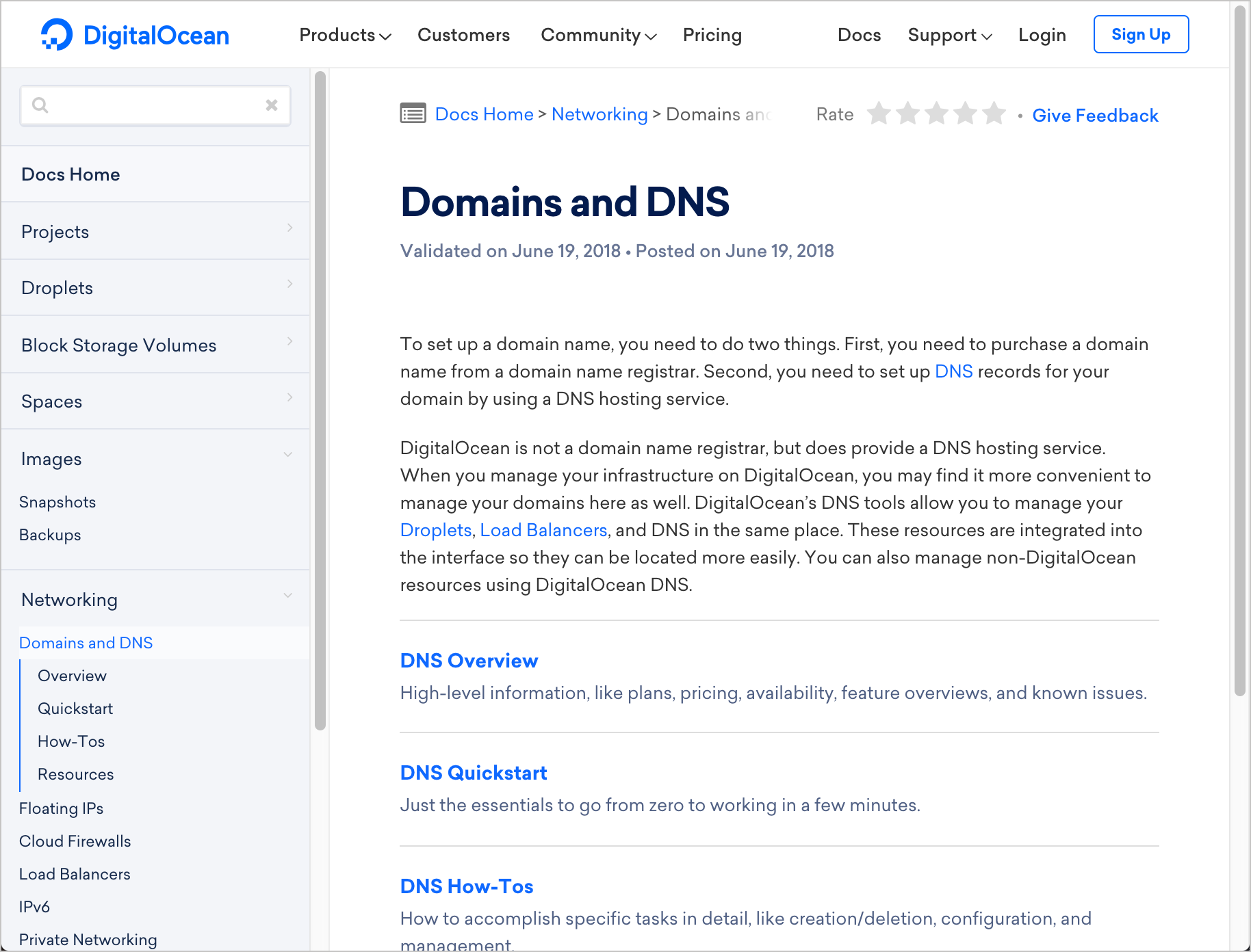
At my work, an info architect in another group has been encouraging me to create overviews when users click the folder title in a sidebar. As an example, with the docs from Digital Ocean, when you click the folder title, you see an overview topic that provides a brief intro to the folder’s content along with a list of pages and summaries:
It took some time to win me over to this idea, but I finally saw the light. Particularly, when I realized that the overviews should contain brief summaries of each page, and not just a list of the page titles (which is already visible from the sidebar), I agreed that this approach would improve doc usability. As I implemented this in some of my docs, I ended up calling this feature “Pages at a glance.”
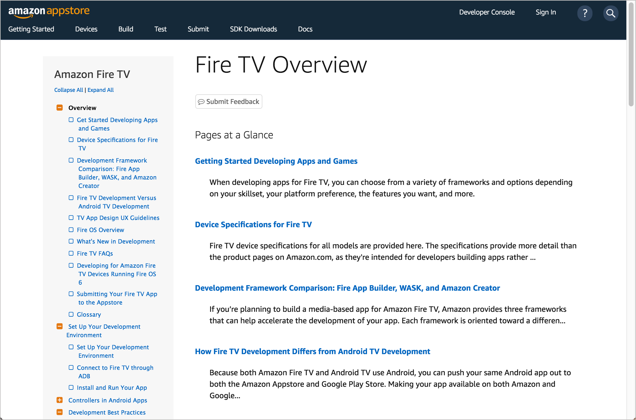
Here’s a quick demo of “Pages at a glance” with Fire TV:
The idea is that users who see the section title in the sidebar can click the folder title and get a better sense of the folder’s contents at a glance. In the section overview, users can view the page title followed by the first two sentences (or 200 characters) of the topic.
This design principle aligns with an article in my Simplifying Complexity series — specifically, Principle 4: Reduce and distill vast information down to its essence. (In fact, I even added the “Pages at a glance” explanation into a new section there called “Showing section summaries at a glance”.)
As a general best practice, section summaries follow the idea of progressive information flow to provide users with an increasing amount of detail as desired. The progression goes somewhat like this:
sidebar title >
    sidebar menu >
        folder title >
            pages at a glance >
                page's title >
                    page's summary >
                        page's mini-table of contents >
                                page's paragraphs
The flow of information moves from condensed to more detailed. This allows users to more easily navigate the information to determine whether its relevant to them. Each of these elements distills the larger information into small, easily consumable units that the reader can quickly process.
What you don’t want to do is drop the reader into a collection of long pages that don’t provide any kind of up-front summaries or distillations of what they contain. In those scenarios, the user would likely resort to Ctrl+F to try to find keywords on the page.
Implementing “Pages at a glance” in Jekyll
To implement “Pages at a glance” in Jekyll, I basically just added a frontmatter property called folder and a weight. Then I used a where_exp filter to get the content. Here’s the code for this include:
<h4>Pages at a Glance</h4>
{% assign folderKey = {{include.folder}} %}
{% assign folderPages = site.docs | where_exp: "item", "item.folder == folderKey" | sort: 'weight' %}
<dl>
{% for folderPage in folderPages %}
<dt><a href="../{{ folderPage.permalink }}">{{ folderPage.title }}</a></dt>
<dd>{% if folderPage.description %}{{ folderPage.description | strip_html | strip_newlines | truncate: 200 }} <a href="../{{folderPage.permalink }}">more »</a>{% else %}{{ folderPage.content | strip_html | strip_newlines | truncate: 200 }} <a href="../{{folderPage.permalink }}">more »</a> {% endif %}</dd>
{% endfor %}
</dl>
You call the include like this:
{% include pages_list.html folder="fire-app-builder-get-set-up" %}
The advantage of using the where_exp is that you can constrain a data set before looping through it, which makes the loop more efficient.
Some authors objected to adding weight on all these pages, so I also provided another technique where description properties are added to the sidebar data file (where the hierarchy of the pages is already established). However, this approach requires you to store the description separate from the page’s content, which might be less intuitive.
The importance of the page summary
Not all our topics have a description property specified in the frontmatter, so looking at the code in the previous section (specifically folderPage.content | strip_html | strip_newlines | truncate: 200), you can see that the first 200 characters of the content gets pulled. These characters are stripped of any HTML or line breaks.
However, this caused issues. If the first two sentences contained a Markdown link, then the summary ended up looking like it had broken formatting, like this:
This is my page summary. [Some title](../fire-tv/some-title.html) with some more details here ...
As a result, I went in and manually copied the first two sentences of each topic into a description property and removed any links or other formatting.
As I did this, I realized that the first two sentences didn’t always encapsulate what the topic was actually about. Sometimes there was a bit of a lead-in that provided some necessary context for that topic.
However, I think best practices would be to get right to the heart of the topic’s main idea in the first two sentences. These first two sentences are probably the most important in the entire topic — not just for this “Pages at a glance” feature or readability, but also for SEO as well, since the keywords identified by the first few sentences are weighted highly.
Additionally, in my Jekyll templates, the HTML meta tags (shown in search results pages and used to inform Google’s search algorithms) are populated via the description content.
Enforcing best practices with structure
Ideally, when defining the Jekyll templates, I should have made the description property a requirement and enforced this best practice from the start. But since we were migrating content from another system (moving hundreds of pages), it was easier to just pull from the body for this description.
In my blog posts here, one of my best decisions was to define a summary section in my page’s frontmatter that I then incorporated into the layout. I created this summary section about two years ago after seeing it on Jakob Nielsen’s blog (for example, see this post here to see the summary).
If any of my posts omit the description, the layout has a gaping hole. In this way, the structure forces me to align with best practices, because I know this description is probably just about the only part many people read. (Of course, real enforcement would break the build if the description property were missing from the frontmatter, but the ugly gap in the layout works well enough.)
I’m sure there are other ways to enforce best practices through structure, but this summary one is surely one of the best. And the manipulation of this summary into the “Pages at a glance” feature is a natural application of the summary in action.
About Tom Johnson

I'm an API technical writer based in the Seattle area. On this blog, I write about topics related to technical writing and communication — such as software documentation, API documentation, AI, information architecture, content strategy, writing processes, plain language, tech comm careers, and more. Check out my API documentation course if you're looking for more info about documenting APIs. Or see my posts on AI and AI course section for more on the latest in AI and tech comm.
If you're a technical writer and want to keep on top of the latest trends in the tech comm, be sure to subscribe to email updates below. You can also learn more about me or contact me. Finally, note that the opinions I express on my blog are my own points of view, not that of my employer.