
Principle 4: Reduce and distill vast information down to its essence
The focus here is on distillation, not integration
In the previous article, Ensuring information harmony in the larger documentation landscape, I argued for the importance of integrating new information into a larger documentation landscape. I explained that it’s easy to create a new article and publish it to a documentation site but much harder to assess whether the new information harmoniously fits in with all the other information on a site (not just harmony with other docs, but with existing forum posts, blog posts, and other information assets). Integrating a small piece of information into a larger body of information requires wide reading and information analysis to determine information fit and harmony.
Conversely, the opposite activity — taking an existing body of information and distilling its essence down into a smaller information unit (whether that smaller unit is a title, overview, heading, topic sentence, quick reference guide, or some other compressed form of information) also requires cognitive prowess. Crystalizing large information into a brief distillation that captures the main point in as little a space as possible can be a difficult skill that rivals a poet’s astuteness with language and articulation. Despite the difficulty with the task, this distillation is worth it as it can go a long way towards simplifying a complex system.

Reducing information bloat
In the Laws of Simplicity, John Maeda explains that reduction is the easiest way to simplify complexity:
The process of reaching an ideal state of simplicity can be truly complex, so allow me to simplify it for you. The simplest way to achieve simplicity is through thoughtful reduction. When in doubt, just remove. But be careful of what you remove. (See Law 1: Reduce)
Maeda isn’t specifically focusing on documentation in his book, but rather speaking generally, such as with product design. If your TV remote control is too complex, reduce its number of buttons. Reduction simplifies the user experience because it removes the number of choices.
With documentation, the tech writer’s first task is usually to translate descriptive information into concise, actionable steps that align with the user’s goals. This work usually involves reducing the amount of information, whittling it down to the bare bonds of actionable steps. Mike Hughes captures this perfectly in this short graphic:
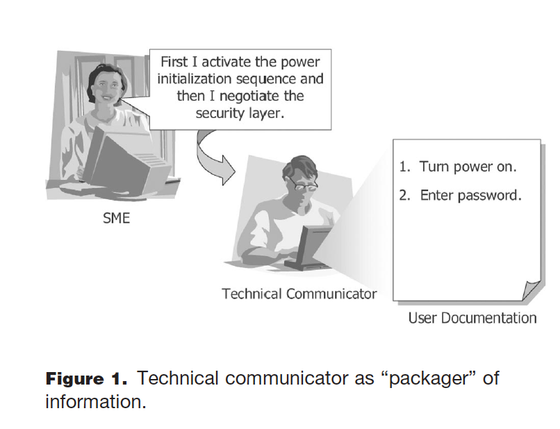
When some engineers write, they have a tendency to over-explain the details of how something works rather than providing the minimal amount of information the user needs to accomplish their task. For example, an engineer might explain the intricacies of architecture and design even though the user just wants to know which button to press. Reducing the information that falls outside of the user’s task needs is usually the first step a tech writer takes to simplify content.
Reducing information bloat is actually a byproduct of minimalism, a concept put forward introduced by John Carroll. Carroll’s emphasis on action-oriented instructions usually results in a reduction of secondary, non-task-based content in docs. Hence, the docs end up being briefer due to the task-based focus. In a recent Intercom interview, Carroll explains:
…brevity is more a consequence of minimalism than a principle of minimalism. If you go back to what I was saying earlier about trying to facilitate the learner’s initiative and goals and aspirations and impede them less, you will most likely end up with a briefer design, or it might be layered. (Minimalism Revisited: An Interview with John Carroll, STC Intercom March 2013)
In other words, by focusing on the information users need to complete a task, tech writers often reduce the other fluff that is unnecessary. We carve this information away to let users focus on the information they need to complete a task. What happens to the other information? If it’s not eliminated, it sometimes gets layered at secondary or tertiary levels, as I’ll explain in the next section.
Progressive disclosure to hide secondary information
The effort to simplify complexity by reducing content can be too extreme. It can, at times, be counterproductive for users. Have you ever ordered a product and found that it doesn’t come with any instructions? Or if it does, the simple one-pager included in the box is hopelessly insufficient for your goals, and so you end up being even more frustrated? I have a pair of Bluetooth headphones that, in the name of simplicity, have minimal documentation. I think the product owners wanted to convey to users that they just need to turn the earbuds on and pair them — an easy, simple, hassle-free experience!
But in my experience, sometimes one earbud pairs and not the other; sometimes turning one off turns the other off as well. Sometimes one earbud won’t connect even when the other is connected. It’s unclear if pairing mode is required for both earbuds or just one, and so on. I would gladly welcome more detail about how these mysterious Bluetooth earbuds work.
Rather than delete the extra information, tech writers often shift information around. We decide to put secondary information in less visible spaces — perhaps in collapsed sections, or in less visible topics (the equivalent of footnotes in an academic paper). Carroll refers to this as “layering” the information. Others call it “progressive information disclosure.” It’s the idea that different information should be made available at different layers in a system, or that information can be revealed to the user little by little (instead of all at once).
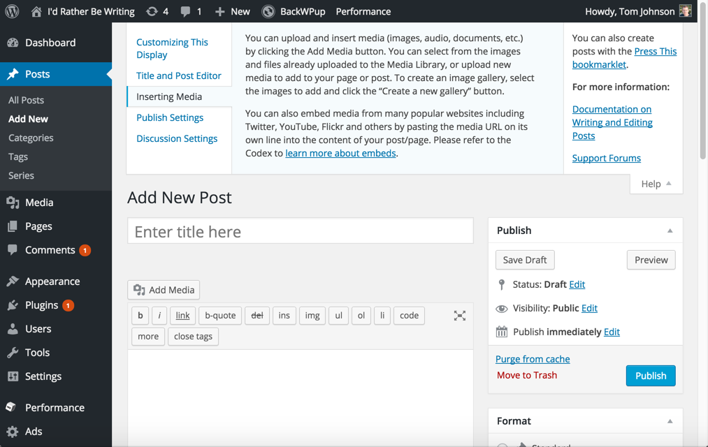
Perhaps at the end of a topic, users might see a link for more info that takes them to another section where the architectural intricacies are explained, or where they can read the details about the many path options they can take, or maybe they find information for older versions or techniques for older API levels. Commonly, in user interfaces, a tooltip provides some brief detail followed by a Learn more link where the additional information appears. Here’s an example from the WordPress UI:
Web designers often consider progressive information disclosure in deciding how to layer information on a website. A website might begin with a few large category choices on the homepage. At the second level (which appears after users select a homepage category), more information is presented. At the third level, additional information is made available, and so on. But you don’t overwhelm the user with all information choices up front. The same layering strategy can be used directly in documentation (not just in user interfaces or commercial sites).
(By the way, I’m not a huge fan of the term “progressive information disclosure.” I prefer the term “layers” or “progressive information detail,” since “disclosure” suggests that you find out unwanted or negative information little by little. Like a doctor who lets you know little by little the details of a debilitating disease, or an insurance agent who slowly explains what is not covered, or a kid who wrecked his or her parent’s car and slowly discloses that he not only dented the bumper, but also took out the neighbor’s fence, injured a dog, and broke one of the windows … and lost the keys … and was slightly intoxicated … and also failed a math test.)
While progressive information is a valuable principle for UX, it’s not exactly reduction. It’s more like “information re-organization.” Sure, we reduce information in places and expand it in others, but we still have the same amount of information. True information reduction is an act of reducing the amount of something. At any rate, deciding where to reduce information and where to expand it is a useful skill to develop.
Keeping the sidebar navigation consumable at a glance
Most tech writers will readily agree with the concept of layering or progressive disclosure but then create a sidebar navigation for their docs that contains hundreds of topics in deeply nested folders. When deciding on where to reduce/re-organize information, my preference is to keep the sidebar navigation consumable at a glance. I don’t try to pack every topic in the documentation in the sidebar, making it a massive navigation tree that users can expand and collapse all afternoon. This runs counter to the purpose of the sidebar navigation.
What exactly is the purpose of the sidebar navigation? Surprisingly, its job isn’t so much to facilitate navigation (users still get to topics via search). Instead, the sidebar serves a psychological / cognitive need. One of the first steps in unraveling complexity is to break complex systems down into a list of numerable parts. The sidebar provides this list of parts that users can view. If there are too many parts listed to be meaningful to users, break up these parts into several distinct sidebars.

When the sidebar is consumable at a glance, it helps users understand all the parts that make up a complex system. I typically give each product its own sidebar (usually one product has between 25-75 topics). Below the sidebar, links for related doc sets allows users to select another product and its sidebar. Again, by providing users with information consumable at a glance, they can see the big picture of the system and better understand how each part fits together. Additionally, because the sidebar shows a hierarchical grouping of the parts, the sidebar can help users understand the system as a whole.
Showing section summaries at a glance
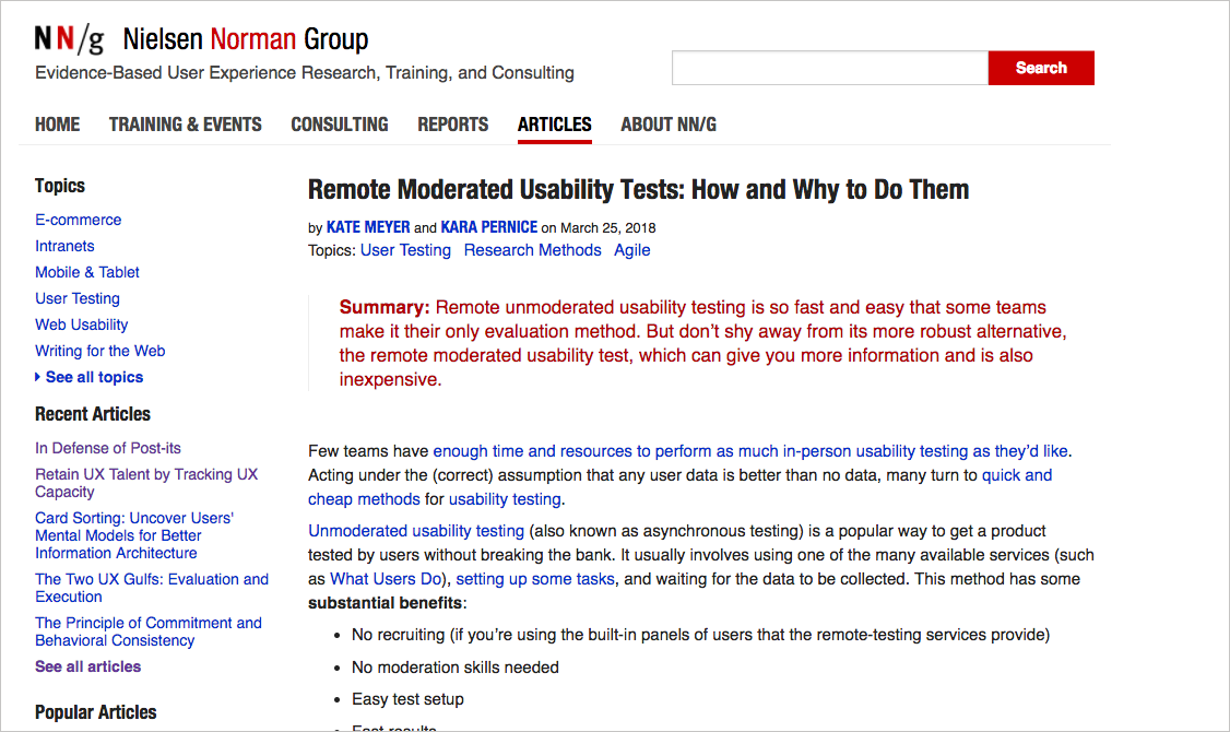
While looking at the titles in the sidebar can help users get a sense of the whole, sometimes the titles aren’t very illuminating. Another usability approach is to show users the page titles and descriptions at a glance for each section. For example, look at this example from Digital Ocean:

I did the same thing with Fire TV docs as well:

When you click a folder title, it shows the pages in the section along with a short summary of each topic. This lets users take in the whole in a more detailed way than simply reading the section titles. It allows users to take the next step of moving towards more detail — first the user expands the section title to see the list of topics, and then the user looks at the section overview details to see which topic might be relevant.
Crafting the summary sentences is somewhat challenging, but these initial two sentences in a topic are potentially the most useful. Ideally, they should give users a quick sense of whether the topic is useful. SEO keywords should probably be targeted, and this same description can be rolled up into the HTML’s meta description tag and search index as well.
Distillation of information
In the previous section, I noted that the first two sentences of a topic should give users a quick sense of what the topic is about. This moves us into the topic of information distillation. Distillation is not necessarily information elimination or re-organization. Distillation involves compressing meaning into a shorter space. When you distill the meaning of a section into a descriptive section heading, you aren’t eliminating information but rather distilling the main point into a short phrase and allowing readers to consume the information at a glance.
A good structure in a doc page usually provides a title, summary, headings, mini-TOC, and topic sentences that lets users take in the information at a glance rather than reading the content line by line. These elements are simple, but they are the bread-and-butter of information usability. Let’s go into more detail for each element.
Titles
A title should capture the essence of the information in a clearly understandable way. Titles should not be vague or fuzzy but should communicate as much as possible in as little space as possible. The title must broadly convey the main point of the content. The title probably has the most influence on the content’s visibility in Google, so the title must not only communicate meaning but do so using the keywords a user is looking for.
Summaries
The summary provides several sentences that capture the content in the document and compresses it into a brief paragraph. In DITA, this element is the shortdesc. The short description of a document can act as metadata for the entire content, and it’s much more portable and usable than the entire document. (For example, a section overview might list summaries of all pages in that section, providing the user a good sense of what that section contains at a high level. You can see an example here in the Roku developer documentation.). The summary lets the user know if the information promised in the title is indeed the information the user wants in the document. In other words, the summary elaborates more on the title and main ideas in the topic.
A couple of years ago, while browsing information on Jakob Nielsen’s site, I became converted to the benefit of summaries in content. Seeing this summary allowed me to quickly process whether the article contained the information I was looking for.
In almost all my blog posts, you see a short summary at the top that usually tries to capture the main point of the article. On this Simplifying Complexity site, I’ve put this information into a “Principle” at the top.
The summary is arguably the most important part of the entire topic because most articles have a high bounce rate and short view time from visitors. A user clicks the title, thinking the content would answer his or her needs, and then quickly jumps to another page after scanning the content. In the digital age, users jump from one document to another looking for the right information. In fact, a Time, Inc study found that “Consumers in their 20s (‘digital natives’) switch media venues about 27 times per nonworking hour—the equivalent of more than 13 times during a standard half-hour TV show” (The Evolving Role of the Technical Editor, STC Intercom, Sep 2012). The summary provides an efficient way for users to judge whether they’re on the right page.
Interestingly, this summary is one of the hardest elements to write. I’ve been including summaries on my blog posts for a while, and it is extremely difficult to compress meaning into a few sentences that describe the whole in a useful, informative way. The ability to reduce a large amount of information into a few sentences that distill the meaning in a clear way is a skill that few possess. The more topics and ground your content covers, the harder the summary is to write. In fact, if your content doesn’t have a clear focus, it will be nearly impossible to write a summary.
Also, after working for so long on the content body, we’re usually ready to be done with it, so this most important element often doesn’t get the attention it deserves.
Section headings
Section headings also incorporate the same principles as the title and summary but on a section-by-section level. Each heading should neatly capture the essence of that section in a way that, if the reader didn’t read the section, he or she could still get the gist of the content. A reader should be able to glance through the section headings and understand the gist of the content.
All too often, section headings are meaningless verbiage, their only real purpose to provide some structural division of the content. A good heading is hard to write because it forces you to clearly identify the main point of that section. As with the summary, the section heading is hard to write if the main point of that section is fuzzy or wanders in multiple directions.
I was recently editing some content an engineer had written. I added headings on a variety of sections and then attempted to distill the point of each section into the heading. He said I’d made the headings technically inaccurate, and changed them back to more general titles. When I asked him to sharpen the headings to capture the point of the paragraphs below each heading, he said it wasn’t possible. He said a user will just need to read the details to understand that section.
I lost this battle, but the experience underscored the challenge of writing good headings. It’s not easy to capture the meaning of a larger body of information in a small, tight space where you only have 10 words or so, especially when one small shift in the heading might make the content inaccurate on a technical level. For more on headings, see my post Subheadings: Perhaps the Most Useful Technique in Technical Writing.
Mini-TOC (table of contents)
The mini-TOC simply pulls together all headings on the page and provides the user with a quick summary of the page’s contents. This quick summary lets the user see more detail about what the page will cover, without scrolling down the page to read each heading section by section. If the headings are good, the mini-TOC should informative and helpful.
Beyond just consolidating the headings, the mini-TOC establishes the relationships between headings. Nesting headings inside other headings (creating hierarchy) tells the reader how the information is related. Hence, the mini-TOC helps increase the meaning of the section headings and lets the user understand how the information in each section fits together.
While analyzing a topic’s mini-TOC, you may find that some headings should be grouped. Just as a single task with too many steps can be improved by breaking it into multiple tasks, a long list of h2 headings should be broken up into some h3 headings and grouped. Lists alone don’t tell us the relationship between the sections except that they’re related. But if some headings are hierarchically arranged in groups, this grouping provides cognitive meaning to the user and makes the content as a whole easier to consume.
Topic sentences
Finally, topic sentences are also an important information usability technique. When I’m scanning a document, I often read the first sentence of each paragraph. When the writer has a clear focus, topic sentences come naturally. Topic sentences apply more to conceptual and narrative information than task-based information, but they’re still worth noting here.
Quick reference guides
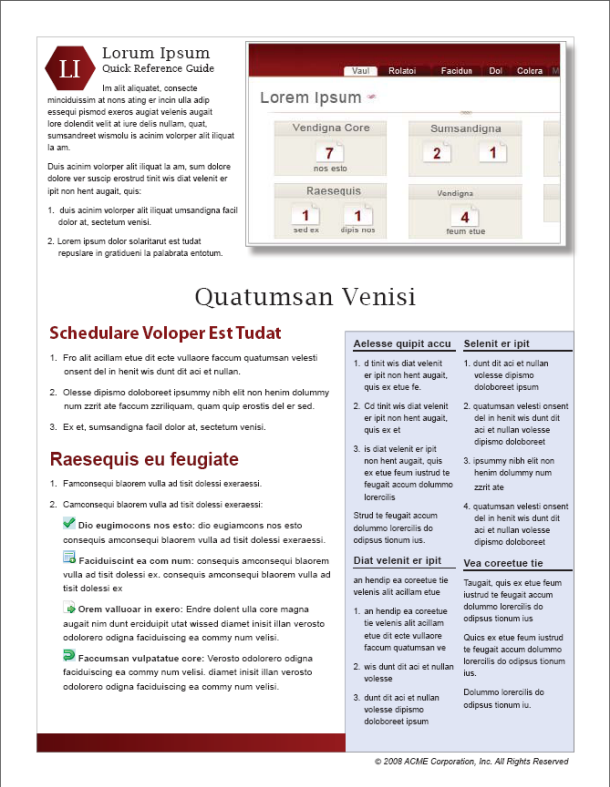
One final, key deliverable for compressing information is the quick reference guide. A quick reference guide provides a 1-2-page guide (in an attractive magazine-style layout) that provides a brief summary of the core tasks and features in the system. Here’s an example:
The quick reference guide should provide the user with just enough information to get the gist of what the system is about, how to do key tasks, and get going. Almost invariably, you write the quick reference guide near the end of your documentation project, when you can see the whole and compress it accordingly.
The information in the quick reference usually can’t be single sourced, since it’s not just an excerpt from the docs but rather a more briefly written summary of the entire system. As a result, many times it seems like yet another deliverable we don’t have time to write. But for the best user experience, the quick reference guide provides incalculable value to users.
I’ve written quite a bit about quick reference guides before. See Quick Reference Guides for a list of articles. Probably the best article is Quick Reference Guides: Short and Sweet Documentation.
Minimal viable documentation
I’d like to mention one more strategy related to information reduction, layering, and distillation: minimum viable documentation. Technical writers usually care deeply about documentation and prefer it to be thorough and complete, answering all users’ questions. As a result, it’s hard to even contemplate a strategy of minimum viable documentation. But let’s start with the idea of a “minimum viable product.”
The idea of pushing out a minimum viable product is that, because products are hard to develop, you want to get a lightweight product out there for users to test, and then iterate based on the feedback. This is the whole idea of agile. Through the constant feedback and iterative development, you ensure that you’re building the product in a way that users want (rather than building the product in a vacuum for two years and then emerging for the first time to show it to users, only to find that you went off course long ago). You can read more about minimum viable products in this WTD write-up on minimum viable documentation by Andrew Spittle and Matthew Lyon’s talk.
Applying the same principle to docs, we could say that docs are hard to write. How do we know that we’re even creating the right information — the information that users need, the questions they’re asking, addressing their actual problems? We could save ourselves a lot of guesswork and time by simply putting out a minimum amount of documentation at release. Then we listen to forums and support cases to better understand user feedback. Based on that feedback, we iterate on the docs. In this way, we make sure the information we’re adding aligns with user needs rather than just adding all the information we think users might want to know about.
Techniques for hiding less-used information
If you can’t delete information to reduce complexity, look for ways to hide less-used information on the screen through JavaScript techniques, such as show/hide elements, expand/collapse toggles, navtabs, tooltips, and more. See Principle 10: Hide complexity with UX design (such as through JS or CSS).
Questions for reducing and distilling vast information down to its essence
Some questions you might ask of a text include the following:
- Is there a high-level summary at the top of the document?
- Is there a mini-table of contents in the document?
- Are the headings descriptive of the content, allowing users to consume it at a glance?
- Have you stripped away or hidden the non-essential information that users might consider extraneous to their core tasks?
About Tom Johnson

I'm an API technical writer based in the Seattle area. On this blog, I write about topics related to technical writing and communication — such as software documentation, API documentation, AI, information architecture, content strategy, writing processes, plain language, tech comm careers, and more. Check out my API documentation course if you're looking for more info about documenting APIs. Or see my posts on AI and AI course section for more on the latest in AI and tech comm.
If you're a technical writer and want to keep on top of the latest trends in the tech comm, be sure to subscribe to email updates below. You can also learn more about me or contact me. Finally, note that the opinions I express on my blog are my own points of view, not that of my employer.