

Principle 10: Hide complexity with UX design (such as through JS or CSS)
Techniques for hiding less-used information
While troubleshooting a recent support case, I looked over documentation I’d written nearly a year ago, trying to identify where the user got stuck. I was shocked at how confusing the docs now seemed. The documentation tried to explain query syntax for targeting elements in a media feed that could be either JSON or XML. If the feed was JSON, developers would use one type of query syntax; if the feed was XML, they would use another. The documentation discussed the two approaches in sections one right after another.
This scenario is common in developer docs because you often have multiple languages to account for. You might have a process for calling an API that you need to explain using PHP, Java, .NET, or other languages and frameworks. The general approach might typically be the same, but the code samples and specific technical details will differ.
In these scenarios, a common approach in documentation is to hide the languages users don’t need. As I revised the JSON/XML documentation, I started separating out the languages into navtabs, like this:
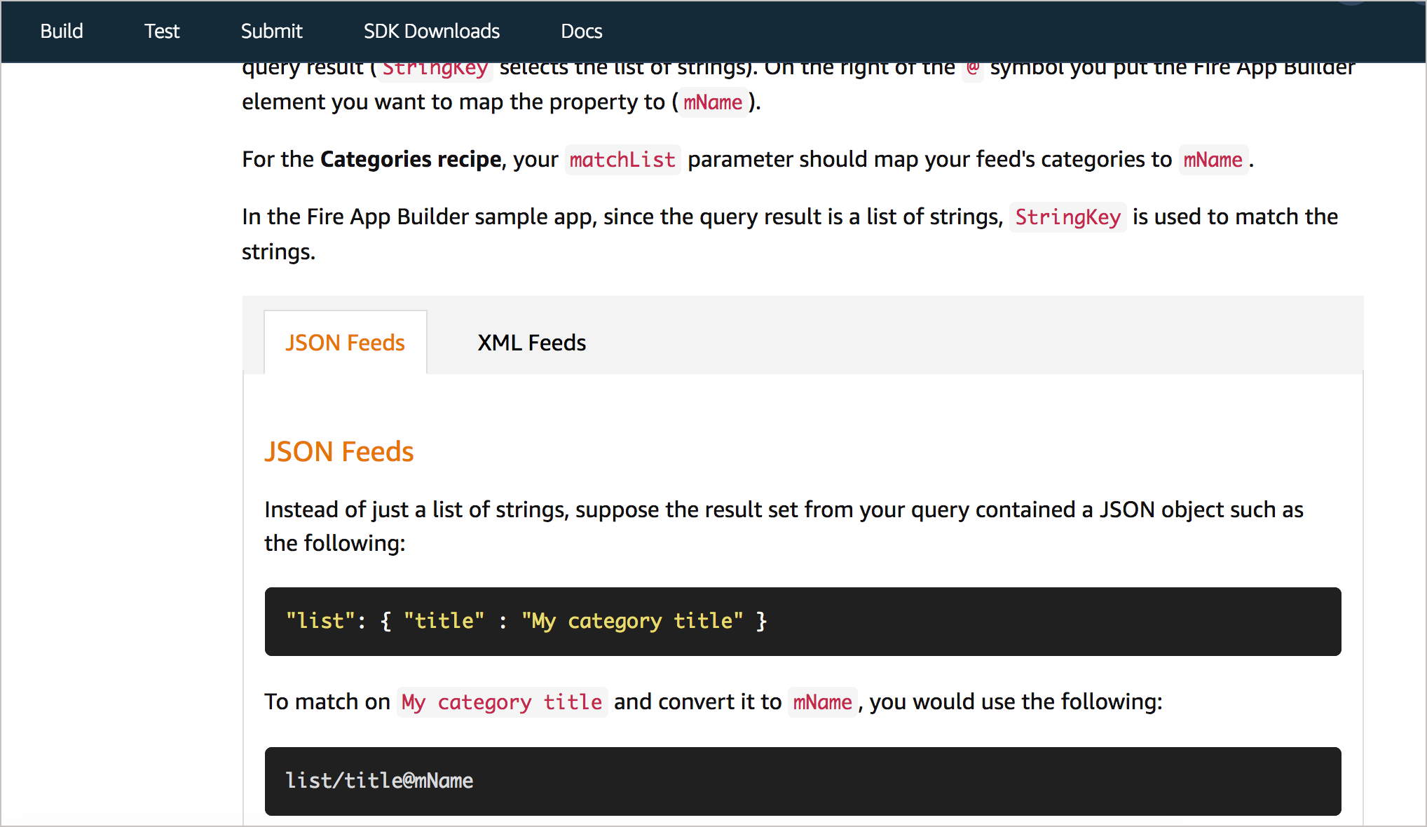
Previously, I had these sections stacked on top of each other, which lengthened the page and increased the visual clutter. By incorporating navtabs like this, users who care only about JSON or XML can select the corresponding tab and avoid seeing the irrelevant material.
As technical writers, when we try to simplify information, our first assessment should be to consider whether we can delete the information. But in many cases, product teams want the information included, even if it applies to just a minority of users. In these cases, we can rely on interactive JavaScript techniques for hiding this less-used information. Hiding these details can help simplify our docs because users won’t have to sort through potentially irrelevant information in order to read the instructions.
If you can’t delete it, hide it
In user interface design, hiding complexity is a standard approach taken to simplify applications. User interface designer Tyler Tate explains:
If you can’t kill a complex feature, the next best thing is to hide it. Too often, rarely used yet complex features take up more screen real estate than frequently used yet simple features. This shouldn’t be. A good user interface should make the most common tasks the most prominent and then hide rare tasks so that they don’t get in the way. — Minimizing Complexity In User Interfaces — Smashing Magazine
Hiding complexity is one way to simplify the information experience for users. Although most UI principles apply to interface design, we can equally apply them to documentation. Here’s the same passage above but adjusted to target documentation:
If you can’t kill a complex explanation, the next best thing is to hide it. Too often, rarely used yet complex explanations and processes take up more screen real estate than frequently used yet simple features. This shouldn’t be. Good user documentation should make the most common tasks the most prominent and then hide rare tasks so that they don’t get in the way.
When Tate designs a UI, he considers the 80/20 rule, where 80% of people use just 20% of the features. He makes the 20% of features occupy prime real estate while either removing or hiding the other less-used features.
Sample JS techniques for hiding information
We can use a number techniques to hide complex information. Here are a variety of techniques along with examples:
- Navtabs to separate information above the fold. GitHub Pages Docs let users choose their path and then shows information related just to that path. Intuit also separates out different steps into sidebar tabs to keep all information readily visible.
- Navtabs to load different information on the page. My Fire TV Device Specifications provides a good example. Instead of 8 separate pages, all specs are available from the same page, hidden until you choose the device with the specs you want to see.
- Expand/collapse functionality for sidebar menus. Apple’s Home Pod documentation provides a good example of expand/collapse features in a sidebar. You can even hide the entire sidebar.
- Expand/collapse buttons in the main body of content. Twilio’s tutorials reduce complexity by only showing the next step in a tutorial after you click Next at the bottom. The next content loads on the same page. Impressively, the code in the right side pane shows the relevant code in focus and blurs the other code. Google Play Console’s help also regularly collapses documentation into expandable sections.
- Glossary tooltips that appear when you click a term. I incorporated glossary tooltips on some unfamiliar terms in the Login with Amazon documentation. This reduces the visual clutter of a definition in the main body of text.
Design decisions: stacked or adjacent?
It might not always be appropriate to hide information. Designer Ryan Singer explains that sometimes it’s better to stack information while other times it’s better to position it adjacent in space. Singer says that he learned this distinguishing principle from Edward Tufte:
I once saw Tufte give a workshop in Chicago where he introduced a valuable concept. He said information may be displayed adjacent in space or stacked in time. Take a book for example. If two dots are on the same spread, they are adjacent in space. All it takes to switch between them is movement of your eye. Compare that to a dot on one page stacked above a dot on another page. You can’t see them at once. You have to flip back and forth between pages to see one dot versus the other.”
The trade-offs between elements adjacent in space versus stacked in time are always in the mind of a UI designer. Placing many elements on the same screen reduces the need for navigation and gives users a comprehensive feeling of “it’s all at my command.” Moving focus from one element to another is instant and seamless. On the flip side, separating elements onto different screens slows things down with navigation while increasing clarity. There is more room for explanation and luxurious space when fewer elements occupy the page. The eye has less to filter through. The course of action is more obvious.Learning from “bad” UI – Signal v. Noise
In short, if placing elements side by side creates a sense of confusion (because the user needs both types of information), consider stacking instead. But if users don’t need both sets of information, consider stacking because it allows users to more easily focus on the material and stay immersed in it.
In cases where you’re showing code for different programming languages, stacking would be better. There’s no need for the user to take in multiple code languages at once.
Using JS in docs makes PDF and XML problematic
One consequence of implementing JS techniques to hide complexity is that the information becomes harder to generate to PDF. You pretty much end up with a web-only output. If you have requirements to deliver PDF, you might be limited in the number of JS techniques you can implement, or you’ll have to code the content more carefully.
Implementing JS techniques also poses challenges for authors following structured authoring schemas like DITA or Docbook. If you want to implement some show/hide elements with JS, you probably can’t, as that code won’t validate with the schema. Given that the number of authors who must conform to a given XML schema constitute a large number of tech writers, it’s no surprise that JS isn’t more commonly used in docs. This is part of the reason tech doc interfaces tend to feel outdated in comparison to modern website UIs. If we want to embrace modern web interfaces that give us greater control to simplify the information shown to users, we will probably start ditching PDF and XML.
Finally, many tech writers feel that hiding elements on the page reduces the user’s ability to quickly find information, such as after landing on a search results page or when pressing Ctrl+F. If users can’t quickly locate information because the content is hidden by default, they might quickly lose patience and leave the page. Because of this, you probably want to limit the number of hidden elements on the page so that users don’t play guessing games in opening various doors to see where the information might be hidden. On the other hand, with clearly labeled section headings, locating the information should be fairly intuitive. And because of the reduced visual clutter, users might be able to see the section more quickly.
Questions for hiding complexity with UX design
- How can you reduce the scope of the content by hiding the unnecessary (or less essential) parts of information?
- With progressive disclosure in mind, how many levels should the information flow?
- Can you reduce the complexity of information by hiding some parts or making it more navigable through JS or other techniques?
About Tom Johnson

I'm an API technical writer based in the Seattle area. On this blog, I write about topics related to technical writing and communication — such as software documentation, API documentation, AI, information architecture, content strategy, writing processes, plain language, tech comm careers, and more. Check out my API documentation course if you're looking for more info about documenting APIs. Or see my posts on AI and AI course section for more on the latest in AI and tech comm.
If you're a technical writer and want to keep on top of the latest trends in the tech comm, be sure to subscribe to email updates below. You can also learn more about me or contact me. Finally, note that the opinions I express on my blog are my own points of view, not that of my employer.