

Principle 1: Let users switch between macro and micro views
The need for maps in the first place
Before we get into navigation maps and the larger principle of macro versus micro viewing modes, let’s take a step back and unpack the reason why such maps might be needed in the first place.
The guiding principle when documenting almost any system is to identify the users’ tasks and then describe the tasks with individual steps. This is a fundamental way that technical writers simplify complex processes.
Here’s a simple example to illustrate. My daughter recently bought a book on drawing simple cartoon characters, and as I watched her draw one of the exercises, I noticed the instructional approach in the book was pretty similar to techniques in documentation.

Here she’s learning to draw “Dog Man.” To simplify the task of drawing Dog Man, the author has broken the process out into “28 ridiculously easy steps”:
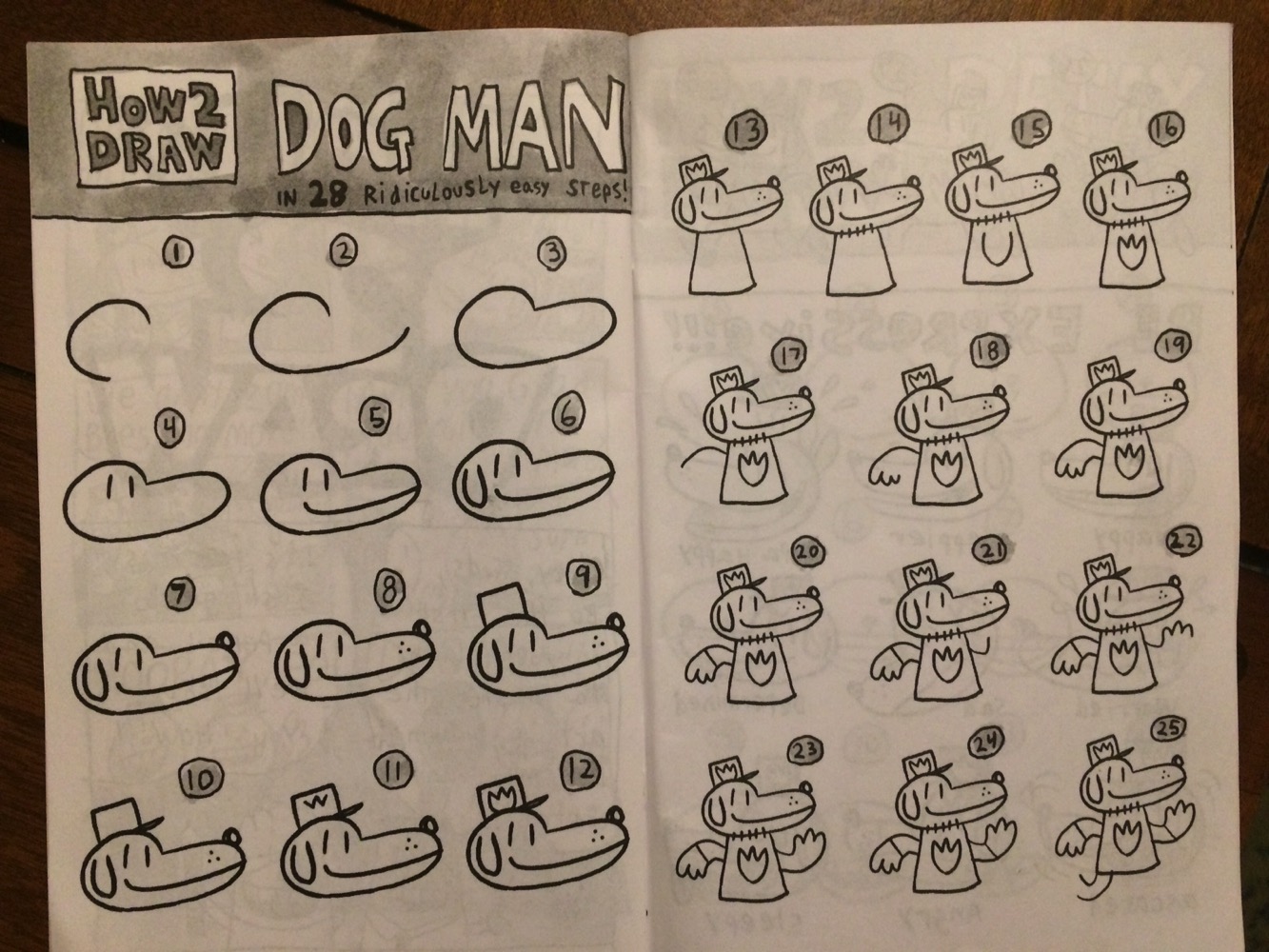
If you were to just show a picture of Dog Man and say, “Here’s what you need to draw,” the user (in this case, a small child) might get confused. So, to make it easier, we break down the process into little individual steps. Steps are how we initially simplify anything that’s complex. Taken as a whole, a system might be impenetrable and confusing. So we break it into smaller components that are more understandable and approachable in scope.
How many steps do we break complex systems down into? Often the more you want to simplify complexity, the more steps you create (to an extent anyway). For example, if someone were really new to drawing (perhaps a four-year-old), there might be some additional steps:
- Get a blank sheet of paper
- Sharpen your pencil
- Find a hard surface to put the paper on
- Hold your pencil near the end between your thumb and two fingers
- Start drawing in the middle of the page, and so on.
But this level of granularity wasn’t needed here. My daughter was able to successfully follow the steps and draw Dogman:
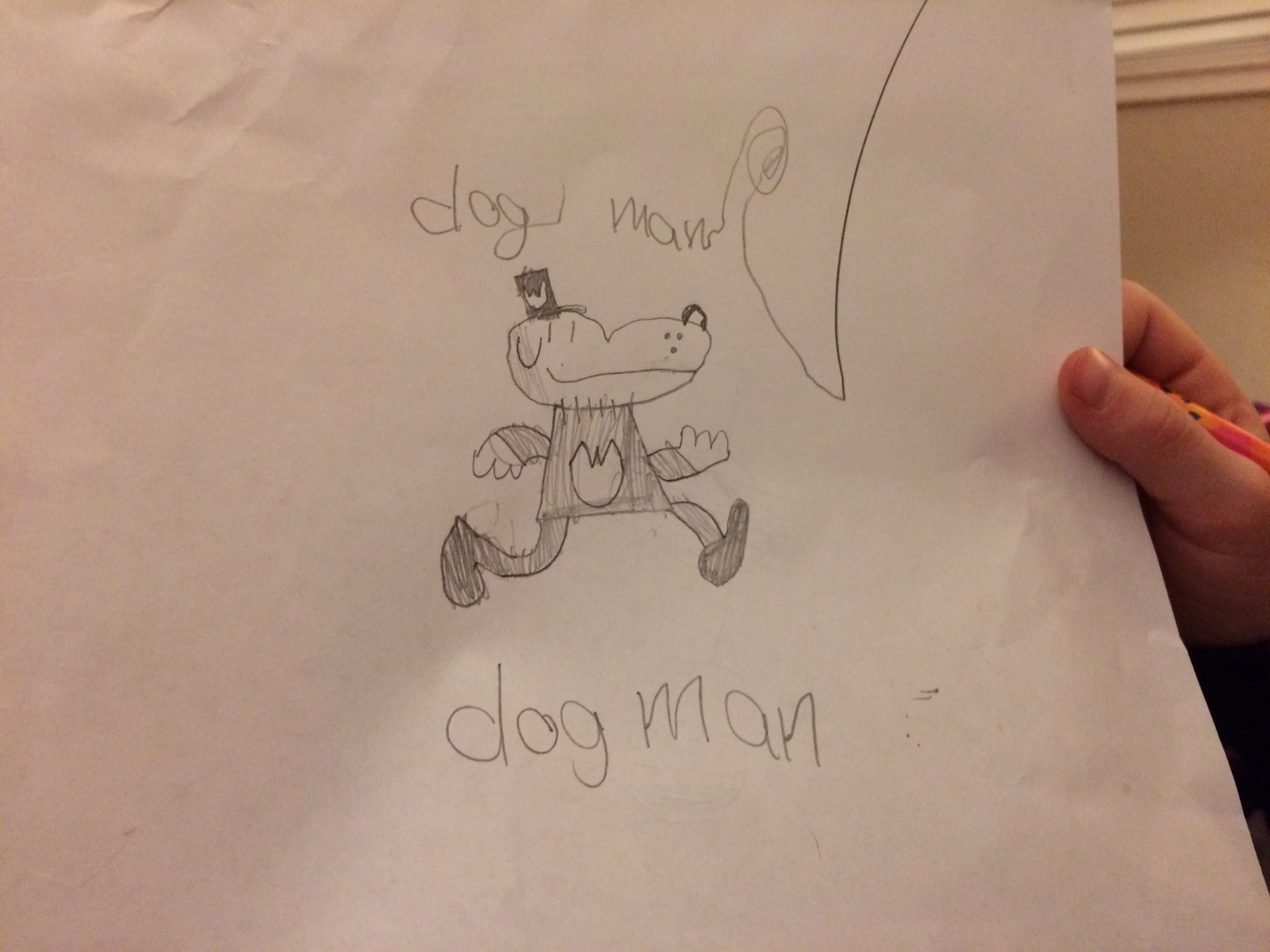
If the procedure weren’t broken down into these individual steps, she might not have been as successful. Steps are an ingenious way to take something complicated and make it simpler and more practical. The same process scales to nearly anything.
For example, when you want to drive to a distant and unfamiliar location, you usually route the instructions on your phone using a mapping app. The app breaks down the route into individual steps that you follow. The whole process of going from one side of San Francisco to the other is too complicated to take in at once, but when you tackle the process in individual steps, you can make it through. This is why approaching technical information as task-based steps is the core strategy in technical writing. Almost every technical writer knows this technique. You identify the tasks, and then you list out approach to the tasks as individual steps.
From steps to groups of tasks
So far, I’ve been talking about a single task that involves a list of steps. But let’s scale up the complexity a bit. Now suppose the task is a larger process that involves 30 or 40 steps. Again, this larger task (now a “process”) starts to be confusing, so we break the process up into smaller chunks or tasks. We create several tasks, each task with its own steps. These tasks become subheadings under a larger process.
For example, suppose I were creating instructions on how to assemble a bicycle (a task more difficult than drawing Dogman). I would start by identifying the various tasks required to complete the larger process. For example, assembling a bicycle might involve 4 core tasks:
Task 1. Attach the cranks
- step one
- step two
- step three
Task 2. Set up the drivetrain
- step one
- step two
- step three
Task 3. Assemble the brakes
- step one
- step two
- step three
Task 4. Put on the wheels
- step one
- step two
- step three
I imagine each of these tasks has quite a lot of detail, such that each task would span several pages of information. As such, I would put each task on its own page. Then I would link the pages together somehow. This brings me to the core technique here — maps.
Maps
To link multiple tasks (described on separate pages) together, you can embed a map at the top of each page, like this:

Each individual page shows this map, orienting the user in the larger process while also allowing him or her to focus on the specifics of each task.
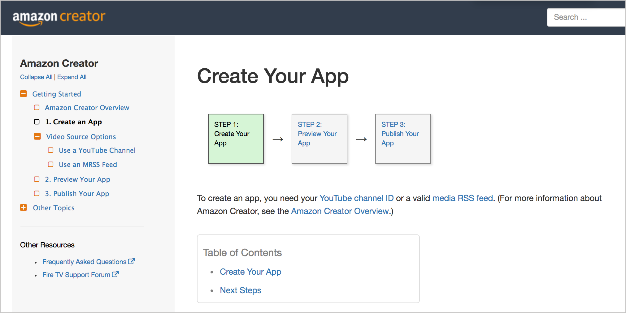
Here are some example maps in recent projects I’ve worked on. When creating your Amazon Creator app, you follow these three steps:
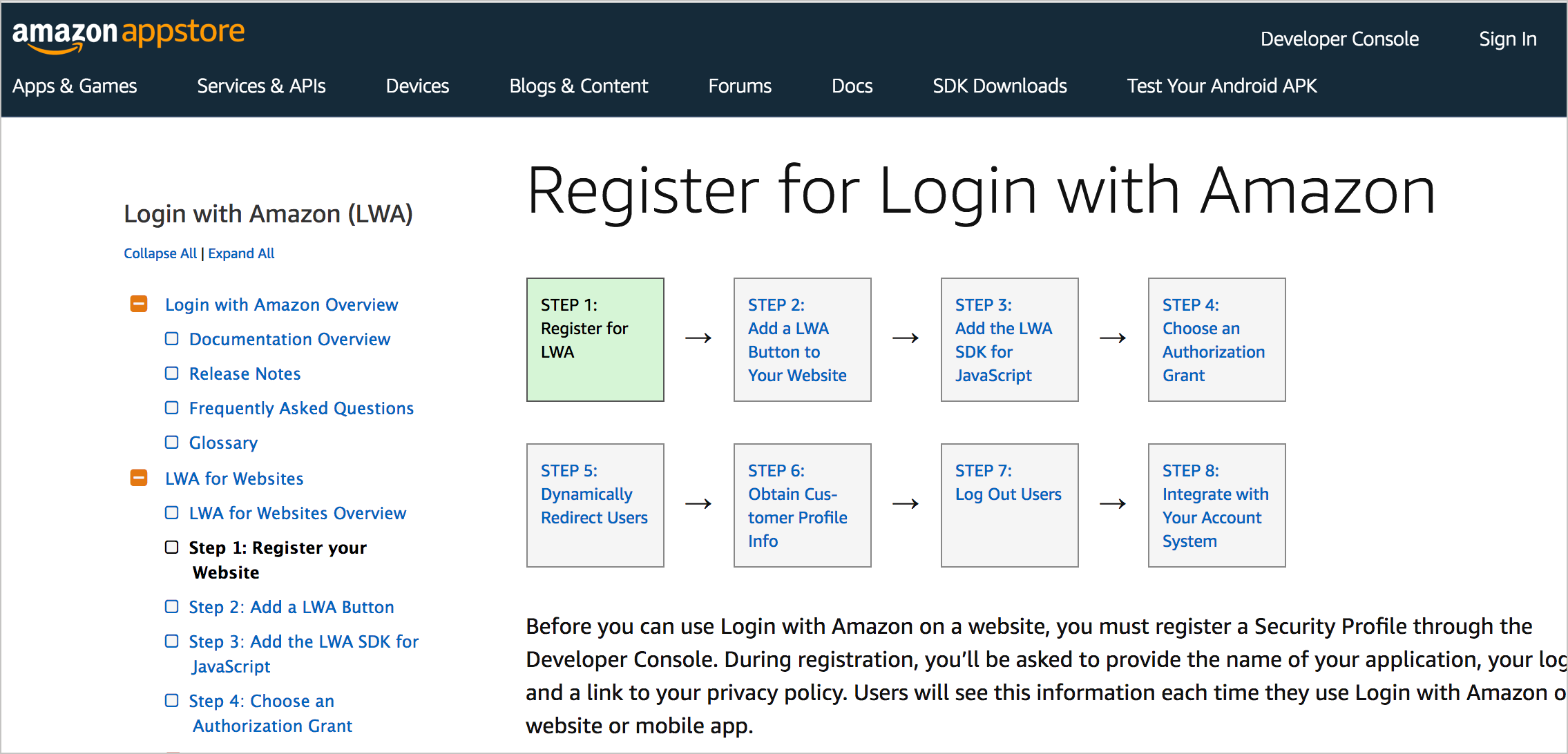
When integrating Login with Amazon into your app, you follow these steps:
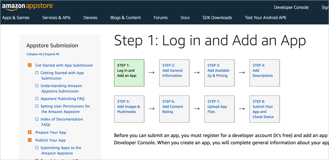
When submitting an app into the Amazon Appstore, you follow these steps:
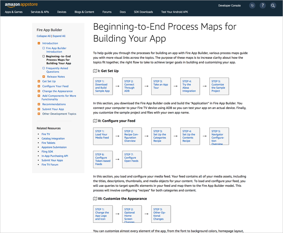
When downloading and configuring Fire App Builder, you follow these steps:

I’ll jump into more technical detail for creating these maps (such as using CSS versus SVG) in a later tutorial. For the simple CSS approach, see Examples of linear workflow user maps built with JS and CSS.
The maps help ground the user with the big picture process. When you’re mired in the details of a single task (the micro view), it’s easy to lose track of the larger journey (the macro view). The map serves as a constant reminder of where you’re currently at and where you’re headed. Embedding the map at the top of each page facilitates the toggle between the micro and macro modes.
If users land on the task from search or random browsing, the map provides an immediate understanding of the context of the information. Users might realize that they need to back up a bit and complete some preparatory tasks before working on other tasks. They’ll also realize the scope of their current activity, and what larger journey he or she is following.
What about non-linear processes?
The previous maps are all fairly linear. What about non-linear processes? Real processes rarely involve simple, straightforward linear steps as these maps indicate. I will dive into non-linearity in more detail later because it’s a key feature of a complex system. Non-linearity, branching, conditions, feedback elements that change the user’s direction, etc., all make the linear representation of steps as shown in the above maps problematic.
However, part of the technique of documentation is to create the illusion of a linearity. Linear processes are easier to follow. Our brains are wired for linearity and have difficulty making sense of non-linear systems. As such, even if a process isn’t strictly linear, I look for ways to depict a linear map to simplify the task (assuming the linearity I portray doesn’t negatively mislead the user or distort the system).
For example, with the Appstore Submission map above, you don’t actually have to proceed in that order. After completing the first tab in the submission console, you can complete the other steps in any order you like. Here’s what the submission console for the Appstore looks like:
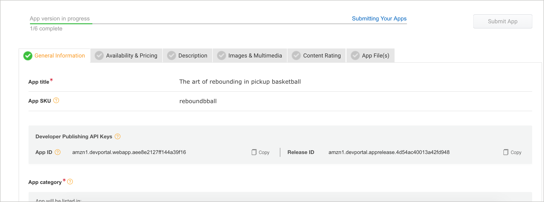
You could upload your app files first, then complete the content rating, and so on. As long as you complete the required information on each tab, you’re fine.
However, to simplify the process, I’ve drawn a linear map with the suggested route through the system. This suggested route follows the same sequence of tabs in the submission console, so it’s not a stretch. The map gives a possible route to the destination, but it isn’t so rigid that users are locked into it.
Additionally, some of the steps have multiple options. With the Amazon Creator map, when you create an app, you can choose either YouTube or an MRSS feed as your data source. The map doesn’t represent that branching (though it probably should). In part, the CSS approach I’ve taken in creating the workflow boxes and arrows makes more sophisticated displays hard to depict. For this reason, it’s probably better to use SVGs for maps.
Again, I’ll explore more sophisticated maps, non-linearity, and design techniques in upcoming tutorials. For now, I’m arguing that embedding maps in documentation can help orient users along a larger process that spans multiple topics.
Multiple maps in a system
Let’s enlarge the scale a bit more. First, we looked at a single task with steps, then a larger task with various sub-tasks, then a map linking the tasks together. Because there’s not a single map for all content in a system, we can provide multiple maps as well. The idea of chunking simply repeats itself indefinitely, like a fractal. Large amounts of information are chunked into manageable sizes.
With the Fire App Builder app, I previously showed the map for downloading and customizing the app. That’s only the starting point. Afterwards, there are other maps to follow, such as Configuring Your Feed, Customizing the Appearance, and Adding Components.
Theoretically, I could have made one long, linear map, like this:

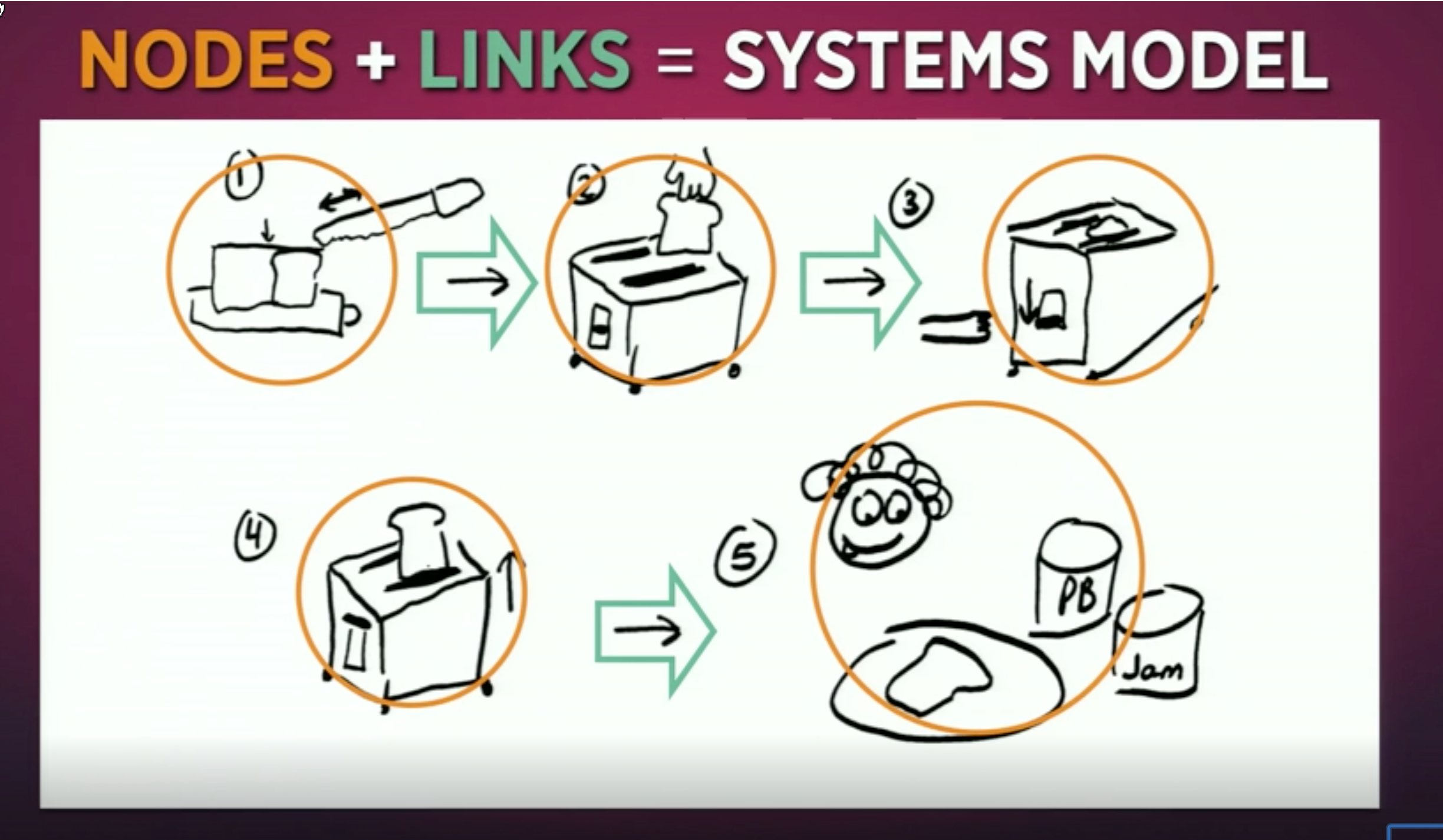
However, while this map might be more accurate, its effect is the same as a single task that has 45 individual steps. Designer Tom Wujec says that when you have too many nodes and links (objects and connections between those objects), you give users a sense of “mapshock.” He says the average “systems map” (a drawing that shows nodes and links) has between 4 and 8 nodes:
“Less than that, the drawing seems trivial….more than 13, the drawing produces a feeling of mapshock – it’s too complex. The sweet spot is between 5 and 13. So if you want to communicate something visually, have between 5 and 13 nodes in your diagram.” (See Got a wicked problem? First, tell me how you make toast to view an excerpt from the Ted Talk.)
Here’s a sample image from Wujec’s presentation. He regularly gives groups the exercise of explaining how to make toast.
Wujec believes that groups should collaboratively visualize their processes in a systems design like this (but through sticky notes which can easily be moved around and regrouped). When they do it in an iterative fashion (meaning they adjust and fix and keep moving the notes around during multiple cycles of analysis), they achieve clarity, engagement, and alignment in their process. They might identify problems that were often not previously perceived. (See An Introduction to Systems Thinking and Wicked Problem Solving™ for more details.)
My main point here is that just as we break up tasks into multiple mini-tasks when the task has too many steps, we do the same with system maps. Maps can have sub-maps. Or perhaps using a new term here, a “journey” can involve following multiple maps. (My lingo here looks like this: journeys -> maps -> processes -> tasks -> steps.)
Additionally, chunking maps into a larger journey helps add flexibility into your system. Because linearity is somewhat of a fiction, constructing a single, long, linear sequence of tasks across the entire system makes the user’s journey more rigid. If customers had, in fact, one single route through a system, the mega map might be feasible. But a single route in a system is rarely the case.
Instead, in the case of the Fire App Builder map, with each map, I inserted a simple map icon that links back to a page of other possible maps (an index of maps). This way, I provide the ability to navigate between the task that the user is focused on as well as the larger task. This brings me to the larger principle I’m articulating — allow users to navigate between the macro and micro.
Maps provide navigation between the macro and micro
Maps are a simple way to let users navigate between the macro and micro. That’s the larger principle here — the ability to easily move between macro and micro is essential for making your way through a complex system. These modes are comparable to “seeing the forest” versus “seeing the trees.”
For example, I was recently hiking in Hidden Villa, a green area near Los Altos (near Silicon Valley). The map looked like this:
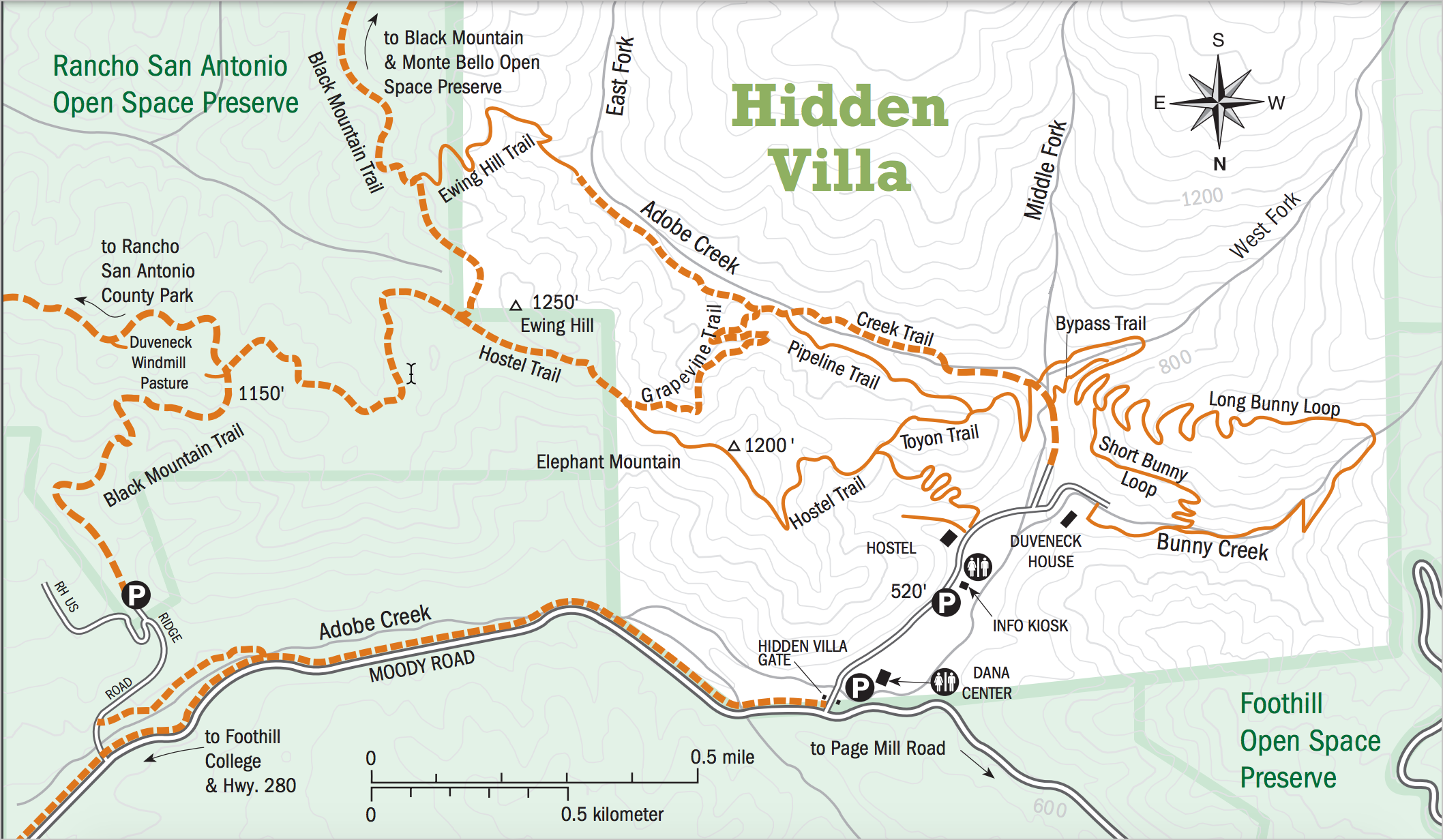
We wanted to hike up Ewing Hill (shown in the upper-left of the map). The large map looked easy enough to follow, but when we started hiking, the right direction wasn’t so clear.
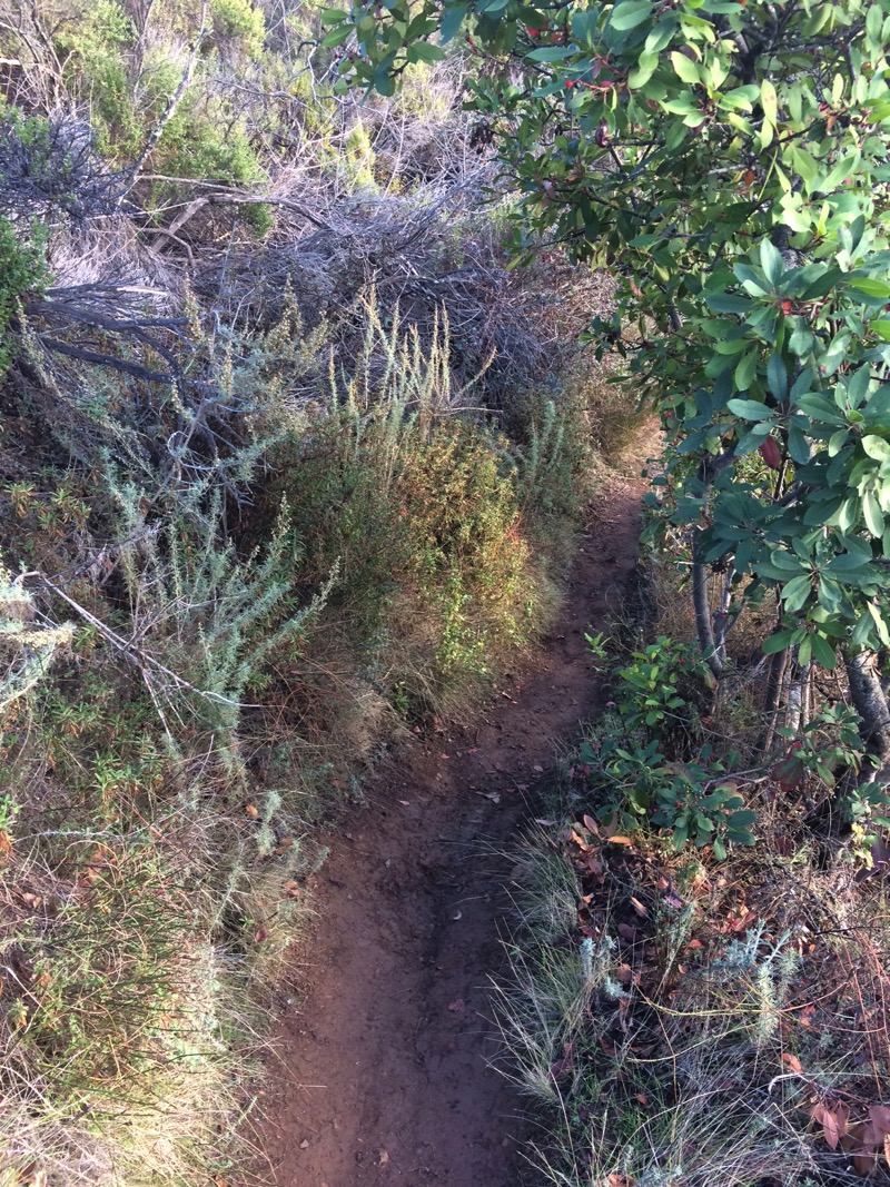
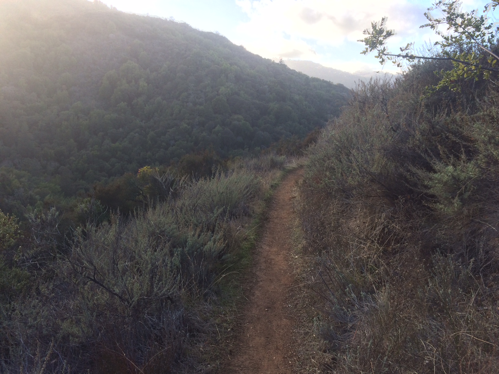
Are we going the right way? Without any signs to confirm, we trudge along the trail, hoping it’s the right way to Ewing Hill. There are lots of trails, and they often crisscross. Here we’re heading up a hill, so that’s good, but there are lots of hills around here.
Let’s look at the map.
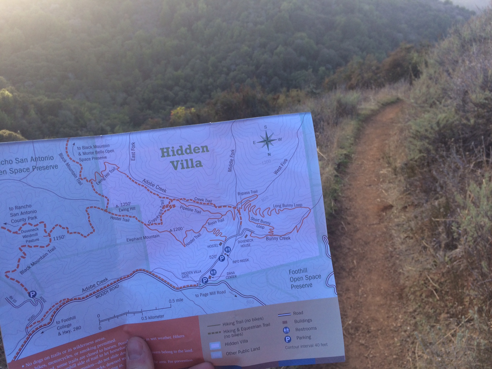
Yep, looks about right. The ability to toggle between the macro (the map) and the micro (the immediate terrain) is essential for navigation. Signposts along the way in the micro (immediate terrain) also help confirm that we’re in the right place as well.
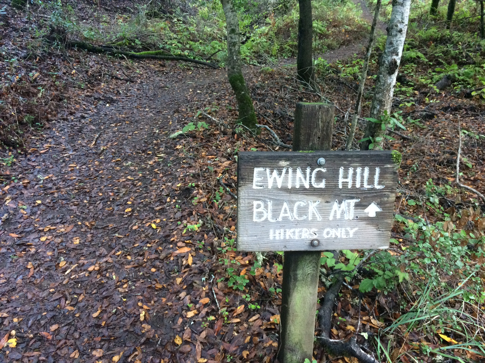
With the help of the map, we finally made it to the top.
Hiking Ewing Hill near Hidden Villa near Los Altos. Everything is fresh green and quiet after yesterday’s rain. Hidden Villa also has a small farm with animals you can interact with. Great #bayarea hike. pic.twitter.com/RdDnQPPH7G
— Tom Johnson (@tomjohnson) January 6, 2018
With actual trail maps, the switch between macro and micro modes is common and clear. Why wouldn’t the same principle apply to terrains of information as well? Well, it does. When we give documentation to users but fail to include maps, it’s the same as telling hikers to go from point A to point B in a wilderness landscape without providing a map. Is it any wonder why so many users get lost in documentation wildernesses, and why they often complain that they can’t find the right answers, that docs are confusing and poorly organized? There’s no map.
Quick reference guide maps
Another type of high-level map is a quick reference guide. Whereas the workflow maps I’ve been describing explain how to navigate among the various tasks for a specific goal, the quick reference guide provides a summary of the entire system at a glance. Here’s a sample layout for a quick reference guide:
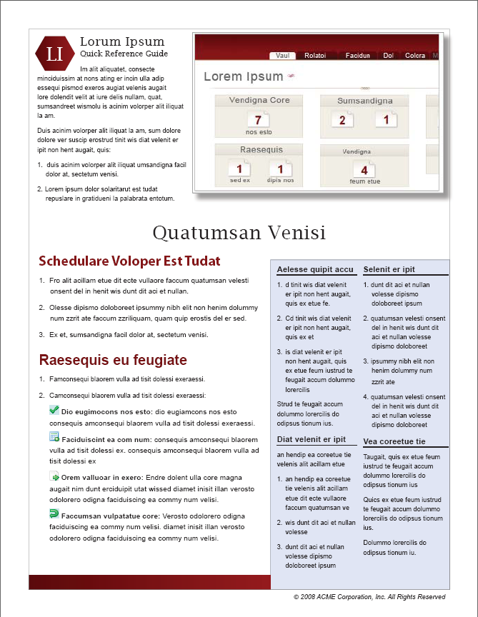
This guide usually describes, in a brief, summarizing way, the core tasks in the system. It lets users know in just a minute or two what the system can do, how you do it, and the general scope of the system.
Here’s another design for a quick reference guide:
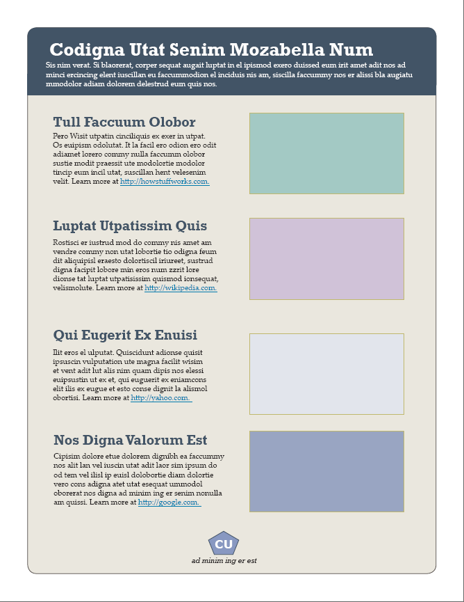
Whereas workflow maps provide a depiction of the steps in a process, quick-reference guides provide a macro view of the system — its capabilities, core tasks and features, and supported goals. In short, it’s just another way to zoom out and give the user a macro view of the system, usually in 1-2 pages.
The benefit of these higher-level guides is to help orient users in the same way that a map orients users about the terrain they’re in. With the Hidden Villa map, it shows me what trails are available, the elevation of the hills, the options for traversing back down, parking, bathrooms, compass directions, etc. These elements are critical for orientation and planning. But to actual hike Ewing Hill, you have to put the map away and look at the trail. You have to focus on the details before you, the micro. If the micro doesn’t make sense, you consult the macro, and by toggling between the two modes, you find your way. The principle is really that simple. The more controls you can provide within your documentation system to enable users to toggle between the micro and macro, the better oriented they will be.
Other benefits to zooming out
Zooming out on a complex problem is a key strategy for simplifying complexity, but this view sometimes offers other benefits. Beyond the benefits of orientation and context, some experts of complex systems say that zooming out to the macro can help you identify the elements that matter most. In complex systems, these elements that matter most (or which are most interesting) are often the seemingly insignificant components that have significant effects. They are the flapping of the butterfly’s wings that cause storms in the oceans on the other side of the world.
In a 3-minute Ted Talk on How complexity leads to simplicity, ecologist Eric Berlow argues that zooming out might initially appear to increase the complexity of a system because you expose its many parts and interrelationships. However, in that zoomed-out, macro view, you can more easily see which elements are key influencers in the system, and then zoom in to focus on those parts.
Summary
One principle for simplifying complexity is to facilitate the user’s movement between macro and micro views. You can do this by providing a map that lets users toggle between “seeing the forest” versus “seeing the trees.” In the upcoming sections, we’ll look at ways to approach non-linear systems, where traditional maps break down because there isn’t a clear sequence or process within a system.
Questions for letting users switch between macro and micro views
- Can the process be simplified by chunking the information into more granular steps?
- If there are multiple chunks spread out that users have to follow, is there a map that connects the chunks together in a navigable way?
- Would it be appropriate to provide a quick reference guide of the process, as a high-level map of the information terrain?
- Does each chunk connect to the next with a “Next Steps” section?
- What larger process does this task fit into?
- What mechanisms facilitate zooming in and out of the process?
- If you were to draw out the process, what would the workflow map look like?
About Tom Johnson

I'm an API technical writer based in the Seattle area. On this blog, I write about topics related to technical writing and communication — such as software documentation, API documentation, AI, information architecture, content strategy, writing processes, plain language, tech comm careers, and more. Check out my API documentation course if you're looking for more info about documenting APIs. Or see my posts on AI and AI course section for more on the latest in AI and tech comm.
If you're a technical writer and want to keep on top of the latest trends in the tech comm, be sure to subscribe to email updates below. You can also learn more about me or contact me. Finally, note that the opinions I express on my blog are my own points of view, not that of my employer.