
Principle 5: Conform to the patterns and expectations of the genre and schemas
Overview
In previous topics, I analyzed how integrating new information into the larger landscape and conversely distilling information from a larger landscape into smaller units both help to reduce the complexity of information. In this article, I’ll dive into another technique for simplifying complexity: making information fit a pattern or schema that is familiar to users, especially story schemas. Our mind constantly filters the events, objects, and information around us by ignoring irrelevant information and fitting the important details into mental schemas. These schemas allow us to operate efficiently in what would otherwise be a complex chaos of incoming sensory information. As such, using these schemas simplifies the user experience.
One approach for fitting information into the user’s mental schemas is to look at genre conventions and user expectations, and then follow these same conventions and expectations in the new information. However, this approach does little to exceed expectations in a genre of dissatisfied and frustrated users. A better approach is to fit information into a larger user journey that looks from beginning to end across topics, rather than focusing on one specific topic. This larger, more encompassing journey contains more of a story arc that resonates on a universal level with users.
How I first started exploring this topic
Recently, at work, I was asked to do a competitive analysis of a competing product. I’d never written a competitive analysis before, and I started by gathering as much information as I could about the competitor’s product. I reviewed previous analyses on similar topics, looked at developer surveys, read feedback, ran through sample scenarios with the product, and more. After about a week, I had a long file that contained seemingly endless notes on a variety of topics. My notes were a jumble of random observations, questions, details, half-written sentences, screenshots, references, and other information that I’d been gathering as I forayed through the competitor’s product and app submission experience.
I needed to structure this jumble of information in a way that would make sense to users. This is a task we all face when confronted with large amounts of information that we need to organize and present to users. I face similar scenarios when I’m preparing presentations or even when writing posts like this one. What principle do we use to group, structure, explain, and otherwise present large bodies of information in ways that makes sense to users? What is the structure that will both engage the user and organize the information in a smooth, coherent flow? More importantly, how can we make complex information more readily consumable and usable to readers, reducing its complexity? To fully answer this question, we’ll explore script theory, genre conventions, schemas, and story.
Script theory
One way to reduce the complexity of experience is through a psychological principle called “script theory.” In the latest edition of Communication Design Quarterly, Kirk St. Amant, a tech comm professor in New Orleans, explains that script theory refers to the routines and behavior we follow automatically and unconsciously based on the stimulus from objects, people, and other triggers in a particular space. These reflexive responses can be a good technique for making complex spaces more usable.
Here’s an example of this stimulus-response interaction. When checking into a hotel, users encounter the lobby, receptionist, concierge, waiting area, check-in desk, and other details that trigger users into an automatic routine based on previous experiences. Almost without thought, when users encounter these “prototypes of space” (aligning with their previous details in similar spaces), they know what to do, the routine to follow, what’s expected of them, and what to expect from others. Their actions and responses seem to have been scripted, like a play that has already been written out. Actors perform their roles almost in an automated way.
Script theory originates from work by Silvan Tomkins (you can read more about it here). By prompting users with the right stimuli — stimuli that align with the prototypes the user associates with that space — you help users naturally move about and operate in that space. Following the expected conventions allows users to easily filter out the immensity of detail of a new space (the hotel layout, new faces, lighting, noise, etc.) and get their task done without much thought. St. Amant explains:
By catering my design to meeting your experiences, I make these items easier for you to use in that context (Reflexes, Reactions, and Usability: Examining How Prototypes of Place Can Enhance UXD Practices, Communication Design Quarterly 6.1 2018).
Years of experience in certain spaces or situations build up expectations for those spaces and situations. When your design matches those expectations, users can naturally plug into the workflow and process the objects and information in that space in an almost unconscious way, fitting the information into the mental model they’ve already formed. What might otherwise be a complex experience — figuring out where to check in, who to ask, what to present, how long it will take, what information you need, what will be asked of you, etc. — is minimized because the experience has already been scripted, so the mind doesn’t need to figure it out from scratch.
As another example, think about the experience of driving along the freeway. How can users go 65 MPH on a congested freeway, navigating through multiple lanes, exits, pullouts, traffic conditions, and other patterns as well as read signs and follow map routes with so few accidents? Freeways are highly predictable from state to state, so they trigger expected driving behavior. The freeway provides a predictable experience that aligns with user expectations, which reduces the amount of cognitive attention drivers must devote to the task. As a result, you can listen to an audio book while driving and also munch away on food at the same time — your brain isn’t strained to try to make sense of everything. It just follows the script.
Genre conventions and usability
St. Amant’s article focuses on the usability of spaces (as does Tomkin’s theory), not so much on texts or documentation. But he does briefly mention how script theory applies to texts as well. St. Amant says, “when we generate texts – such as user manuals or instruction sets – we could be using a mental model of how elements in that space are organized to guide what we write.” In other words, every genre has certain expectations around it. When you align your text with these genre conventions, you make it easier for users to find, navigate, and absorb the information.
One of the first steps to organizing and presentation information, therefore, is to understand the expected conventions in the genre. With some genres, the information has such a strong convention that going against it would create confusion and disorientation. In an article on the usability of medication information, Henk Pander Maat and Leo Lentz explain that European regulations recently required companies to follow a new template for medication information that didn’t align with user expectations. As a result, users had trouble locating the information. Maat and Lentz explain:
Text genres come with corresponding genre schemata or move structures, specifying what will be discussed and in what order. Genre conventions serve readers by providing a collectively shared shorthand for interpreting information (Kostelnick & Hasset, 2003). They help readers scan a page and identify relevant information on the basis of structural expectations. For instance, an experienced reader of scientific articles in the experimental tradition is thoroughly acquainted with their structure (Swales, 1990), and the same goes for book reviews (Toledo, 2005), and application letters (e.g., Henry & Roseberry, 2001; Upton & Connor, 2001), to mention just a few well-established text genres. (Using Sorting Data to Evaluate Text Structure: An Evidence-based Proposal for Restructuring Patient Information Leaflets, Technical Communication, 58.3, AUGUST 2011)
For the many different genres of information — scientific articles, book reviews, recipes, personal essays, press releases, white papers, sales reports, help topics, blog posts, etc. — there are conventions that readers expect (whether they’re aware of them or not), and when authors follow these genre conventions, readers can more easily locate, navigate, and make use of the information.
The prototypical help topic
Shifting away from healthcare and medication genres, what expectations are there for help topics in the genre of technical documentation? In What Makes Up a Procedure?, Hans van der Meij, Peter Blijleven, and Leanne Jansen review “data from 52 software manuals and 52 hardware manuals” with the purpose of better self-awareness in tech comm practices and discernment of weaknesses and strengths in the same.
They build on work by David Farkas, who in turn was building upon systems theory. Systems theory refers to an analysis of “states and actions” in a system. Summarizing system theory, the authors explain that “a procedure must inform users about system states and actions that change those states.” Based on systems theory, Farkas identified 5 components in a topic that (if you’ve ever written documentation) will likely be immediately familiar:
“The streamlined-step procedure consists of five components: a title that introduces and briefly explains the goal of a procedure; a conceptual element that elaborates the goal; an infinitive subheading that clarifies the purpose of subgoals; steps with action statements and system responses; and notes that present information that lies outside the main flow of the procedure (e.g., warnings)” (What Makes Up a Procedure?.)
Based on both system theory, Farkas’ research, and their analysis of the 52 software and 52 hardware manuals (published between 1991 and 1998), the authors arrive at the “Four Components model.” Hans van der Meij, who in 2015 won the ISTC’s Horace Hockley award and reflects on his contributions to the field, says he “spent hundreds upon hundreds of hours analysing the products of technical communicators” to arrive at this Four Components model. In this model, procedures consist of the following:
- goals
- prerequisite states
- action and reaction
- unwanted states (warnings and troubleshooting information).
(Institute of Scientific and Technical Communicators Spring 2016)
The model here shouldn’t come as a surprise and instead should only confirm our experience with help information. (Otherwise, the model wouldn’t describe the prototype for documentation genre conventions.)
I support the movement here to align with genre conventions and craft help content that aligns with these four components. Certainly, including goals, prerequisites, actions and reactions, and unwanted states (including a heavy focus on problem-solving information) leads to good documentation. But are these components and conventions all we can aspire to when creating documentation? If these components and conventions constitute best practices in documentation, why are so many users dissatisfied and unhappy with their documentation experiences?
Given the reluctance and disdain users have in opening documentation to learn a system, the experience is not too unlike the traveler stopping at a remote rest area facility. Expectations are low, so why not encourage more innovation in this area?
Schemas and learning
With the goal of finding a deeper connection, let’s move past scripts theory, genre conventions, and the Four Components model to dive deeper into a concept that has been related all along: schemas. Suppose that rather than just matching expected conventions, we could actually construct and shape documentation to fit not just the user’s schema, but also something more profound — the schema upon which all other schemas are based?
First, let’s unpack what a schema is. Schemas are the patterns the mind uses to organize and make sense of information. Put another way:
A schema is a cognitive framework or concept that helps organize and interpret information. Schemas can be useful because they allow us to take shortcuts in interpreting the vast amount of information that is available in our environment. (What Is a Schema in Psychology?)
Let’s make schemas clearer through a technical analogy. When you create an RSS feed, like the one for my blog, the information is arranged in a structure like this:
<?xml version="1.0" encoding="UTF-8"?>
<rss xmlns:atom="http://www.w3.org/2005/Atom" version="2.0">
<channel>
<title>I'd Rather Be Writing - Tom Johnson</title>
<description>Technical writing blog focusing on the latest trends, news, and other topics in the field of technical communication.</description>
<link>https://idratherbewriting.com/</link>
<atom:link href="https://idratherbewriting.com/feed.xml" rel="self" type="application/rss+xml" />
<pubDate>Thu, 05 Apr 2018 06:46:40 -0700</pubDate>
<lastBuildDate>Thu, 05 Apr 2018 06:46:40 -0700</lastBuildDate>
<generator>Jekyll v3.7.3</generator>
<item>
<title>New article on Simplifying Complexity: Reduction, layering, and distillation as a strategy for simplicity</title>
<description>
I published a new article on Simplifying Complexity called
<a href="https://idratherbewriting.com/simplifying-complexity/reduction-layering-distillation.html">Reduction, layering, and distillation as a strategy for simplicity</a>
. It's all about how reduction and distillation of information helps reduce complexity for users.
<a href="http://bit.ly/reductionforsimplicity">Read more >></a>
</description>
<pubDate>Wed, 28 Mar 2018 00:00:00 -0700</pubDate>
<link>https://idratherbewriting.com/2018/03/28/reduction-and-distillation-as-form-of-simplicity/</link>
<guid isPermaLink="true">https://idratherbewriting.com/2018/03/28/reduction-and-distillation-as-form-of-simplicity/</guid>
<category>simplifying-complexity</category>
</item>
<item>
<title>The math game my daughter and her friend created with Codesters</title>
<description>
My 13-year-old daughter and her classmate recently created a math game designed for fifth grade students learning variables. They used Codesters, which is a website that uses Python to let kids code directly in the browser in an easy-to-learn way.
<a href="http://bit.ly/codestersappmath">Read more >></a>
</description>
<pubDate>Wed, 28 Mar 2018 00:00:00 -0700</pubDate>
<link>https://idratherbewriting.com/2018/03/28/math-game-created-by-students/</link>
<guid isPermaLink="true">https://idratherbewriting.com/2018/03/28/math-game-created-by-students/</guid>
<category>general</category>
</item>
</channel>
</rss>
I could have other elements here, but they would be irrelevant to and ignored by the RSS schema. RSS readers like Feedly look at the feed elements, specifically the title, description, and other elements, and they ignore everything else. They pull that information into a framework for display.
There are lots of different schemas for different types of information. iTunes has its own schema for podcasts, and media platforms often require content providers to present information in a specific JSON schema that can be consumed by their system.
Our minds work the same way. We have various schemas in our heads. When we get an influx of information, we pull out the information we need to fit into the empty slots available in the schemas in our mind. This might mean discarding a great deal of irrelevant information or unnecessary detail in order to fit the particular schema. It’s how our brain makes sense of what would otherwise be a chaos of sensory input and other details.
This filtering of information to map to an existing mental schema can have unintended consequences. Kendra Cherry explains:
… these mental frameworks also cause us to exclude pertinent information to focus instead only on things that confirm our pre-existing beliefs and ideas. Schemas can contribute to stereotypes and make it difficult to retain new information that does not conform to our established ideas about the world. (What Is a Schema in Psychology?)
For example, someone in a religious cult might have a mental schema that causes them to ignore certain details that don’t fit into their schema while performing mental gymnastics on other details to distort them into the needed schema shapes. The same phenomena can happen when writing a literary analysis as well. Once you get an idea of your thesis, you filter the information in the text that doesn’t fit your thesis, and you jam and hammer the existing details into the schema you’ve got in your head.
Patricia Chalmers says schemas play an important role in the way we learn:
Schemas are generally thought of as ways of viewing the world and in a more specific sense, of incorporating instruction into our cognition. … Schemas have been further described as “mental representations of general categories of objects, events, or people.” … For example, the schema of “bottle feeding” is composed of the cognitive organization of: learning to see a shape, recognizing and categorizing it as a bottle, grasping the bottle, bringing the bottle to the mouth, and sucking on the nipple of the bottle. (The role of cognitive theory in human-computer interface), Computers in Human Behavior, 2003)
Learning is not just about aligning with existing schemas the user already has. It’s often about introducing new schemas that the user doesn’t have or rearranging the user’s existing schemas into new patterns. Chalmers continues, building on Jean Piaget, a French psychologist who studied cognitive development:
Piaget proposed that learning is the result of forming new schemas and building upon previous schemas. He proposed that two processes guide learning: (1) the organization of schemas, and (2) adaptation of schemas. He further proposed that adaptation of schemas involves: (a) the assimilation of new information into existing schemas, or (b) the accommodation of schemas to new information, which may not fit into our existing schemas.
Mark Baker makes a similar argument about how learning involves internalizing new and possibly different/conflicting schemas. In a post about why chatbots are not the future of technical communication, Baker bursts the hype bubble about chatbots because they don’t force users to do any real learning. Baker explains:
… the real problem [with chatbots] is that there is only so much that experts can do for us. In the end, learning is about rearranging our own mental furniture, finding our way through the thickets of our own minds. The expert can help us enormously at certain key junctures in that process, but most of it we simply have to do for ourselves. (Chatbots are not the future of Technical Communication)
To take the analogy about mental furniture a bit further, we generally have ideas about where couches and rugs and dining room tables should be arranged in a house. But suppose the learning task is to rearrange the furniture so that dining room table is in the living room, and the couch is in the bedroom, and the rugs are on the back patio. This re-mapping of the mental schema creates some disorientation and cognitive strain on the user because users can no longer just naturally categorize incoming sensory data into an existing schema in their heads. This is why learning is painful and why it’s not just a matter of fitting information into an existing schema. In many cases, there isn’t an existing schema in user’s minds to map the information to. Or the schema that users were attempting to map the new information into doesn’t quite work, and the author must introduce a modification of the user’s schema or persuade the user to accept a different, less natural schema for the information.
Overall, users have a variety of schemas for different topics and scenarios, and when organizing and presenting information, we should be familiar with the user’s schema and consider it with our new information. While differing backgrounds and experiences lead to the formation of different schemas, I think the mind has an innate, possibly pre-built (a priori) schema that provides an overriding pattern that it tries to arrange all information into. This fundamental, a priori schema is story.
Story: The hard-wired schema organizing all other schemas
Regardless of the genre, story is the universal schema that our brains invariably try to map information to. In Wired for Story, Lisa Cron explains:
We think in story. It’s hardwired in our brain. It’s how we make strategic sense of the otherwise overwhelming world around us. Simply put, the brain constantly seeks meaning from all the input thrown at it, yanks out what’s important for our survival on a need-to-know basis, and tells us a story about it, based on what it knows of our past experience with it, how we feel about it, and how it might affect us. … Story is the language of experience, whether it’s ours, someone else’s, or that of fictional characters.” (Wired for Story)
The power of story is what attracted me to major in English as an undergraduate. Sure, I liked language and characters, history and criticism. But story was the real magnet. When structuring presentations and blog posts, story has been my go-to structure for as long as I can remember. It is the structure that, if you get it right, allows everything to fit into a natural place. If you can conceive of some story structure for your content, every detail naturally finds the right resting place, and your content takes on a momentum and energy of its own. There’s suddenly something at stake, and everything becomes more interesting. If you’re presenting, story also makes details stick in your head (so you don’t need notes) and gives you a natural direction through a topic and landscape. Story works as an organizing principle for almost anything.
Cron speculates that humans are drawn to story as an innate survival mechanism. “Story is what enabled us to imagine what might happen in the future, and so prepare for it,” Cron says. The evolutionary purpose for story is clear: if you know how others deal with and overcome struggle (or don’t overcome it), you can use that learning to your own advantage.
The Harvard Business Review says story also has a biological reinforcement. Narratives that develop tension trigger releases of Oxytocin in the brain, which increases our empathy. When empathy increases, people are kinder to each other and more willing to cooperate, donate, or help out. The brain’s positive, reinforcing response to story suggests that story maps to something deeply important in the human mind and experience. (See Why Your Brain Loves Good Storytelling.)
In The User’s Journey, a book about how to incorporate story into business contexts to engage users with products, Donna Lichaw says stories are “our oldest, best tools for communicating, teaching, and engaging with people.” She explains:
Story, and its underlying architecture, powers the ability to understand what happened in the past, what happens in the moment, or what will happen in the future. It’s a framework and a lens with which humans comprehend everything.
Whether you plan for it or not, your customers use their story-driven brains to understand your product and what it’s like to use your product. They also use their story-driven brains to tell others about your product. The better the story, the better the experience, the better the word of mouth.
She says that infusing the user experience with story leads to a better, more memorable and lasting impression on the user. Story also helps users “have an easier time doing whatever they were trying to accomplish” and instills them with desires to “to repeat that experience” (The User’s Journey: Storymapping Products That People Love).
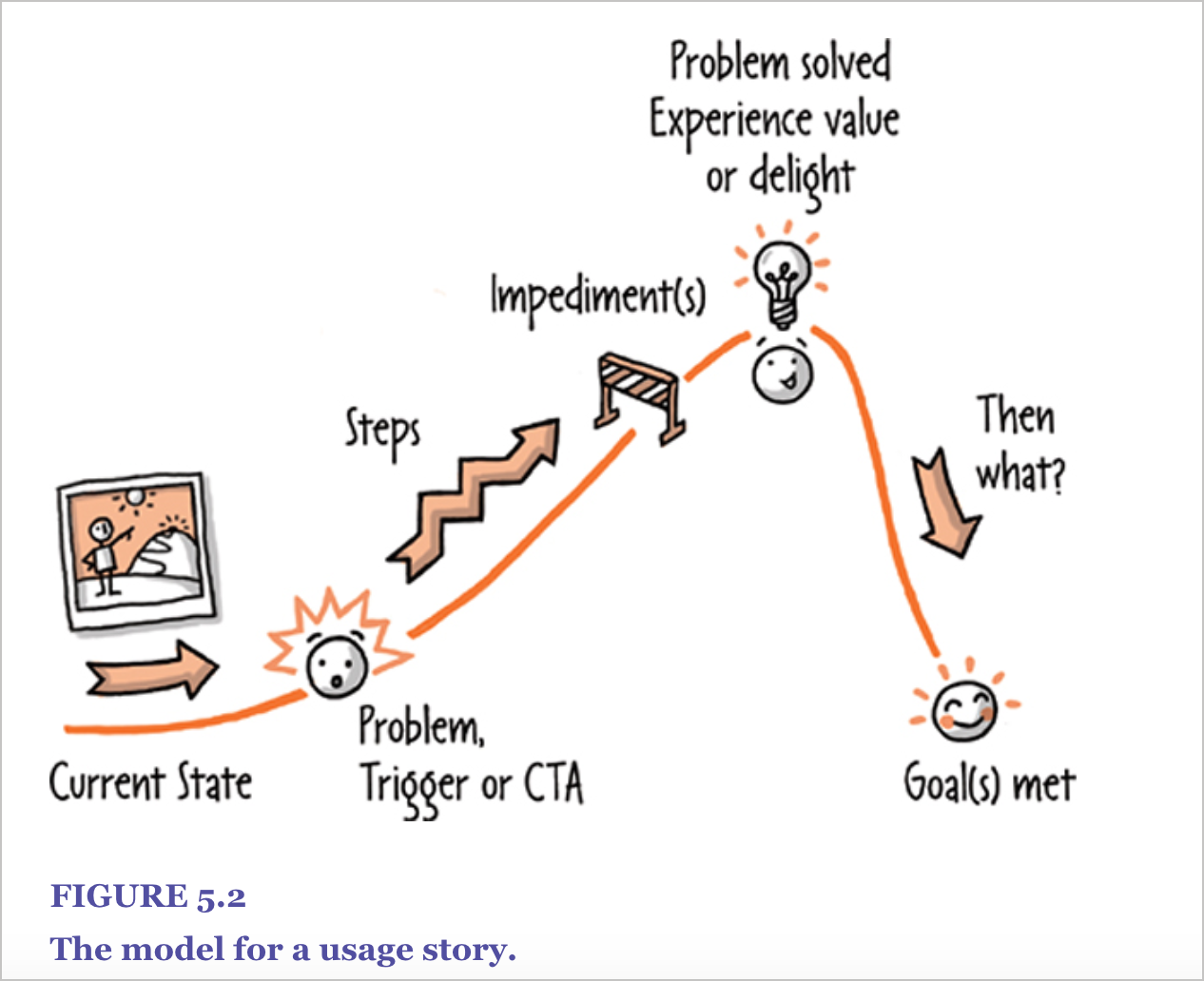
In The User’s Journey, Lichaw first explains the basic structure of story. The typical story includes exposition, inciting action, rising action, crisis, climax, denouement, and end. Her depiction of story follows the typical breakdown of “characters, goals, and conflict” — elements Aristotle called out as the foundation of story, she explains. Stories have a clear beginning, middle, and end. With this explanation, there’s nothing new here that you wouldn’t find in a creative writer’s handbook, but what is unique is the application of this same creative framework to the business context.
Lichaw shows the typical shape of a usage story as follows:
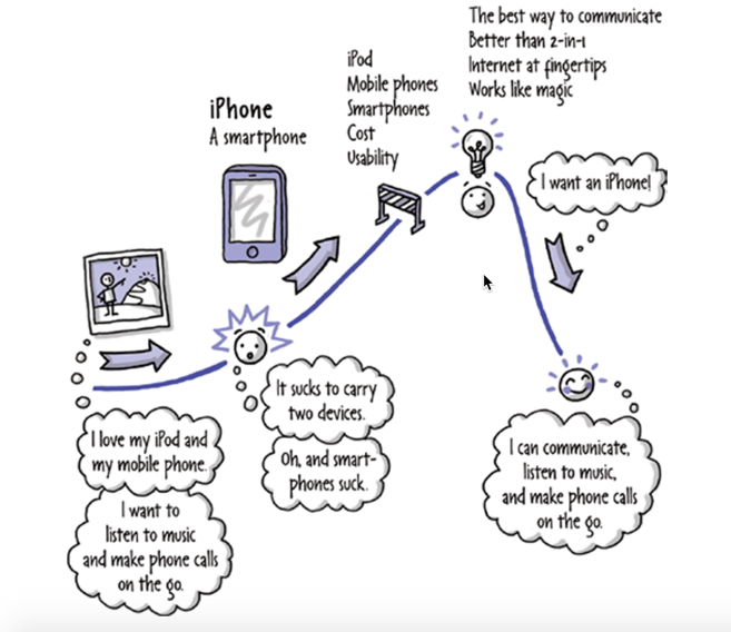
As an example, Lichaw uses the keynote Steve Jobs gave when announcing the first iPhone at an Apple keynote. Steve built up the problem of having separate devices (one device for calling, and one device for web browsing and listening to music), and then presented the iPhone as the solution.
Lichaw shows how the different types of stories in the workplace — “concept stories,” “origin stories,” and “usage stories” — can incorporate these same basic story principles to engage users.
Key to Lichaw’s approach is to make users the heroes of these stories:
What’s great about story and its underlying structure is that it provides you with a framework—a formula, if you will—for turning your customers into heroes. Plot points, high points, and all.
She says Kathy Sierra’s book Badass: Making users awesome has a similar focus on users. You’re not the protagonist. Your users are your story’s characters that have goals and move through the story arc. She says, “The inciting incident is the problem or need that your users have. They have a big goal, but … wait … there’s a problem. Why can’t they meet their goal?” Lichaw recommends that teams map their users’ paths and decisions, listen to their deliberations and other feedback in order to map their stories.
Most technical writers with humanities backgrounds love the idea of combining story with the more technical aspects of their jobs with documentation. For example, in a recent issue of Technical Communication, J.J. Haas explains that one key difference between technical and creative writing is that in technical writing, the author remains invisible to the reader. In contrast, with creative writing, the narrator is a character in the story. Haas explains:
… the creative writer must reveal himself to the reader to engage him in the emotional rollercoaster of an experiential story. The reader has to see the creative writer as an honest broker for the narrative, as if the creative writer must show his hand before the reader will put his own cards down on the table. The best way for a reader to become emotionally engaged in a narrative is for the creative writer to reveal himself so that the two of them can attain what I call “a soul-to-soul connection.” (Technical Writing Versus Creative Writing, Technical Communication Mar/Apr 2018)
In other words, the distinguishing element for the creative genre is that the writer reveals him or herself to the reader. Haas is right on target with his observations. I started this post by revealing myself right from the start, establishing the relevance of the topic through a recent personal experience. Otherwise, how else do I establish the relevance and invite interest in the topic? As a writer, I was trying to draw in the reader to share in this struggle to find natural organizing patterns for large bodies of information. If you make the writer invisible, you greatly diminish the appeal of the personal essay form.
Even without bringing in personal experience, the form of personal essay thrives on the writer’s struggle with ideas to sort out meaning and clarity from a jumble of life details and reading. It’s this sense of intellectual struggle — again, the writer revealing him or herself and struggles to the reader — that gives energy and humanity to the text.
I’m not arguing that technical writers should suddenly become visible narrators in documentation. For sure, that won’t work and flies against all convention in the genre. Making users the heroes sounds cool but doesn’t have nearly the same engaging result as with creative genres. It’s hard to climb inside the user’s head and deliberate against all kinds of imagined frictions, and then present those deliberations in an engaging way — though that activity is surely a good practice and innovation is welcome here.
Stepping back both inside and outside of your product
Even though the technical writer can’t be visible, you can still paint a general story. Lichaw says to step back and provide a “big picture overview.” Her mapping of stories shows larger arcs, paths users take both inside and outside the product. In her chapter on writing usage stories, she gives this advice:
More than likely, anything you build a usage story for will be a combination of screen and non-screen-based steps. For example, that university welcome center might have screen-based kiosks that help visitors find what they’re looking for, as well as signage and other affordances—oh, and humans who might hang out at a service desk. That app you’re building might have a user flow with steps that take place outside of the screen, such as when a customer calls customer service for help. It is essential to consider usage stories within their broader context of who, what, when, where, and why someone is doing something. And, of course, it is essential to consider, assess, and plan for the intended story of use. Plot point by plot point.
As I looked through all the material I’d gathered in my competitive analysis, I decided to step back a bit and map out the “developer’s journey” — following this larger flow that includes the combination of screens and non-screens, various points along the way that span multiple tasks, workflows, interactions, decision points, and challenges. For example, rather than starting with the first screen in the app submission or development process, I started even earlier, considering why users would choose to develop an app for the platform in the first place. What motivates them to take interest (or not) in the platform?
After considering this larger picture, my developer’s journey looked more or less like this:
- Evaluate streaming media platforms
- Assess app development options
- Register as a developer
- Get oriented on the developer site
- Consult the documentation and build the app
- Test the app
- Submit the app
- Troubleshoot problems and seek help
By zooming out a bit and looking at the larger journey, more of a story arc emerged. Instead of just a single story, it’s a journey. Granted, this isn’t a gripping drama by any means. But journeys or stories don’t necessarily entail drama in the creative sense. And you can still see elements of van der Meij’s Four Components model of a help topic here – a user has a goal, there are difficulties along the path to achieving the goal, there is trouble and troubleshooting, and when the user achieves the goal, the state changes.
By stepping back a bit and mapping the user’s larger journey, which might include 20 or more specific points as the user moves through the system from beginning to the end (or even before arriving at the beginning), the larger trajectory emerges and shows more of the story.
Stepping back and showing the larger picture, I’ve realized, it’s not a natural activity in tech comm. When we document a system, we often get lost in the details of each task. For example, when I start new documentation for a product, I might begin by listing the top 10 tasks I anticipate will need documentation. Each task has a host of granular details that must be nailed down, and when viewed alone, this zoomed-in task doesn’t seem so story-like. But when you step back and view all the other tasks the user takes on this larger journey, the story emerges, and you can paint a fuller picture for the user. This larger journey is what I haven’t devoted nearly enough attention to shaping in my documentation. Why not? I think topic-based authoring is partly to blame.
How topic-based authoring killed the user journey focus
Part of the reason for this neglect of the larger journey is the shift the tech comm industry took towards topic-based authoring. When John Carroll published his research about how users jump around from one topic to another, out of order, not following any sequence, and needing to start from any page as if, as Mark Baker says, it’s “page one,” this mentality implicitly suggests that the larger story arc connecting these individual topics is unimportant. Since readers only nibble on bits of information here and there, why bother shaping the “user’s journey”? In topic-based authoring, users don’t necessarily follow a journey — they swoop in and out, like a seagull diving for a brief fish in the water and then rising immediately back out.
The consequence of discarding the overarching user journey in favor of individual, disconnected pieces of information is that the user becomes more disoriented and lost in the system. The help information becomes a sea of topics, organized in no strong way, and the user gets easily lost and overwhelmed. You can still chunk up a story into individual topics, for sure, and link them together in a coherent map that carries users from page to page. This would satisfy both story-based schemas and topic-based authoring. But unless the author keeps this larger story in mind, it’s easy to disregard it and just focus on individual topics.
In an article on human-computer interaction (written during the early years of the Internet), Patricia Chalmers explains that the web interfaces often poses challenges for novice learners because they get lost in the nitty-gritty details of the page. They zoom in one piece and lose track of the big picture narrative that glues all of these separate pieces together, and hence can’t form a coherent mental schema of the topic. Chalmers explains:
Many computer users have trouble learning and remembering information presented on a computer screen. Based on cognitive theories, part of the reason for lack of retention is hypothesized to be the user’s inability to form a mental picture, or schema, of the information presented via a computer screen. In order to form a schema, users need to be able to understand where newly acquired information fits into ‘the big picture’. However, computers and the information on them are so infinite, users may have trouble thinking in terms of the big picture. (The role of cognitive theory in human-computer interface, Computers in Human Behavior 2003)
Chalmers cites additional research that notes “novice learners benefitted more organization than did learners with prior knowledge of the subject matter.” Painting the big picture that maps to the user’s journey is key to orienting [novice] users and engaging them. These big picture tasks that span across the system also suit technical writers well, since our strength is our generalist vision, our breadth and knowledge of many different products and processes rather than a specialized knowledge of just one aspect of a product.
In mapping out the user journey in my competitive analysis, probably my most important realization was that the journey my users take extends beyond the bounds of my company’s product. When users build apps for our product, they also build apps for other products too. The language, interfaces, and workflows in these other product spaces create expectations and schemas for our product. Understanding this larger picture across platforms provides a glimpse into the real user journey — and including this additional component adds to the story.
I finished the first draft of my competitive analysis last week. Although it was 43 pages long, all the details were neatly in place, in the right organization, because I organized it around the developer’s journey. The path through each step in the journey provided a full experience, rooted in story, that connected well with the readers. Now I’m thinking of restructuring our end-user documentation around a similar journey.
Questions for conforming to the patterns and expectations of the genre and schemas
- Does the topic contain these categories: goals, prerequisite states, action and reaction, unwanted states (and troubleshooting)?
- Does the discourse follow a task-based format for the genre?
- What story are you telling? Is your content structured around that story?
About Tom Johnson

I'm an API technical writer based in the Seattle area. On this blog, I write about topics related to technical writing and communication — such as software documentation, API documentation, AI, information architecture, content strategy, writing processes, plain language, tech comm careers, and more. Check out my API documentation course if you're looking for more info about documenting APIs. Or see my posts on AI and AI course section for more on the latest in AI and tech comm.
If you're a technical writer and want to keep on top of the latest trends in the tech comm, be sure to subscribe to email updates below. You can also learn more about me or contact me. Finally, note that the opinions I express on my blog are my own points of view, not that of my employer.