

Reflections on my 2019 site analytics
- Overall page views
- Analytics breakdown
- API doc traffic percentage
- Reflections on page view trends
- Reflections on gender metrics
- Reflections on device analytics
- Conclusion
Overall page views
Here’s a breakdown of site traffic analytics on idratherbewriting.com from Jan 1, 2019 through Dec 31, 2019, according to Google Analytics. The blue line represents 2019, while the brown line represents 2014 for comparison.
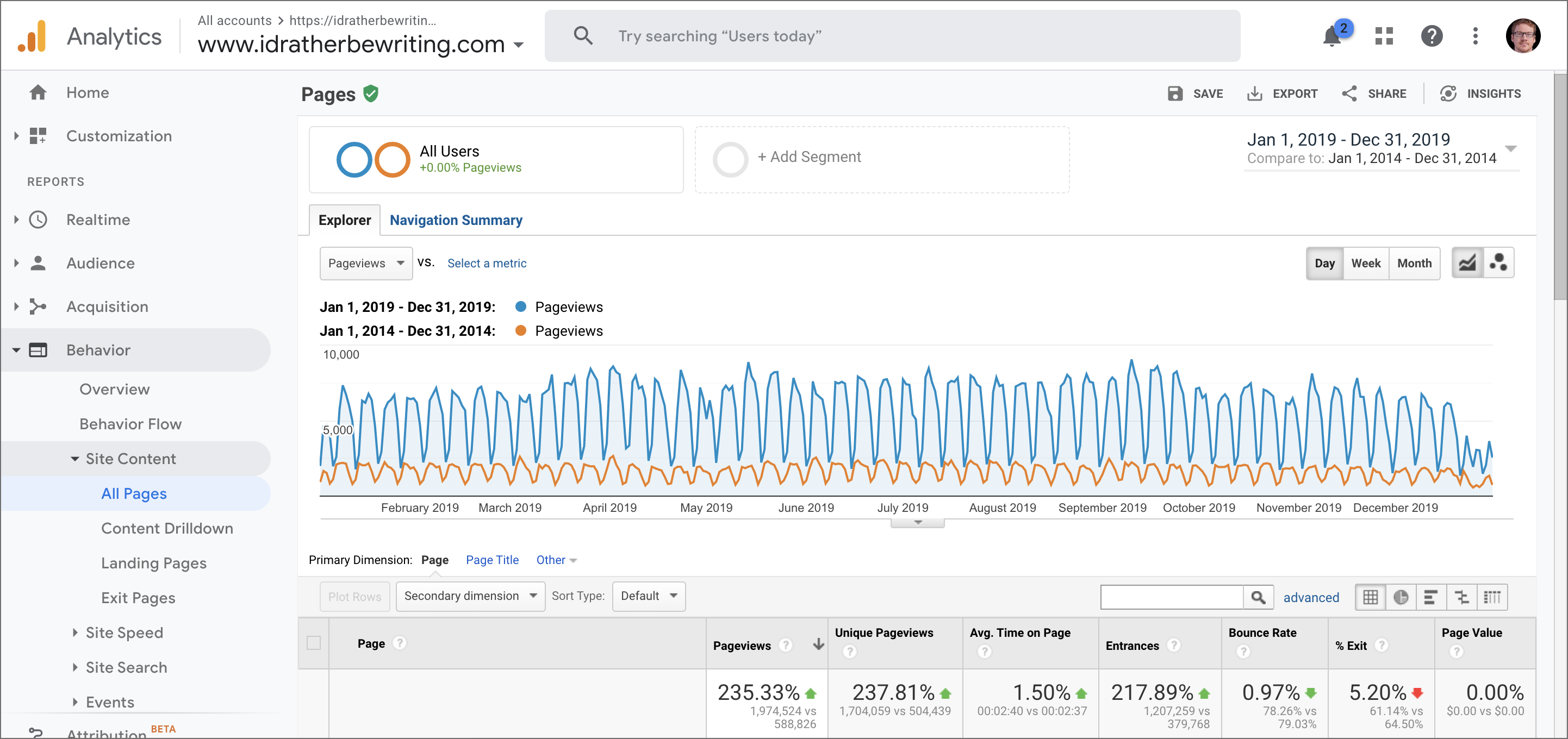
The above screenshot compares the traffic of the site in 2019 with the traffic 5 years earlier. In 2014, the total page view count for the year was 588,826. The site’s traffic has grown by 335% over 5 years.
Analytics breakdown
The following table includes more details from other Google Analytics reports. To make the data more meaningful, I’ve provided both the 2018 and 2019 data so you can compare the changes from one year to the next. I also round data to the nearest whole number (e.g., 1.51% is rounded to 2%; 1.49% is rounded to 1%).
| Jan 1, 2018 - Dec 31, 2019 –> Jan 1, 2019 - Dec 31, 2019 |
Count |
|---|---|
| Page views | 1,552,615–>1,974,524 |
| Average page views per day | 4,253–>5,409 |
| Average page views per hour | 177–>225 |
| Unique page views | 1,331,869–>1,704,059 |
| Average time on page | 2:40–>2:40 |
| Users | 687,818–>909,236 |
| Sessions | 942,306–>1,207,264 |
| Sessions per user | 1.37–>1.33 |
| Average session duration | 1:44–>1:41 |
| Pages per session | 1.65–>1.64 |
| Bounce rate | 78%–>78% |
| Organic search traffic (unpaid search traffic) | 495,033–>761,144 |
| Traffic from social | 5,596–>6,373 |
| Social site breakdown | Linkedin 49%–>42%, Facebook 20%–>15%, Twitter 17%–>23% |
| Geographical region | US 35%–>32%, India 16% –>17%, UK 5%–>5% |
| Browser | Chrome 73%–>76%, Firefox 9%–>9% |
| Device category | desktop 86%–>88%, mobile 12%–>11%, tablet 2%–>1% |
| Device type | iPhone 37%–>38%, iPad 7%–>6%, Google Pixel 1%–>1% |
| Operating System | Windows 60% –>59%, Mac 20%–>21%, Android/iOS 13%–>12% |
| Age | 18-24 (18%–>15%), 25-34 (48%–>52%), 35-44 (23%–>22%), 45-54 (8%–>7%), 55-64 (3%–>2%) |
| Gender | male (72%–>73%), female (28%–>27%) |
All of this information is provided through Google Analytics by default. (I don’t have any special scripts or other tracking cookies other than what Google adds through Google Analytics.)
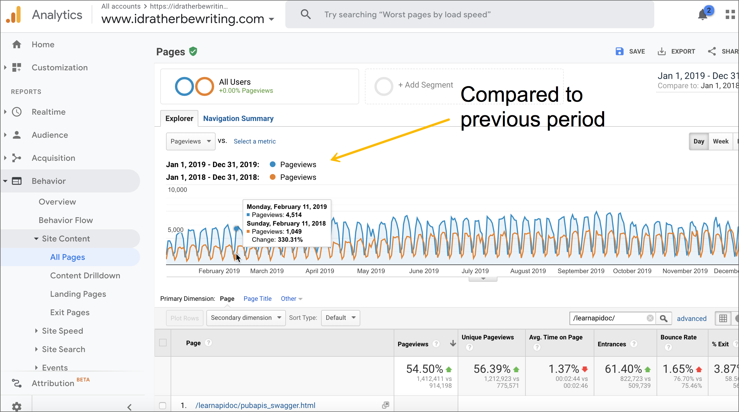
API doc traffic percentage
In 2018, 59% of my site traffic came to my API documentation site (/learnapidoc/). In 2019, that percentage jumped up to 72%
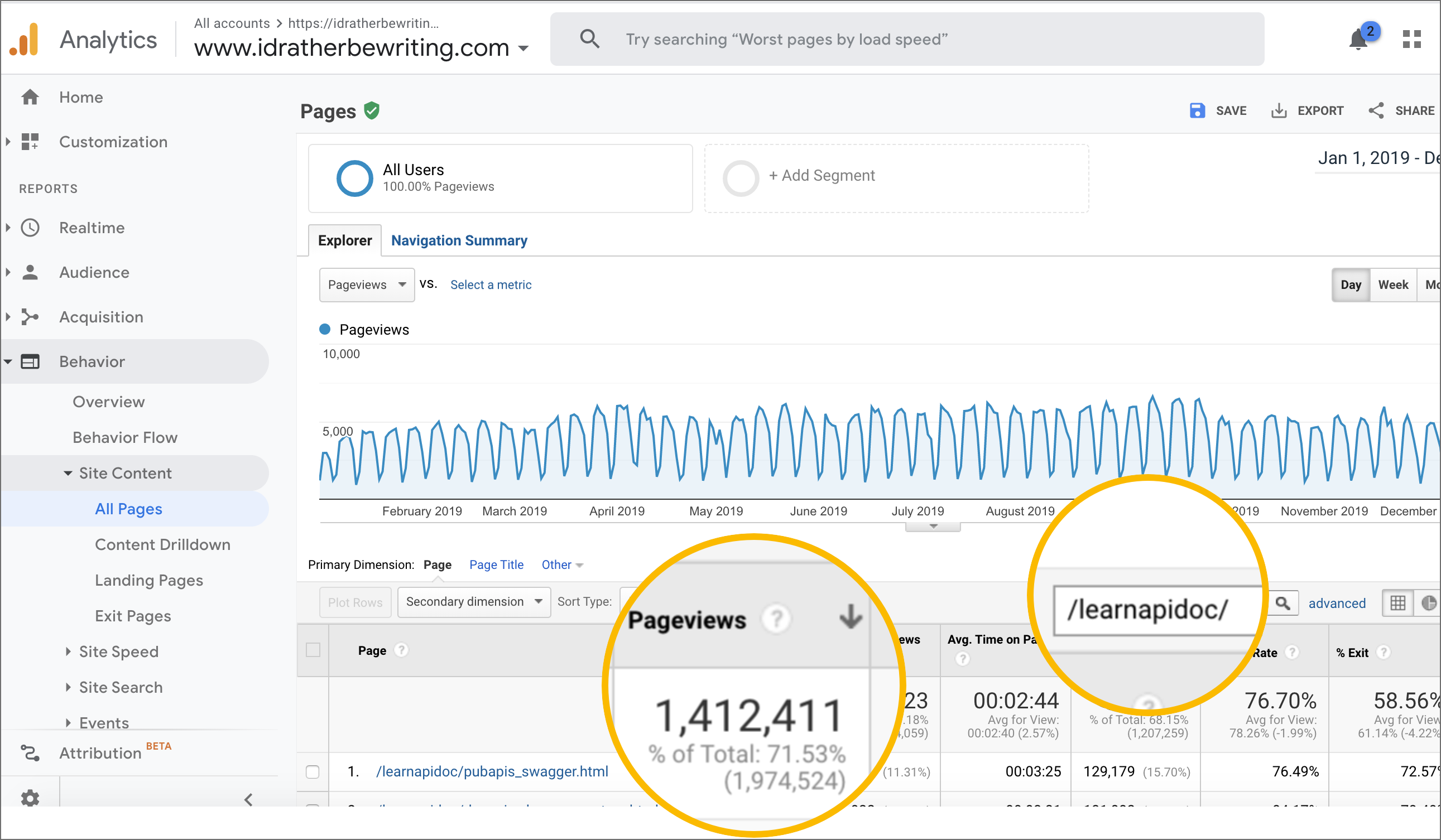
Here’s a graph that compares this growth to the previous period:
The traffic from the API documentation visitors is outperforming other traffic sources. My most popular page is Swagger UI tutorial (8.24% of total traffic), followed by Parameters (8.18%), OpenAPI tutorial (2.41%), Postman (2.27%), and Access and print JSON (2.05%). The remaining pages are all under 2% of total traffic.
Reflections on page view trends
I have several observations and conclusions from these analytics. First, it’s kind of cool to see my traffic increase year after year. I don’t know if (a) there are simply more people online or if (b) my site is actually becoming more popular relative to other sites. I was reading Rhonda Bracey’s 2019 blog statistics, and she also had similar increases in traffic.
But one thing is for sure: when it comes to traffic, the collection of pages in my API doc site is outperforming the blog. I read somewhere that Google factors in the URL date to deprioritize old blog posts, so I’ve started using non-date permalinks in my new blog URLs, but whether these non-dated URLs perform better isn’t apparent to me. I do think that Google likes to see regular updates to content (and hence ranks these pages better), but this is a hunch.
Overall, I don’t think Google differentiates between posts and pages, which is funny because almost all blogging platforms distinguish between these two format types. Also, I like curating and continually updating a collection of pages rather than always punching out one-off posts. Blog posts are ephemeral, only living a few months and then sliding into oblivion. But pages that I try to keep updated live more permanently and have more value.
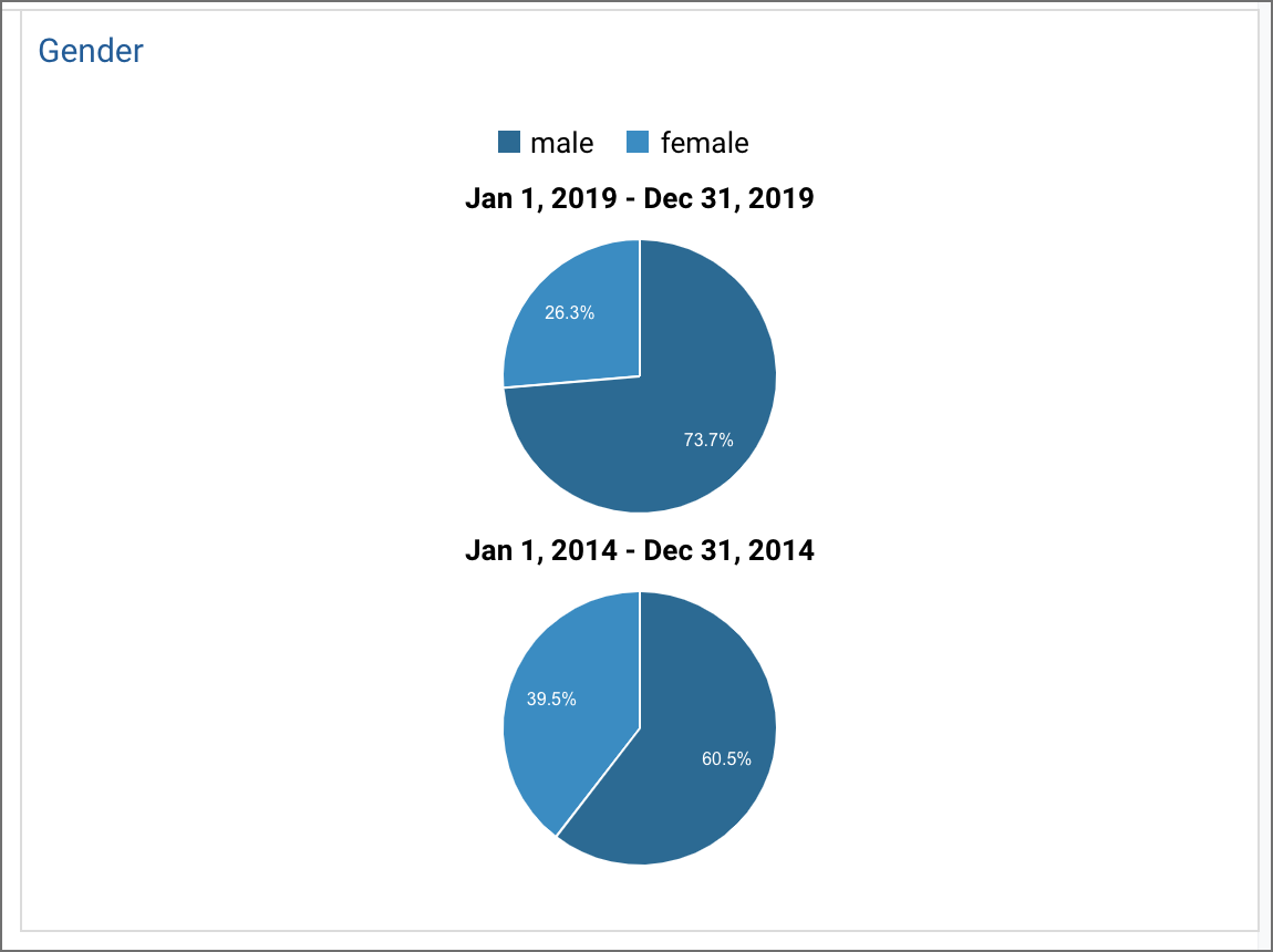
Reflections on gender metrics
A few details other details in the metrics stand out. I am surprised that so many readers are male — 73% in fact. In 2014, the gender split was 60%/40% for male/female, and now it’s 73%/27% for male/female. I thought the API doc site’s traffic might be tilting the scales to more male readers, but perhaps not. In my current dev doc survey, with 108 responses so far, the gender split is 55%/42% for male/female.
Here’s a graph from Google Analytics showing the gender comparison in 2019 versus 2014:
By the way, this metric usually raises eyebrows, as people ask how Google Analytics knows your gender, especially since this seems like private information. According to Search Engine Platform, Google guesses your gender based on your name, using some services such as DOTS Name Validation to infer the gender. Of course, this wouldn’t always be accurate, as some names like Sam, Evan, Pat, Rene, etc., could go both ways, not to mention the difficulty of guessing the gender for names in other cultures, but that’s how the analytic is measured.
Does the gender comparison matter? Not as far as I can tell. My main interest, I guess, is just to understand the demographics in the tech comm profession. The programming culture has a poor reputation for being heavily male-dominated. For example, in the Stack Overflow 2019 survey, 91.7% of the respondents were male. In the 2019 Tech Comm Census, Saul Carliner found that “The majority of technical communicators (57 percent) are female; 40 percent are male and 1 percent identified as other. Two percent chose not to identify their gender.” It’s interesting that 73% of my traffic is male, but overall in tech comm, only 40% are male. Perhaps I’m not connecting with female readers.
Reflections on device analytics
Other metrics that caught my attention were the devices. I’d been using a Google Pixel for the past two years. I was curious to compare the traffic of Google Pixel to Apple iPhone. Apparently, there is no comparison. iPhone traffic accounted for 38% of mobile traffic, and Google Pixel 2 accounted for only 0.62% of the traffic.
Also, tablets are becoming obsolete as a device for browsing the web. (I basically just use my tablet as a small portable streaming media device while I’m doing dishes or to prop up beside my laptop while doing work.)
Conclusion
Overall, the analytics don’t present any crazy metrics to dissect other than the continued increase in page traffic, especially to my API doc site. This increase in traffic has brought some new advertisers from the API doc space — namely SmartBear with SwaggerHub and Stoplight. So that’s good. Also, it persuaded me to start giving API documentation workshops on a regular basis, like with the upcoming January 23 API doc workshop in Los Angeles. Lack of traffic on my Simplifying Complexity series prompted me to refocus my efforts elsewhere.
Some people have told me to write more “deeply reflective” posts on the tech comm profession, and I definitely want to do more of that. In some ways, even with the increase of traffic, the numbers aren’t that meaningful compared to the community of engaged, loyal readers. For example, right now there are 28 people on my site:
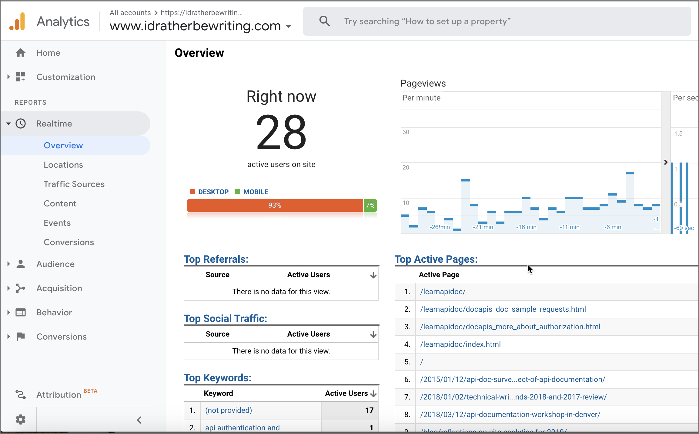
As you can see, the traffic focuses almost entirely on the API doc content. But what does that really mean, especially if those 28 people don’t comment, don’t take my survey, or otherwise engage? In some ways, a few thoughtful comments or retweets outweighs the value of tenfold the number of page views.
About Tom Johnson

I'm an API technical writer based in the Seattle area. On this blog, I write about topics related to technical writing and communication — such as software documentation, API documentation, AI, information architecture, content strategy, writing processes, plain language, tech comm careers, and more. Check out my API documentation course if you're looking for more info about documenting APIs. Or see my posts on AI and AI course section for more on the latest in AI and tech comm.
If you're a technical writer and want to keep on top of the latest trends in the tech comm, be sure to subscribe to email updates below. You can also learn more about me or contact me. Finally, note that the opinions I express on my blog are my own points of view, not that of my employer.