
Creating professional looking graphics in the easiest, simplest way possible
- Lightning talk
- Text alone can be boring
- Visuals are an incredible tool
- But we aren’t artists!
- Step 1: Embrace minimalism
- Step 2: Use the Noun Project
- Step 3: Build a graphics library
- Conclusion
Lightning talk
For the event details, see Write the Docs meetup.
You can view my slides here or just read on below. I’ve added some more detail to each of the slides.
If you’re unfamiliar with lightning talks, they are 5 minute talks, so basically you deliver a single, focused idea in a compressed amount of time. Although I’ve given more than 75 presentations, I had never given a lightning talk.
Here’s the recording:
Text alone can be boring
Text without graphics is somewhat boring, harder to understand, and lacks appeal.
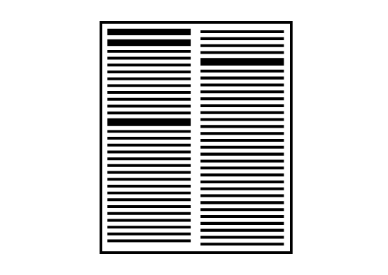
Note that by graphics, I’m not really referring to screenshots, but rather to general illustrations. Not all documentation needs a healthy supply of visuals, but there are some key scenarios where conceptual illustrations, diagrams, or other visuals play a strong role to increase the appeal and clarity of the concepts. Some of these scenarios include the following:
- Introduction of new concepts
- Explanations of processes
- Articulation of complex technical detail
Screenshots (especially with callouts) are certainly a type of visual aid, but technical writers typically don’t have any trouble producing these.
Visuals are an incredible tool
We make things harder on ourselves by not leveraging graphics to explain complex concepts.
I once worked at a place where one of the product managers insisted on getting more whiteboards because whenever someone tried to explain something, the person would invariably draw it out on a whiteboard (and we had just one whiteboard). Have you noticed how at your work, whenever someone is trying to explain a complicated idea to another person, he or she ends up drawing it on a whiteboard?
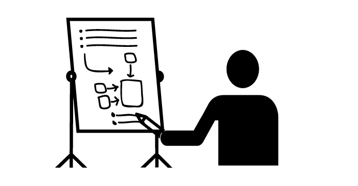
Even with the poorly drawn whiteboard images of boxes, circles, and arrows, the visuals help clarify ideas for both the listener and the explainer. The latter is a key point often emphasized — you don’t necessarily understand something until you can draw it.
But we aren’t artists!
We all usually agree that including visuals is a great idea. The problem is that as writers, we often lack graphic design skills. We pour immense amounts of effort into getting the exact words, tone, and sentence structures with our text. We are perfectionists who are bothered when people who can’t spell or follow a consistent capitalization style.
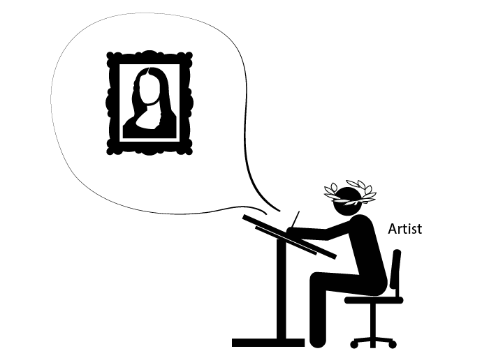
The thought of producing graphics that look like kindergarten art horrifies us, so we often don’t even try. We explain away the lack of graphics with common rationalizations:
- I don’t have enough time
- Visuals are going to be problematic with translation
- We don’t have enough resources dedicated for that
- Our corporate standards are too high for what I can create
You can still produce some professional-looking graphics without being a graphic artist, and without investing a lot of time. I have three principles for doing so.
Step 1: Embrace minimalism
The more minimal the artwork is, the easier it is to make simple changes. If you have more complex artwork, it can take a long time to make some simple changes to the image, and each new image will require more effort to integrate. So keep it simple.
Additionally, focusing on too much artistic detail actually detracts from the real intent of the visual, which is to communicate a concept.
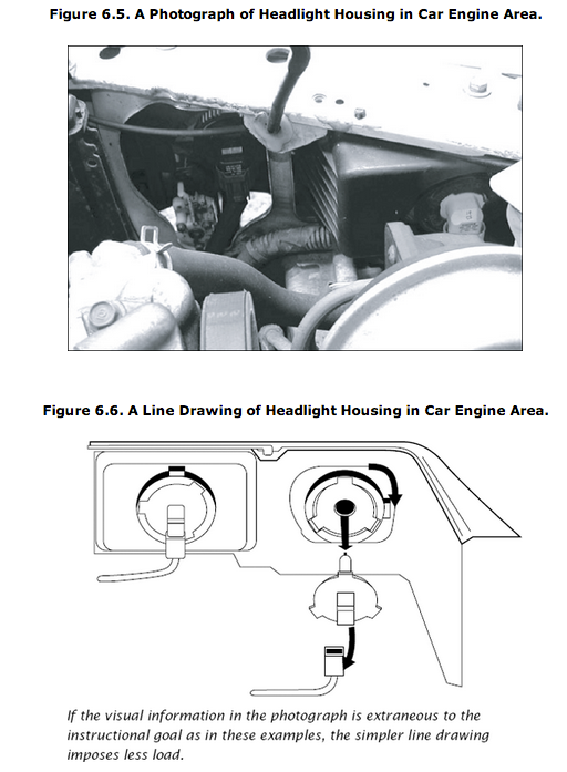
In Graphics for Learning: Proven Guidelines for Planning, Designing, and Evaluating Visuals in Training Materials, Ruth Clark and Chopeta Lyons explain that removing distracting and non-essential elements of visuals can reduce cognitive load and help users focus on what really matters.
Here’s an image from their book that compares a photograph versus a line drawing in a car guide:
Clark and Lyons explain:
... in situations where the learner has little control over the pacing of the lesson such as in a short animated sequence (instructional control rather than learner control), simpler line drawings result in better learning than do complex realistic illustrations. On the other hand, more complex illustrations sometimes result in more learning when learners have unlimited time to study the graphic (Levie, 1987). Therefore, we recommend that you plan graphics at the lowest level of complexity that will support the instructional goal, especially when the content is new, there are complex visual discriminations involved, and when the materials are presented out of learner control. (Chapter 6)
In other words, for users who are pressed for time or rushed, graphics that have the lowest level of complexity often have the biggest impact. But if your users have a lot of time to spend looking at visuals (I’m not sure who these people might be), go ahead and add more detail in the illustrations.
Overall, I think minimalist graphics are a win-win situation – easier to create, and more powerful for learning.
If nothing else persuades you, think of minimalism as a challenge to communicate your ideas with the least possible lines.
Step 2: Use the Noun Project
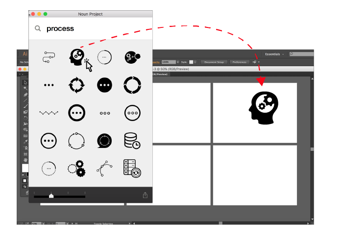
The Noun Project is the best resource to come along for graphics in years, and it is particularly helpful with technical documentation.
The Noun Project is a library of vector-based pictograms covering just about any concept or object you can think of. Of course you’re familiar with Clipart and icon libraries, but here’s what makes the Noun Project so special:
- The icons are vectors, so you can easily make changes to the graphic source.
- The icons mostly fit together in the same family, sharing the same general styles.
- You can drag the icons from the Noun Project app directly into Illustrator (on a Mac).
- With a subscription to the Noun Project ($10/month), you don’t have to give credit to the creators or pay individual royalties.
Because the graphics are vectors, you can make adjustments that you wouldn’t otherwise be able to do with raster graphics. Granted, this assumes you have an application such as Adobe Illustrator, but if you can get Illustrator it’s well worth it.
Most of the icons fit together in a thematic way, though you may need to tweak a few images here and there. With Clipart or other icon libraries, you rarely get a whole set of icons that you need, so you end up with a hodgepodge of different styles that look goofy together. The Noun Project overcomes this by requiring all contributors to design in a minimalistic style.
Even if you don’t have a subscription to the Noun Project, you can at least browse the library for inspiration. Most pictures have a variety of representations, and just browsing how people have represented an abstract idea is helpful.
I often combine visuals from separate graphics and make quick little adjustments. It can also help to set a timer (e.g., 10 min.) for when you plan to finish your graphic – this way you don’t spend too much time with artistic details and instead focus on concepts.
Step 3: Build a graphics library
The more visuals you create, the more ready-to-use components you’ll have at your disposal. If you settle on a certain icon for “server,” for example, then use that same icon in your other visuals. This helps you build a whole visual vocabulary that you can then leverage for your project.
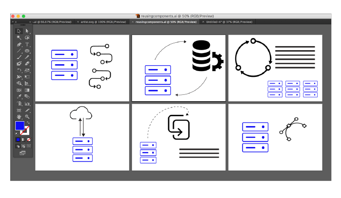
The more visuals you create, the easier they become for several reasons:
- You’ve already decided on certain stylistic choices, colors, sizes, arrows, and fonts, so you don’t have to keep making those decisions with each new graphic.
- You’ve already decided how to represent common components within your technology systems and landscapes.
- You can copy and paste from one artboard to another, making small adjustments as needed.
Conclusion
I don’t consider myself an artist, but by leveraging vectors from the Noun Project for various diagrams, I can build the graphics I need in a professional-enough way. At a former company, using this technique allowed me to gain the favor of a lead engineer who insisted on sending me his primitive box-and-arrow diagrams to make them look more professional.
Developing graphics does take some time, but you end up saving time in the long run because drawing helps you clarify your thoughts, reduces the number of words you have to write, and results in much more attractive, easy-to-understand documentation.
About Tom Johnson

I'm an API technical writer based in the Seattle area. On this blog, I write about topics related to technical writing and communication — such as software documentation, API documentation, AI, information architecture, content strategy, writing processes, plain language, tech comm careers, and more. Check out my API documentation course if you're looking for more info about documenting APIs. Or see my posts on AI and AI course section for more on the latest in AI and tech comm.
If you're a technical writer and want to keep on top of the latest trends in the tech comm, be sure to subscribe to email updates below. You can also learn more about me or contact me. Finally, note that the opinions I express on my blog are my own points of view, not that of my employer.