

Getting sharp, clear text in screen captures — and making sense of Retina displays
- Capture and display at a 1:1 ratio
- Zoom out on your browser’s magnification
- Capture from a Retina display
- Examples of Retina versus non-Retina screen captures
- Summary
Technical writers take a lot of screen captures, often showing interfaces with both text and graphic elements. Usually these are partial screen captures that focus on the part of the screen they are highlighting. (By “screen capture,” I’m referring to captures taken of specific user interfaces.)
In general, a lot of technical writers use Snagit and save the screen captures as PNG files, which is what I also do.
If you want clear, crisp screen captures — especially when those screens contain text — you have several options:
- Capture and display at a 1:1 ratio
- Zoom out on your browser’s magnification before capturing
- Capture from a Retina display and resize in the browser
This last option is somewhat confusing and has pros and cons, so that’s what I’ll spend the most time on in this post.
Capture and display at a 1:1 ratio
If you capture your screen at the same ratio you display the images, the screenshots will usually be sharp and clear. For example, suppose you capture your screen at 600x400px. If you also display your image using the same dimensions, you won’t lose any of the clarity, and your screenshot will remain sharp and clear on other monitors that have similar pixel-per-inch (PPI) density.
However, 600x400px is somewhat large and doesn’t work for all screen captures. At times you may need to show screen sizes larger than 600x400px but then shrink them down to this size.
Overall, trying to follow the 1:1 ratio for capturing and publishing doesn’t really work unless you fill your documentation with partial screenshots (screenshots that show only a partial area of the screen). The more partial a screenshot, the less context you include and the more confusing it becomes to users.
Any time you scale your image up or down, the quality degrades. Mike Spink at Snagit explains why:
Why does scaling cause image quality degradation? Imagine that you transferred your screen capture onto a tile floor comprised of many very small tiles. If you wished to reduce the size of the floor by 50%, you could remove every other tile and then slide the remaining tiles back together again. The problem occurs because some of the tiles that you removed were colored tiles that comprise the content of the image. If there was writing in the image, some of the tiles that comprised characters might be removed. The “dot” over an “i” for example might have been on one of the tiles that you removed, or portions of the top curve in an “e” might now be gone. This results in broken characters, jagged lines and an overall “fuzzy” appearance of the image. (See Snagit (Windows): Images are blurry or fuzzy)
In other words, increasing or decreasing your image size causes your graphics program to manipulate the pixels in ways that degrade the original capture, because the graphics program has to compensate for missing pixels in different spaces.
With upsampling, graphics programs have to add pixels where the pixels don’t exist. Wtih downsampling, some of the pixels get removed from various places on the graphic, and this can result in fuzziness as well. For example, if the graphics program removes every fourth pixel, the removed pixels may make the graphic look less crisp because of the places where the pixels get removed.
Zoom out on your browser’s magnification
You can shrink your browser’s display by zooming out (Shift + - on a PC, Cmd + - on a Mac). If the website is coded well, this may reduce the screen size while also keeping the text clear. After you zoom out the screen, take the screen capture.
However, not all sites retain the same proportions well when you zoom out. Additionally, it can be hard to remember exactly how many times you’ve zoomed out, which could create inconsistent magnification levels in your screenshots.
If you have some partial screenshots that aren’t zoomed out, mixed in with some full-size screenshots that are zoomed out, there will also be an inconsistency with the magnification levels. This inconsistency may be all right, but overall I am not a huge fan of zooming out with my browser. It’s just not very practical given that not all sites react uniformly to zooming.
Capture from a Retina display
You can also capture from a Retina display and then resize the image in your browser to a smaller size. This approach requires a Mac monitor with a Retina display. It’s not a straightforward process, and the high resolution of Retina-captured screen are lost on non-Retina monitors.
If you have a MacBook Pro (perhaps hooked up to multiple monitors that may not have Retina displays), move the browser you plan to capture to your Mac’s Retina display and take your screen capture there. Using Snagit, when you save the screenshot you’ll see a “Save using Retina size” check box. (This option only appears if you take the screen capture from a Retina display.)
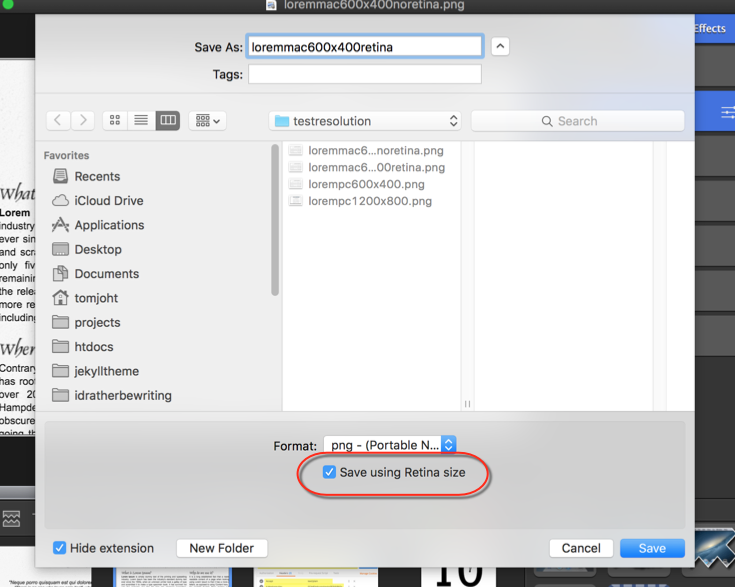
Save using the Retina size, and then embed the screenshot on your page. If you were to view the embedded screen capture in the browser, you’ll see that the screenshot is actually twice the size of the original dimensions. To compensate for this larger size, add some inline or embedded styles to rescale the display in the browser, such as this:
<img src="screenshot.png" style="max-width:600px"/>
Now you’ve got twice as many pixels packed in half the space. As a result, the screenshot will be sharper and clearer on Retina displays because you’re packing more pixels into a display that can make use of those extra pixels. However, for monitors that can’t make use of the extra pixels (because they don’t support that many pixels per inch), the displays will look just as fuzzy as with non-Retina captures.
By the way, “Retina” is a marketing term coined by Apple to describe their high-fidelity screens. Typical Retina monitors have a pixel per inch (PPI) density of 220, up to 400 with the iPhone 6. Don’t confuse PPI with DPI. PPI former refers to the number pixels per inch shown on a monitor, assuming you were to stack the pixels side by side. DPI refers to dots per inch and refers to how many dots of ink your printer can push into an inch. Despite the difference, the terms are often used interchangeably to mostly mean what PPI means. (I’m not covering print images here at all, so we’ll just stick with PPI.)
Examples of Retina versus non-Retina screen captures
Let’s look at some examples. Note that you won’t be able to see the difference unless you can switch between a Retina and non-Retina monitor. Even if you can switch, note that not all non-Retina monitors have the same PPI. (If you only have a non-Retina monitor but you have an iOS device, which has a Retina display, you can open it up to observe the differences in screen resolution. With iPhones, use into horizontal view.)
 </a>
</a> </a>
</a> </a>
</a>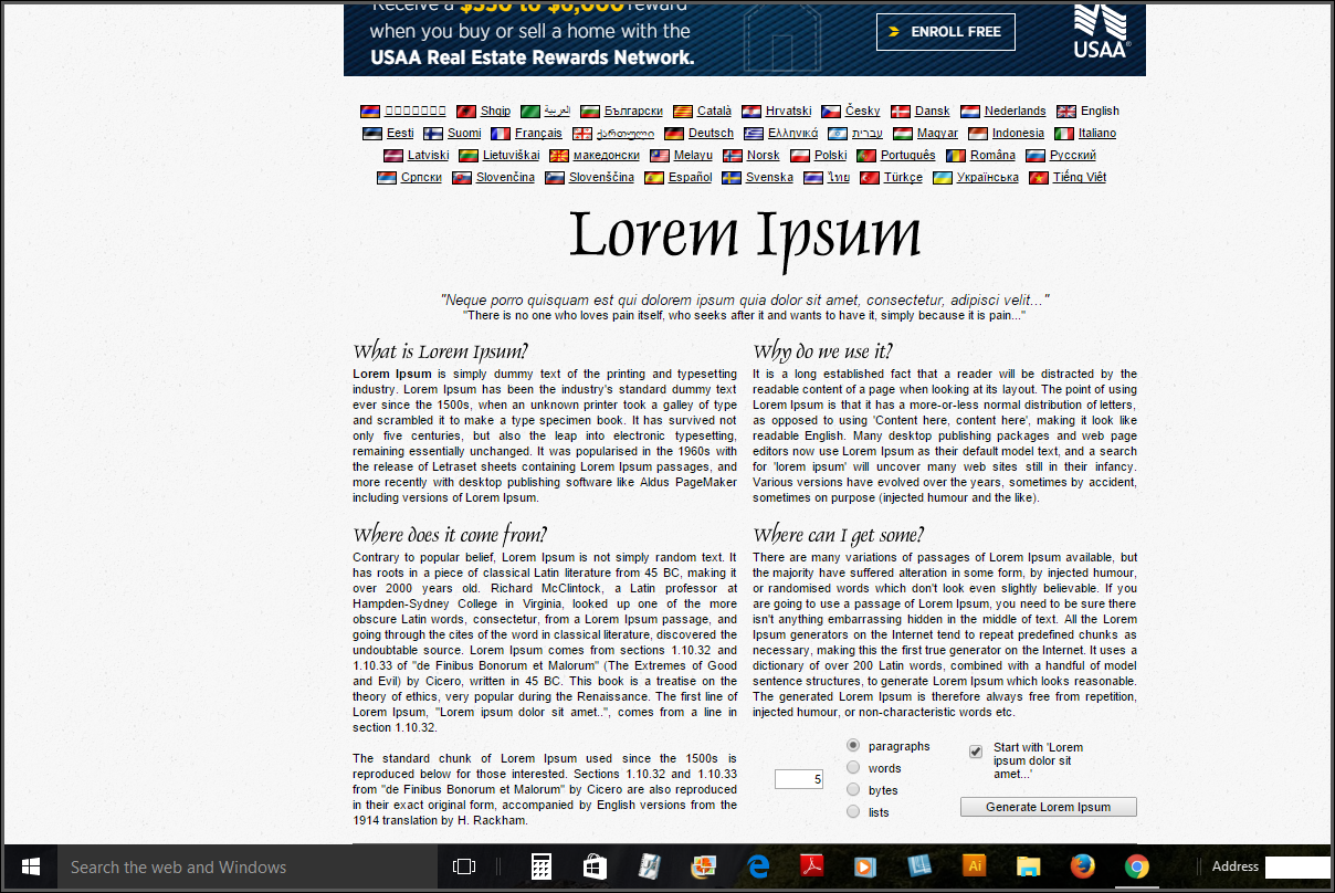 </a>
</a>Now let's constrain the size of the image even more, to 400px.
</a></a></a></a>What’s going on here? Basically, screens display a certain number of pixels per inch (PPI). See this site to see your screen’s PPI: http://dpi.lv/.
One Dell monitor I use has 166 pixels per inch (PPI), another Dell All-in-One PC monitor I use has 138 PPI, and my Macbook Pro screen has 277 PPI. This means when I capture a screen using my Mac’s Retina monitor, I’m capturing more pixels in my image due to the Retina display. When Snagit saves the Retina capture, it saves the image as twice the scale of the dimensions I actually grabbed because of all the extra pixels.
When I constrain that image in the browser to a scaled-down dimension (600x400px instead of 1200x800px), I retain those extra pixels on Retina displays, since the screen’s high PPI allows them to make use of the pixels (there is space for the pixels to go). On non-Retina monitors, however, the extra pixels are wasted because the monitors only accept a certain PPI threshold — having more pixels does nothing, and when the monitor has to drop some pixels to accommodate the image, degradation starts to occur.
When I constrain the display to 400px on a Retina monitor, I pack more pixels into the space, so the image resolution increases. But with non-Retina monitors, there isn’t the same PPI available, so the resolution isn’t affected.
In sum, the only way to get crisp images on a non-Retina monitor is by preserving the 1:1 capture/display ratio. But on Retina monitors, you can get high fidelity by saving the capture in the Retina size (or you can constrain larger images into smaller spaces). However, your page may load more slowly due to the large images.
Using 2x-scaled Retina images for screen captures works great if your audience has Retina displays. But if they don’t, all of those Retina-optimized images are going to look less crisp on the non-Retina monitors because of the downsampling that takes place through image resizing. (The degradation from downsampling is an effect I didn’t realize until I did the tests.) This makes the question of using Retina-sized images more of a damned-if-you-do, damned-if-you-don’t decision.
If you don’t use Retina sizes, you sacrifice crispness on Retina monitors. If you do use Retina sizes, you sacrifice crispness on non-Retina monitors; additionally, the pages will load more slowly due to the larger file sizes (which are about 4x as large). If you have a lot of Retina screen captures loading on the same page, users might experience a progressive-download-display effect as the images download. The higher file sizes can be particularly slow to load on mobile devices.
Additionally, if you embed max-width styles in your image tags, it makes the mobile styling of the images more difficult.
Summary
Are Retina images worth it? I’m not sure. As a Mac user, one of the features I most like about Macs is the crisp resolution of the images. Everything is so much clearer and easier to read.
My guess is that more monitors are moving towards higher PPI, so it probably makes sense to start using Retina images now. But if you don’t, it probably won’t make much difference.
About Tom Johnson

I'm an API technical writer based in the Seattle area. On this blog, I write about topics related to technical writing and communication — such as software documentation, API documentation, AI, information architecture, content strategy, writing processes, plain language, tech comm careers, and more. Check out my API documentation course if you're looking for more info about documenting APIs. Or see my posts on AI and AI course section for more on the latest in AI and tech comm.
If you're a technical writer and want to keep on top of the latest trends in the tech comm, be sure to subscribe to email updates below. You can also learn more about me or contact me. Finally, note that the opinions I express on my blog are my own points of view, not that of my employer.