

Two examples where high-level overviews are essential: Macbeth and Elon Musk
Macbeth
Last month my second-oldest child Callie, a senior in high school, came home stressed out about an enormous reading assignment for Macbeth. The reading assignment included dozens of questions about the author, context, plot, key quotations, interpretation, and more. Yet as Callie tried to read Macbeth, the text seemed incomprehensible.
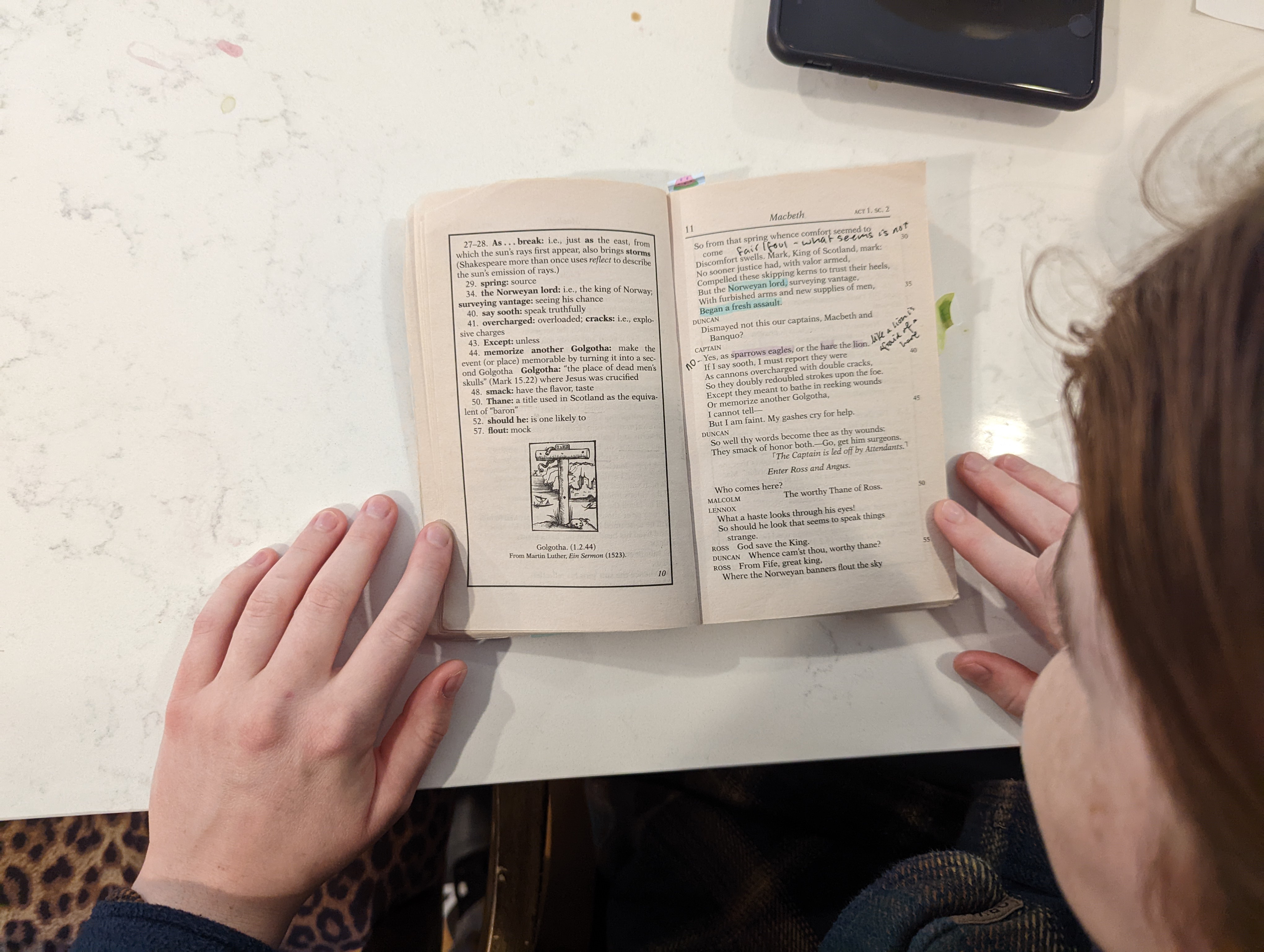
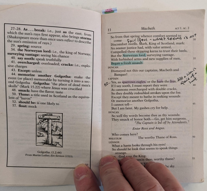
I remember reading Macbeth in high school and memorizing the “double, double toil and trouble” passage, but I couldn’t recall the plot at all. And as I looked at the Macbeth text that Callie had, with its many footnotes and explanations inserted on each page, I could see that reading it from start to finish, as one would normally approach a novel, wouldn’t work well. If you have to read a footnote for practically every line in the text, how can you ever make much progress?
Fortunately, my wife (who never neglects to remind me that she took five AP classes in high school and received perfect scores on each of them), told Callie not to start with the original text but rather at a high-level overview. “You don’t just start reading Shakespeare,” she said. “Start by reading the Wikipedia entry so you get an idea of the plot, the important characters and themes. Or read some high-level Cliff’s Notes.”
Here’s a close-up pic in case you want to try reading a page:
As we discussed Cliff’s Notes (apparently not that commonly known among high school students), my wife had a better idea: YouTube. My wife searched YouTube for “macbeth” and in no time we were all watching Macbeth in 7 minutes:
During the video, I could see light bulbs going on and the stress melting away. The 7-minute overview gave us a sense of the main characters, general plot, and major themes in a matter of minutes.
After this video, we watched 5 longer explanatory videos from Psycho English Teacher on Macbeth. Here’s her summary of Act 1:
We followed this with similar videos from the same for Act 2, 3, 4, and 5. This took 45 minutes in all, but we both watched with full attention. All the pieces of Macbeth were assembling in place, and by the end of the videos, Callie felt a thousand percent more confident about the assignment. Psycho English Teacher has a knack for stripping down complex texts and plots into easy-to-understand language and actions. (She would have made an excellent technical writer.)
After this night, I never saw any catastrophizing stress over the Macbeth assignment. Callie eventually read much of the primary text, pulled out various quotations, and completed the bulk of the reading log. Sadly, I don’t think Callie ended up reading the entire text, but enough to complete the assignment and get a perfect score (50/50 while the class average was 31/50). When Callie did read the primary text, the foundational grounding from the high-level YouTube overviews made the text much more accessible, in spite of the Shakespearean language.
This experience confirmed the importance of the high-level overview, but it also illuminated exactly when this overview is needed: in times of complexity and length. In this case, the high-level overview provided a shortcut for the reader. Instead of having to slog through 200 pages of Shakespearean English and confusing plot lines, the high-level overview distilled the essential information in consumable, more efficient ways.

For this reason, the high-level overview provided an easier path to the user’s end goal. This example stands in contrast to the high-level technical overview that exists as extracurricular reading, more on the periphery of user goals. In Callie’s case, the high-level overview functioned more like a quick reference guide, which is a genre I’ve written about previously.
For Macbeth, the high-level overview reduced the user’s pain by allowing the user to bypass the long, tedious reading for a stripped down, only-what-you-need-to-know version.
I remember the first time I’d made a quick reference guide, condensing a 100+ page manual into a two-page guide. It looked something like this:
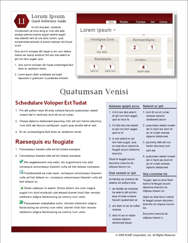
The program manager came to me one day and said he was so happy that he actually cried. He felt that finally, a tech writer understood that people don’t like to read long documentation. He loved that the quick reference guide simplified many hours of reading into bare-bones essential information. (And that it also gave the product a user-friendly simplicity to the user.)
Perhaps the takeaway here is that rather than creating high-level overviews that go into detail about the system, I should instead strive to create quick reference guides that distill more complex information into the essentials. The end result is somewhat similar: the high-level overview encapsulates the details of the entire system in briefer, more consumable ways.
Elon Musk and code reviews
Let’s move on to the second example: Elon Musk and the Twitter architectural diagram. My colleague pointed this example out to me. A couple of weeks ago, when Elon Musk was trying to do code reviews, figure out how Twitter works, and decide what engineering resources were needed (or something), he posted this whiteboard pic of Twitter’s high-level architecture:
LMAO this is a super high-level architecture diagram hastily scribbled onto a whiteboard. What code? Who falls for this?
— Snettles, Son of Pleasurizer (@Michael51090080) November 19, 2022
Here’s an enlarged view of that high-level diagram:
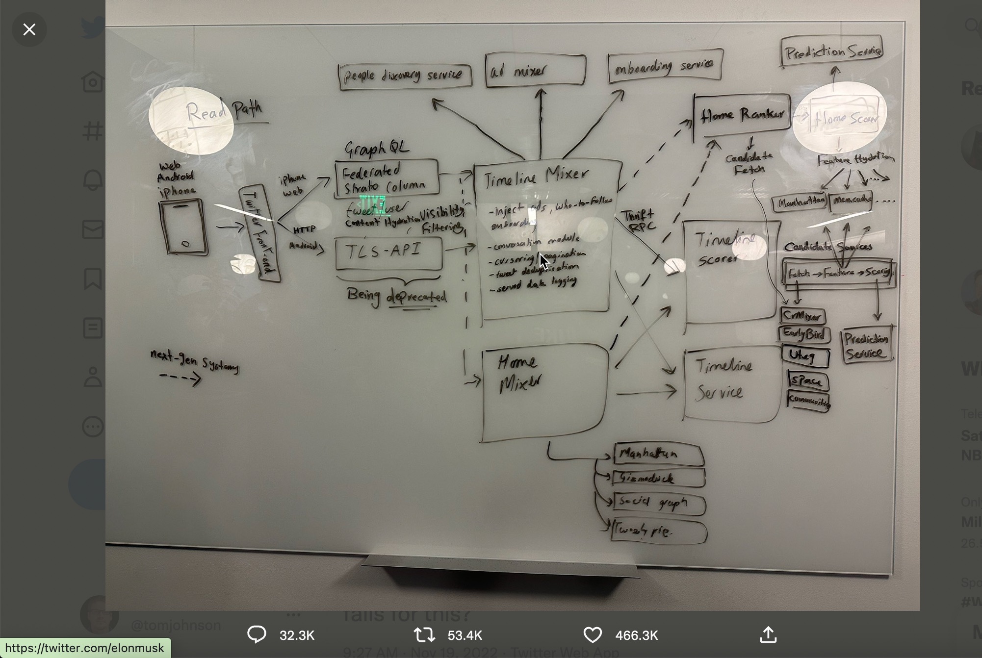
Whether this architecture was useful for the new CEO’s decision-making, or whether it’s real purpose was to project Musk’s narcissistic CEO mythology as a tech-savvy leader, this is beside the point. The point is that this high-level architecture is the starting point that Elon Musk felt to be necessary for decision-making. Without it, the lines and lines of programming code, engineering teams, and Twitter functionality had no context or larger meaning.
Even putting aside the many controversies surrounding Elon Musk and Twitter, most engineers in all tech companies start at a similar level as well. When you join a new team or take stewardship of a new technology, it’s natural to seek a high-level diagram and overview of the system.
Interestingly, I’m guessing this high-level architecture at Twitter wasn’t already documented. (I keep wondering whether Musk kept any technical writers at Twitter or whether he considered them non-essential personnel, despite the irony of this high-level documentation being one of his first requests.)
For many engineers, a high-level diagram satisfies the need for written documentation. Perhaps when you see the pieces on the board, it’s enough for engineers to understand how it all fits together, without supplementing the diagram with tedious explanations. In contrast, for non-engineers, maybe they need the additional detail.
A lot could be said for creating high quality diagrams. I haven’t run across too much in tech comm literature that dives into best practices here. But some common techniques for high-level architectural diagrams might include the following:
- Choose an appropriate level of detail. The diagram here is fairly simple, though I’m guessing that engineers could have made it look more like one of those unintelligible football plays that have chaotic spaghetti arrows and lines going everywhere. Maybe each of the boxes here has its own universe of complex detail, but that level is appropriately abstracted away into a single box at this level.
- Communicate a logical flow of information. Where does information start and where does it end? The eye should have some natural focus through the diagram. In this example, it seems that the action starts on the left and moves toward the middle elsewhere. There are dotted lines going to some services (to indicate optional paths?). I don’t see many bidirectional arrows. But if you trace the directional flow, it’s somewhat intelligible, even with no familiarity with Twitter.
- Provide more detail about each component if the user wants it. It could be that for many engineers, this high-level is all that’s needed. But suppose you want more information about the “Home Ranker” box. (This seems like an interesting algorithm that I’d like to know more about.) How can you take the reader to more detail here? Good documentation facilitates a flow of progressive information.
Similar to the Macbeth example, in this scenario the high-level diagram saves the CEO many hours of time that would otherwise be spent reading more specialized code. Instead of trying to sort through endless code repositories and APIs, the CEO can see at a glance all the pieces and how they fit together. This workflow provides the semantic hierarchy of each piece, showing that some components (e.g., the “Timeline Mixer”) have greater importance than the “service graph” or “EarlyBird,” which are probably more marginal services.
The takeaway here is to focus more on good diagramming techniques and best practices rather than writing out longwinded explanations of each component and providing more narrative detail.
If you wanted to provide more detail, the diagram here could provide links to further reading. (Adding links to each box in a vector diagram can be done through Adobe Illustrator.)
When I was at Amazon, I once documented an XML schema by doing something similar. See Movie Elements, for example:
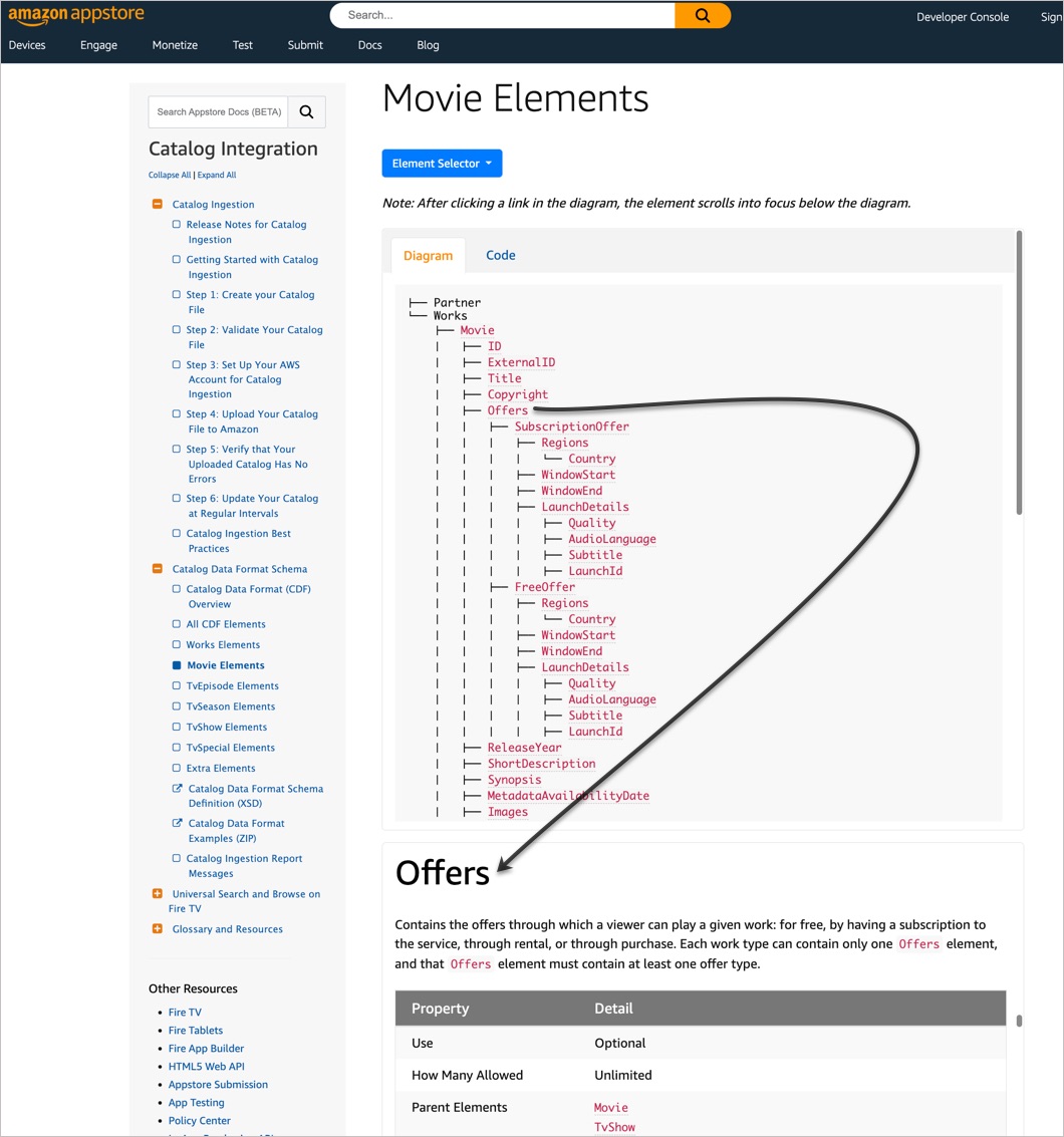
I created a tree view of the code, then linked each element in the tree to an explanation below. When you click a link, the explanation scrolls into focus. (I used some scroll-to jQuery plugins for the scrolling effect.) The code wasn’t too complicated and could have equally been done through other approaches. But this idea is key: make the code visual and provide links for more detail from that visual diagram. (I’m still proud of this documentation!)
In the case of an XML schema, there wasn’t a narrative flow to the elements. Each element followed the same pattern of reference information. I couldn’t imagine anyone reading them linearly from start to end, so the scroll-into-focus technique seemed appropriate. But with an architectural diagram, there’s more of an opportunity to create a narrative flow to the material, so jump links that put the reader into the context of a narrative (without scrolling into focus) might be more warranted.
The problem with the architectural diagram, though, is similar as before: who needs this info? What tasks prompt a user to dig into the high-level architecture? In Musk’s case, although motives are murky, he appears to need the information for making company hiring/firing decisions related to essential services. But even this scenario seems farfetched for a CEO, and given that the diagram didn’t seem to exist previously suggests that maybe no one needs this information anyway. System-level information is only useful when making system-level changes. As such, system-level information might only appeal to those in a position to make system-level changes (which doesn’t include many people but might have high impact).
Conclusion
In this post, I aimed to rescue some value for lengthy overviews by identifying two scenarios where they’re essential:
- When the high-level overview serves as a substitute for reading the entire manual. In this example, the overview functions more like a quick reference guide that distills the whole into a condensed summary.
- When the user needs to make system-level decisions, such as how to optimize the system or reduce system bloat. In these cases, the target users are probably senior levels executives or managers.
About Tom Johnson

I'm an API technical writer based in the Seattle area. On this blog, I write about topics related to technical writing and communication — such as software documentation, API documentation, AI, information architecture, content strategy, writing processes, plain language, tech comm careers, and more. Check out my API documentation course if you're looking for more info about documenting APIs. Or see my posts on AI and AI course section for more on the latest in AI and tech comm.
If you're a technical writer and want to keep on top of the latest trends in the tech comm, be sure to subscribe to email updates below. You can also learn more about me or contact me. Finally, note that the opinions I express on my blog are my own points of view, not that of my employer.