Pulling readers through long documents
- Thrown into a tailspin
- The user’s reading contract
- Retaining focus and ADHD
- Story versus interactivity
Thrown into a tailspin
It’s been a few weeks since I added another post in this series. I actually want to wrap this series up because I’ve arrived at good answers to my questions. But this past month, I ran into new obstacles that threw me into a tailspin, and I’m still trying to get out of it. Let me describe what happened.
It started a few weeks ago when I attended an internal technical writing conference at Google. I gave a presentation, called “Specialization Myopia Syndrome and the Product Overview,” which went well. One of my colleagues presented on the topic of focus, following similar themes as the ones I’ve been exploring in Journey away from smartphones. I loved his presentation — everything seemed so relevant to me. Yet in the conference chat threads, a couple of people noted that many of the techniques for focus aren’t helpful to neurodivergent people. One added that for those suffering from PTSD, some of the techniques for focus can even be harmful.
Harmful? What? This comment thread jarred me. I wasn’t sure how to make sense of the PTSD comment, but the neurodivergence aspect, especially ADHD neurodivergence, got me thinking. It woke me up and started me on a path of questioning all of the focus techniques I’d been writing about. One of my kids has ADHD, and as they were getting diagnosed last year, my wife looked over their shoulder at the assessment questions and realized that she too had ADHD. I’m 99% sure that my youngest kid (12) also has ADHD. I didn’t fully understand what ADHD meant, nor was I familiar with the varieties of the symptoms. I started to feel a bit selfish and dumb for writing so much about focus while half my family struggles with ADHD.
Around this same time, I finished a long narrative describing the workflow of directions requests (what I referred to as a “Life of a [something]” narrative). At 20+ pages, I felt pretty good about the content, both the shape and flow, but it became clear through the reviews that, however good, few people would read beyond a few sections. We sent the finished version out to a handful of new employees in our org, including a survey for feedback, but received only one survey response out of eight. The one response praised the content and big picture focus. But just one response?
Meanwhile, I had another “long distance” document in progress (describing another workflow as well as other big picture ideas). It was sort of stuck in limbo, waiting for reviewers to get to it. I started to experience a reality check about document length. Did it matter how compelling the content was? Unless people absolutely had to read technical documentation, they didn’t seem to naturally pick it up. No one has free time on their hands and thinks, What shall I read this morning? Like a treatise on the tax code, we don’t pick it up out of curiosity. Only a small handful of curious financial accountants might.
The paradox is that everyone usually gives effusive support for the big picture overview. They see the value of content that connects the dots across services and products. They emphasize and reinforce how much we need this content. Finally! Thank you for doing this!! They underscore the need for this high-level information with exclamation marks. But after you write it … crickets.
In a nutshell, here’s the problem:
- Complexity requires detail.
- Detail requires length.
- Length requires reading
- Reading requires time and attention.
- Time and attention are scarce commodities.
- Without more readership, the motivation to write more high-level content fizzles.
The user’s reading contract
While waiting and wondering about feedback, I kept thinking about how to design content for someone with ADHD. In an experiment, I tried to amplify the journey map for the content. I broke the content into 4 pages, and then designed a visual workflow map showing each page in the journey, sequenced with numbers. Below the map, I provided a short description of each page based on the journey context. If you were on page 2, for example, a description of page 2’s contents appeared below the map. I embedded this journey map prominently at the top of every page.
I figured this journey map would help all types of users, not just those who might click around in non-linear ways. But the journey map, it turned out, didn’t make reading happen.
I’m becoming more convinced that the only way to get people to read long documents is to target a situation where the documentation is integral to a key task the user has to perform. And this is perhaps why in-depth, high-level overview documents aren’t often written — they aren’t critical to anything the user needs to do. Instead, they are useful for high-level understanding, if readers are so inclined to enrich their perspective. But in-depth overviews don’t demand that users read them in the same way that task-oriented documentation demands to be read.
The motivation for the user to read task-oriented documentation is to trade task completion for readership time. Someone really wants to do X. To achieve this, they are willing to trade Y. For example, maybe I really want to have an IKEA dresser in my room because I don’t have enough space to organize my clothes. The price for accomplishing getting this dresser is to fight through three hours of assembly time that involves following steps in an wordless IKEA manual. The scenario is an exchange: task completion for reading time. For these three hours of suffering through the manual, I will get an assembled dresser in return. Without this exchange, I’m not reading the manual. (Maybe this could be called the “user’s reading contract”?)
What’s the exchange for reading high-level overview content? The writer offers understanding, but no completed task. Is a broader understanding enough to overcome the time and effort involved from the user? I had assumed yes, but now I’m thinking no. Or maybe yes for higher-level managers, cross-functional product managers, or other more in-depth strategic level roles, but not your average tech worker assigned a bug to fix.
Retaining focus and ADHD
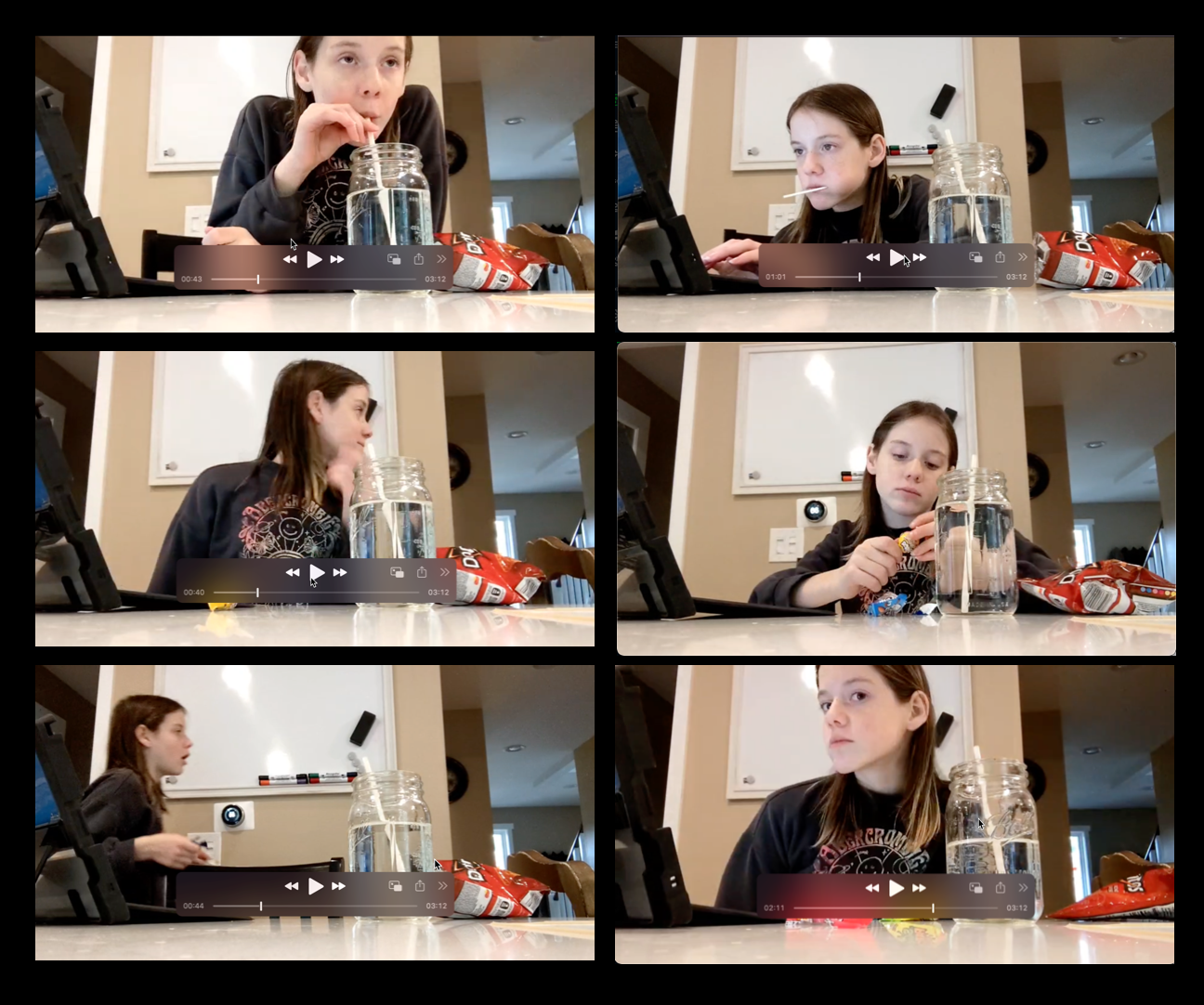
Watching my youngest daughter struggle to finish her homework, I became more and more interested in understanding ADHD. She struggles to retain focus on the homework assignments, and her racecar attention pulls her brain in so many different directions at once. The other week she sent me a video she sent me showing how her focus gets pulled away. In the video, she’s working on a small homework assignment, and it looks as though she’s working, but she’s really jumping from Spotify to snacks to who knows what. It takes her 30 minutes to finish something that should take 5 minutes.

This has made me worried as a parent. The homework is simple now, but as it gets harder and harder, what then? Many of the traits of ADHD manifest as the context changes; specifically, as the classes and homework intensify, the traits become more apparent.
I started listening to podcast after podcast on ADHD, reading articles and books about the topic (for example, What your ADHD child wishes you knew and ADHD 2.0), listening to talks and presentations (there are quite a few on TEDx, actually), and more. Learning about ADHD brought so much clarity to my relationship with my wife for the past 20 years. Such as why she was always multitasking, or asking me to do 5 things at once, or why I struggled to connect the dots between conversation topics, or why she could get angry so quickly, or on the flip side, why she had so much passion and charisma, or why I loved her quick outspoken attitude, the way she could get so emotionally invested in something, and so on.
In learning about ADHD, I kept looking for the magic formula that would unlock long-form reading and focus, which would not only help my daughter but also somehow make it so that people would read the long overview docs I was writing. Perhaps some special arrangement of information or chunking, or interactive workflows, but no, at least not yet. I haven’t found any magic bullet that good tech comm practices don’t already teach — split up information into individual tasks and steps, use subheadings, balance text with visuals, provide workflow maps, use simple language, short paragraphs, unambiguous terms, and so on.
Story versus interactivity
For most long texts (for example, a 200-page book with no images), writers use story as the captivating structure that pulls readers in. If a story doesn’t emerge 50 pages into a book, readers lose interest. But how compelling does the story have to be to include someone whose attention gets pulled away in uncontrollable ways? For those with ADHD, their attention doesn’t always remain long enough for the story to emerge (unless they tap into hyper-focused states). Without this story, there’s no hook to keep you reading.
In documentation, providing a story is even harder. Presumably, the conflict in technical documentation is the focus on some task (how you go from pieces of wood and screws in a box to a fully assembled, functioning dresser). And the protagonist overcoming that conflict is the reader. But for the in-depth overview, which connects dots between services, or which describes the architecture of the system, or traces a workflow that information follows, and so on, there isn’t a concrete goal or task to ground the reader’s attention. The reader isn’t the protagonist either, but rather a bystander.
So what is a tech writer to do? Here are a few options that I’ve brainstormed:
- Make documents shorter. Sacrifice depth and clarity for brevity. Instead of 3,000 words, limit it to 500. Let users figure out the rest on their own. Stop trying to be so comprehensive. Let users explore and learn on their own.
- Pack all the additional detail into expandable sections, allowing those who want more information to click for it. The 500 word article could be expanded into 3,000 words if users need that information. This technique follows progressive information disclosure, allowing the user to define how much information they want to consume.
- Ignore low readership or non-reading users. Those who want the information will find it and read it. Write for the few people (even one person) who needs this information.
- Scrap the extensive overview and instead insert the conceptual information into teaching moments along task-oriented journeys. Add the information in long asides, tips, sidebars, or other information.
- Create more interactive widgets, surveys, and other doohickeys for readers. Think about corporate e-learning strategies — every screen requires you to click different objects to reveal text that you can read.
- Gamify the progress in the journey map, giving the user more of a sense of fun in completing each step. Show a progress bar lighting up as they make their way through the document. Celebrate each step.
- Gamify the content itself, providing the equivalent of a bare room with clickable objects (like a video game). Force the reader to figure out the story on their own. In short, create a non-linear, interactive reading experience.
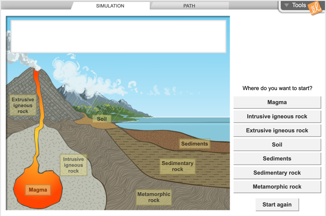
Regarding this last approach, here’s an example used in my daughter’s science class to teach kids about rock cycles. This is from the Rock Gizmo on Clever:
You click around to reveal different bits of information. Well, the graphic isn’t as interactive as I would have liked — only the buttons in the right sidebar are clickable. But imagine if each aspect of the graphic were fully clickable, and when clicked, information appeared on the right of the graphic or the graphic itself would change. That might allow for user-driven, non-linear learning paths through content. Designing this might be more work initially, especially if you didn’t have this model in mind from the start. But it might also be more in tune with the type of content one would read.
I can only see this working for some infrequent scenarios. A rock cycle or other workflow might be perfect. And as far as tools for this, I don’t know.
Even with all this interactivity, I watched as my daughter used this diagram to find answers to her homework questions. The interactivity of the buttons didn’t draw her in. Instead, she just clicked around (between playing with the cat, changing music on Spotify, and eating snacks) until she located the answers to her questions. Sometimes she seemed to click randomly. A button on a site compels one to click it almost in an automated way.
Of all the techniques, the writer in me leans toward story as the best mechanism. I’ve always loved story — it’s why I majored in English as an undergraduate. Story is a time-tested technique for pulling readers in. Perhaps I simply haven’t constructed it well enough within technical documentation.
What are your thoughts? How can we get people to read large amounts of conceptual information without the payoff of a completed task that they feel urgency about?
About Tom Johnson

I'm an API technical writer based in the Seattle area. On this blog, I write about topics related to technical writing and communication — such as software documentation, API documentation, AI, information architecture, content strategy, writing processes, plain language, tech comm careers, and more. Check out my API documentation course if you're looking for more info about documenting APIs. Or see my posts on AI and AI course section for more on the latest in AI and tech comm.
If you're a technical writer and want to keep on top of the latest trends in the tech comm, be sure to subscribe to email updates below. You can also learn more about me or contact me. Finally, note that the opinions I express on my blog are my own points of view, not that of my employer.


