A few things tech writers frequently say: Videos tedious, topics best when short, people just use Google, and more
I gave a presentation at the STC Berkeley chapter last week. It was a lively group, and people had a lot of insightful things to say. Here are a few comments various participants made. I want to highlight these assertions because I hear them so frequently.
- Videos are too tedious to watch -- I'd rather have the text that I can go right to.
- Users only go to help to search for a specific answer, so they want a short topic rather than having to wade through a lot of content.
- My preferred way to get help is to have a friend right beside me to ask questions whenever I need it.
- If I do a search on Google, I'll find the content I'm looking for, but not when I use the application's search.
- Tech writers don't include more examples because they don't have the information to write examples.
Reflecting a bit
I'd like to reflect on a few of these assertions, both agreeing and disagreeing to an extent.
1. Videos are too tedious to watch -- I'd rather have the text that I can go right to.
I hear frequently this comment from tech writers, though I believe it only reflects one user story or behavior.
Yesterday I was talking with one of our users, and I asked her what her favorite websites are to learn code. She said he likes lynda.com (a site focusing on video-based tutorials) when she's trying to get a general feel and orientation to the topic, but when trying to do a specific task, she prefers written instructions, because they allow her to move at her own pace and to go back and forth as needed.
I think her response sums up how a lot of people use help. When you're new to a topic and want the big picture, videos are great. They introduce you to the concepts and allow you to see how it works at a high level.
But when you're trying to assemble the nuts and bolts, videos may move too fast and gloss over some of the details that might be critical.
To balance video with written instructions, it's probably best to provide both formats, aligning the videos with introductory concepts and aligning written material with more advanced topics and tasks.
Still, even written instructions benefit from illustrations, diagrams, and other visual content. Visual communication, whether in the form of a workflow chart, illustration, concept diagram, or other visual can be tremendously helpful.
As evidence for the importance of visual communication, check out this recent post on Techwhr-l by Edward Smyda-Homa (aka @uselessassist). Edward highlights complaints from dissatisfied users about poor instructions by posting or retweeting the complaints on Twitter. From analyzing more than 1,500 tweets, he finds that the number one complaint of users is either lack of pictures or wordless pictures. Edward writes:
I was able to neatly categorize about 70% of the first 1500 retweets into a dozen categories:
No Pictures/Just Pictures (16%)Unreviewed/Unedited (15%)
Too Long (11%)
Output Quality (11%)
Translation (9%)
No/Wrong Instructions (7%)
Too Complex (7%)
Unnecessary (7%)
Wrong Medium (6%)
Retrieveability (4%)
Sexism (4%)
Too Vague (3%)
The "just pictures" complaint no doubt points to IKEA-like manuals. At any rate, visual communication is the number one element of feedback for product assembly type instructions.
Given the importance of visual communication, I think as professional communicators, tech writers should leverage visuals as often as appropriate, particularly to explain complicated concepts and techniques. But also remember that combining pictures with words is what makes technical content particularly clear.
2. Users only go to help only to search for a specific answer, so they want a short topic rather than having to wade through a lot of content.
This assertion ignited the most discussion during the evening, and I don't think I defended long-form help topics very well. I think Mark Baker's advice to treat every page as if it's page one has the most logical appeal (and is the logic I should have leveraged), but how one defines that page probably still varies.
Basically, if you're starting a page from a search, do you have enough context and detail to make sense of it all? Is the topic complete enough unto itself to be meaningful? Or does the article depend on other articles for users to make sense of it within the context of a goal.
At any rate, how you chunk information in your help content seems to be a perennially controversial topic. Maybe the discussion is best made by throwing out abstract ideals and instead focusing on specific examples of content and analyzing whether the topic is the right length.
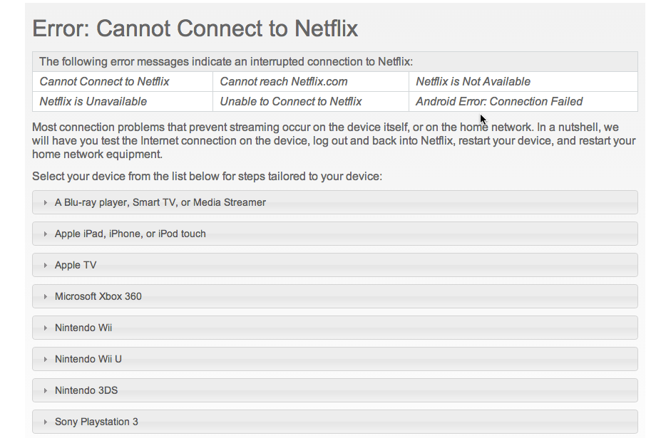
For example, here's a help topic from Netflix.
Would you split that into 8 different topics so that users can go directly to the material they're looking for?
3. My preferred way to get help is to have a friend right beside me to ask questions whenever I need it.
I hear this comment a lot. The idea here is that artificial intelligence solutions like Siri on the iPhone might actually make this scenario possible.
 Sometimes I'll use Siri to do tasks I don't want to do manually. For example, I might say, "Siri, turn brightness to 100%". Or my daughter will playfully say, "Siri, change my name to 'Chocolate Rainbow Heaven'." It's easier and quicker than figuring out where or how to make these adjustments.
But we're a long ways off from implementing artificial intelligence solutions for help. It's good to have Star-Trek-like ideals, though. Let's just hope that this kind of solution doesn't turn out to be version 2 of Clippy.
And while we're dreaming, can I recommend that we bypass the virtual friend altogether, as it might create silly imaginary dialogues within the mind, and instead anticipate and respond to the user's distress through a brain wave transmitter? When the AI solution kicks in, it should emit a countering sea of beta waves to soothe and calm the frustrated user before initiating the instruction. Once the subject is prepared, there's no need to avatarize the friend or verbalize the response. Just merely project the answer in the recesses of the mind as a kind of imprinted echo or deep-felt answer.
4. If I do a search on Google, I'll find the content I'm looking for, but not when I use the application's search.
I think most of us have had this same experience, which is pretty much why we love Google. And yet, I've never actually implemented Google Enterprise Search as the default search box in my help material.
Why not? Sometimes the material isn't online (for example, right now my content is behind a firewall). Other times I don't want to go through the hassle of setting up a fee-based subscription through Accounting to purchase the service.
Regardless of whether we bring Google to help, users will probably use Google directly anyway. And if this is the case, you end up competing not only with the findability of your own content, but with all the other web content as well.
At my previous job, where help was online, I remember how users constantly landed on old blog posts announcing new features rather than the feature how-to pages in the documentation. I'd get comments from old posts and wonder, how is this post still getting traction after it slid off the homepage months ago? And then I realized that users were using Google.
Yep, there's a lot more to say about this topic. Google is at the center of findability in the future.
5. Tech writers don't include more examples because they don't have the information to write examples.
This was a bold claim I'd never really heard before, but yeah, I tend to agree. The good examples that contain business-specific information are either too complex or sensitive to include in the help, or they are simply out of the reach of technical writers who are working with the nuts-and-bolts of tools rather than strategic business-decision making.
Hearing this feedback made me want to explore the example side more. Getting the right information for real examples is a much larger effort and issue but one with incredible payoffs. A really detailed example might be great material for a corporate blog.
This assertion about tech writers not having real examples highlights the gulf that will probably forever exist between excellent help and mediocre help. Crossing it involves much more than figuring out how to communicate the 1-2-3 steps of tasks.
Many of these comments I reflected on could drive entire posts and hour-long discussions. I'm curious to hear what your reaction to these common assertions would be. Do you agree, disagree, or have other insights?
About Tom Johnson

I'm an API technical writer based in the Seattle area. On this blog, I write about topics related to technical writing and communication — such as software documentation, API documentation, AI, information architecture, content strategy, writing processes, plain language, tech comm careers, and more. Check out my API documentation course if you're looking for more info about documenting APIs. Or see my posts on AI and AI course section for more on the latest in AI and tech comm.
If you're a technical writer and want to keep on top of the latest trends in the tech comm, be sure to subscribe to email updates below. You can also learn more about me or contact me. Finally, note that the opinions I express on my blog are my own points of view, not that of my employer.


